We were entrusted with creating a distinctive product identity for the Single Origin coffees by Kawacom, a proud member of the KAWA Coffees family. The project focused on crafting a compelling design for pod capsule packaging, tailored to showcase three initial coffee origins. This effort followed the identity system we had previously developed for the broader KAWA Coffees product range. The objective was to create a cohesive design system that honored the diversity of these origins while maintaining a strong visual connection to the parent brand.
The first challenge was to represent the origins in a meaningful yet visually striking way. To achieve this, we categorized the origins into three distinct regions: Africa, South America, and Central America. This grouping allowed us to focus on the unique characteristics of each area while emphasizing the product’s global nature.
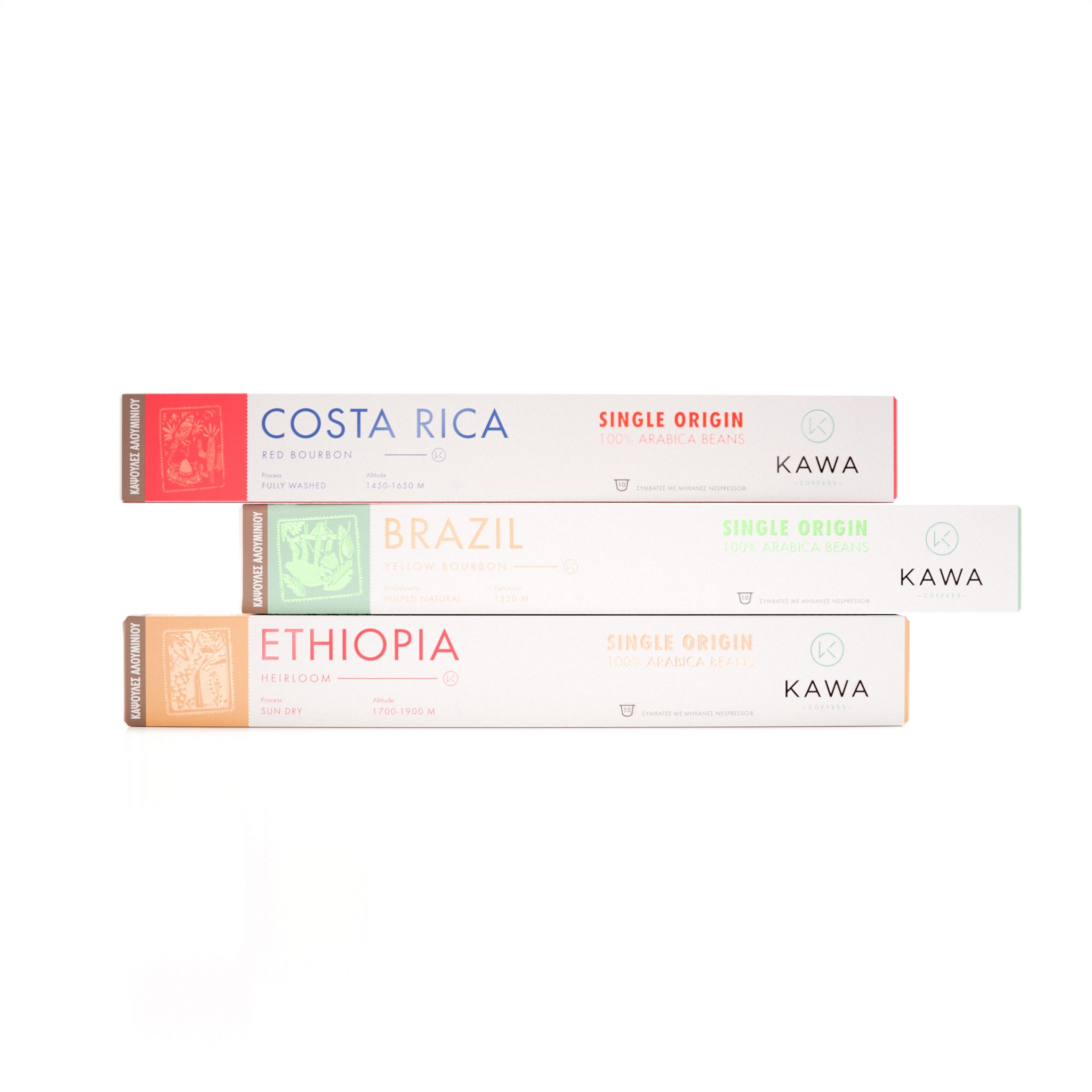
The design process began with the packaging itself. We opted for a clean and minimalist aesthetic, featuring a white background that offered a sense of simplicity and sophistication. To highlight the multicultural essence of the Single Origin range, we integrated a world map into the design, subtly reinforcing the idea of global connectivity. To maintain consistency with the existing KAWA Coffees brand identity, we incorporated its signature color palette into the design, ensuring a seamless visual transition between the established product range and the new capsules.
The pod capsule packaging then became a versatile canvas for showcasing the distinguishing features of each origin. Drawing inspiration from the local culture and natural beauty of the three regions, we created unique illustrations for each. These illustrations were designed to resemble passport stamps, symbolizing the journey and origin of each coffee. This concept tied in beautifully with the idea of exploring the world through coffee.
Each illustration was paired with bright, nature-inspired colors that reflected the essence of its region:
- Africa: A combination of yellow and red, inspired by the vibrancy of the savannas and the warmth of the African sun.
- Central America: A blend of red and white, evoking the striking contrasts found in the region’s arid desert landscapes.
- South America: Dual-tone green, representing the lush, verdant rainforests that are iconic to the region.
This design approach created a cohesive and visually appealing system that not only distinguishes each origin but also reinforces the product’s premium and multicultural character. Each capsule becomes a small work of art, celebrating the uniqueness of its origin while remaining firmly rooted in the identity of KAWA Coffees.
By combining thoughtful design elements, cultural inspiration, and a strategic use of color, we succeeded in delivering a packaging solution that is both functional and evocative. The result is a visually striking identity for Kawacom’s Single Origin coffee capsules—one that tells a story of global discovery, exceptional quality, and a deep appreciation for the rich diversity of coffee origins.


