Project: Shuangqiang / Premium Packaging
Service: Premium Packaging Design
Channel: Omnichannel
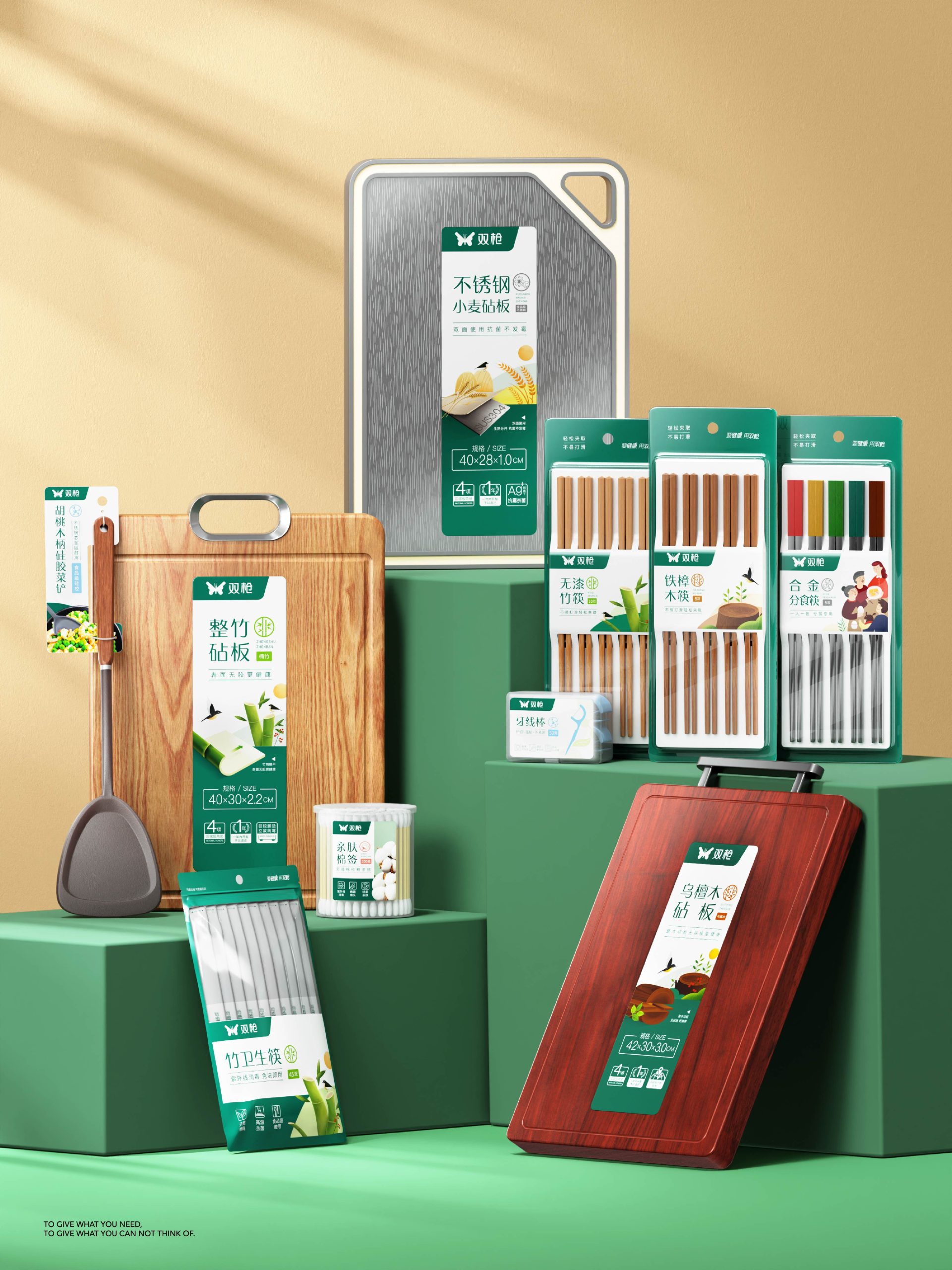
Shuangqiang was founded in 1995 and listed on China’s A-share main board in August 2021. It is the world’s first publicly listed bamboo products company and the first listed chopsticks company, as well as a leading player in the kitchenware industry, with annual revenue exceeding RMB 1 billion. Despite its growing market share and scale, the brand faced a critical challenge: an overly extensive product line covering multiple subcategories—such as chopsticks, cutting boards, and cotton swabs—across various sizes. In addition, frequent changes in visual direction led to highly diversified packaging styles, lacking a unified visual standard. This prevented the effective accumulation of brand visual assets and resulted in significant brand resource waste. The core challenge of this project was how to build a packaging system that works for the existing product range while remaining scalable for future expansion.
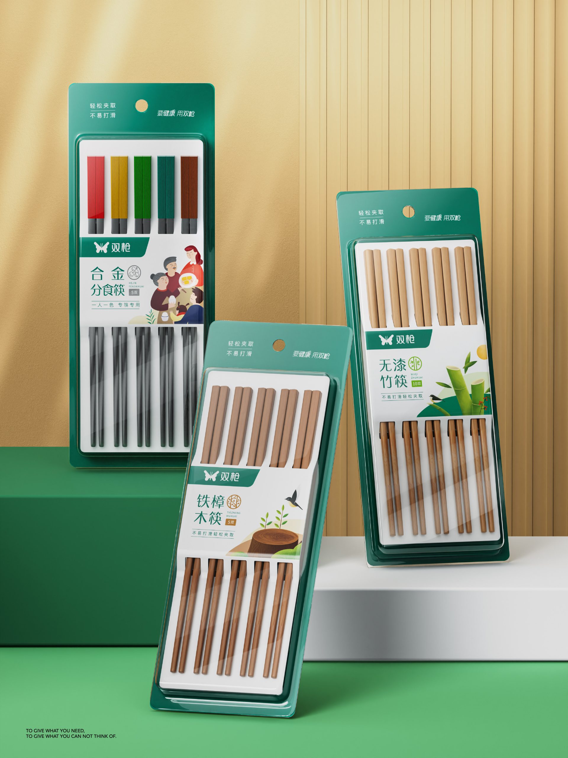
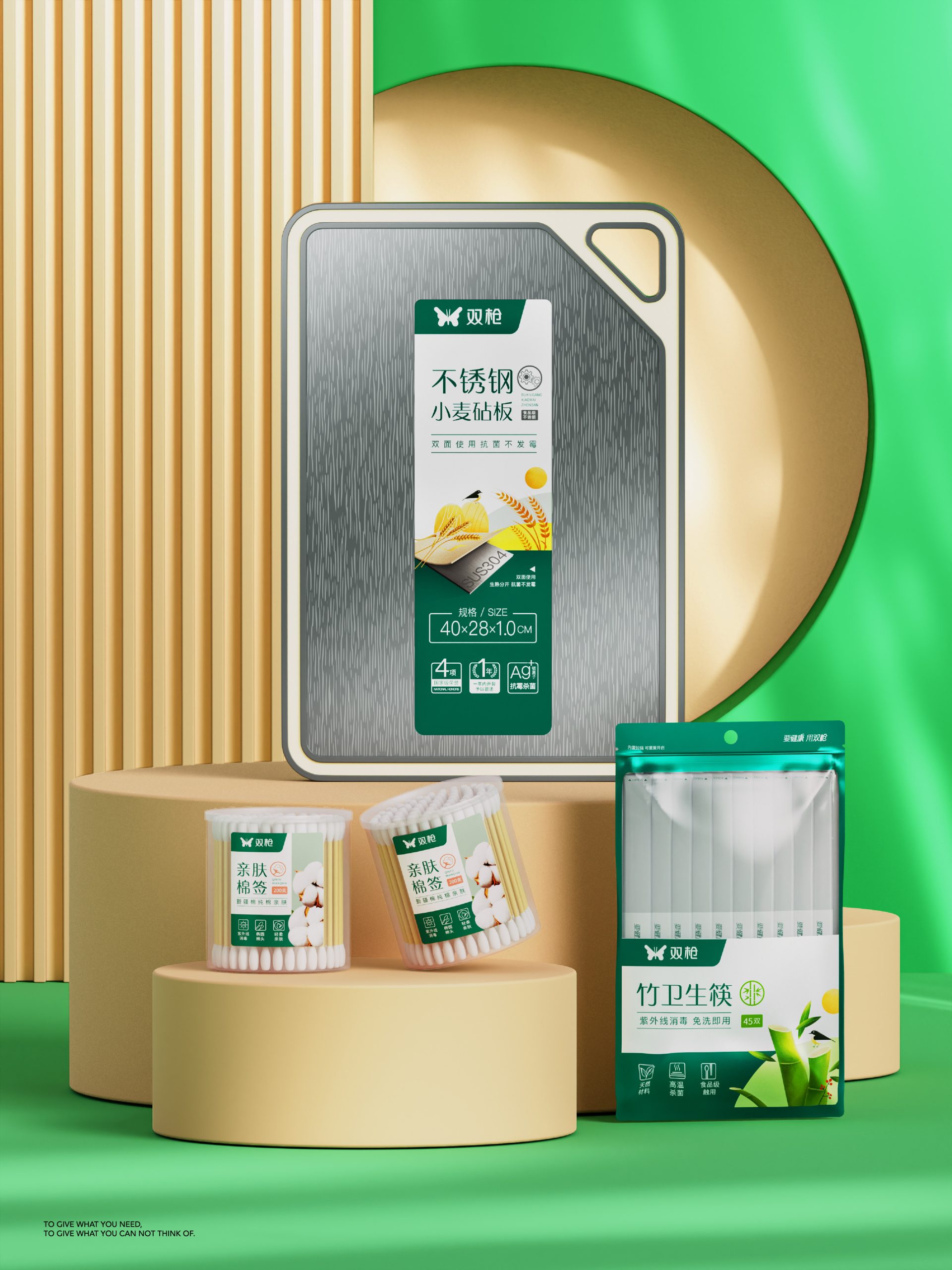
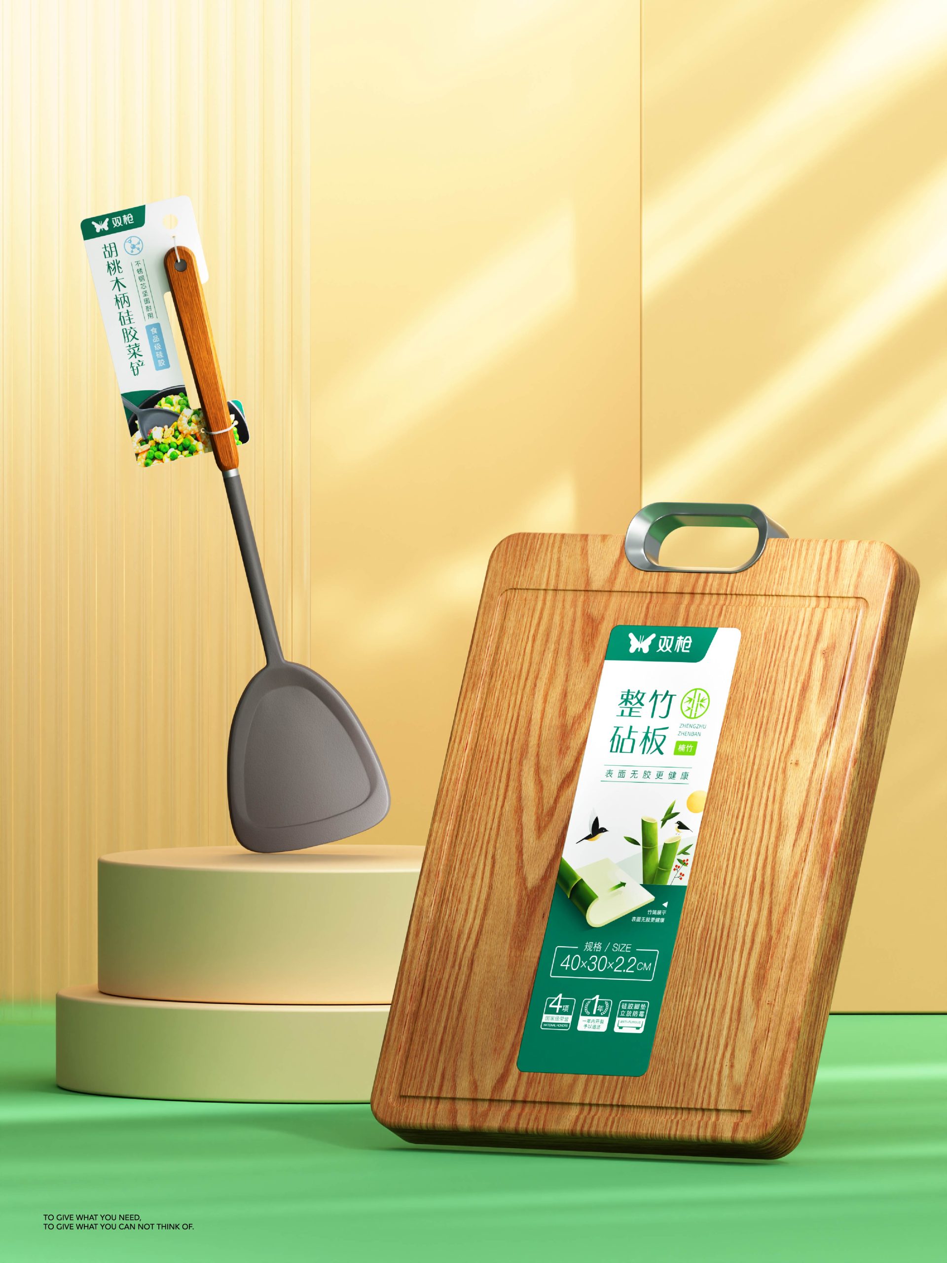
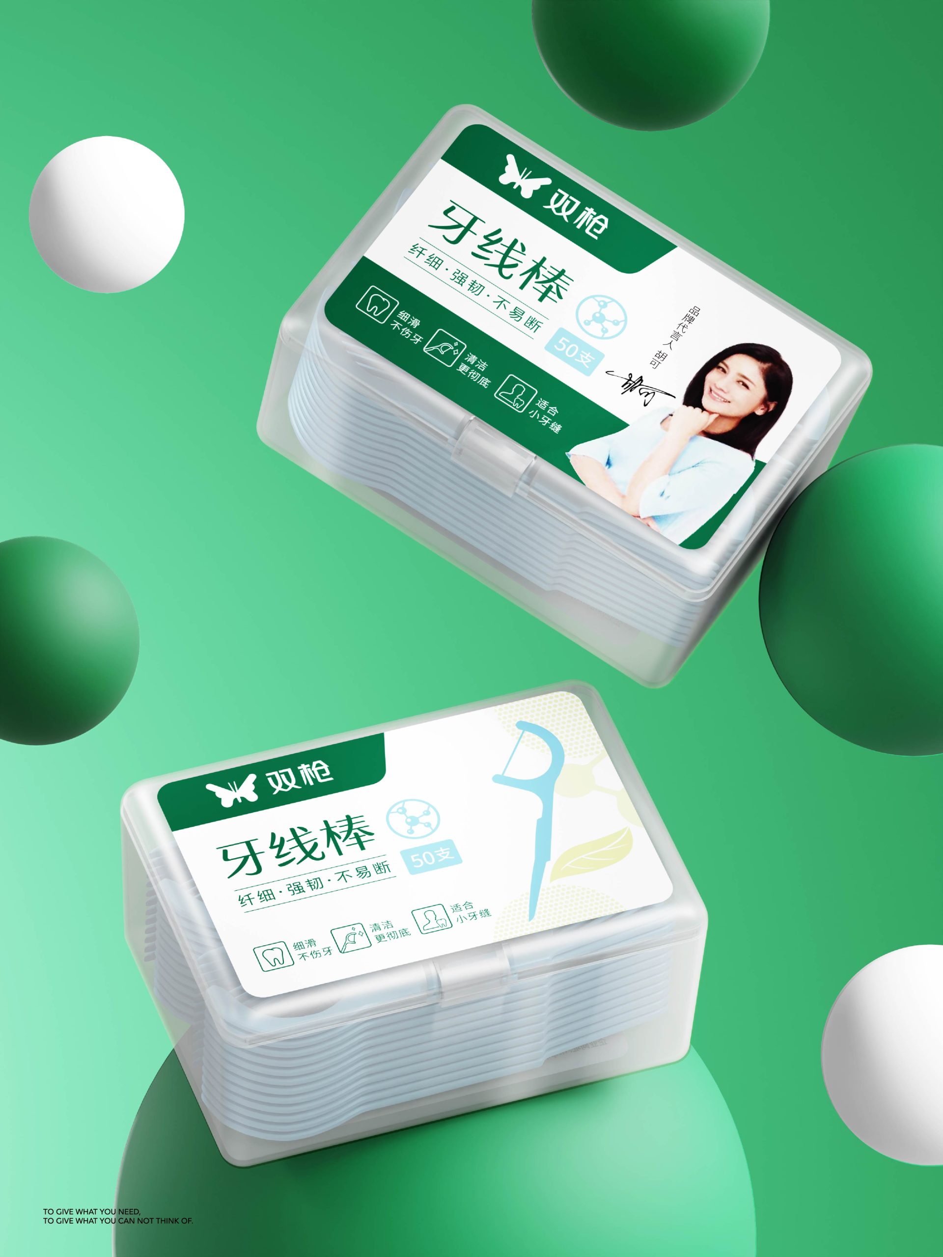
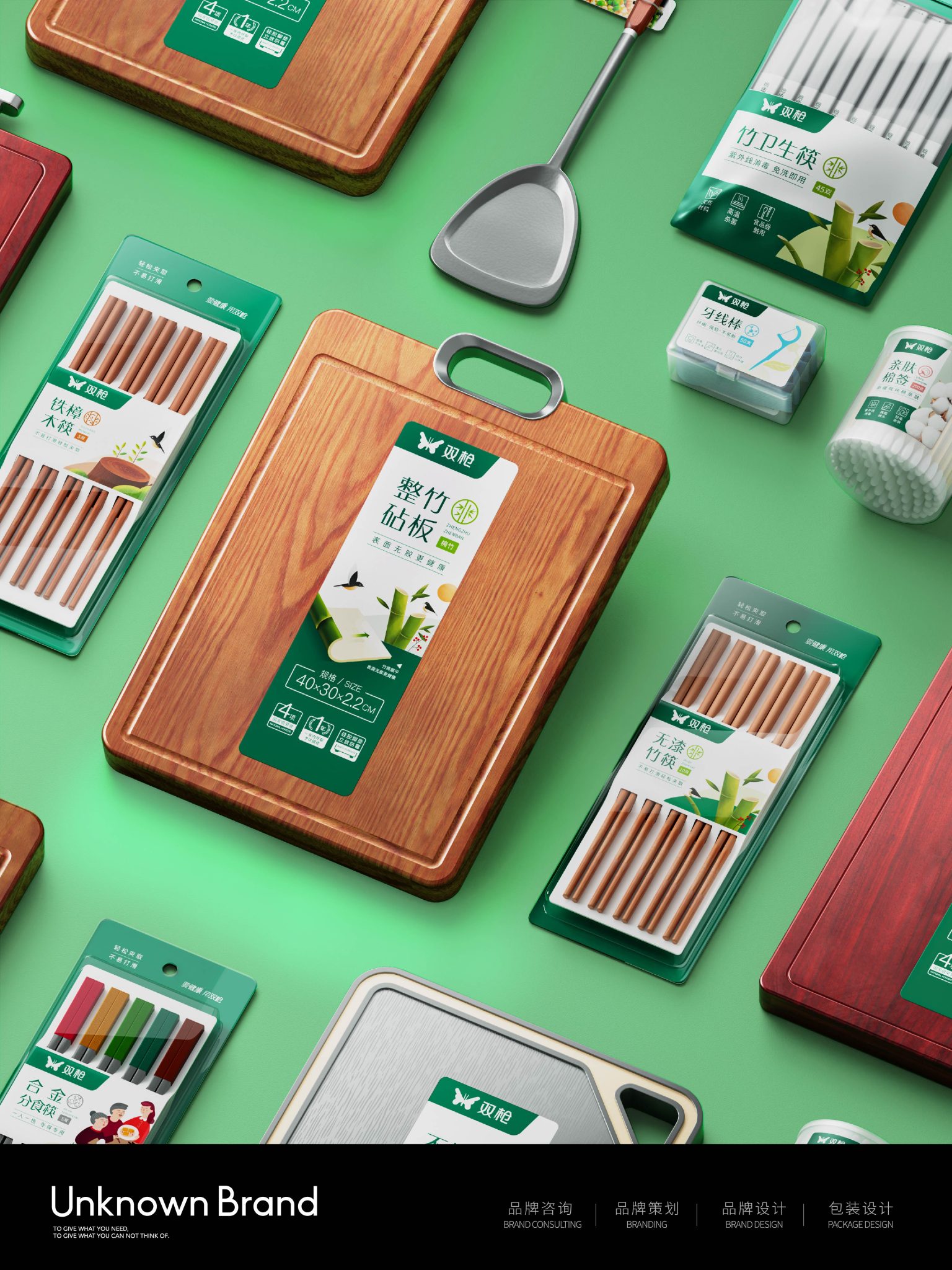
At the early stage of the project, the team conducted in-depth research into industry trends, competitive landscapes, and consumer needs, alongside a thorough audit of the brand and its product portfolio. During execution, the top-level layout was standardized first, defining a dedicated brand zone with a fixed placement of the Shuangqiang logo to ensure consistency across all products. The product display area uses standardized imagery to clearly showcase raw materials and textures, helping consumers better perceive product quality. The selling-point section communicates key functions and material advantages—such as mold resistance and antibacterial properties, food-grade silicone, and UV sterilization—through concise text and intuitive icons.
In terms of brand recognition, research shows that 80% of consumers remember brands through color. Drawing from the Shuangqiang logo, green was extracted as the brand’s signature color and applied as the primary packaging background to strengthen visual recognition. To ensure effective implementation, strict color standards were developed in collaboration with the brand, guaranteeing consistency across different printing suppliers and maintaining a unified brand image and packaging appearance.
This premium packaging system not only standardizes the brand’s product packaging but also represents a strategic reshaping of brand value, enabling the company to rapidly build brand assets and significantly enhance market visibility.