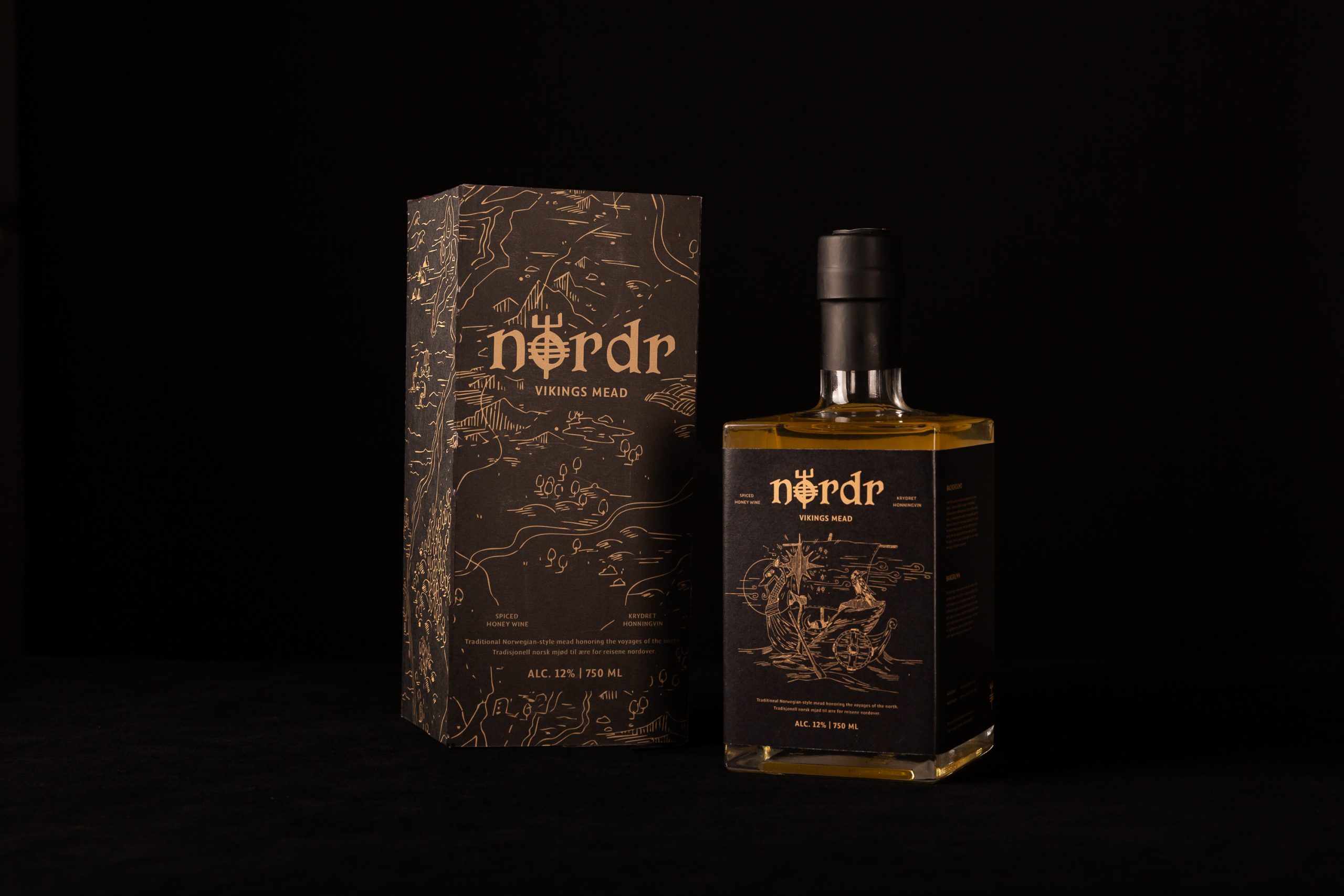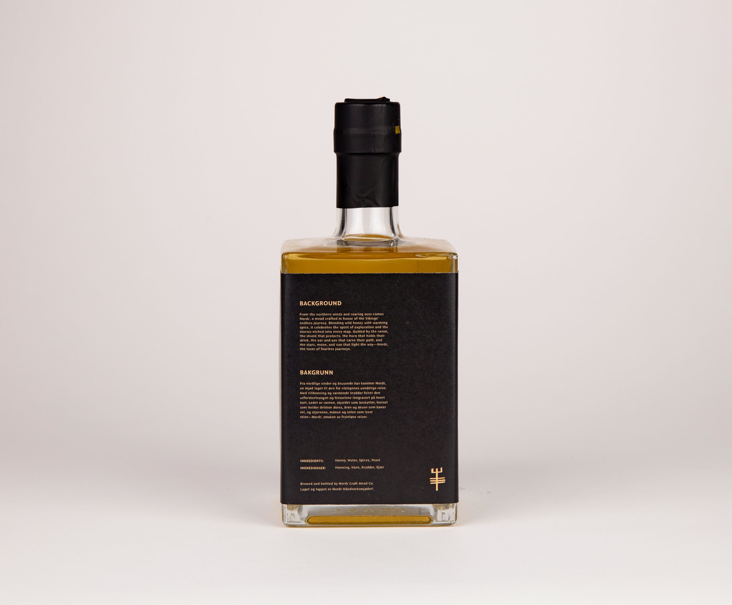
For this student project, our assignment was to create a bilingual alcohol packaging system from a country of our choice. Since I am primarily Norwegian, I chose to focus on Norway—specifically the visual language and storytelling traditions of the Vikings.
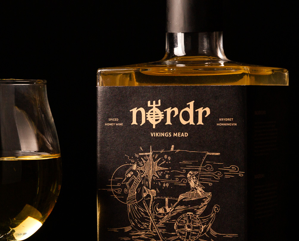
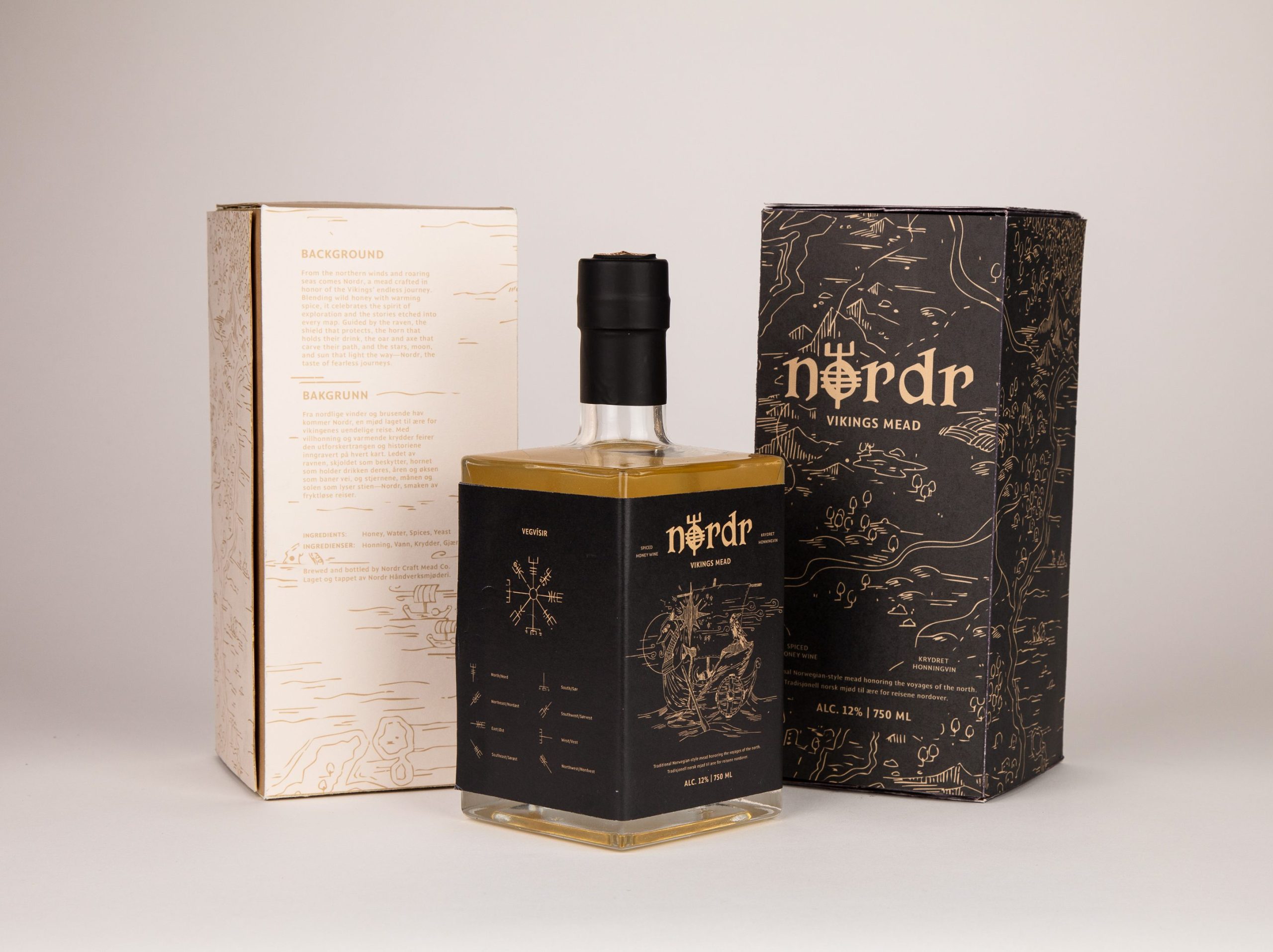
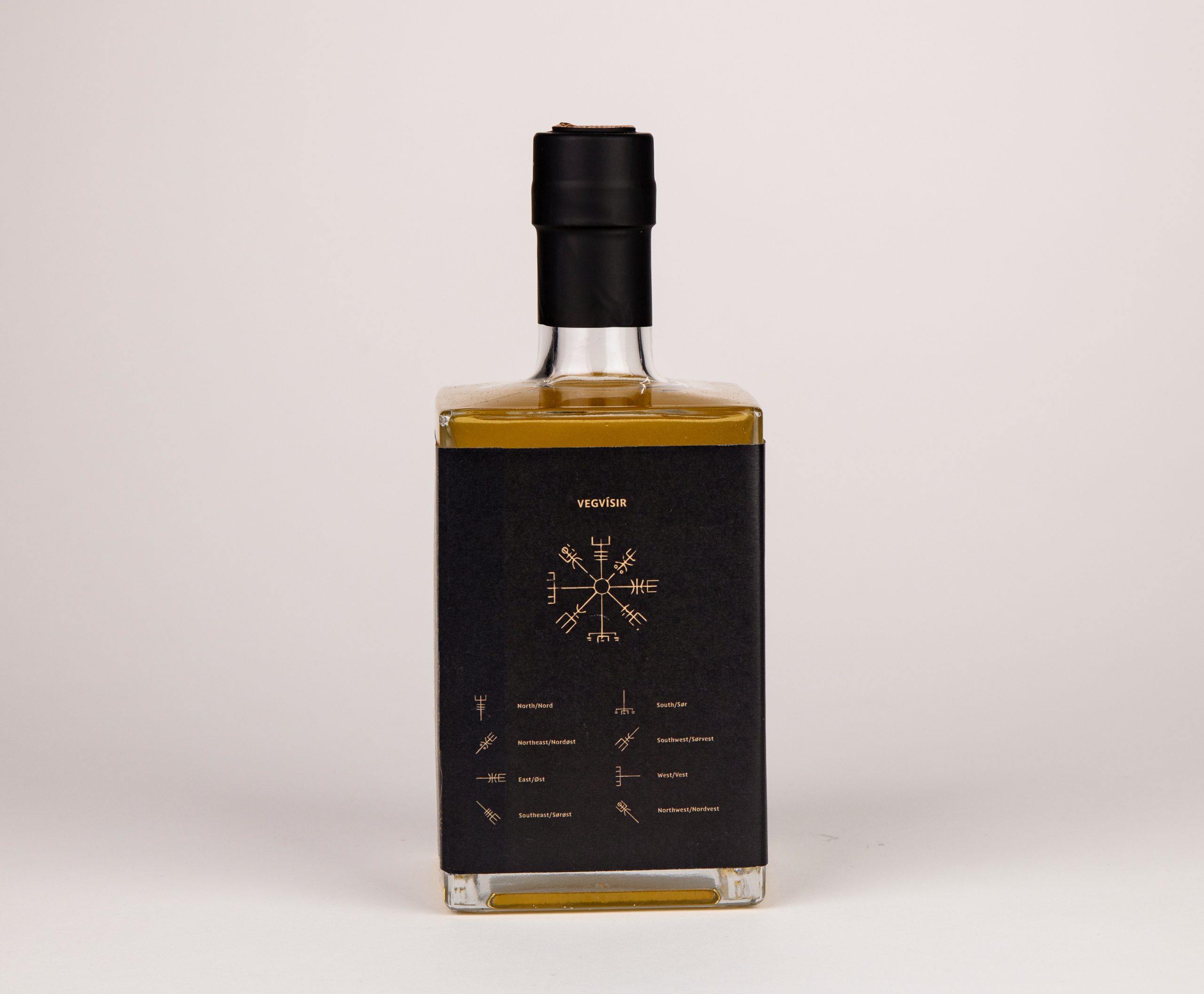
I centered the concept on the theme of a Viking journey, drawing from elements of navigation, exploration, and Norse symbolism. Early research included the sun, moon, constellations, and Polaris, the North Star—all essential tools for Viking navigation. I also incorporated the Vegvisir, a symbolic compass used as a guide for travelers. One entire panel of my bottle label is dedicated to the Vegvisir, providing meaning, narrative, and an interactive moment for the user.
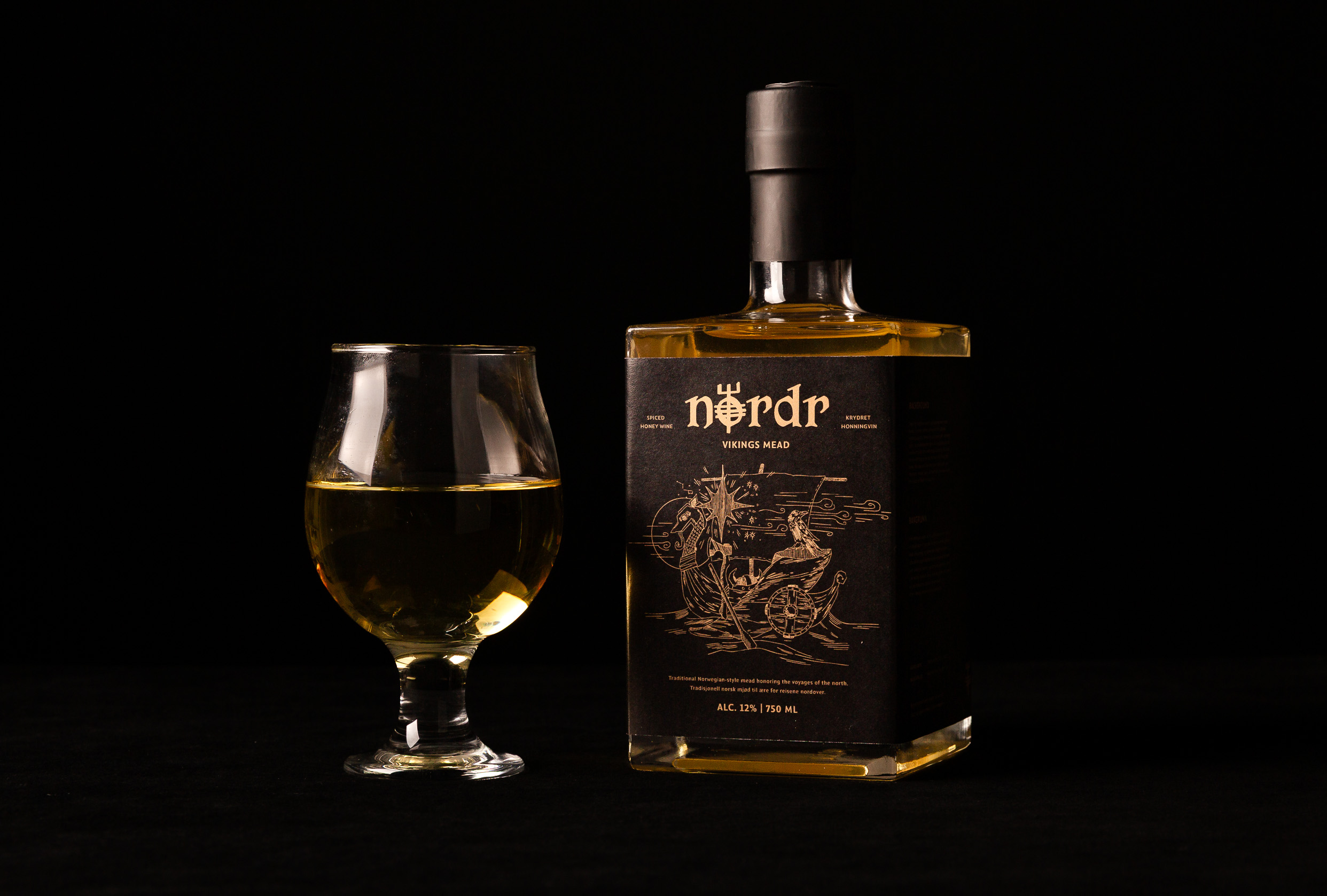
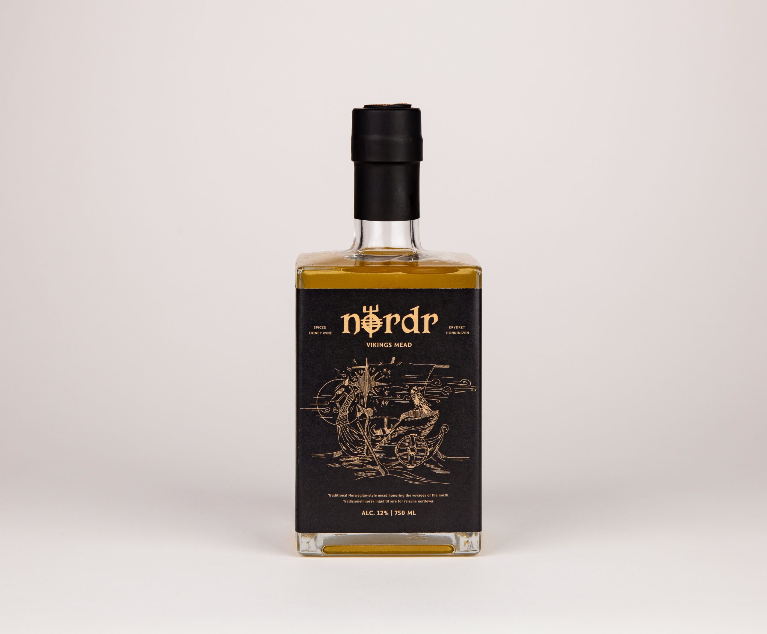
Along with navigation, I explored additional culturally meaningful symbols: Viking longships, ravens (used to help locate land), and iconic objects such as the drinking horn, shield, axe, and helmet. The sea and wind—two forces that shaped every voyage—were visual motifs I knew I wanted to integrate as well.
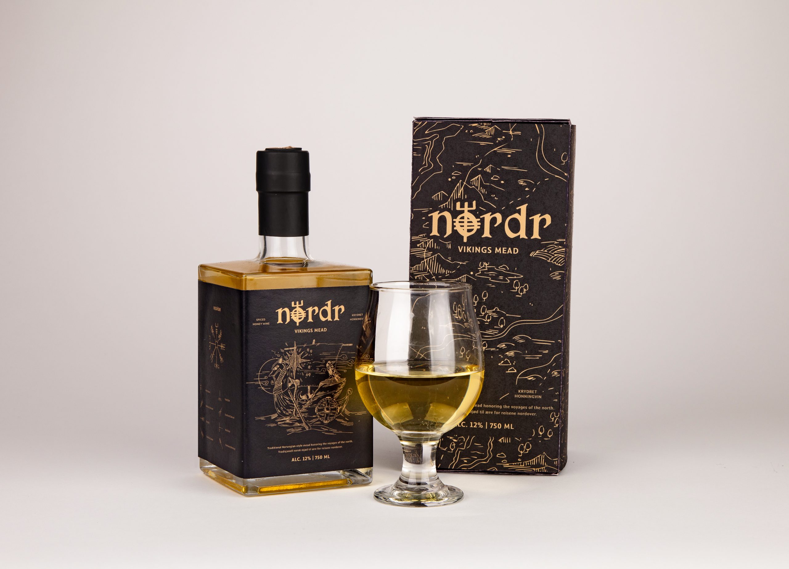
From the start, I planned a hand-drawn, illustration-based direction and created a map of early Norway and surrounding regions as a core element. I chose the name Nordr, a traditional Nordic word meaning “North,” which aligned both visually and conceptually with a project rooted in direction, journey, and identity.
For the logo, I worked with forms inspired by the Vegvisir, particularly the directional mark for North. It felt meaningful, iconic, and distinct enough to stand on its own as a symbol.
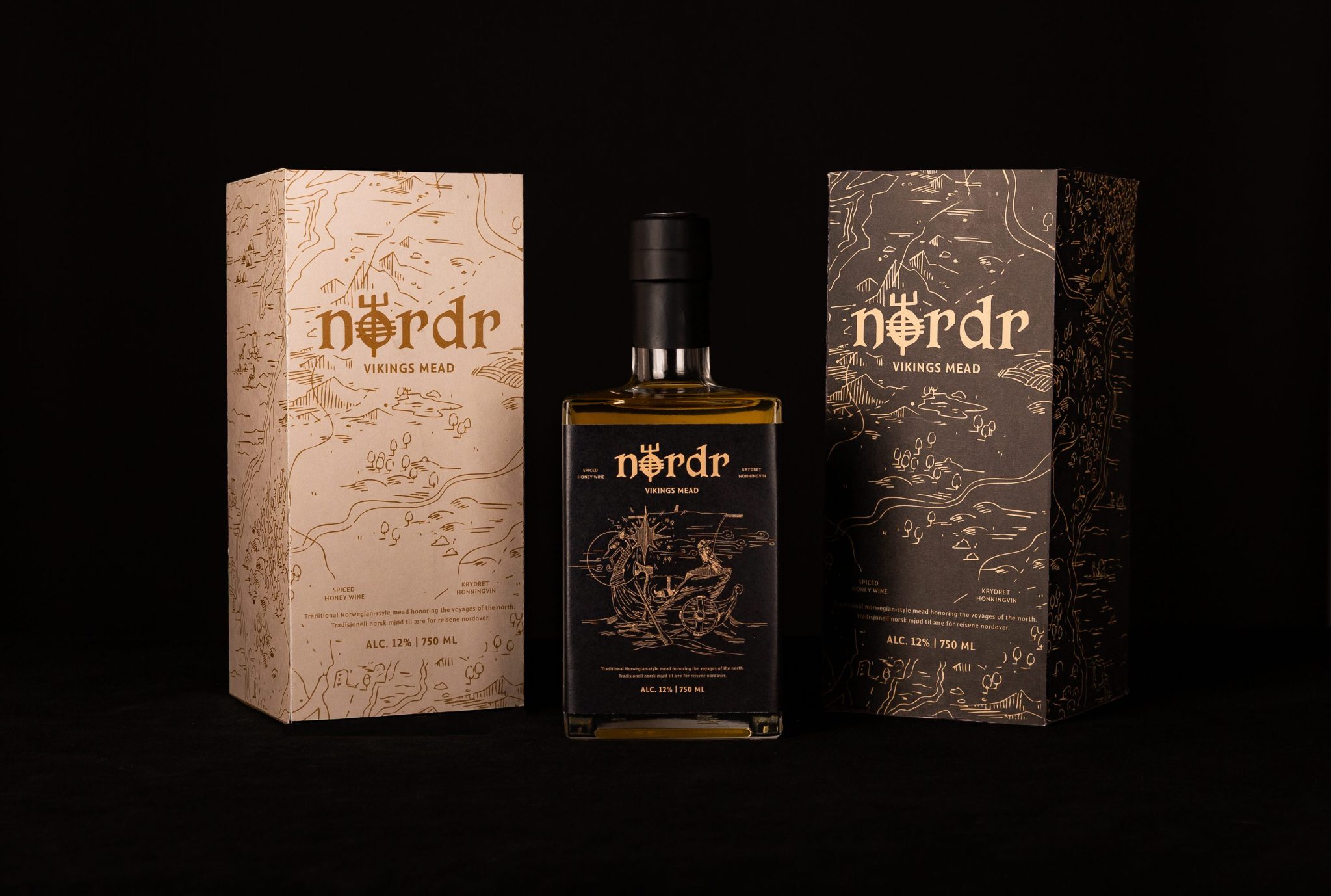
My initial color palettes leaned toward muted blues, browns, greens, and maroons, but none fully captured the tone until I tried a combination of deep charcoal, beige, and gold. This palette symbolizes night, day, and Polaris: beige for daylight, charcoal for night, and gold for the North Star. Because these celestial markers guided Viking travel, the palette felt conceptually grounded.
Typography supported the illustrated direction as well. The display typeface CS Alodia offered an organic, hand-crafted feel that complemented the artwork, while Comma Sans provided clarity and balance with sharp details that still matched the overall aesthetic. Both typefaces also support Norwegian characters for bilingual typesetting.
For the packaging structure, I selected a square, sharp-edged liquor bottle and a rigid box with a magnetic closure. The square bottle offered defined planes for individual illustrated panels, unlike a round bottle, which would force continuous wraparound artwork. The angular form also aligned with the brand’s tone and subtly referenced the way Vikings packed goods tightly for long voyages. For the outer box, I researched folding structures that could mimic the unfolding of a map and selected a format that opened in a similar, experiential way. Embedding magnets added a clean “snap” closure and elevated the user experience.