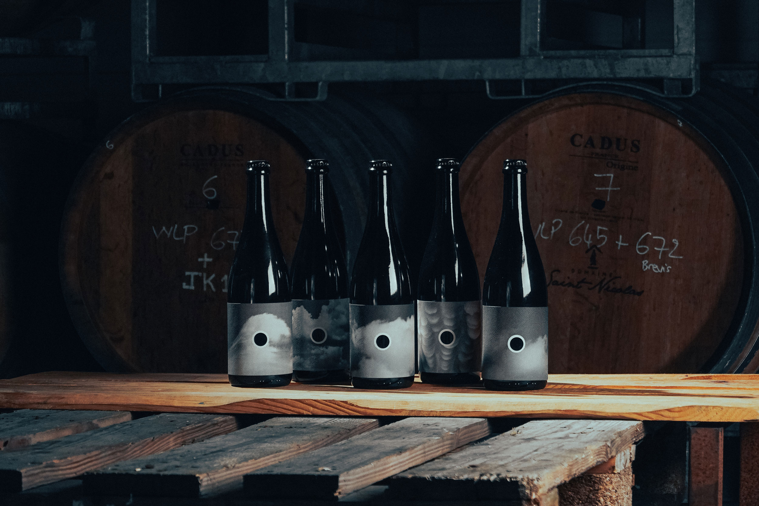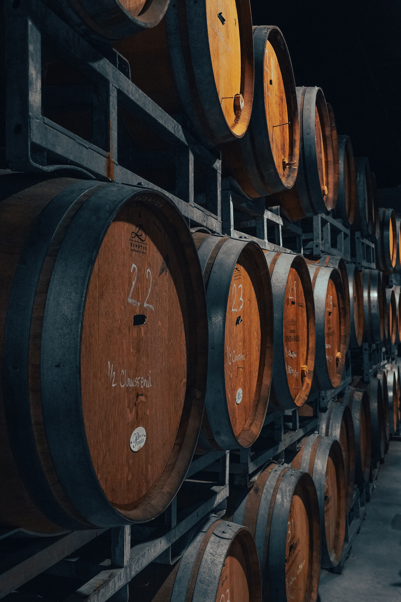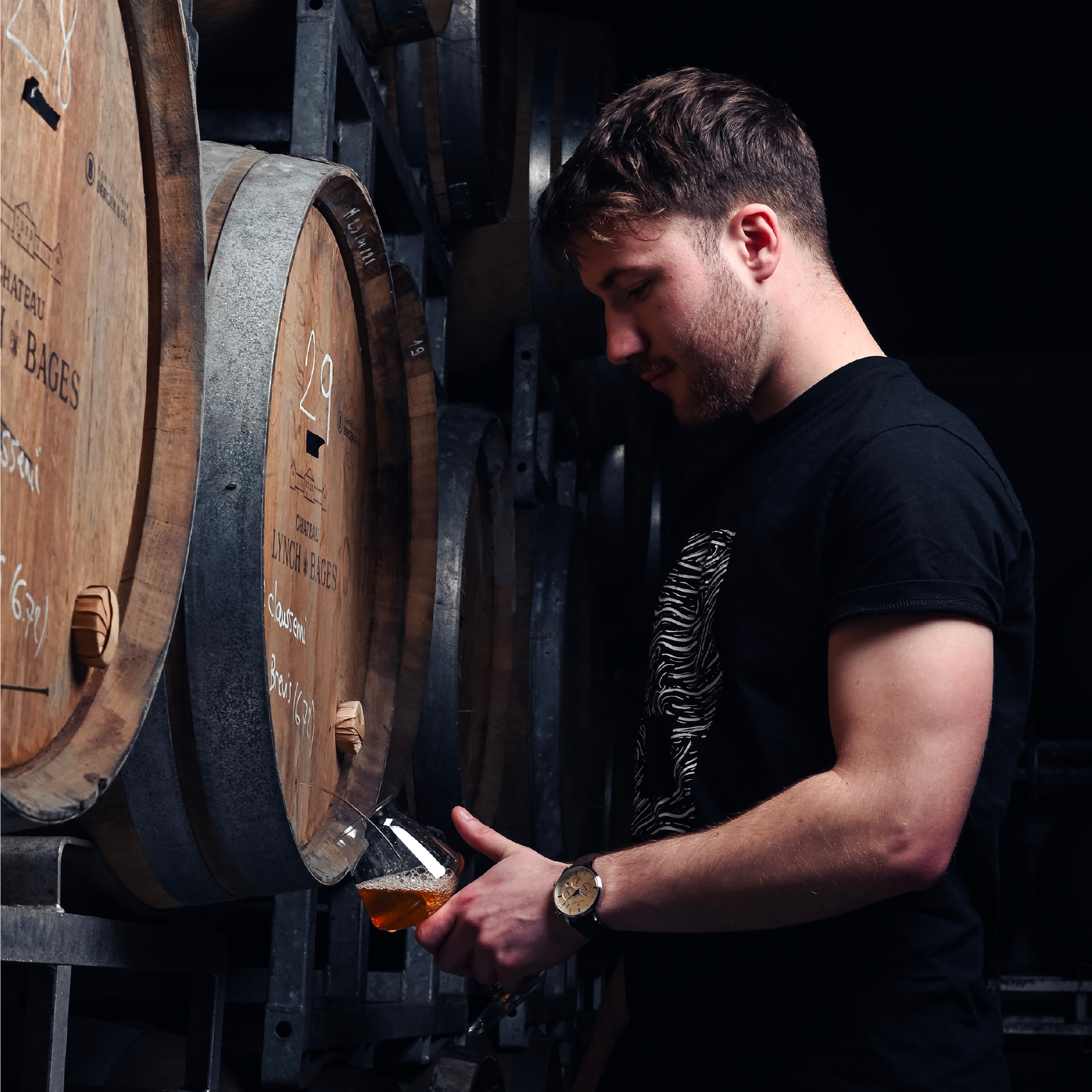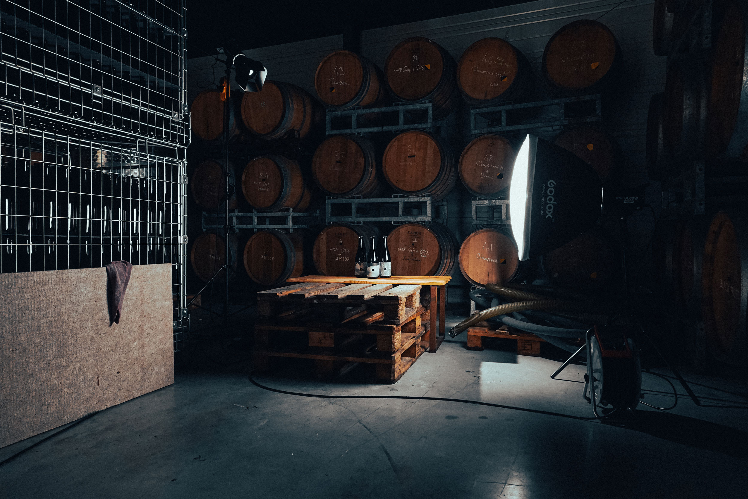
Aerofab Brewery continues its exploration with the launch of AOB — Aerofab Old Barrel, a new range of barrel-aged beers.
Each beer is the result of a unique blend of yeasts, bacteria and barrels, producing complex, tangy, fruity and rustic profiles. A distinctive tasting experience, designed for curious beer lovers.
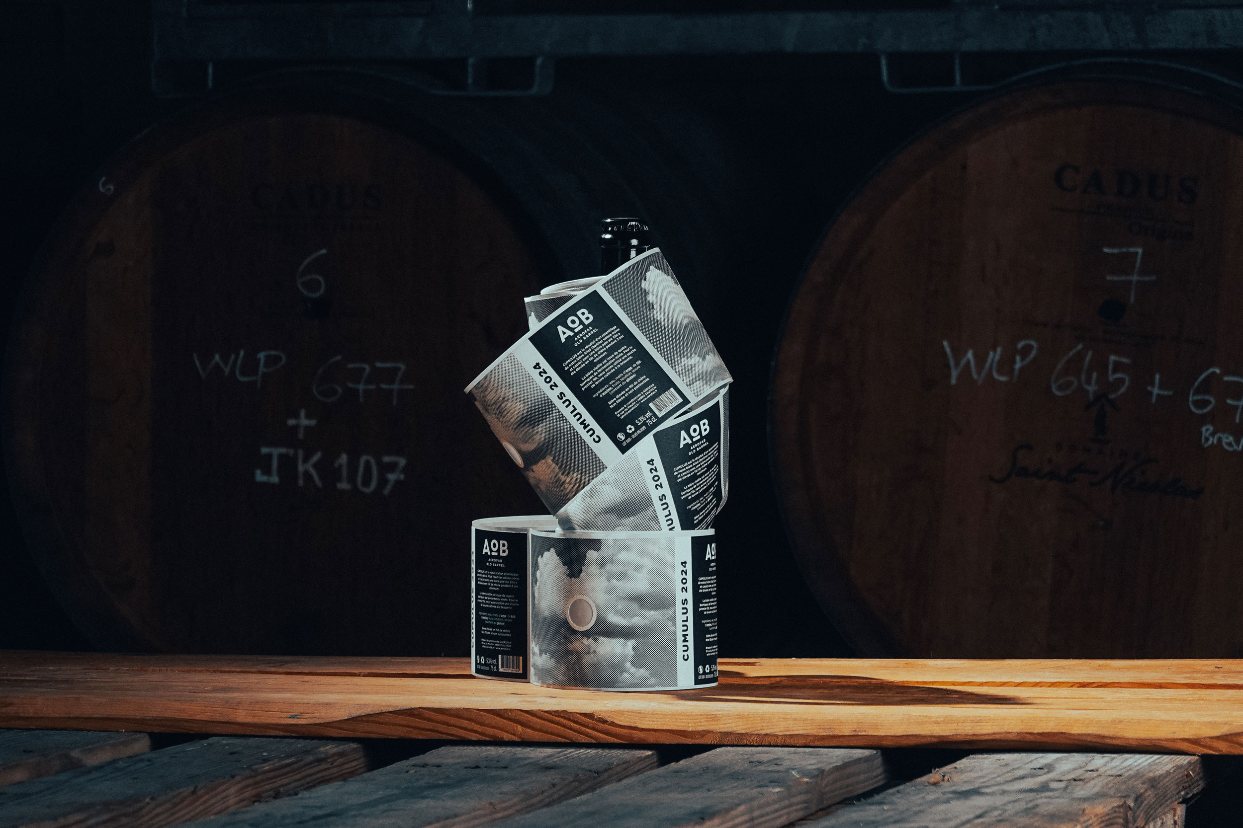
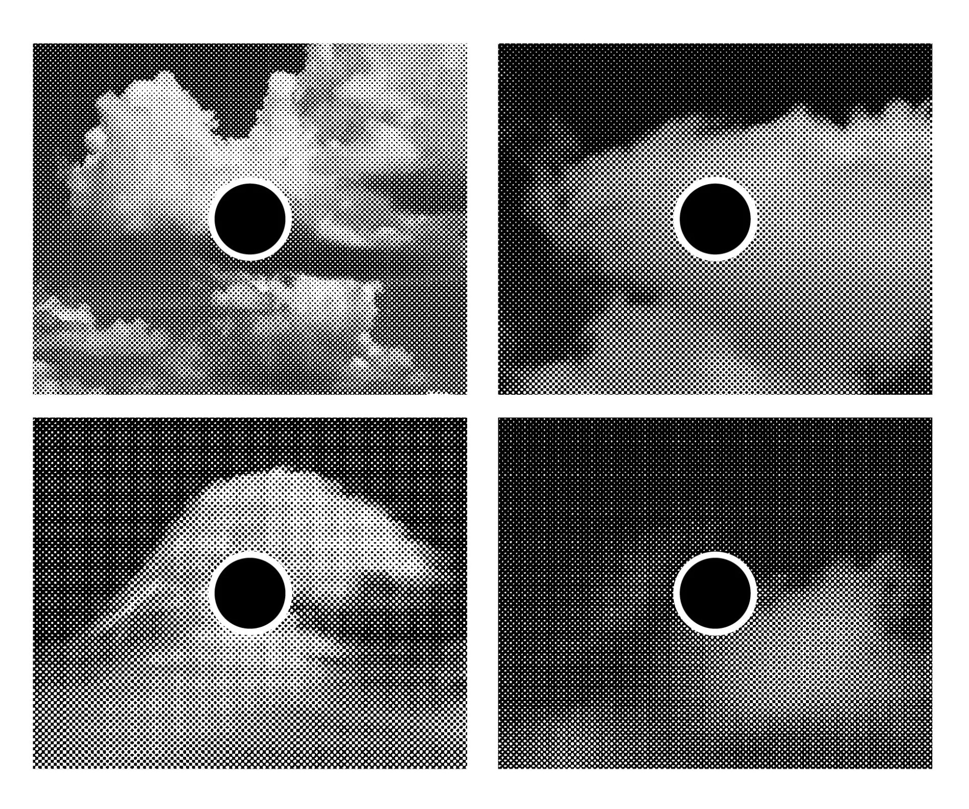
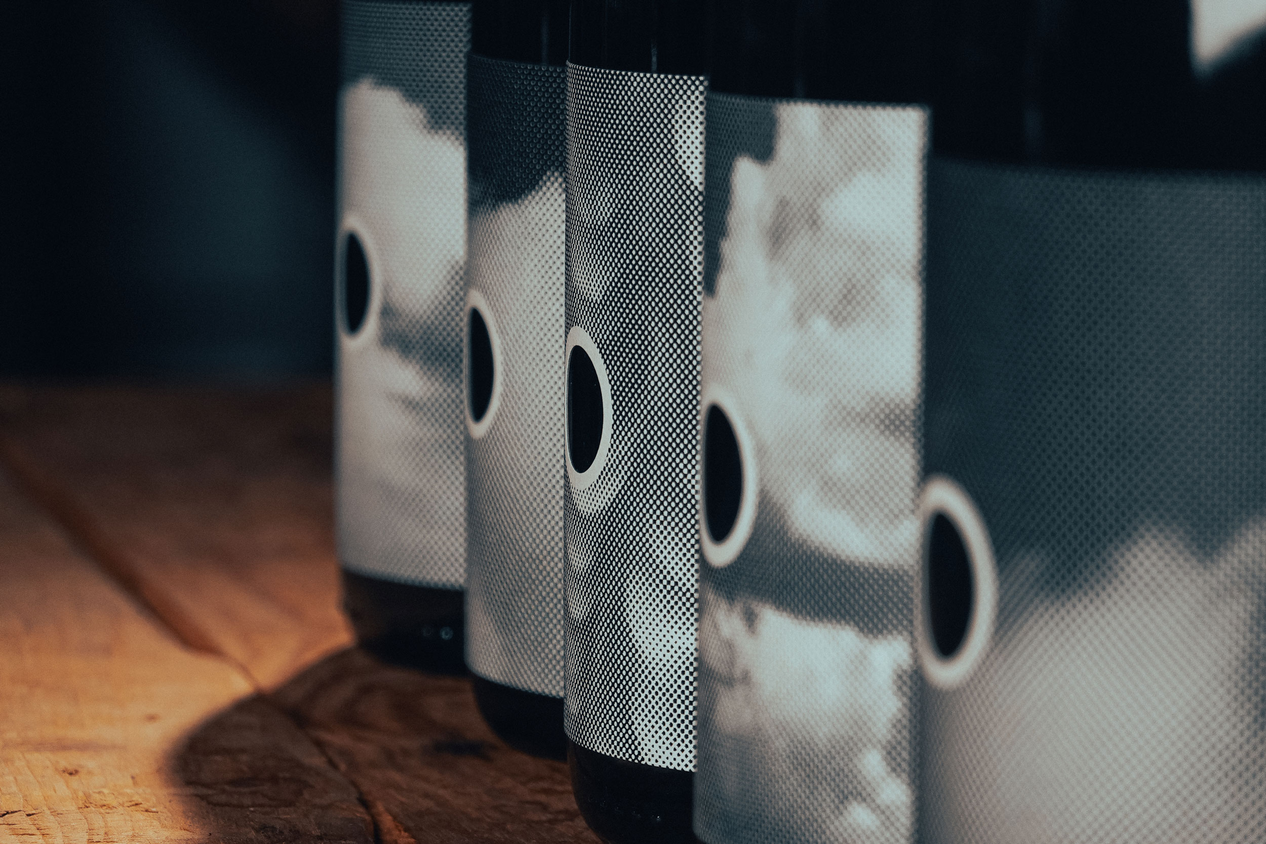
As the AOB range is meant to grow — with dozens of beers already in development — the challenge was to create a strong visual foundation capable of supporting endless variations while maintaining overall consistency. So, I designed a flexible and scalable packaging system, allowing the brewery team to easily produce new labels in-house.
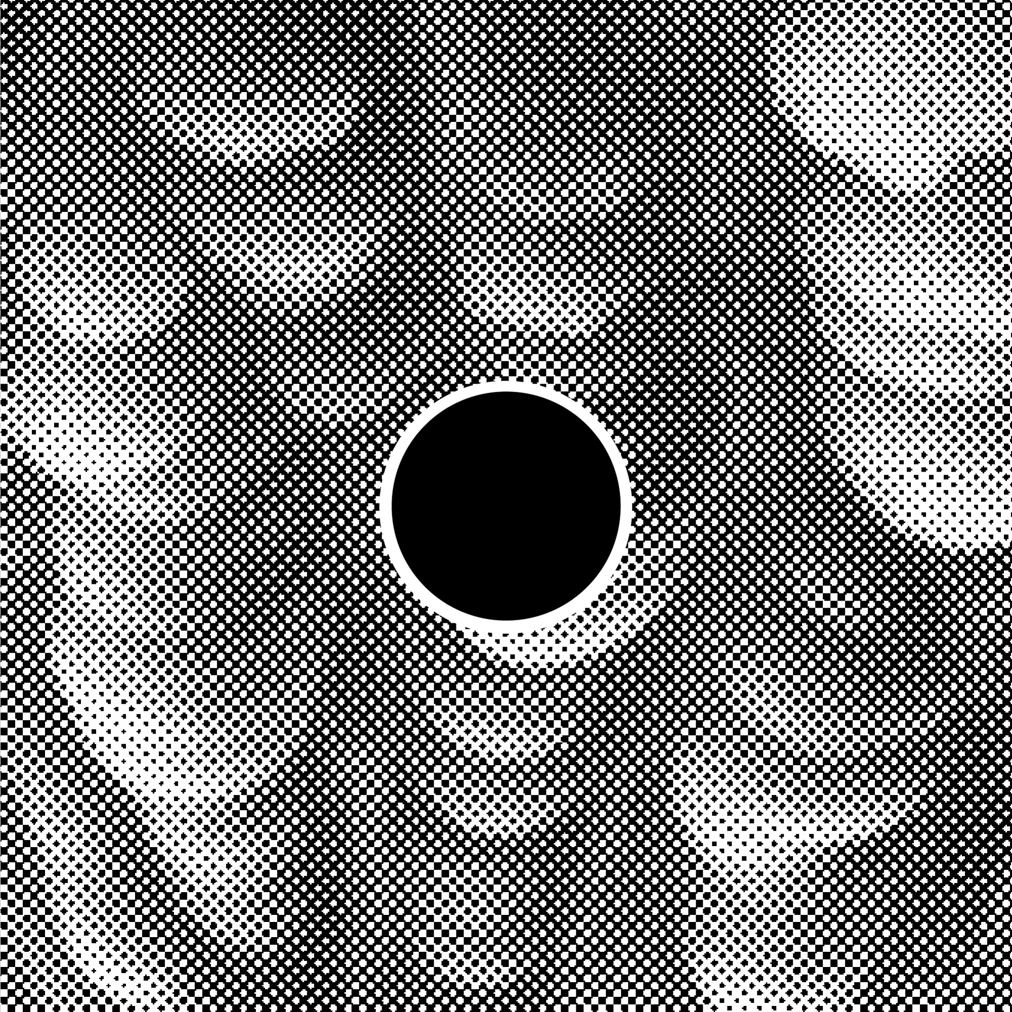
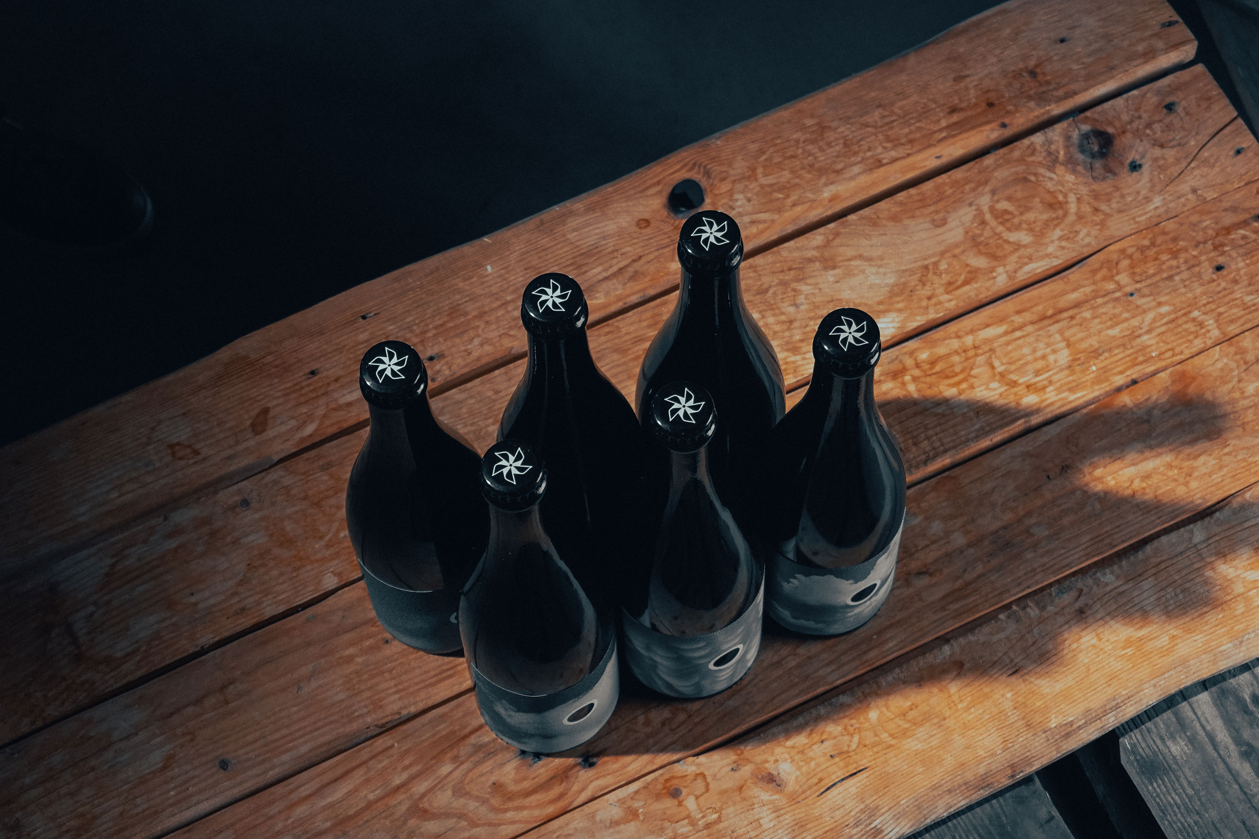
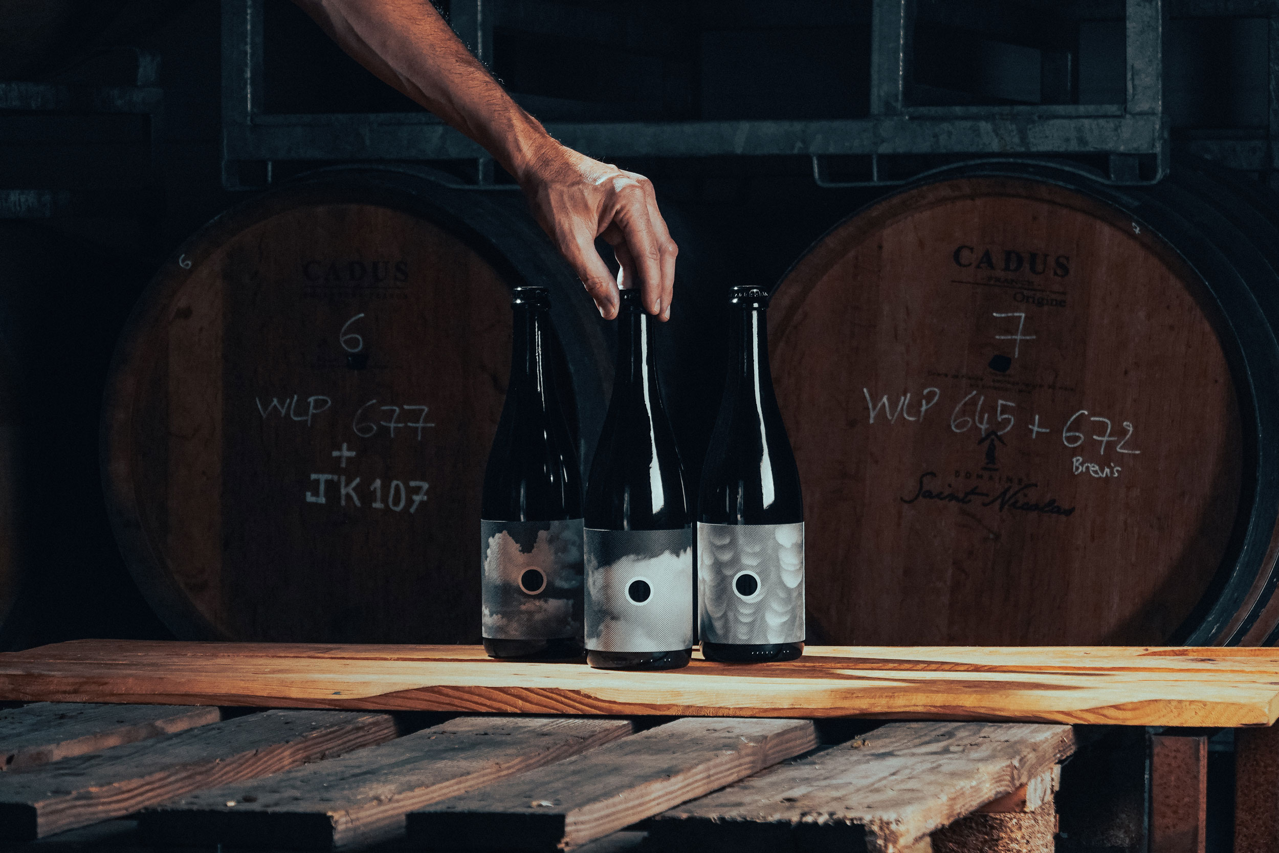
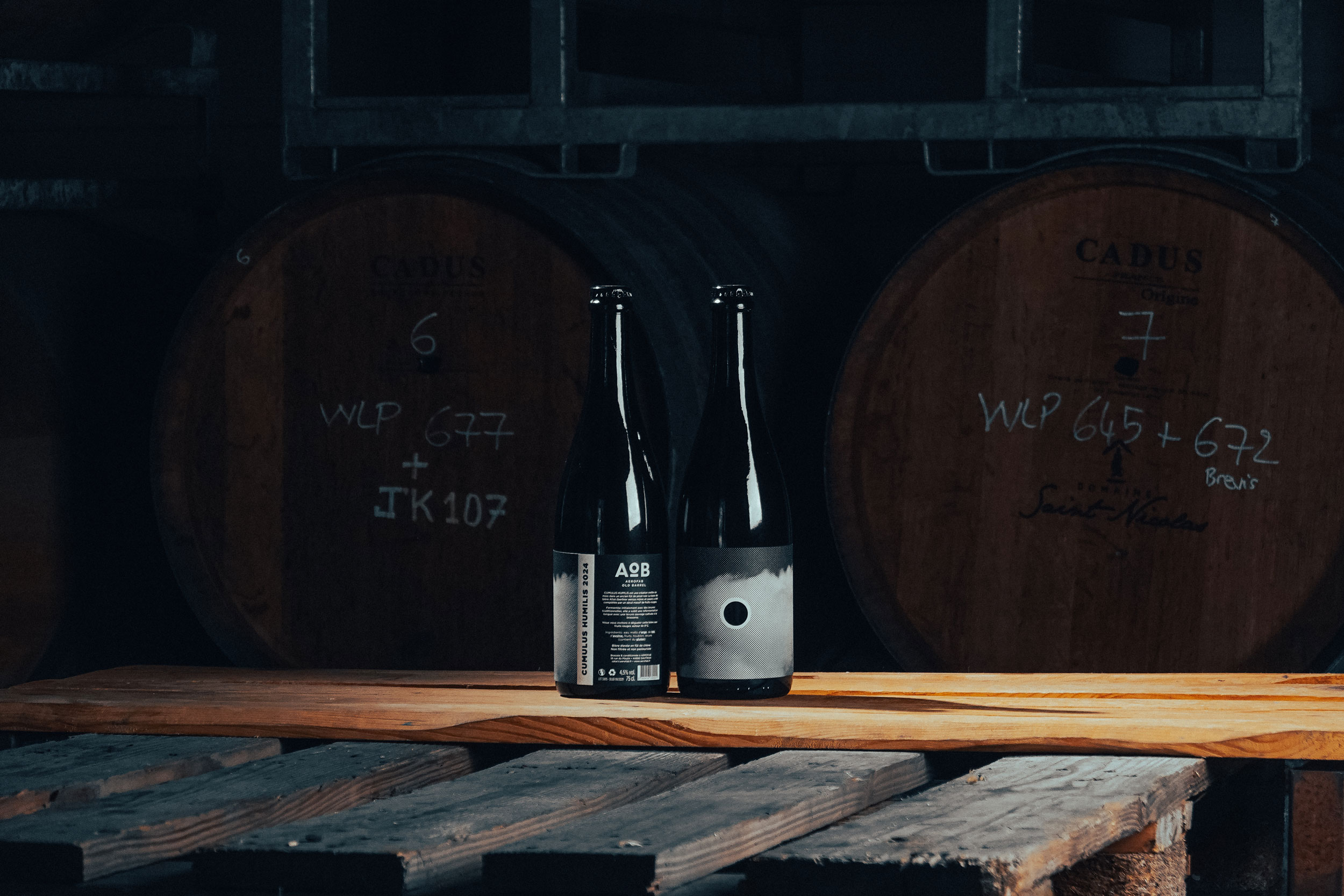
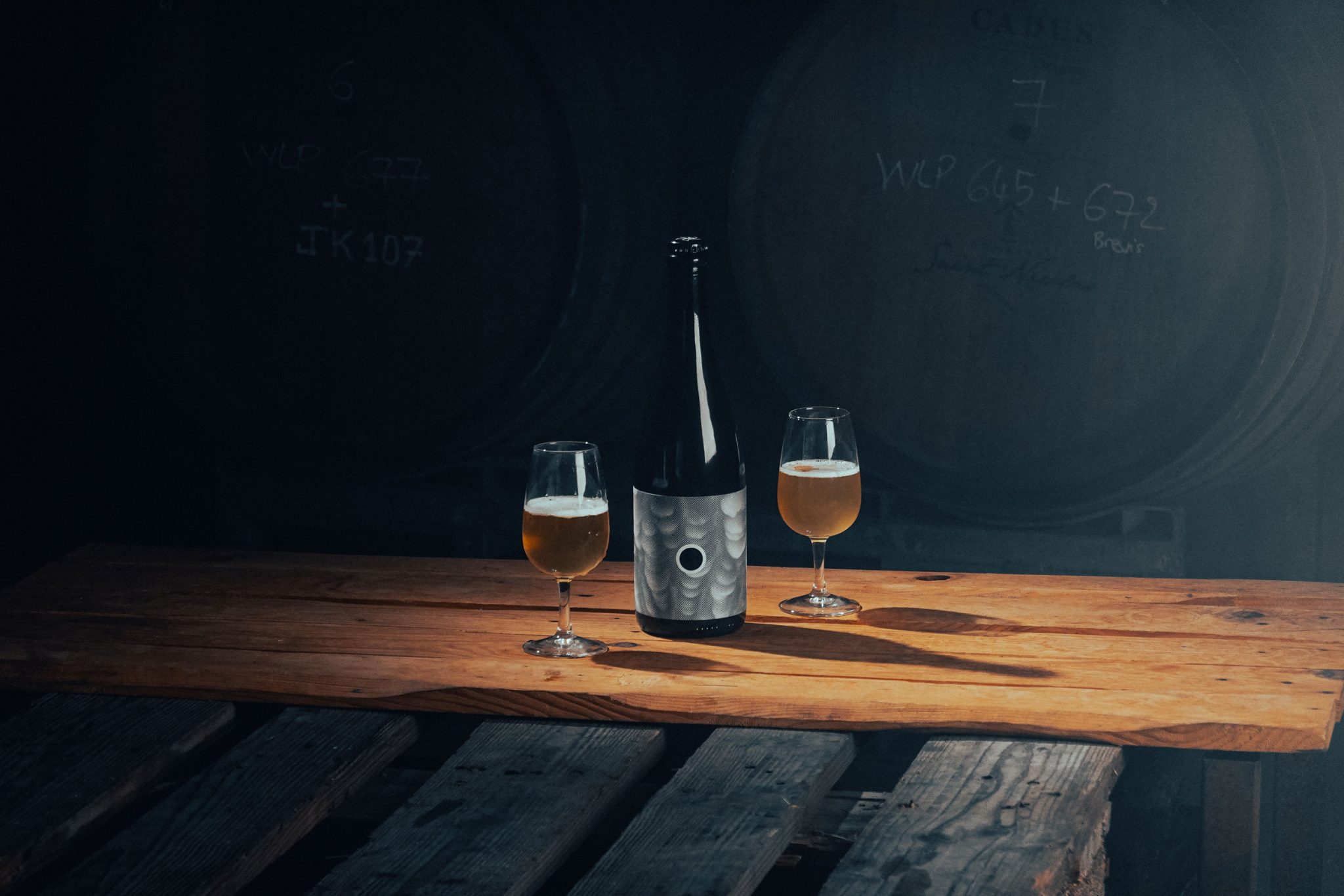
Each beer is named after a specific cloud name, directly inspiring the label design. The packaging embraces a screen-print-like halftone texture, with visible grain and imperfections — a deliberate reference to the handcrafted and unpredictable nature of barrel aging.
At the center of each label, a circular cut-out symbolises the barrel itself — a simple yet distinctive graphic element that visually ties the entire range together.
The result is a poetic and distinctive packaging identity, true to Aerofab’s spirit: experimental, craft-driven and creatively free.
Photos: Studio Yama + Yipikai