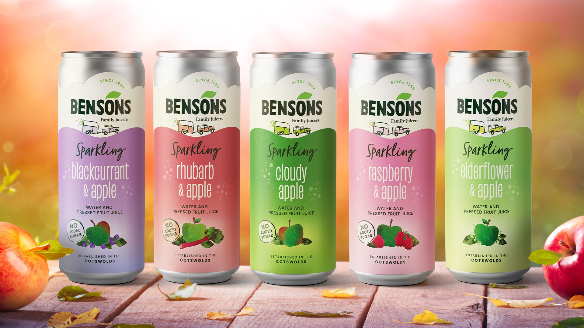
Bensons Family Juicers mark 25 years of juicing in the Cotswolds by unveiling a new brand identity and an exciting new range.
London, United Kingdom, December 2025 – Bensons Fruit Juices, based in the heart of the Cotswolds, was started in 1999 using an old juice press and horsebox for its first deliveries. It soon grew into a thriving business, pressing and selling fresh apple and fruit juices sourced from British orchards. With a commitment to natural ingredients and sustainable practices, the company became a trusted supplier to a wide range of outlets across the UK, offering delicious pressed juice drinks for adults, for kids and for families.
Slowing of business growth post pandemic
Despite this long heritage as artisan producers and the popularity of the Cotswolds, the brand had lost direction after the pandemic, the range had become visually complex and growth had slowed. Loyal customers were keen for Bensons to shout louder about their family business, Cotswold credentials and commitment to British farming.
New brand identity celebrating 25 years of juicing in the Cotswolds
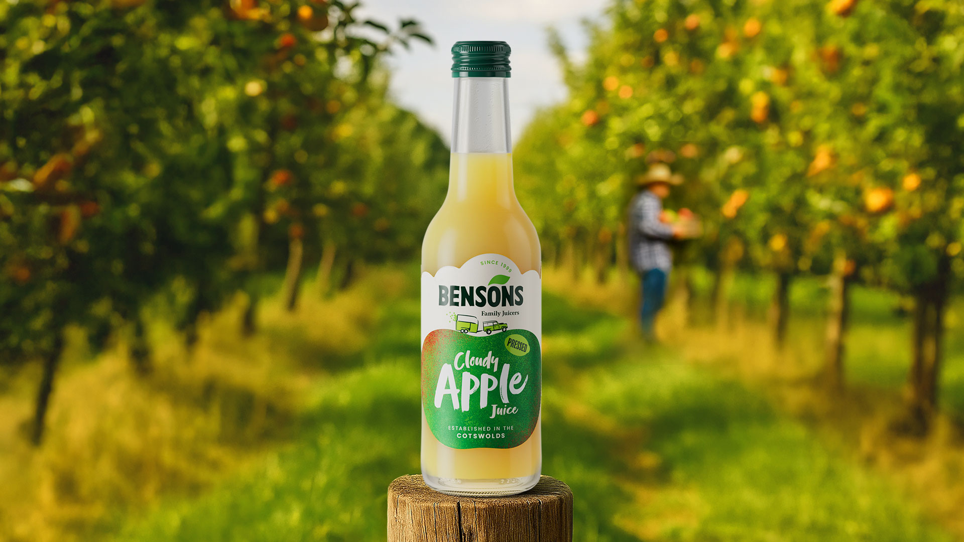
A brand evolution by creative agency Biles Hendry breathes fresh life into the family business identity. They dug deep into the Bensons’ story and captured the spirit of its founders, as well as the soul of the relaxed and rural glamour of the Cotswolds.
Bringing to life the origin story
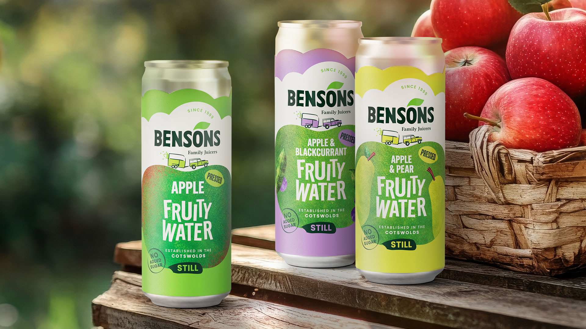
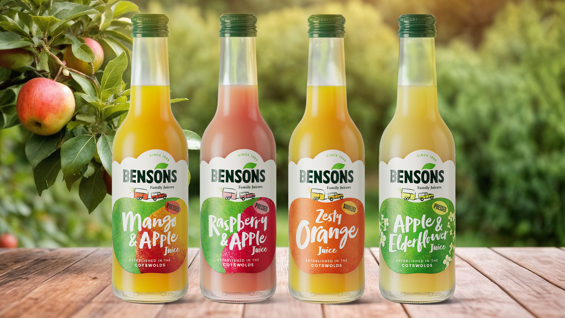
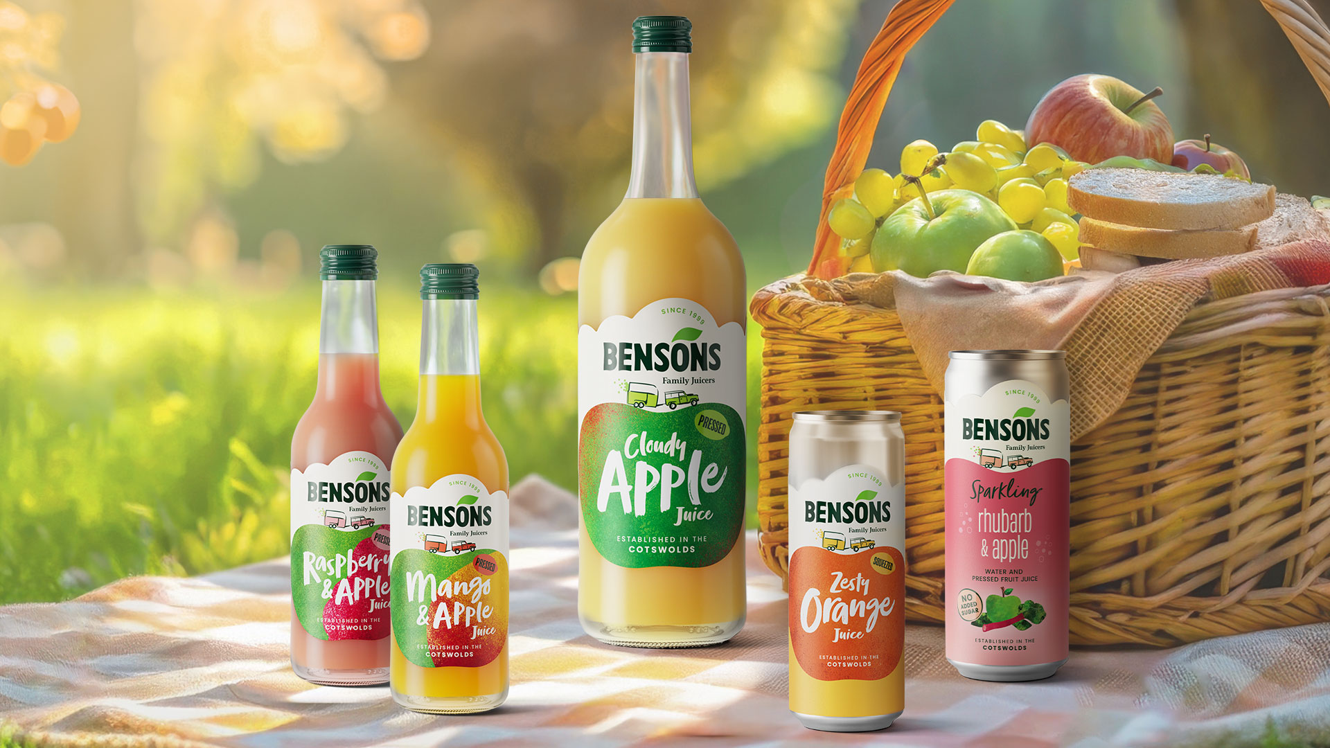
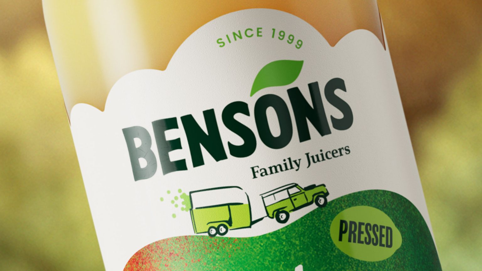
The rebrand pays homage to the company’s humble origin story and brings the Bensons name to the fore. It was an opportunity to introduce new products while making the whole range coherent. Ross Hamilton – Design Director at Biles Hendry comments: “We wanted to preserve the wholesome charm that’s always been at the heart of this business, whilst evolving the design to boost brand recognition and recall through clearer, more confident branding. We introduced the quirky Land Rover and horsebox from the founders’ story – filled with fruit juice bobbing along on its way to market over the Cotswold Hills – to add character and storytelling. We brought the words “Family juicers” into the heart of the logo, and ensured that “Established in the Cotswolds” was reassuringly stamped on the packs. Above all, we put the fruit centre stage using dominant fruit illustration, because at the end of the day, this is what Bensons is all about.”
The work undertaken by Biles Hendry included strategy, logo and identity design and packaging design of the Masterbrand and four ranges: Bensons Pressed Juices, New Bensons Sparkling, Bensons Fruity Water and Bensons Chilly Billy (pressed juice ice lollies), bringing the refreshingly non-corporate brand story to every touchpoint.