About
Saardé (pronounced sar-day) is a design-led brand, that creates considered, textured, pared-back goods for home, body and travel.
The brand founders, Verity & Shenol Kizek reached us and entrusted our team to create their new logotype and the new olive oil soap packaging design, including a custom-designed bottle and a labeling system.
Solution
Our design process was inspired by Saardé philosophy and ethos, the forms and colours of the Mediterranean and Turkey. We created a minimalistic symbol that reflects the natural character of the brand, but also being modern and simple, while the logotype feels more organic and romantic keeping the visual balance.
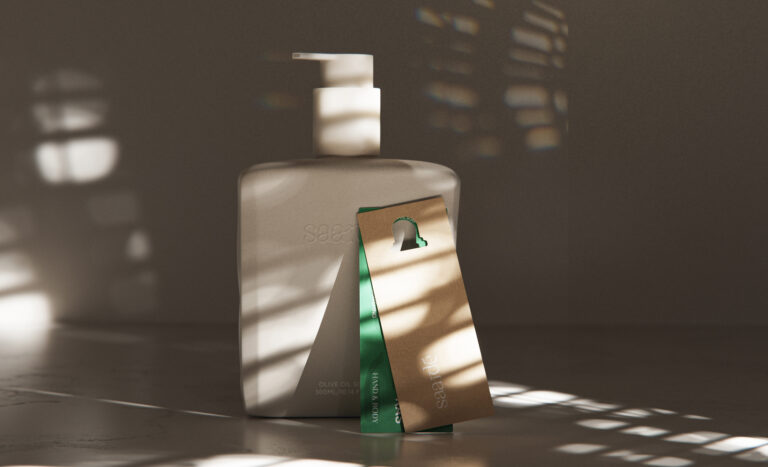
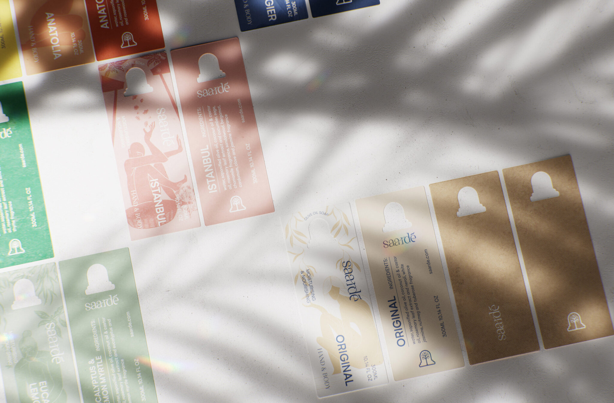
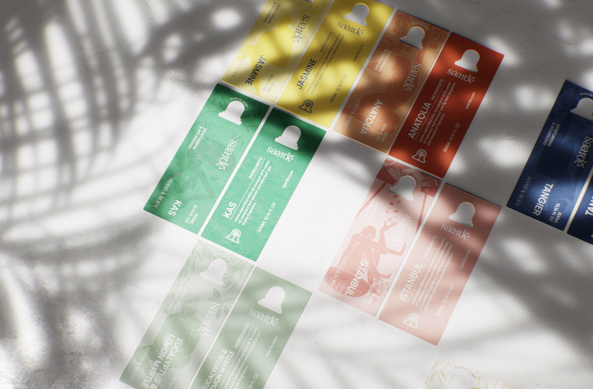
For the labeling system, we created seven unique illustrated figures that represent the character of each product. The colours are vivid without feeling unnatural and the typography brings a modern tone. We choose heavy papers with natural textures to enhance the experience.
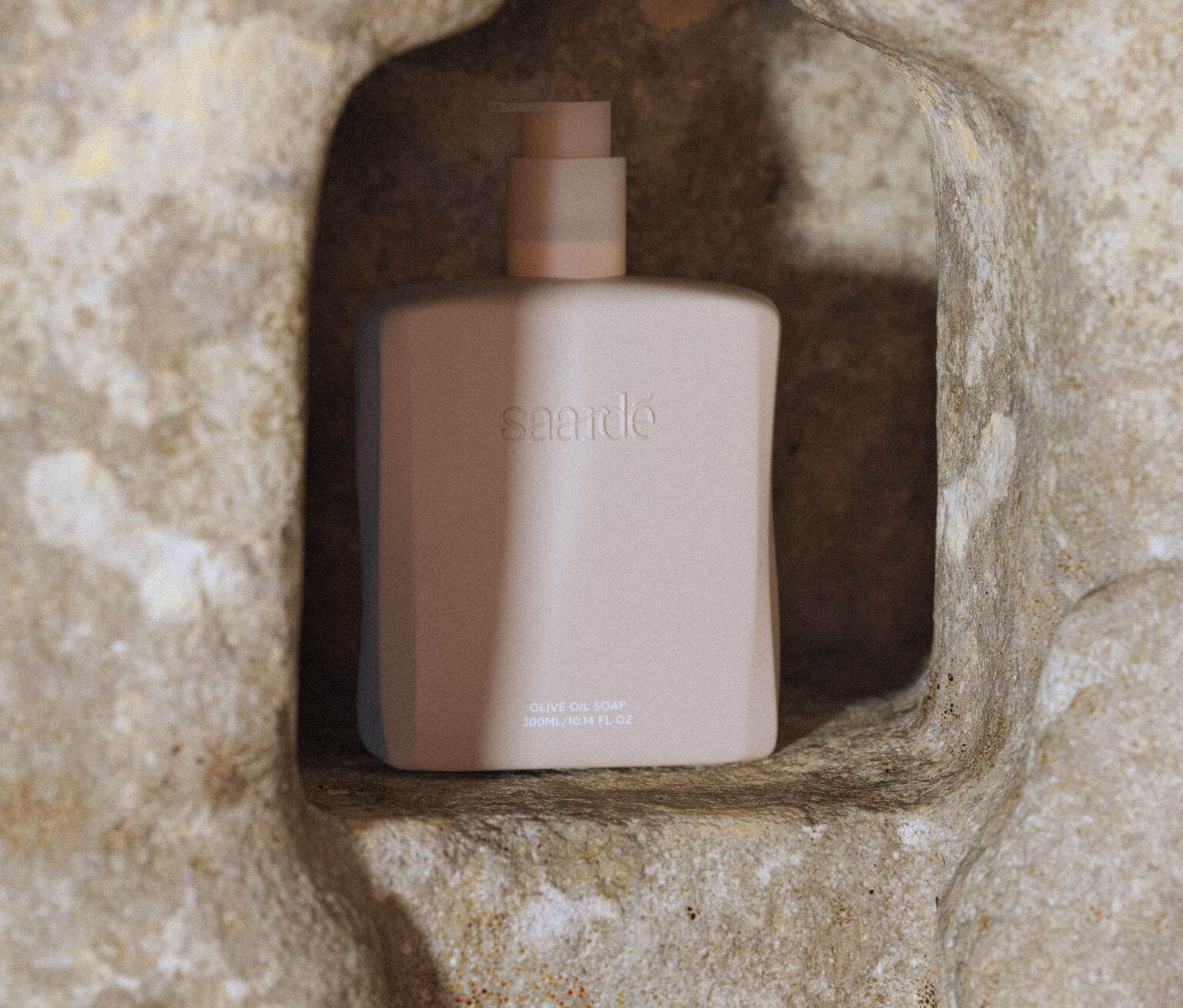
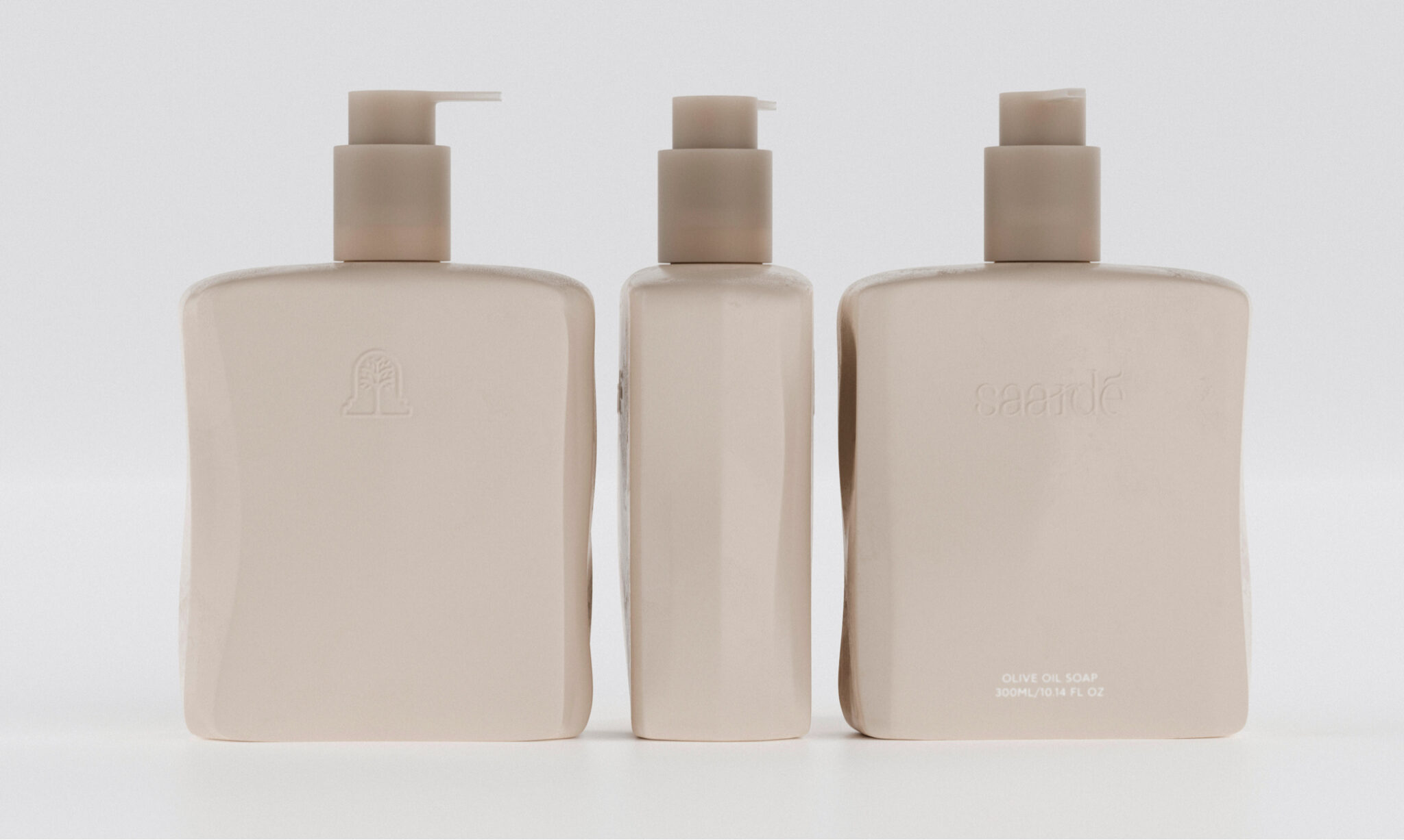
On the bottle, we wanted our design to feel modern and up-to-date but also natural and raw. The main purpose is to create an object of “artistic value” for everyday use. Because the bottle is refillable, we had to create something the user would like to see in his bathroom every morning that could easily fit in most houses.
The inspiration came from a raw bar of soap. The bottle keeps the raw edges and the organic forms of the bar.
Result
The result is a familiar yet unique form of a bottle, combined with the smooth pump coloured on warm tones, makes the product feel down to earth.