

MNCH — A Bold Take on Plant-Based Sandwiches
The MNCH brand was built around one idea — make plant-based food feel bold, modern, and crave-worthy. Every design choice reflects that balance of minimalism and energy.
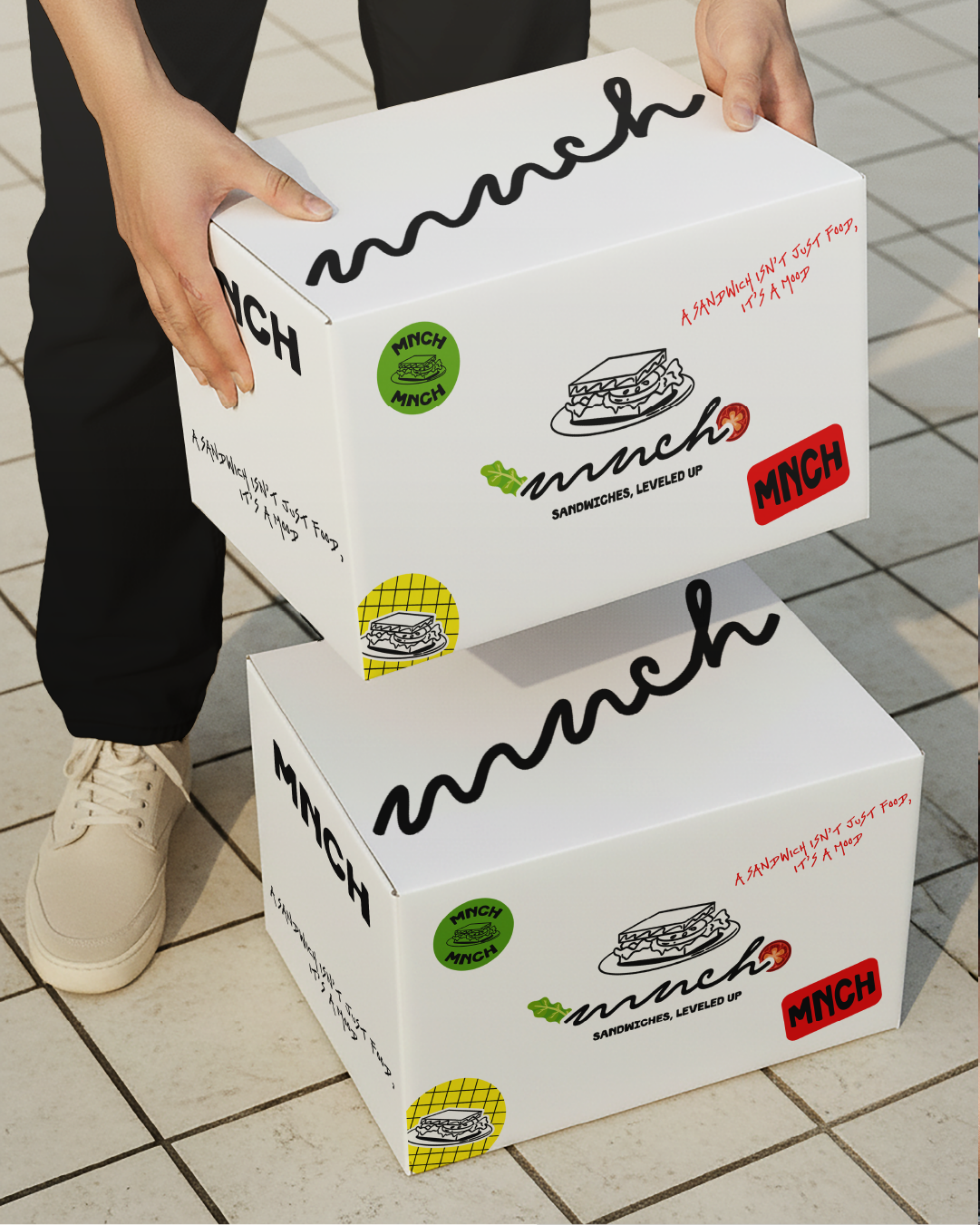
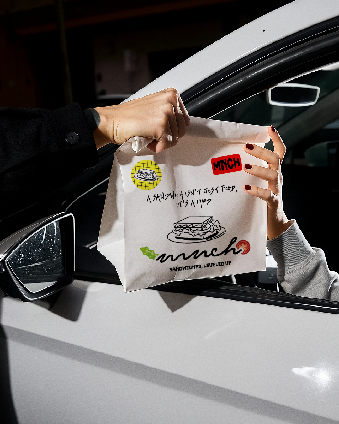
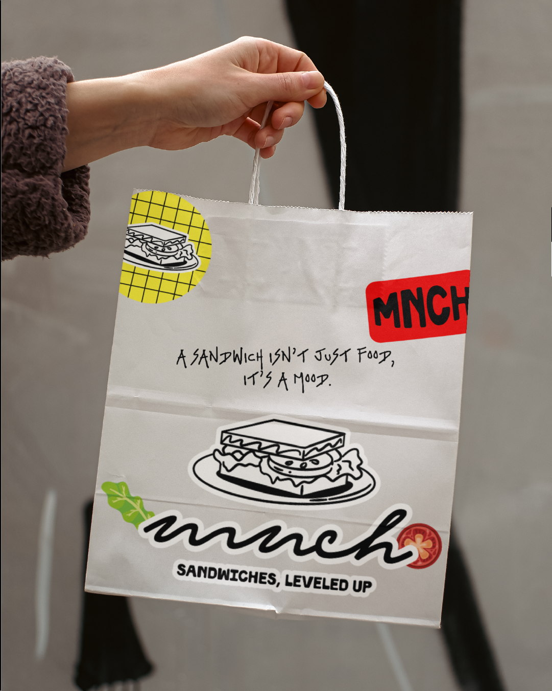
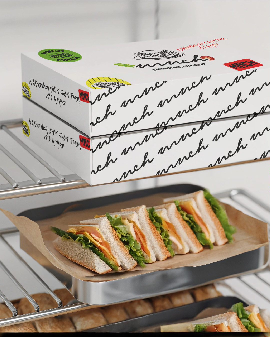
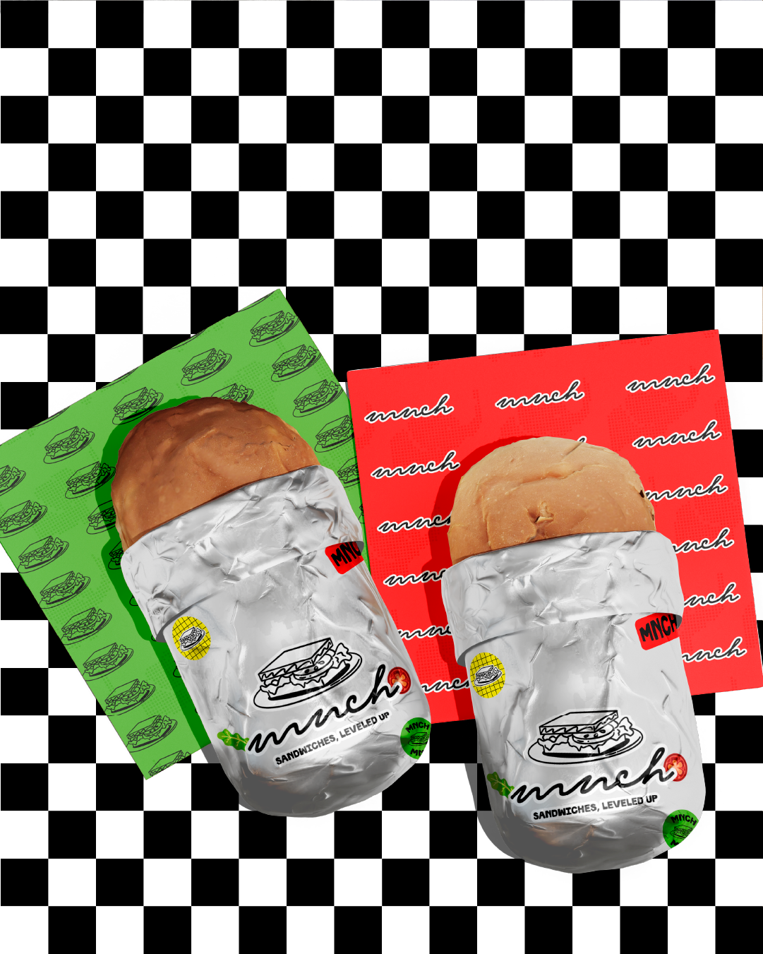
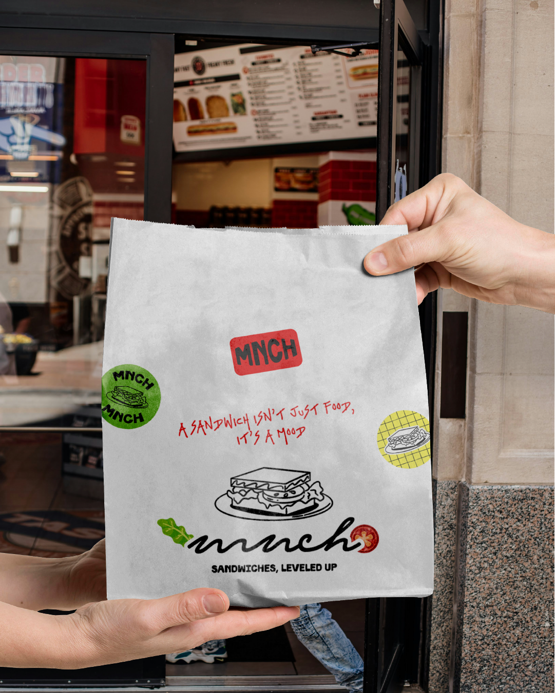
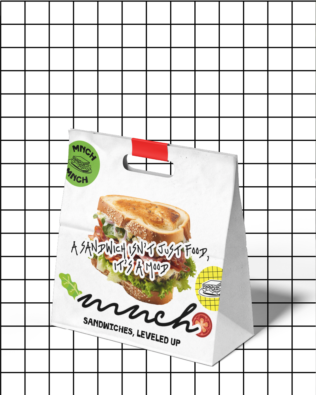
The core palette is kept black and white, representing simplicity, confidence, and a modern edge. It creates a strong base that lets the pops of color — red, green, and yellow — stand out like bursts of flavor. These colors hint at the freshness of the ingredients (think tomatoes, lettuce, and cheese), while also adding warmth and playfulness to the otherwise clean aesthetic.
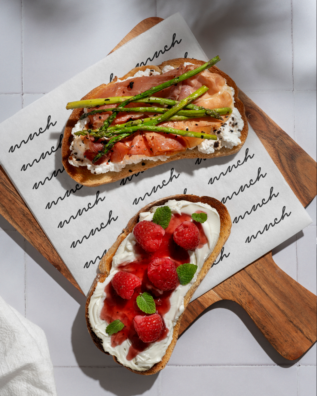
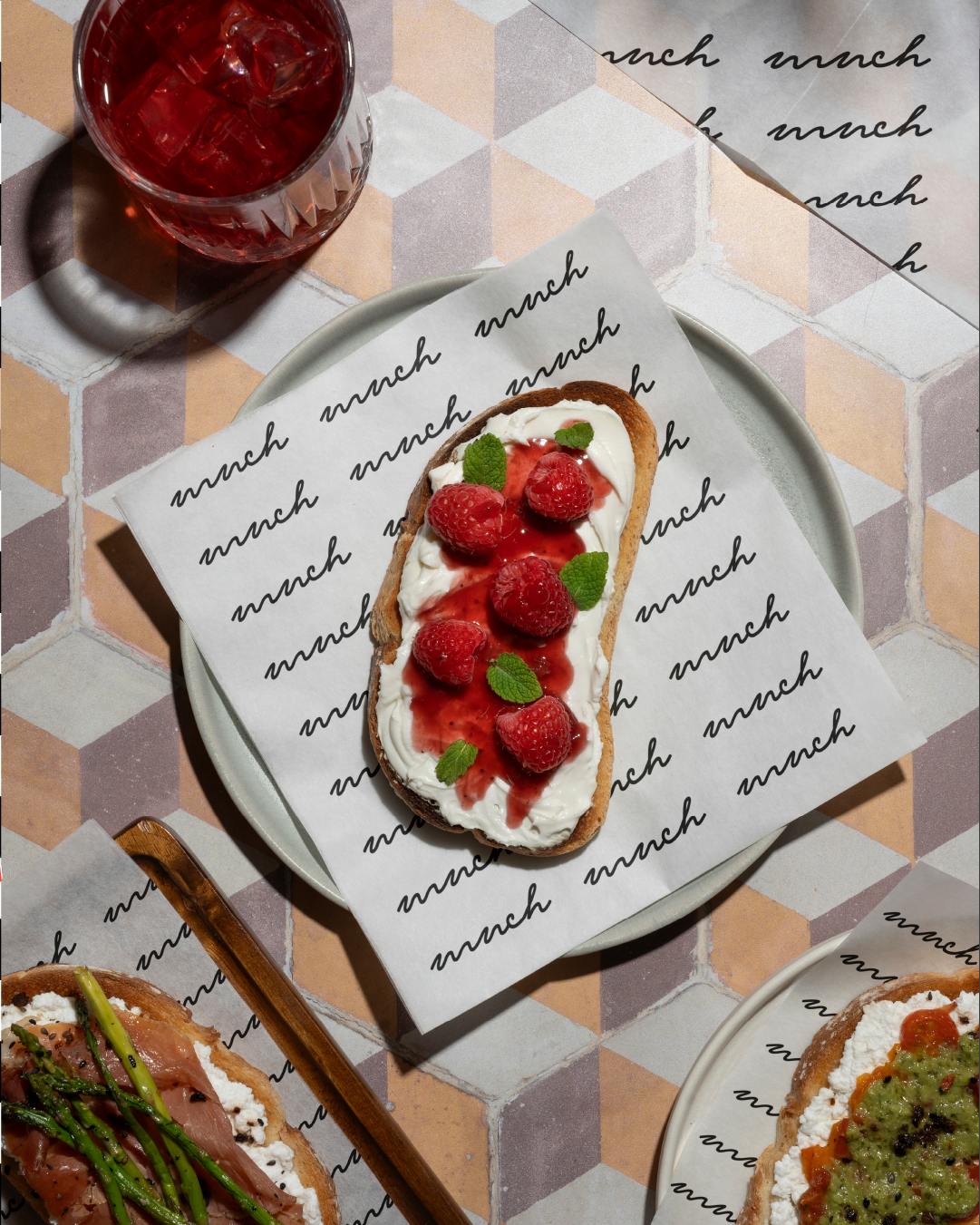
The script, flowy logo font was inspired by the smooth motion of ketchup or mustard being drizzled over a sandwich — casual, effortless, and mouthwateringly familiar. This flowing type contrasts beautifully with the clean grid and geometric secondary fonts, representing the balance between flavor and structure.
To bring personality and approachability, stickers and playful typography bursts were introduced. These add energy, movement, and that signature MNCH attitude, making the brand feel alive and social-media ready.
Together, the elements make MNCH stand out as a fresh, fearless, and flavorful brand — one that’s as visually satisfying as its sandwiches.
 Yusra Tahir
 lunapanda
 Tridimage
 Analoguecreative
 lettera7
 alchimistestudioParis
 Lana B
 Colossal
 Pivot Studio
 M&A CREATIVE AGENCY
 monther al omari
 Anastasia Cherepanova | xtramez
 Hollóka Grafikai Műhely / Graphic Design Studio
 BOLD branding
 Antonia Skaraki
 Pâmella Lorrany
 Z9BKAdsgn
 Francesco Paternoster
 b1studio.ro
 Chris Creative Works
 Boordon
 Dmitriy Kuzovlev
 Brand Society
 yasharpic