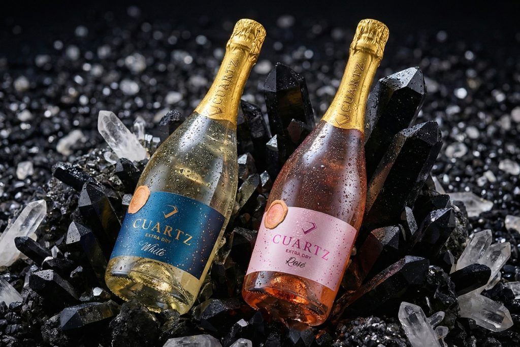

Label design is not just about aesthetics — it’s about capturing the consumer’s attention within those critical 2 seconds at the shelf. ⏱️✨
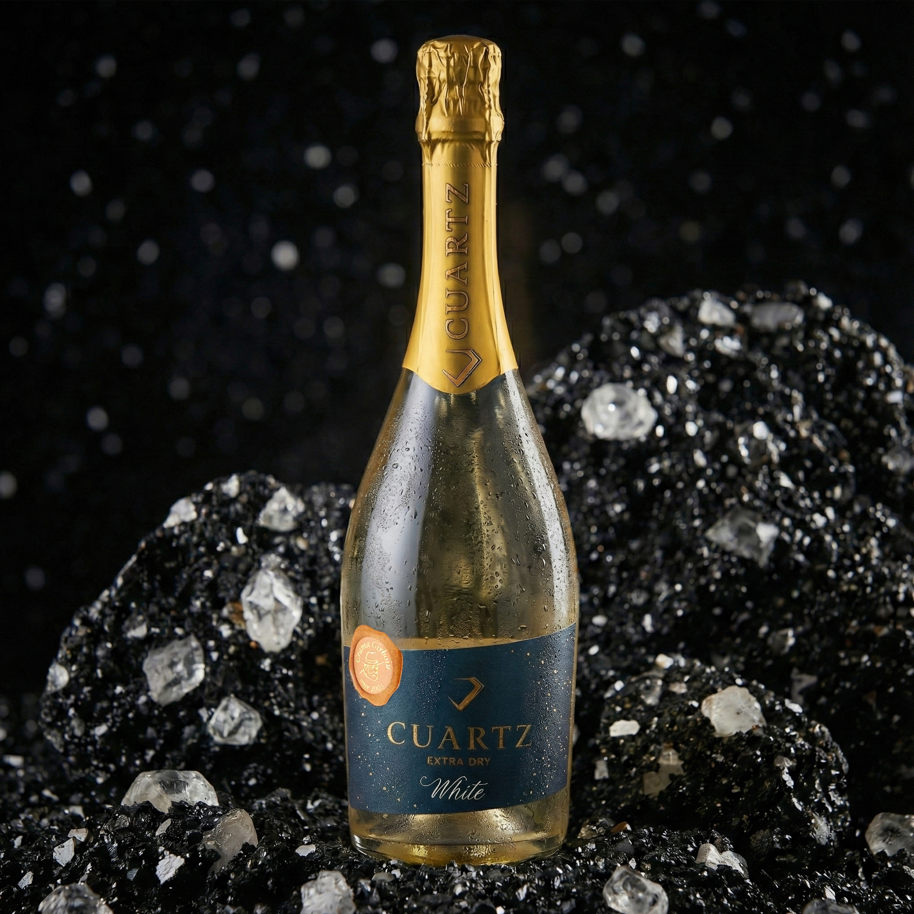
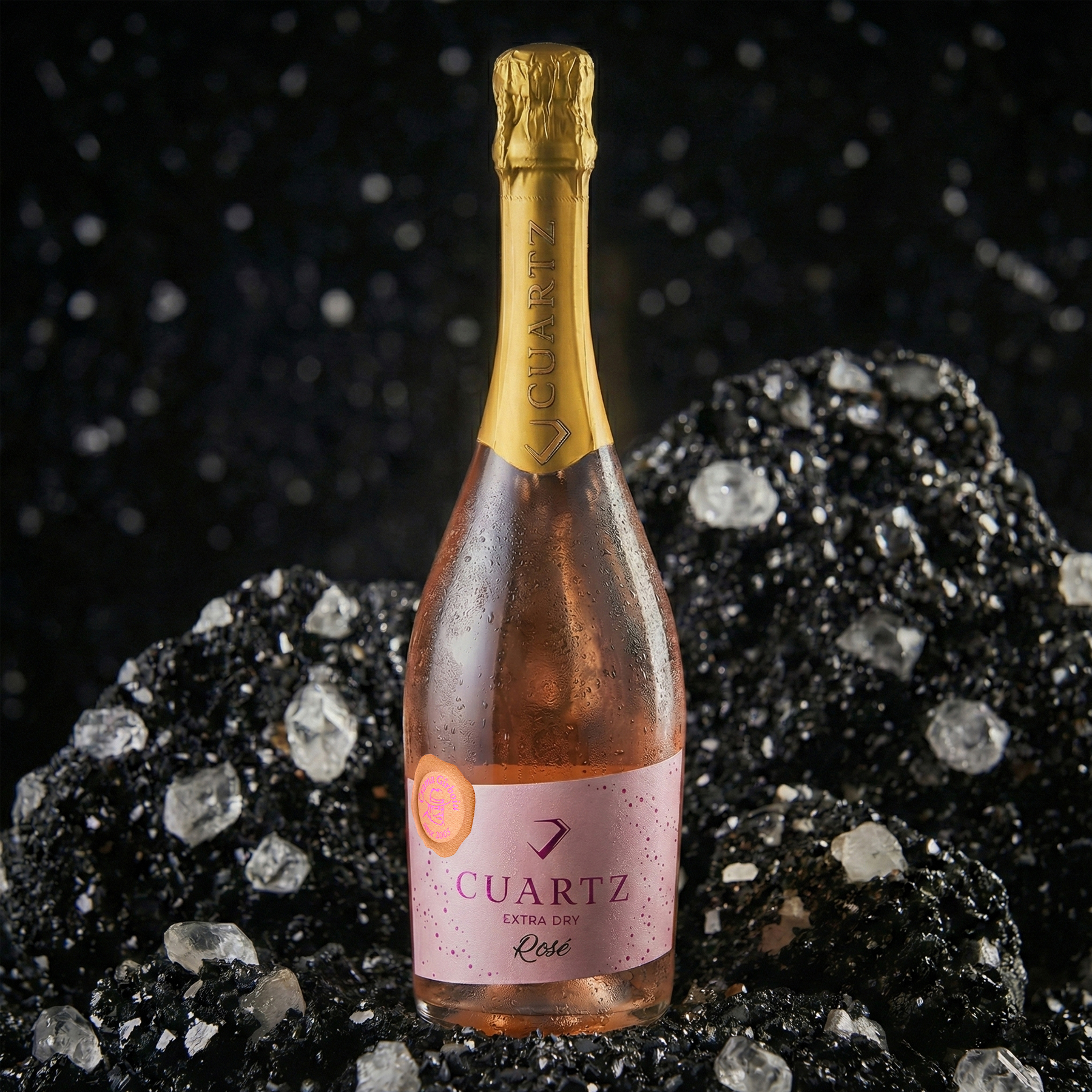
For Cuartz, our challenge was to translate the purity of a precious stone into a premium visual identity. We chose refined minimalism, tactile textures that invite touch, and a color palette that conveys freshness.
The result? A label that stands out, tells a story, and sets the mood even before the bottle is opened. 🥂💎

 Derrick Lin
 Biaa
Biaa Petitmoulin Studio
 White Bear Studio
 Eva Chistyakova
 monther al omari
 Atipus
 alchimistestudioParis
 oneandother
 bloomburo
 helocrene
 Shapers Studio
 Denver Design
 Aidearte
 andrew.huerta
 softmachine
 airobtq
 Buzz & Co.
 Ruby
Ruby themythographer
 IDNB Inc.
 viktorflr
 Zenpack