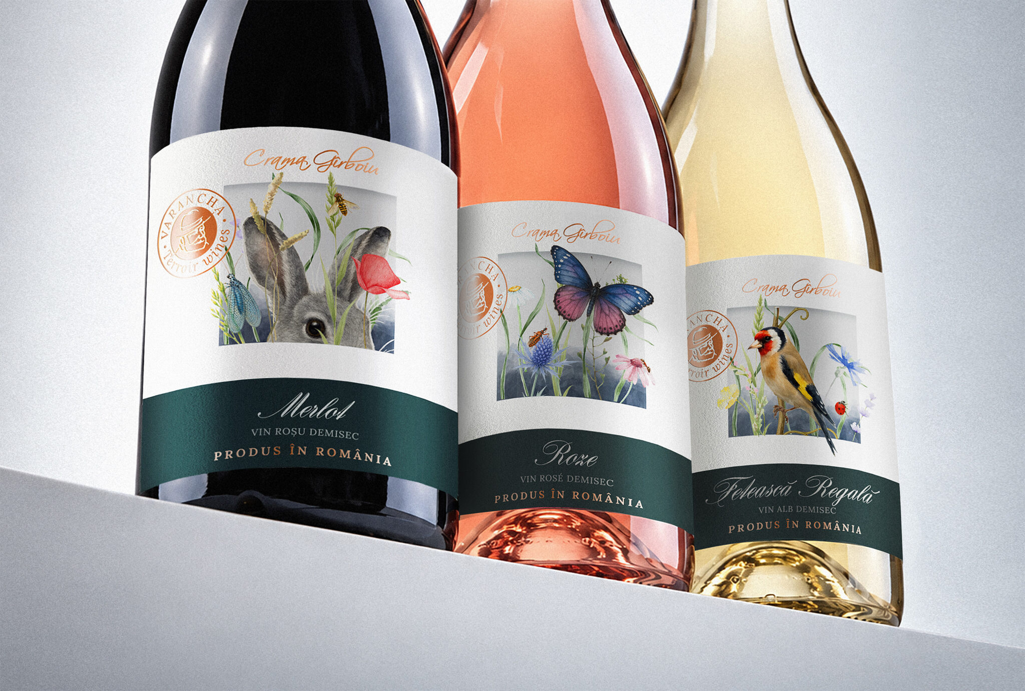

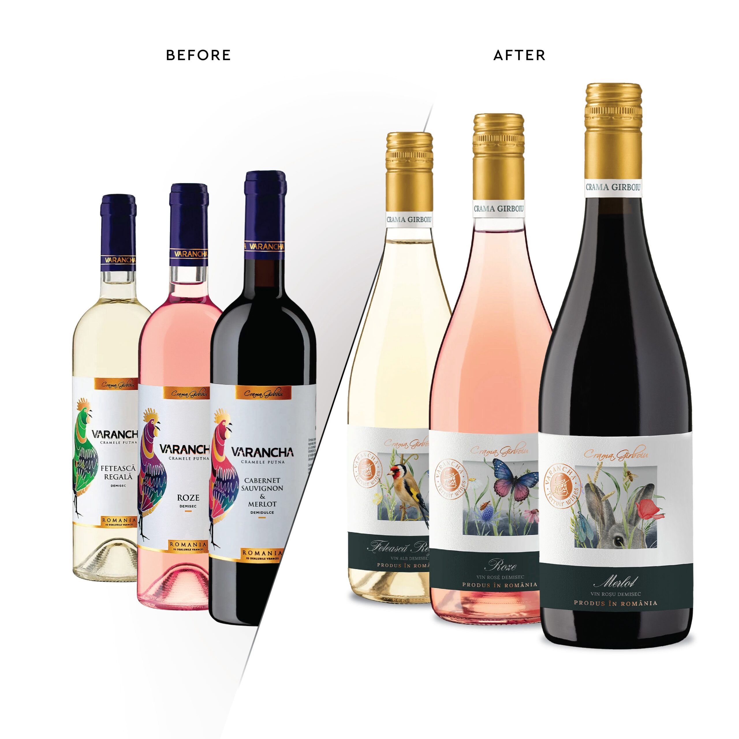
Even established wines can lose their voice in a crowded market. The existing Varancha product line was experiencing a dip in shelf performance, prompting the winemaker to make a bold decision: a total rebranding of the range. The brand needed a breath of fresh air to reconnect with consumers.
Our objective was to develop a completely new, visually striking identity that would guarantee strong shelf impact. The design needed to authentically reflect the unique terroir of Vrancea (the inspiration behind the name “Varancha”). However, we were given a crucial constraint: the brand name itself was difficult to read at a glance, so it could not be used as the primary typographic element on the front label.
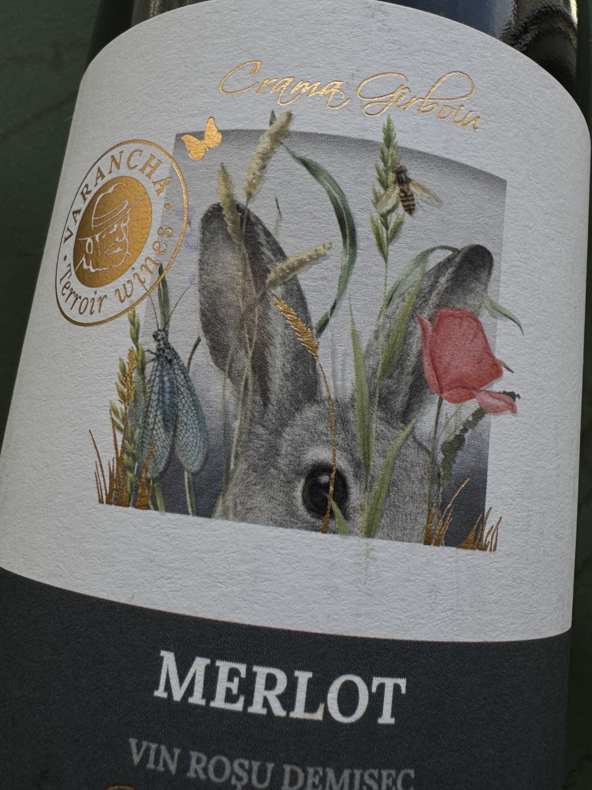
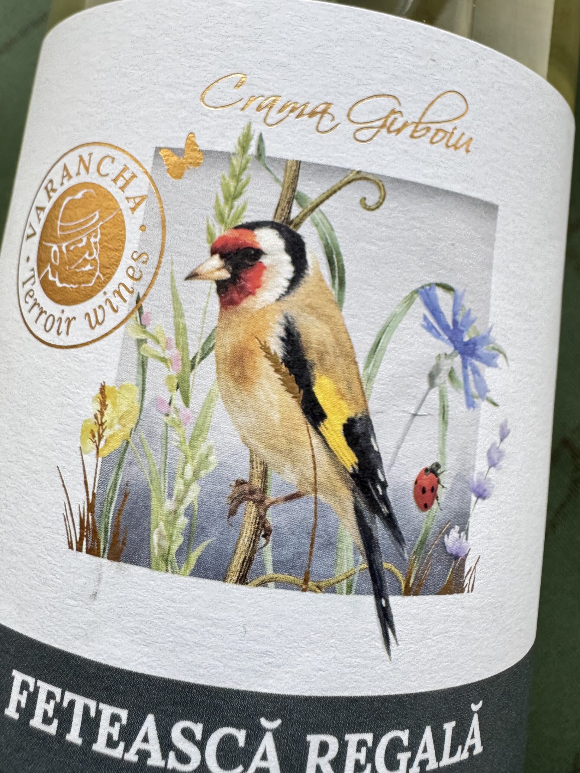
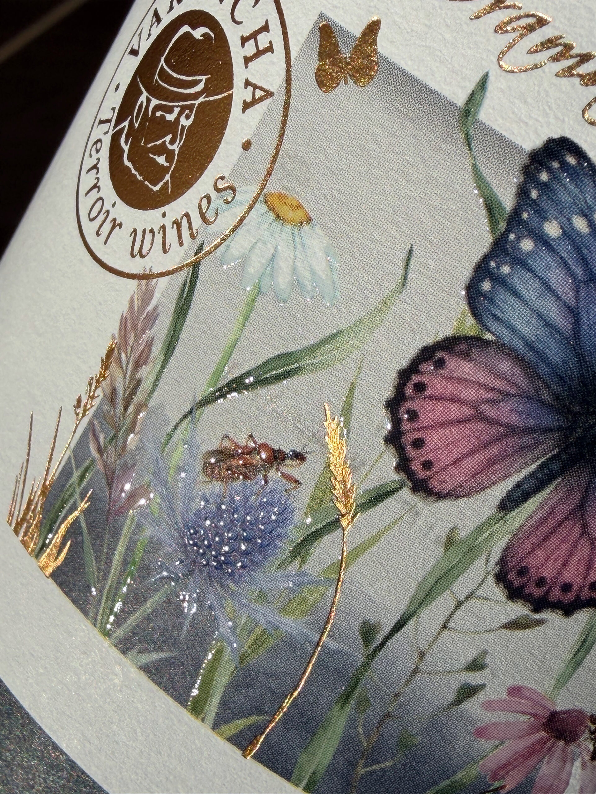
For an entry-level segment, we decided to break the mold and introduce a visual language that is highly vivid, unusual, and emotionally engaging. Instead of traditional vineyard landscapes, we zoomed in. Our strategy was to leverage the micro-universe of the vineyard, bringing macro-style imagery of the wild herbs, insects, and animals that inhabit the Crama Gîrboiu estates directly to the consumer.
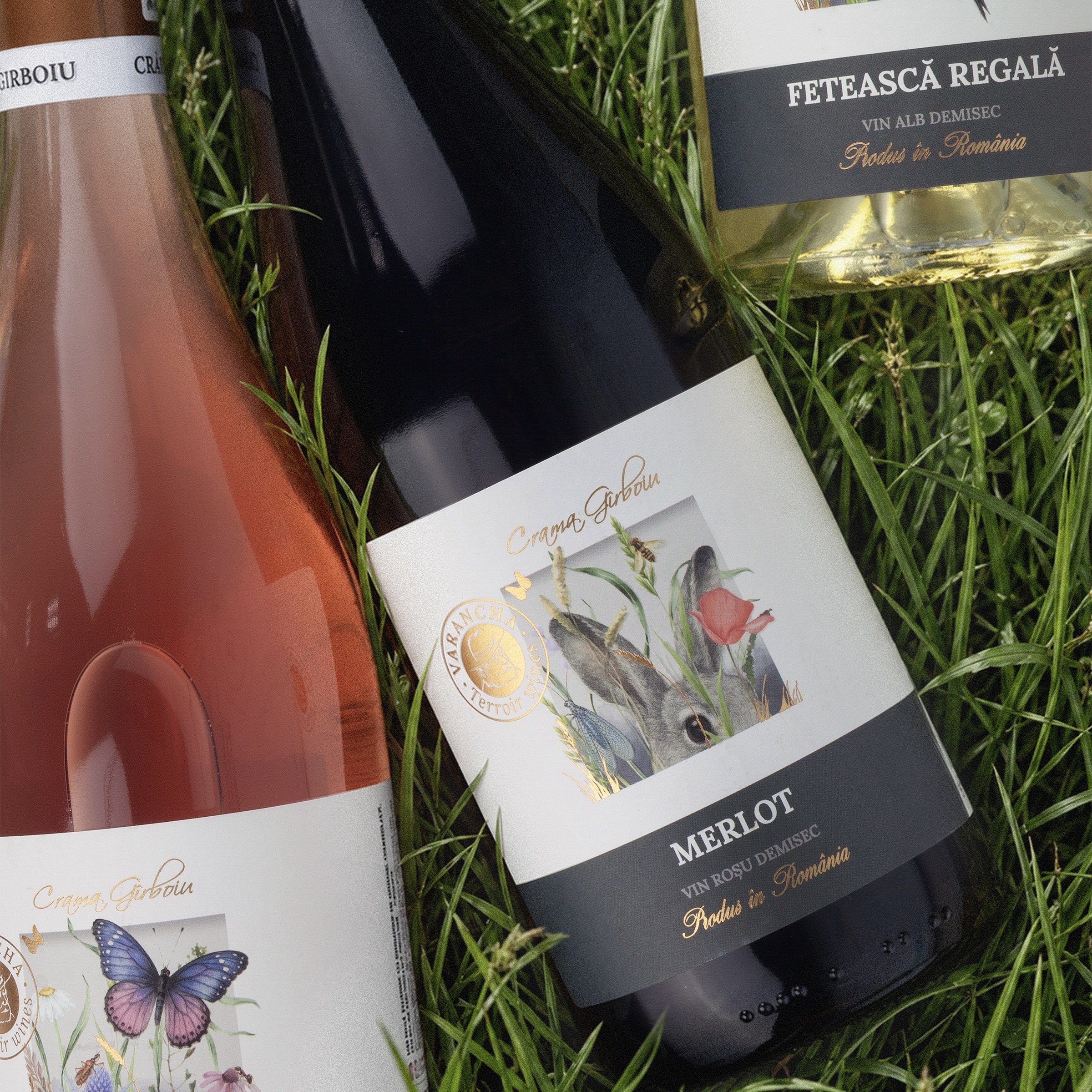
By using real photography of the actual flora and fauna as reference, we kept the visuals deeply authentic. We wanted the packaging to evoke a sensory response, to make the consumer almost smell the fresh grass and feel the pulse of nature, instantly communicating the wine’s pure quality and authentic origins.
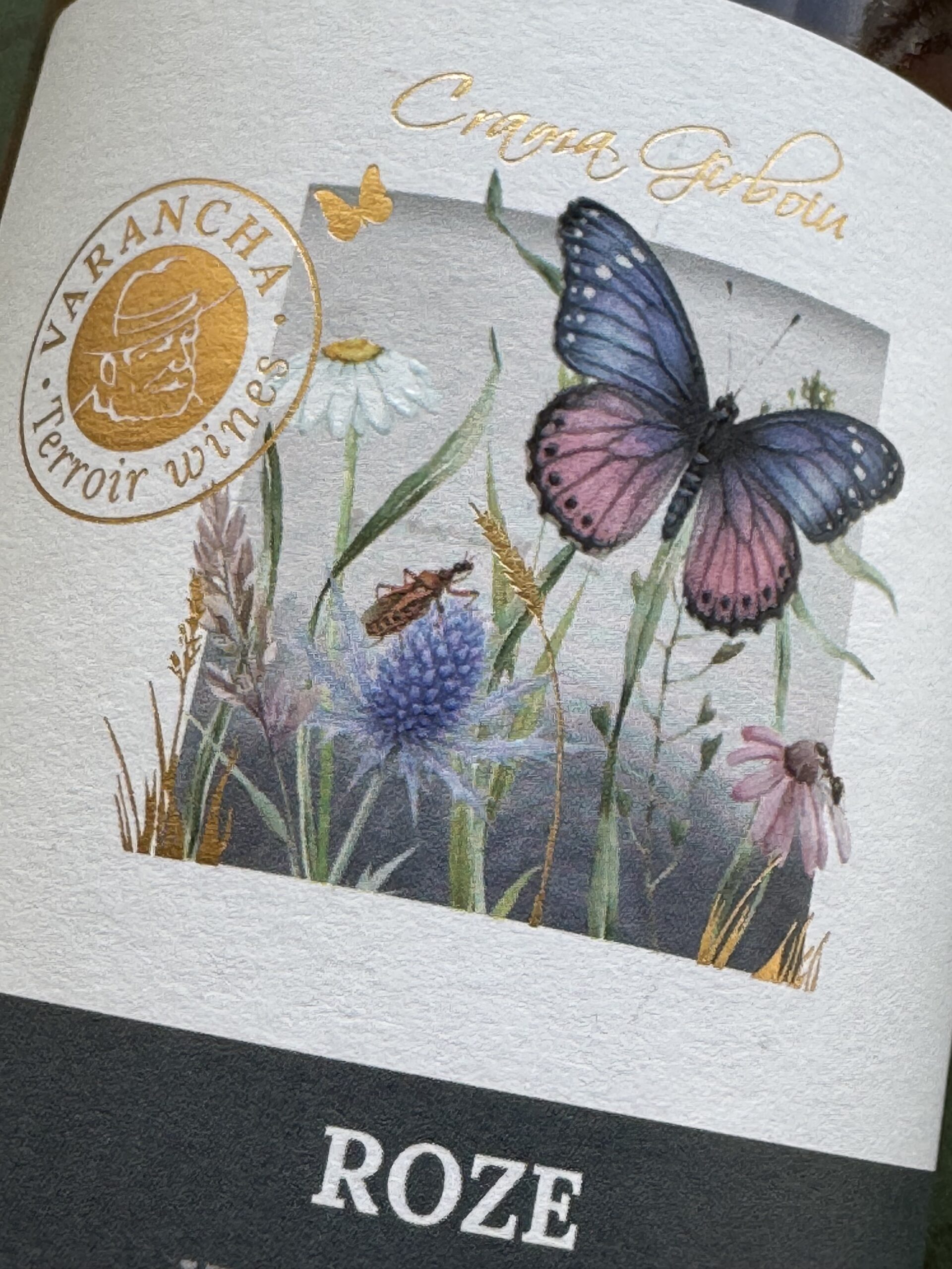
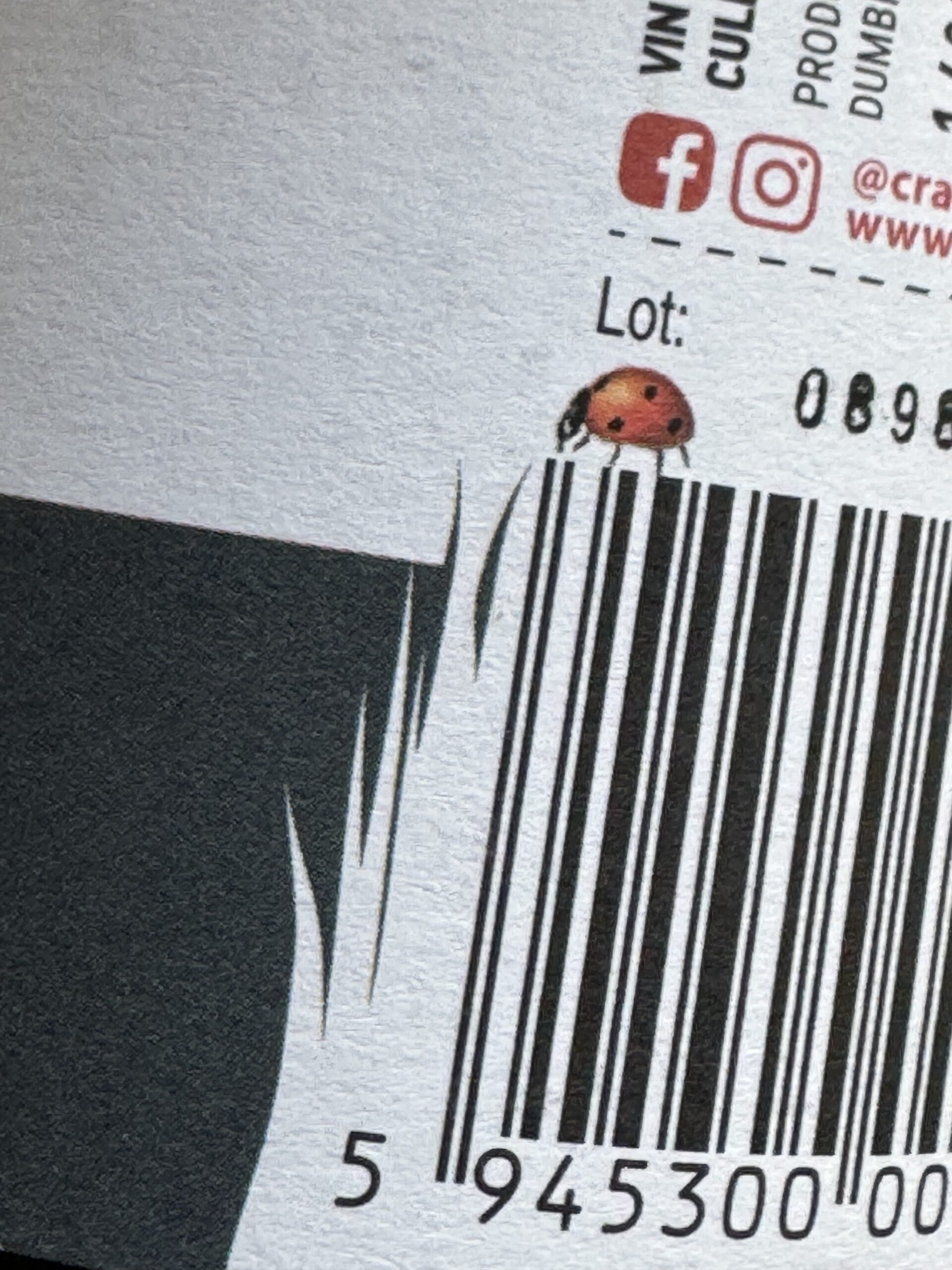
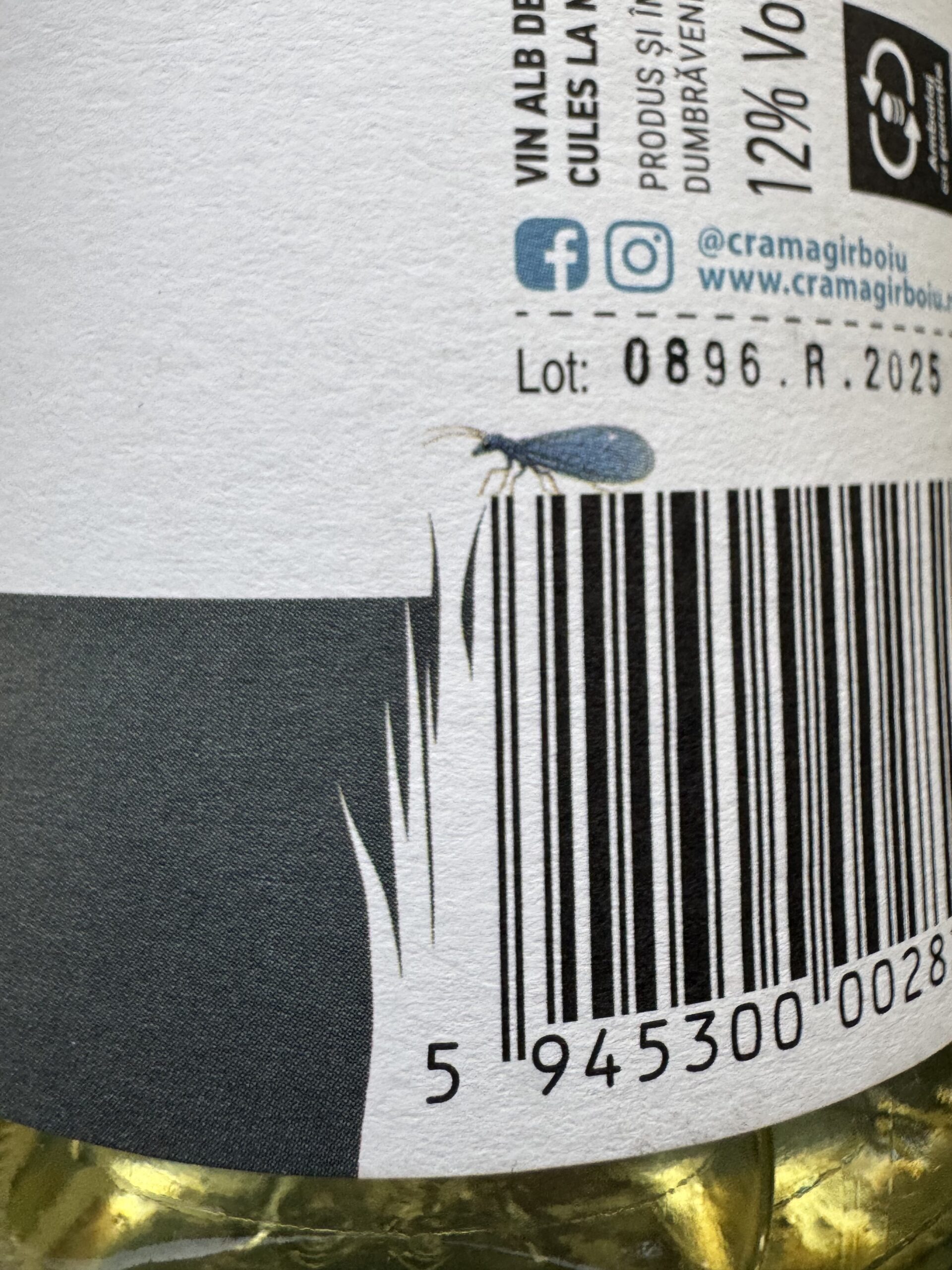
The entire graphic system was built around these vibrant macro illustrations. We engineered the layout so the flora and fauna appear to break out of their frames, extending into another plane to create a subtle, captivating 3D effect. We developed three distinct illustrations, each carefully selected to match the specific character of the wine, while adding a touch of humor and aesthetic finesse.
At the base of the label, a rich, noble emerald green background anchors the composition, elevating the grape variety to act as the hero element. To solve the naming constraint, we reimagined the word “Varancha” not as a standard logo, but as a classic, authoritative seal on the left side of the label. This shift turned the name into a stamp of quality and origin, leaving “Crama Gîrboiu” as the sole brand name visible on the front.
Thanks to the graphical composition being so inherently strong and engaging, we didn’t need to over-invest in complex printing techniques. We let the design do the heavy lifting, focusing on simple but premium finishes. We utilized sharp color accents, the elegant gleam of gold foil, and tactile varnish to give the label an extra sparkle under the store lights and provide an advanced, tactile experience in the hand.
The market reception was overwhelmingly positive. The fresh, friendly, and vibrant new look instantly revitalized the product line’s presence on the shelf, leading to a dynamic and sustained increase in sales. There is no greater reward for our studio than seeing our creative vision directly drive commercial success for our partners.
 monther al omari
 Ximena Ureta Design Studio.
 vitoramockup
 Up-Brands
 Sophiagdotcom
 Peter said
 ayeidadezigns
 Tancybox
 宏洛图品牌设计HONGLT
 Modern Theory
 Dozen Agency
 Atiq Alam
 Olio Studio
 Ruchi S. Joshi
 mmdesign
 awaiskhadim
 Octasoft
 United Creatives Studio
 Kingdom & Sparrow
 Anastasia Bakhmatskaya
 CreativeWise
 Great and Golden