

CHALLENGE
For Aproape Wine & Restaurant, the challenge was to create a wine identity that could express the meaning behind the name Aproape — Romanian for “close” or “near” — and translate it into a memorable visual story.
As a wine created within a HoReCa context, the label needed to go beyond product identification and become part of the experience around the table: people meeting, sharing, serving and enjoying wine together.
SOLUTION
We built the concept around human connection and the many people and gestures behind a bottle of wine.
From the hands that work in the vineyard to those that serve, offer and share the final glass, we focused on the simple actions that bring people and wine together.
These invisible relationships became the central idea of the design: a visual metaphor for closeness, collaboration and shared experience.
CHARACTER & ILLUSTRATION
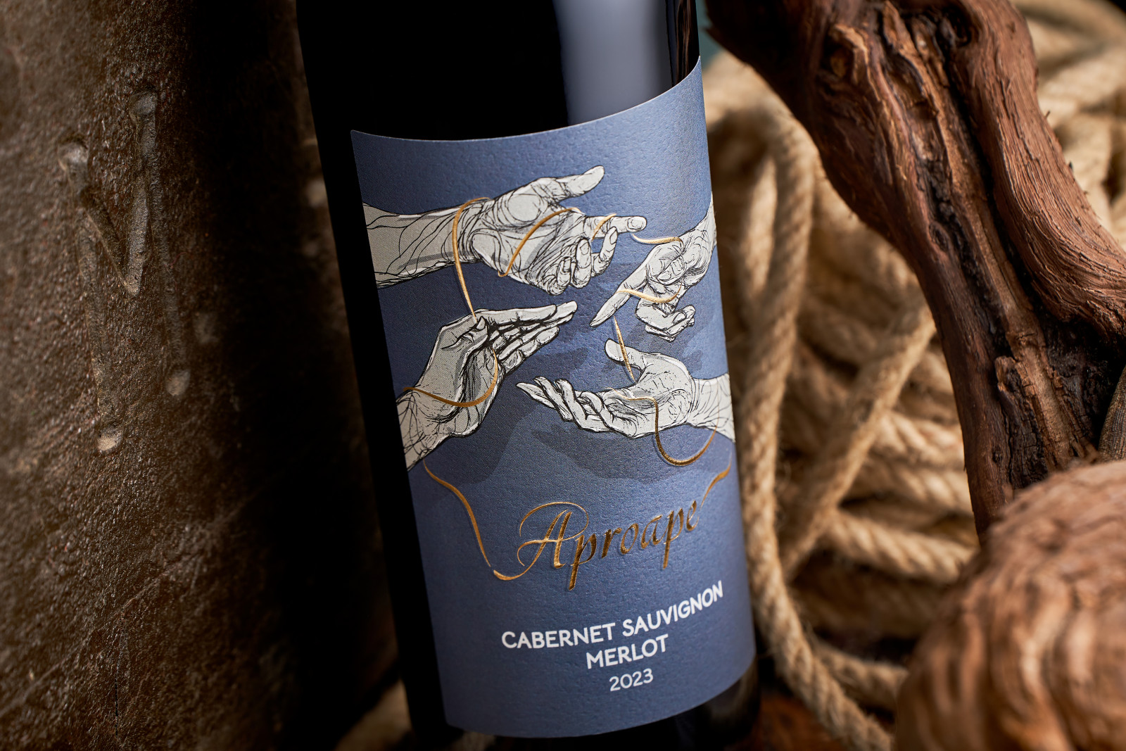
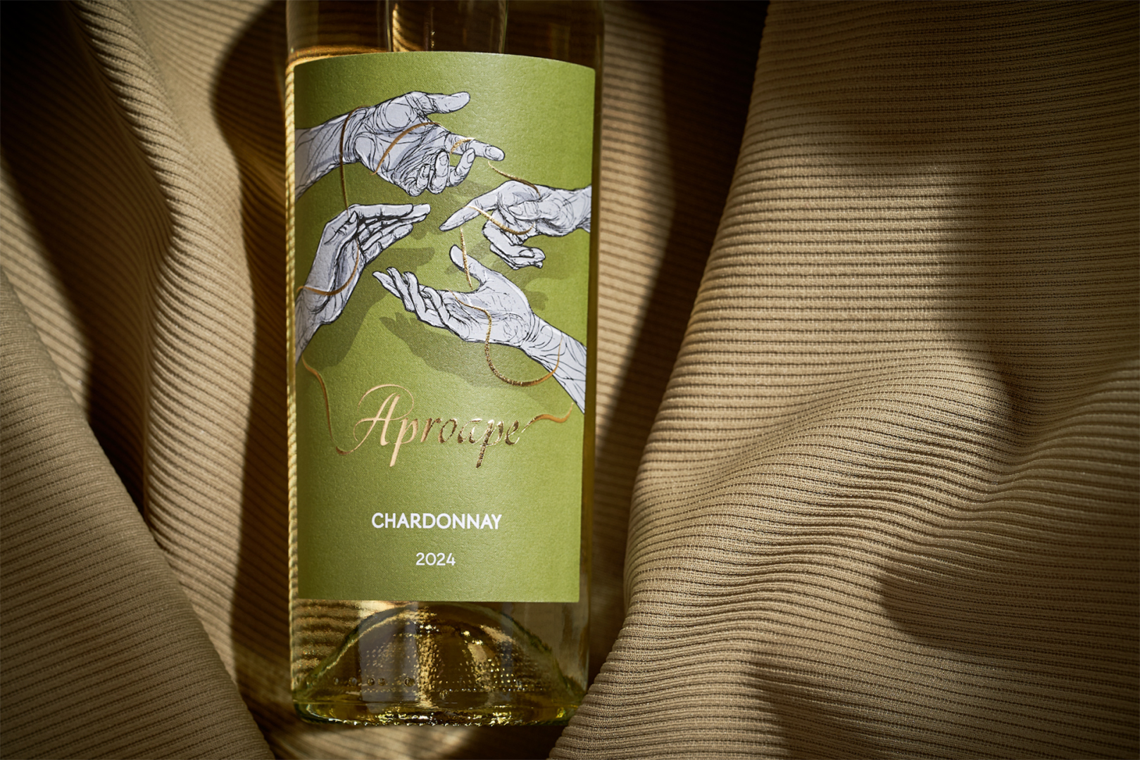
Hands became the main characters of the label.
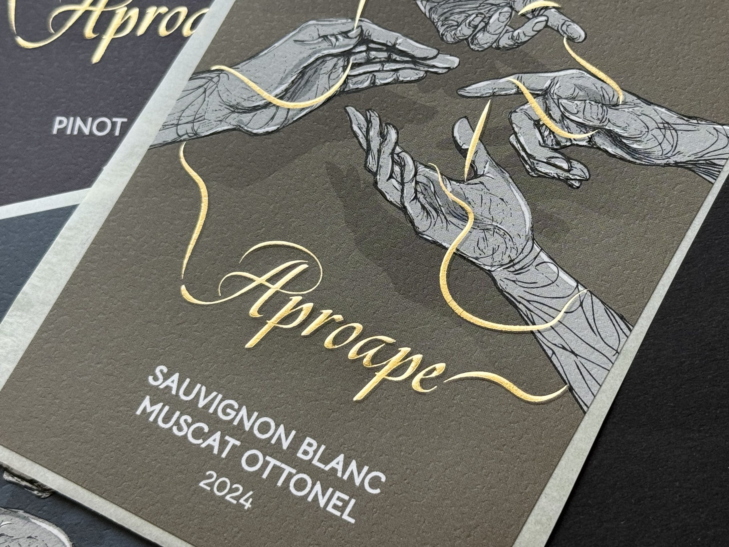
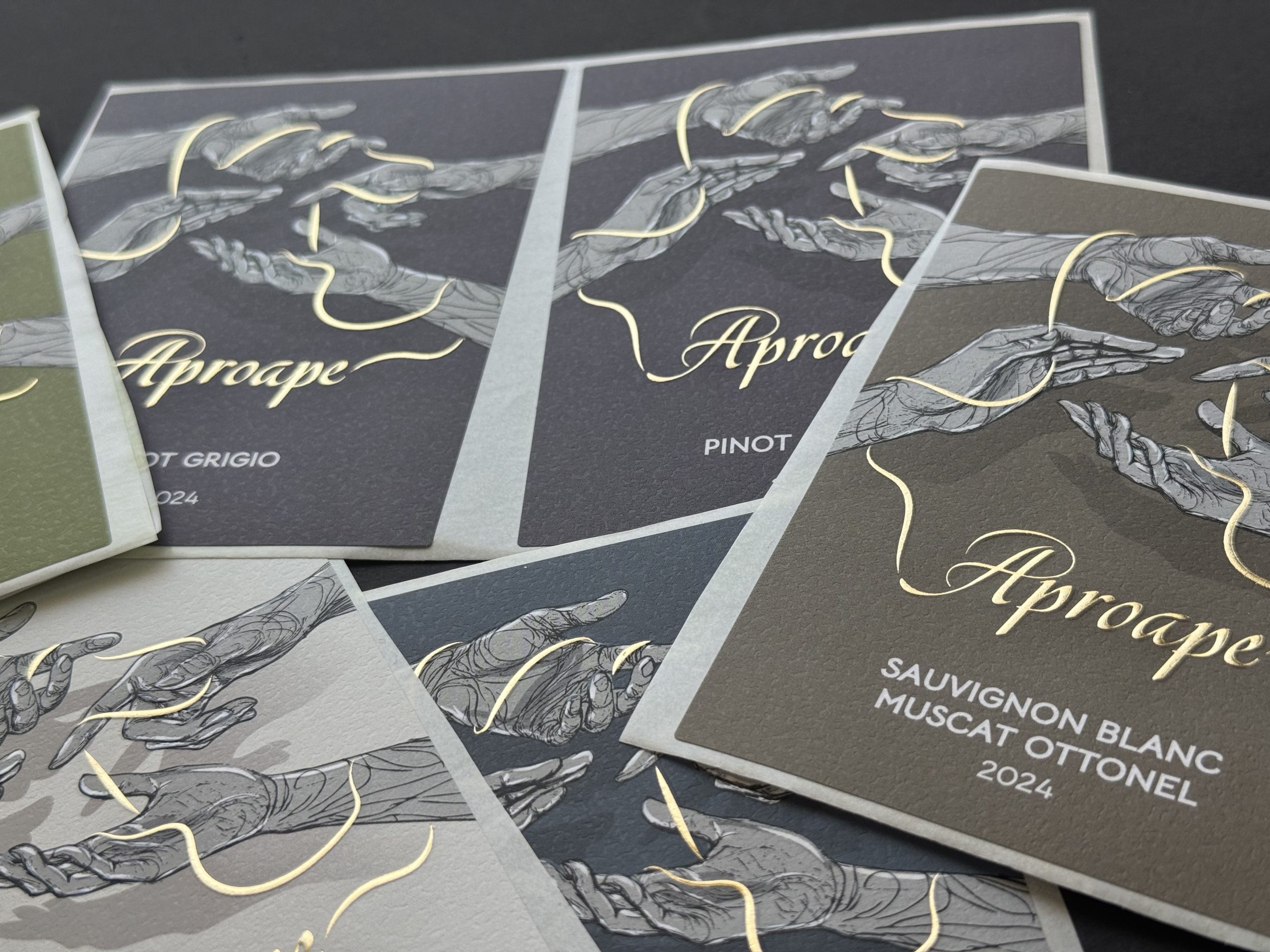
We created a series of detailed hand illustrations capturing different gestures — reaching, offering, holding and receiving. Each gesture represents a different moment of human interaction and a different contribution to the journey from vineyard to table.
A continuous golden thread moves between the hands, connecting them visually and symbolically. It represents the invisible ties between people: trust, shared effort and the simple act of coming together.
VISUAL LANGUAGE
The visual language combines expressive hand-drawn illustration with a restrained, contemporary composition.
Detailed monochrome hands contrast with the deep, natural background, while the fine gold line travels freely across the label, introducing movement and connecting the individual illustrations into one continuous narrative.
The handwritten Aproape logotype adds a personal, human character, while the tactile paper and refined finishing reinforce the crafted quality of the wine.
OUTCOME
The final label transforms the meaning of Aproape into a visual experience built around people rather than conventional wine imagery.
Created for the HoReCa environment, the packaging becomes part of the moment in which the wine is served and shared — reinforcing the connection between the product, the restaurant and the people around the table.
Every hand represents a gesture. Every line creates a connection.
A wine born from connection. A wine about being close.



 Derrick Lin
 Biaa
Biaa Petitmoulin Studio
 White Bear Studio
 Eva Chistyakova
 monther al omari
 Atipus
 alchimistestudioParis
 oneandother
 bloomburo
 helocrene
 Shapers Studio
 Denver Design
 Aidearte
 andrew.huerta
 softmachine
 airobtq
 Buzz & Co.
 Ruby
Ruby themythographer
 IDNB Inc.
 viktorflr
 Zenpack