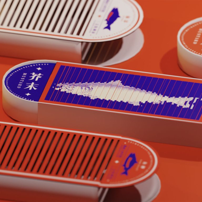

In this Curator’s Insight, we take a look at the Salmon Trace packaging design by students of Lu Xun Academy of Fine Arts.
Team:
Zhang Jian
Fang Meiqiao
Zheng Wenya
Huang Xinyi
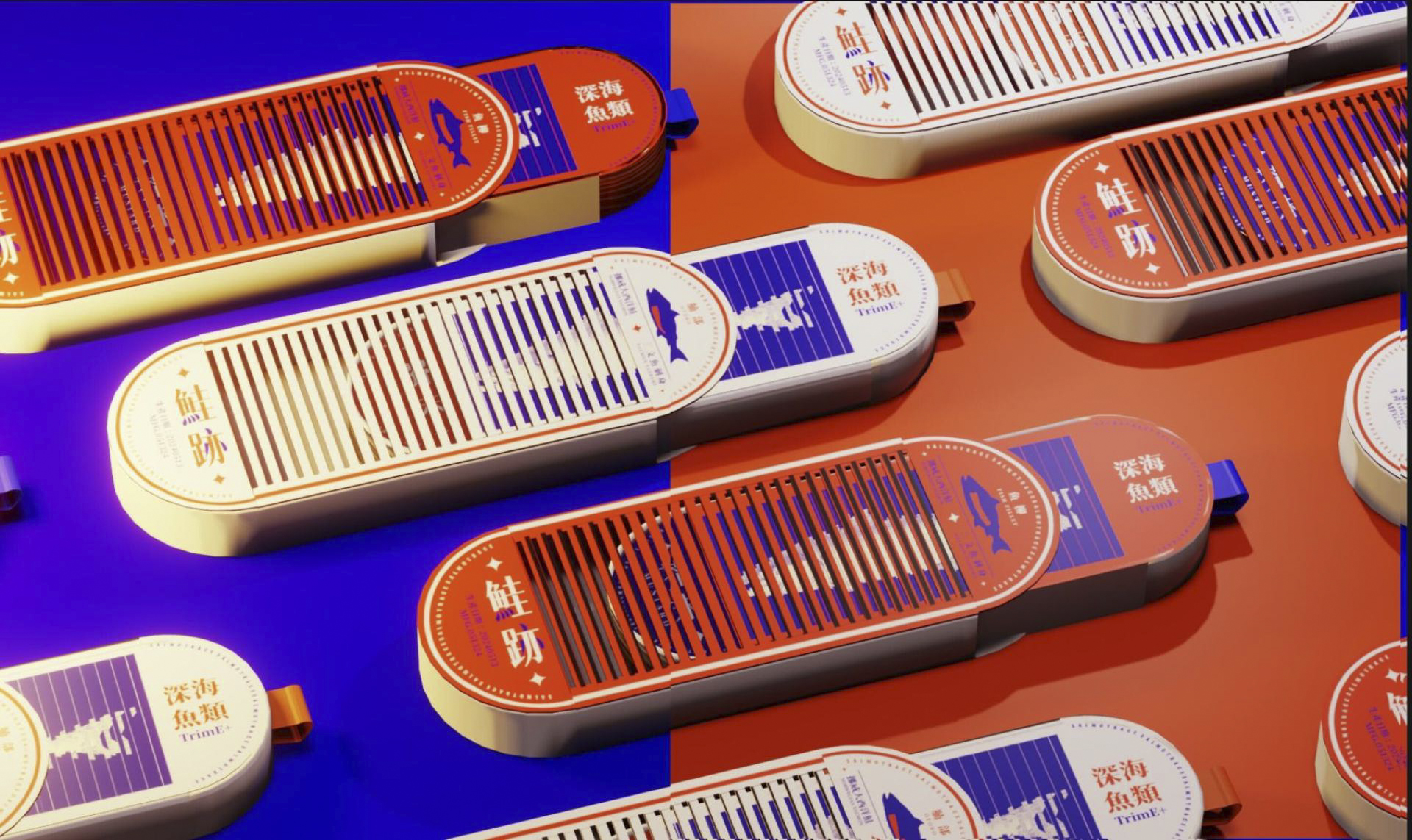
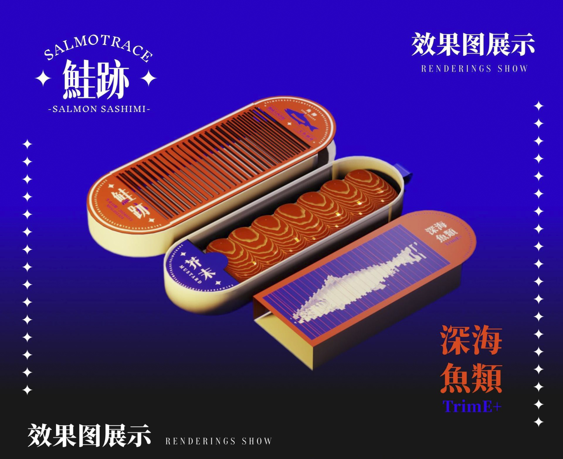
What makes the design unique is how the motion illusion becomes the storytelling device. The thin vertical lines act like a visual filter. When the sleeve moves, the salmon graphic underneath transforms into movement. It feels less like looking at an illustration and more like watching a fish glide through water. This is clever because it uses a physical trick instead of digital technology. No screen, no animation—just smart graphic design and a simple mechanical slide.
Another interesting detail is the colour strategy. The bold orange background instantly signals salmon without literally showing a photo of the product. Instead of relying on realism, the designer uses colour psychology. The deep blue panel works as a visual “water space,” so the salmon silhouette appears to swim naturally inside it. This contrast between orange and blue is strong, energetic, and very modern.
The long, narrow structure of the box also plays an important role. It subtly mirrors the shape of a fish. Many seafood packages are square or generic, but here the proportions quietly reinforce the product inside. This kind of structural storytelling is something good packaging designers think about but is rarely explained in project descriptions.
One especially smart design choice is the graphic restraint. The designer avoids clutter. There are no large photos, no overwhelming text blocks, and no heavy branding screaming for attention. Because of that, the motion effect becomes the hero. In retail environments where many packages compete visually, this kind of calm confidence can actually stand out more.
There is also something playful happening psychologically. When people see the sliding motion effect, they almost always try it again. And again. That means the package encourages repeat interaction, which is gold in branding. It creates a small moment of curiosity and delight—something people might even show their friends.
Another subtle strength is how the pack communicates freshness without clichés. Seafood packaging often uses waves, boats, fishermen, or realistic fish photos. This design avoids all those predictable visuals. Instead, it uses abstraction and movement to suggest life, water, and energy. It feels contemporary and design-driven rather than traditional.


 krrrrrllii
 babyage
 Deep
Deep monther al omari
 Atiq Alam
 TUERCA Studio
 neo creative studio
 Pinot Agency
 Pixels Studio
 Anastasia Cherepanova | xtramez
 awaiskhadim
 Studio Be Design
 Belova Oksana
 We Craft Studio
 ArtDesignByDIna
 Ananya Taran
 Nadezhda Gorelikova
 orhanirmaktasarim
 WillBe
 Hi estudio
 43oz
43oz Rosario Lo Iacono
 alchimistestudioParis