
Drago Milk
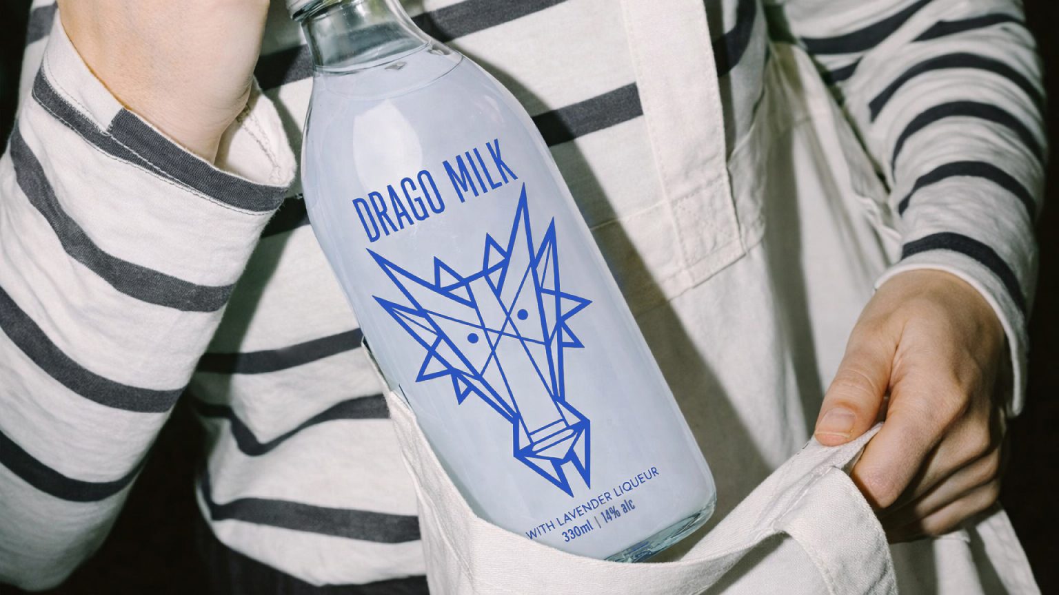
Drago Milk is an alcoholic beverage inspired by the myth of dragon milk — a rare elixir of strength and clarity.
According to legend, dragons never breathe fire without reason — they maintain a balance between power and calm. Their milk inherits the same duality: warmth and softness, strength and clarity. The minimalist design and geometric dragon symbol translate this legend into a contemporary visual language, where taste and image exist on equal terms.
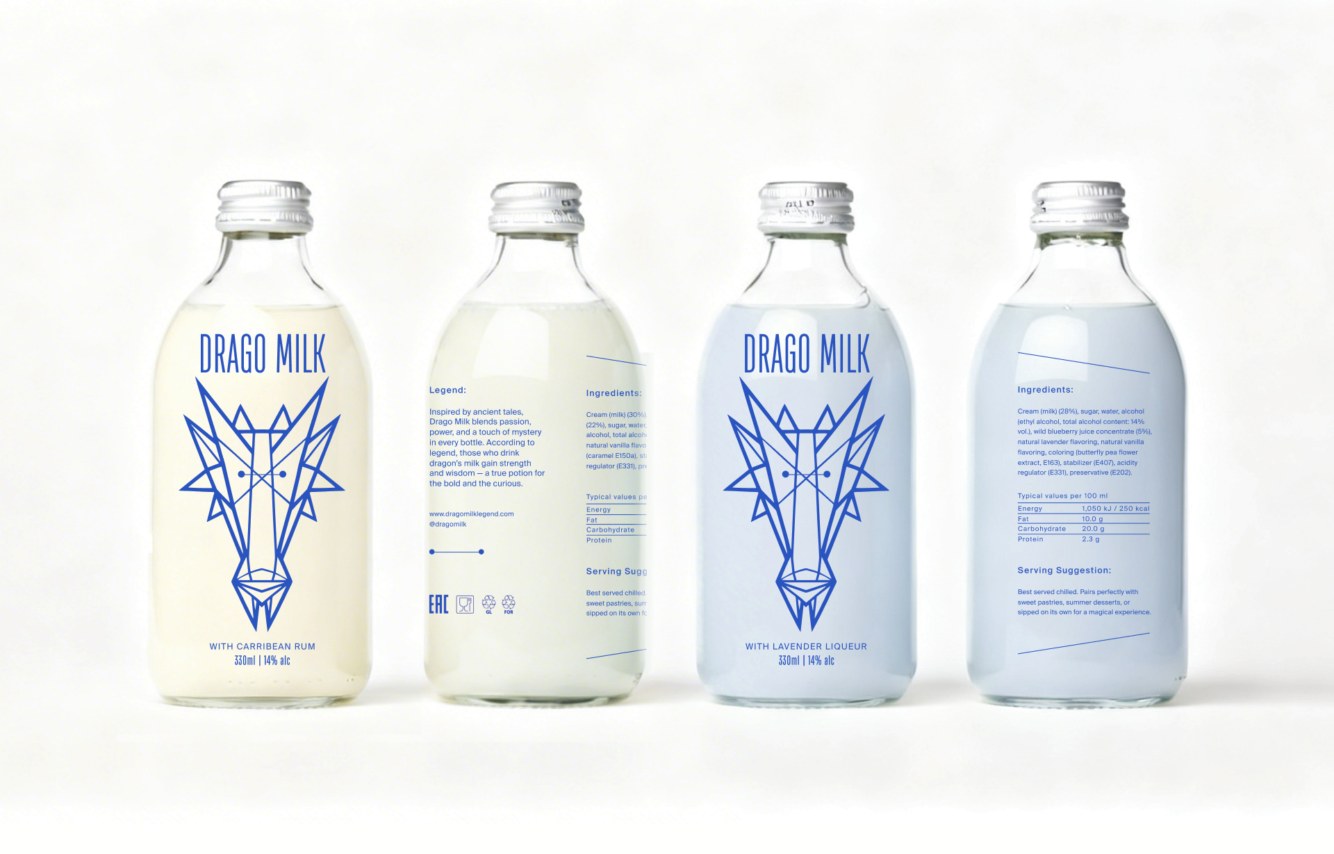
Solution At the core of the project is a contrast: the familiar visual code of dairy products and the category of alcohol, which rarely intersect. The concept is based on reinterpreting the myth through the product itself. Instead of a literal illustration, it takes a condensed, almost abstract form — a drink with a dual character. Caribbean rum brings warmth and depth, while lavender liqueur adds a cool, calm accent. It is not about intensity, but about balance.
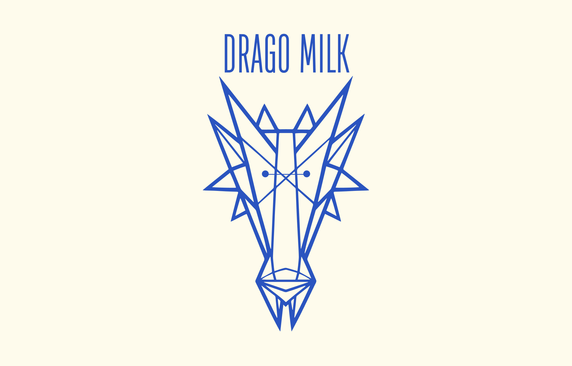
The graphic solution follows the same logic. The geometric dragon mark is stripped of illustration and functions as a symbol. Typography and clean composition create a sense of laboratory precision: this is not a legend, but a recorded result of an experiment. The primary color — blue — is borrowed from the visual code of dairy products, but reinterpreted in a colder, more detached way.
Transparent glass reinforces the idea of an “honest” product, allowing the drink itself to shape the visual identity.
Drago Milk is aimed at a young adult audience that values taste, form, and restrained aesthetics. It is a brand that deliberately rejects decoration and emotional pressure. The packaging avoids visual noise and unnecessary expression, offering a more calm and conscious consumption experience.


 Derrick Lin
 monther al omari
 43oz
43oz lilyz design23
 Modern Theory
 Eighteen Brand Studio
 Bhumika Singh
 MohamedMashaly
 Pixels Studio
 Gulya
Gulya UPRISE
 Lizaveta Kharitonyuk
 Bonsanco Creative Studio
 DesignRepublic
 GIRAFA STUDIO
 PiotrWisniewski
 Sophiagdotcom
 CreativeWise
 SoreThumbStudio®
 Modern World Studio
 Palashcc
 Valérie Colace