

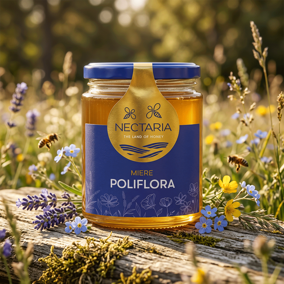
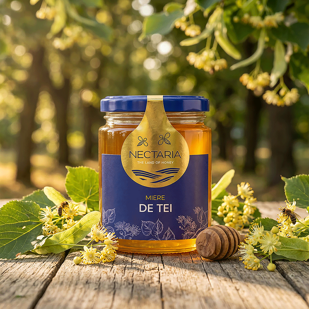
The honey drop became the starting point of the concept and the central element of the visual identity.
Our goal was to differentiate the product directly on the shelf, so we analyzed the honey category and searched for a distinctive, easy-to-recognize element. This led to the idea of a drop-shaped seal — a symbol that suggests product protection while also referencing the world of honey.
We selected a modern, clean, and elegant color palette that highlights the product and supports a premium positioning, while maintaining the natural feel of the category. Nature-inspired graphic elements complete the identity and reinforce the product’s character.
A concept designed for shelf visibility, visual consistency, and instant recognition.
Nectaria — The Land of Honey.


 MID-AIR STUDIO
 Heramb Arora
 monther al omari
 Tríona O'Donoghue • Design
 Cocoon Prague
 alchimistestudioParis
 hugo zapata
 parawaradesign
 UPRISE
 Brand Society
 Que Cálido Studio®
 Richest Branding Pvt. Ltd.
 STRATEDGY
 Shapers Studio
 Platon Ivantsov
 WPA Pinfold
 giselepereiradesign
 ShalaSketches
 05Creation
 Voit Studio
 SSTO
SSTO Abox Agency