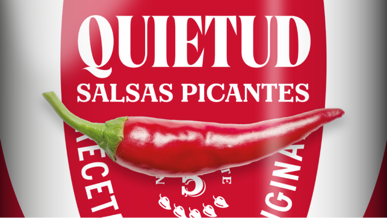

Quietud is a young brand of artisanal hot sauces made with premium ingredients, notably Sherry wines and vinegars, under a careful, rested process.
With the goal of continuing its international growth and especially captivating the North American market, ideólogo has redesigned the corporate identity and packaging design to generate more notoriety, brand recognition, and ultimately, more sales.
In an initial analysis, we noted that the extreme quality of the sauces contrasted with the weakness of its brand identity and general communication.
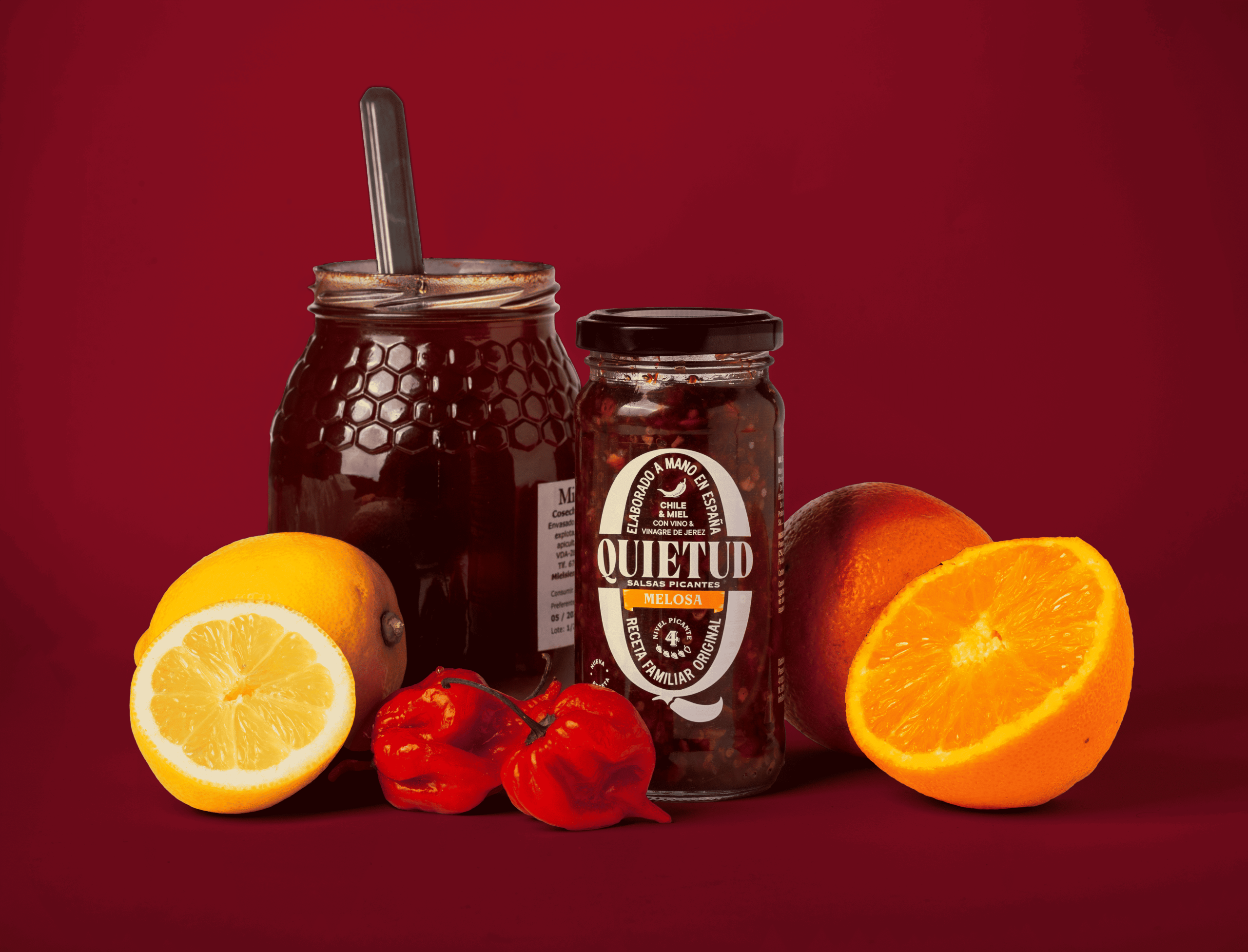
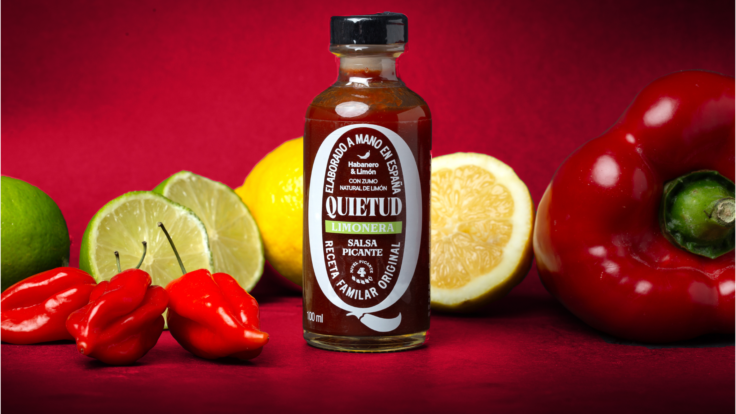
To address this, we replaced the previous graphic elements—which lacked strength and coherence—with an iconic “Q” featuring a chili-shaped tail that occupies the entire visual space of the packaging. This element provides notoriety and a very high level of recognition that stands out even more thanks to its consistent application across all consumer-facing pieces, from the sauce labels to every POP (Point of Purchase) element.
The rest of the information shown on each piece is distributed orderly within the prominent “Q,” creating a graphic block with a vintage feel that delivers communication that is both direct and impactful.
The chosen range of “spicy” colors reinforces the brand’s character and the powerful flavor of its products.
The result is an evolution that does not go unnoticed and which, in its presentation at both the Alimentaria trade fair and the Salón Gourmet, has generated a “flavorful” reception, skyrocketing its sales.





 Lisa Pokrovskaya
 Simple Studio
 Studio Unbound
 David Byerlee
 M&A CREATIVE AGENCY
 alchimistestudioParis
 monther al omari
 Studio Be Design
 LogoSayLove
 agenciabud
 Shustova p
 mutta
mutta @Allenarts13
 Sirka Agency
 Atiq Alam
 Dozen Agency
 j.substance
 SCD
SCD Cristian Lepore | crilep Copia
 Chris Creative Works