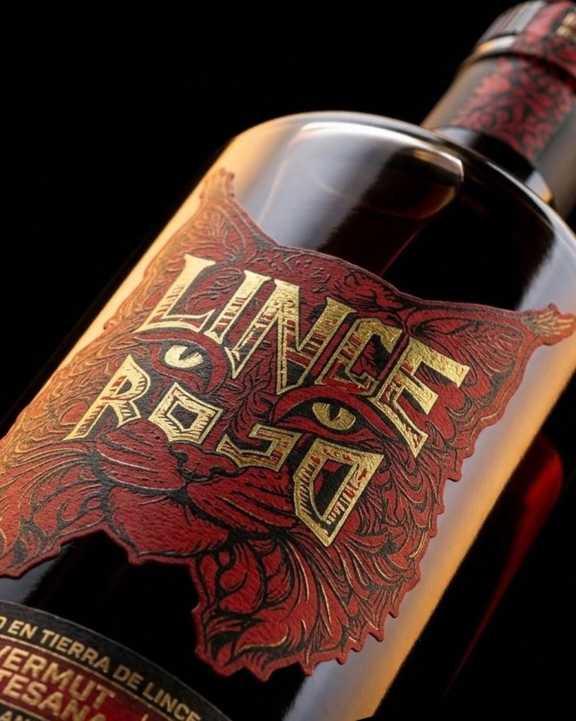

Lince Rojo is an artisanal vermouth born in the Extremaduran dehesa, with a distinctive touch of acorn that sets it apart from any other vermouth on the market. At Ideólogo, we developed its corporate identity and packaging design, with the goal of building a brand capable of conveying the wild, authentic character of its land of origin.
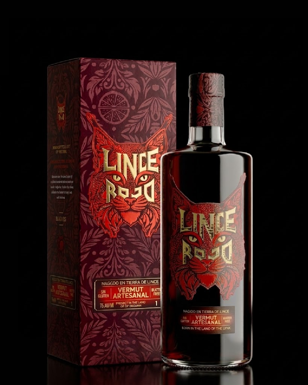
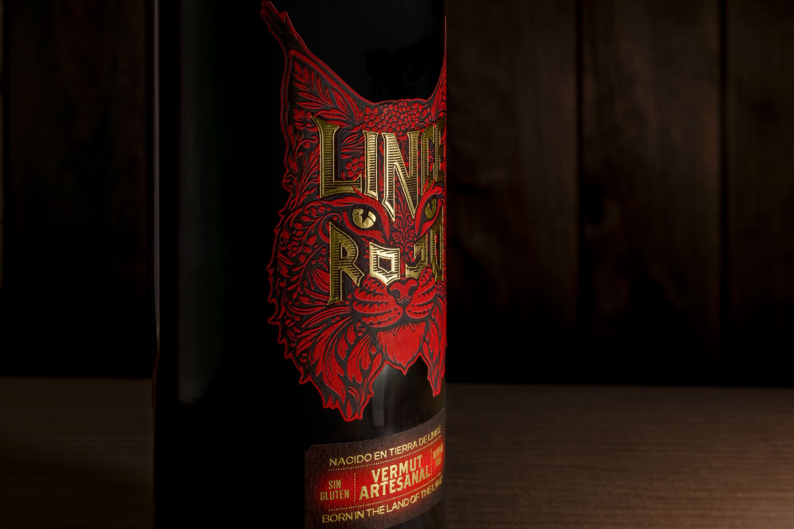
To achieve this, we built a visual system with a personality of its own, with the Iberian lynx as the star of the packaging: a palette of intense reds and maroons and a typeface that combines strength and elegance. We carried that character into every detail, from the labelling to the claim “Nacido en tierra de lince” (“Born in lynx country”), turning the bottle into a statement of origin.
The result is an identity that stands out from the usual brands and wins over those looking for something different. At Ideólogo, we build brands with personality and turn them into brands that sell more and better. That is the Lince Rojo mark.
Curator’s Insight
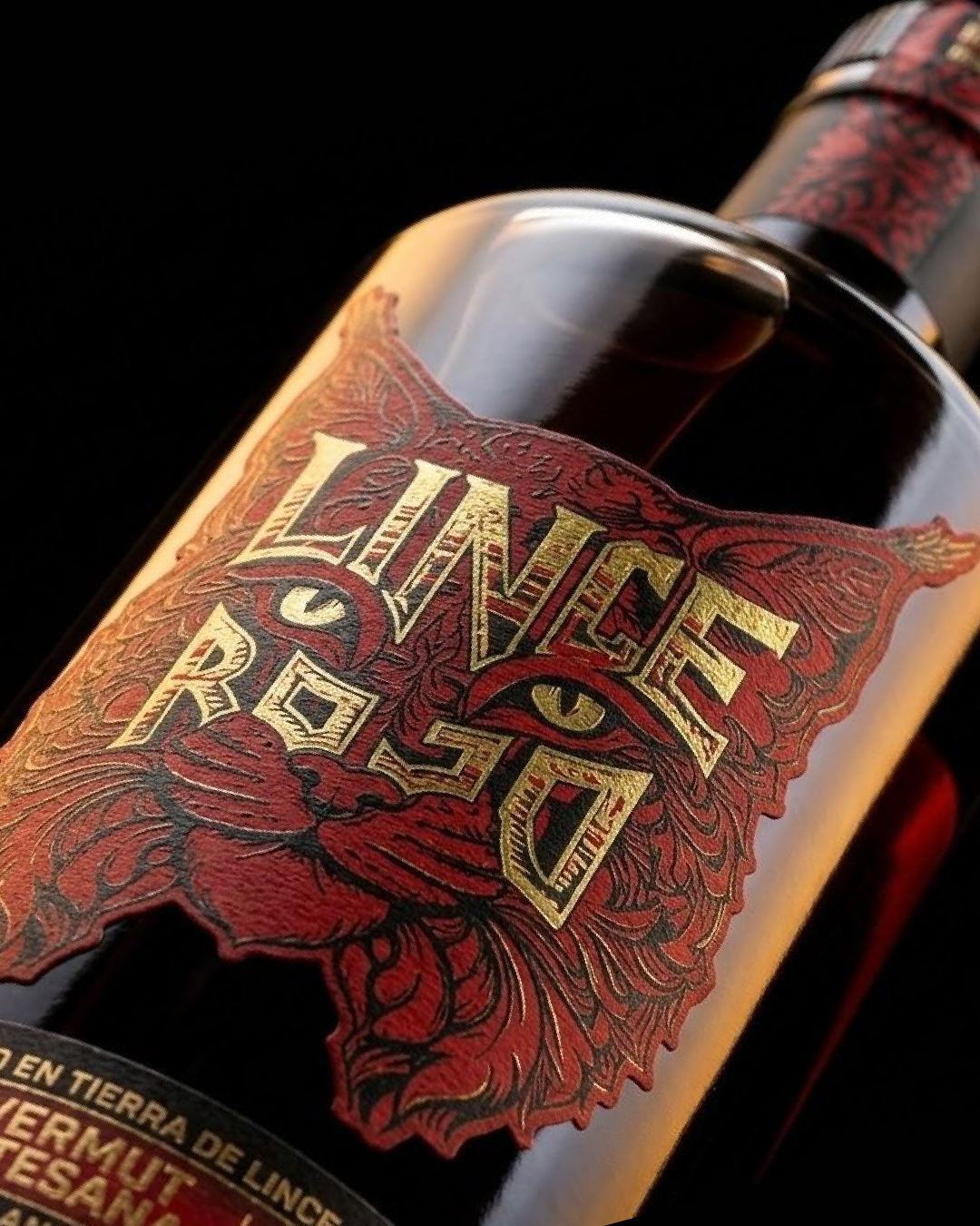
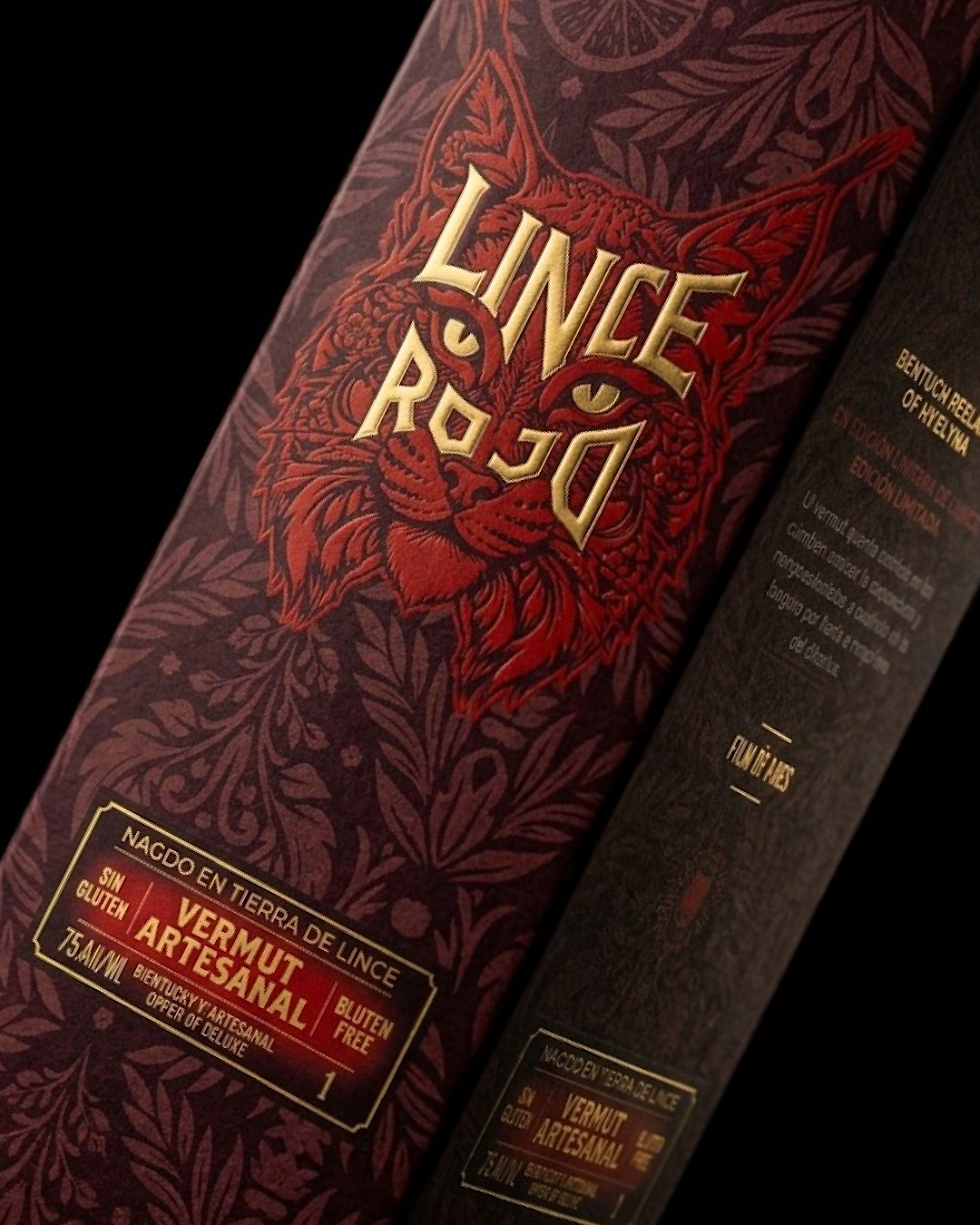
The strongest decision here is that the label is cut to the lynx’s silhouette, so the animal and the nameplate are one shape. The ear tufts break the rectangle, and the eyes sit between LINCE and ROJO, so the letters read as part of the face and the reading order is left to the viewer. Gold foil is reserved for the lettering, while the illustration stays in red and black linework, which keeps the name legible against dense detail. The box supports this with a tonal leaf-and-citrus pattern, quiet enough that the foil lynx dominates. On a dark bottle the cut label floats over the liquid and the outline reads from a distance. When the name carries the emblem, the label needs no separate logo or frame.
 alchimistestudioParis
 Estudio Argo
 Modern Theory
 monther al omari
 Ohmybrand
 Affogato Brand Design
 Tancybox
 waanrong
 nazystudio
 Daria Fox
 g.apolly
 sahildoesartt
 Stiandco
 BREAK DESIGN
 ShreyaDighe
 Sameh Elnahas
 Minim Brand Design
 Ebbi
 Shabouk Printing & Packaging (Shabouk Carton Boxes – شعبوق)
 Brandegree
 Abbydraw Designs Unique Conceptual Branding & Packaging Designing Ideas
 bilel tkouri
 NEV
 Stefano Bracci
 Alina