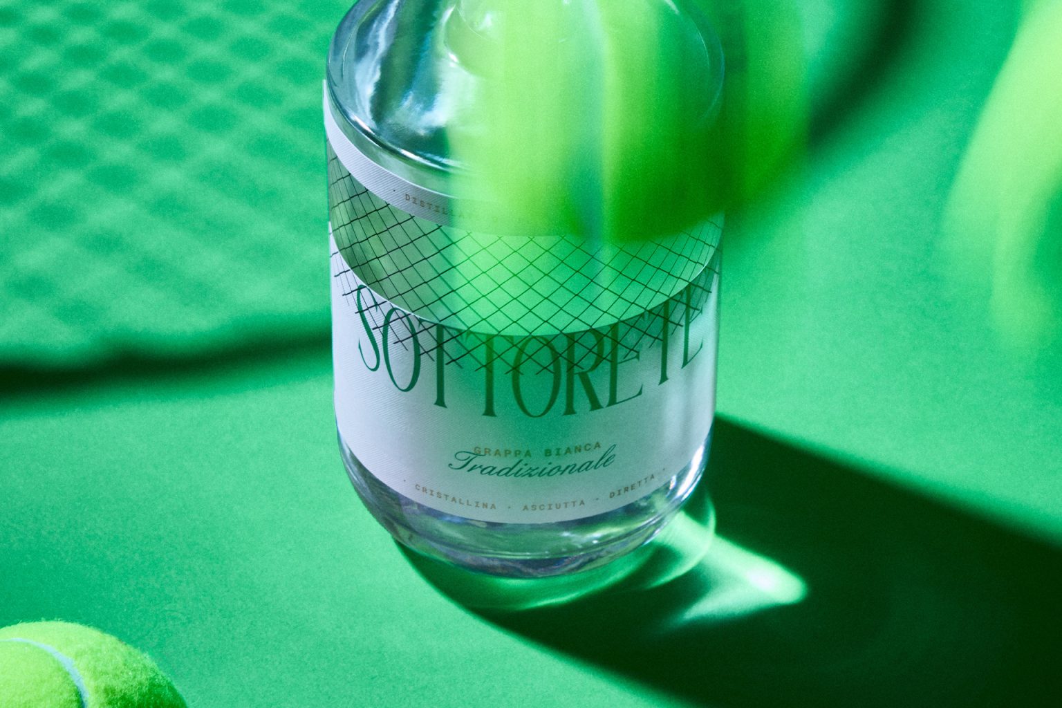

Forecourt: When design takes the field.
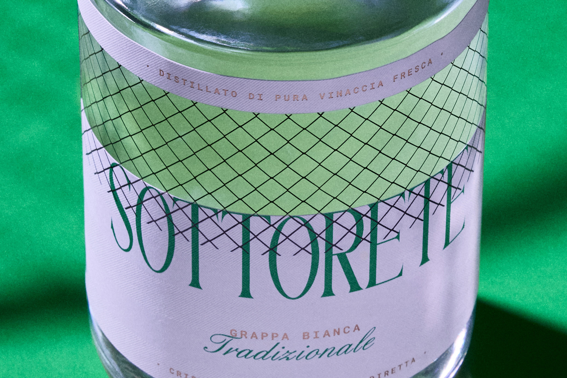
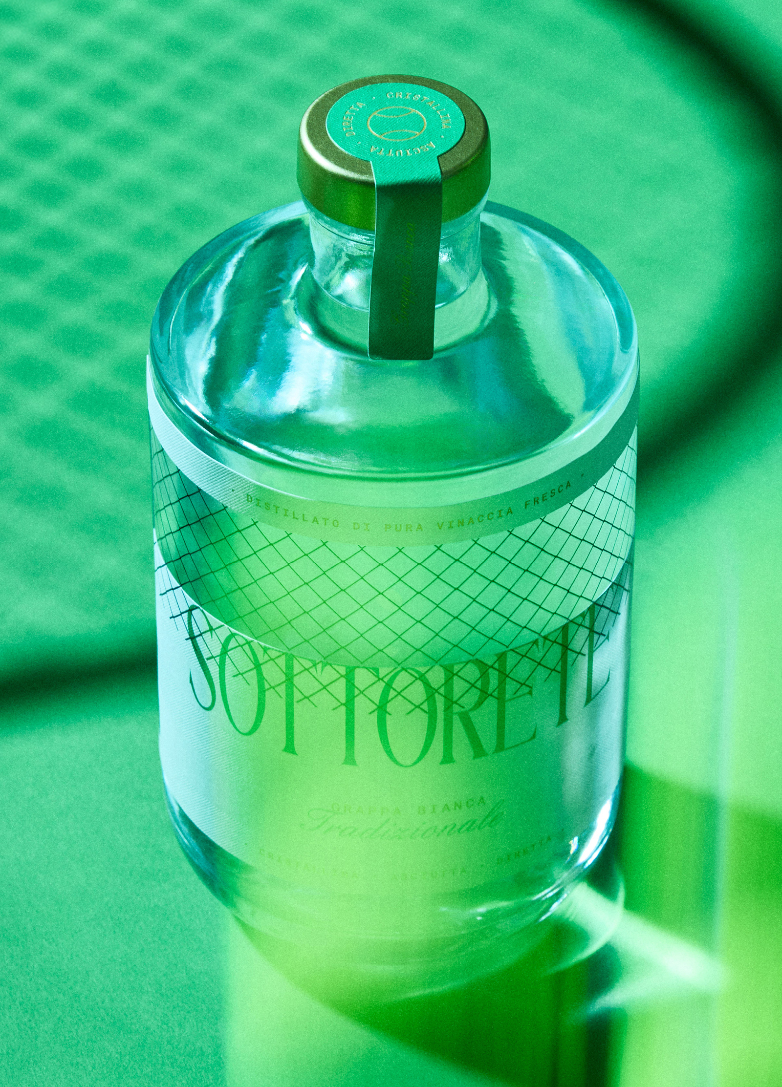
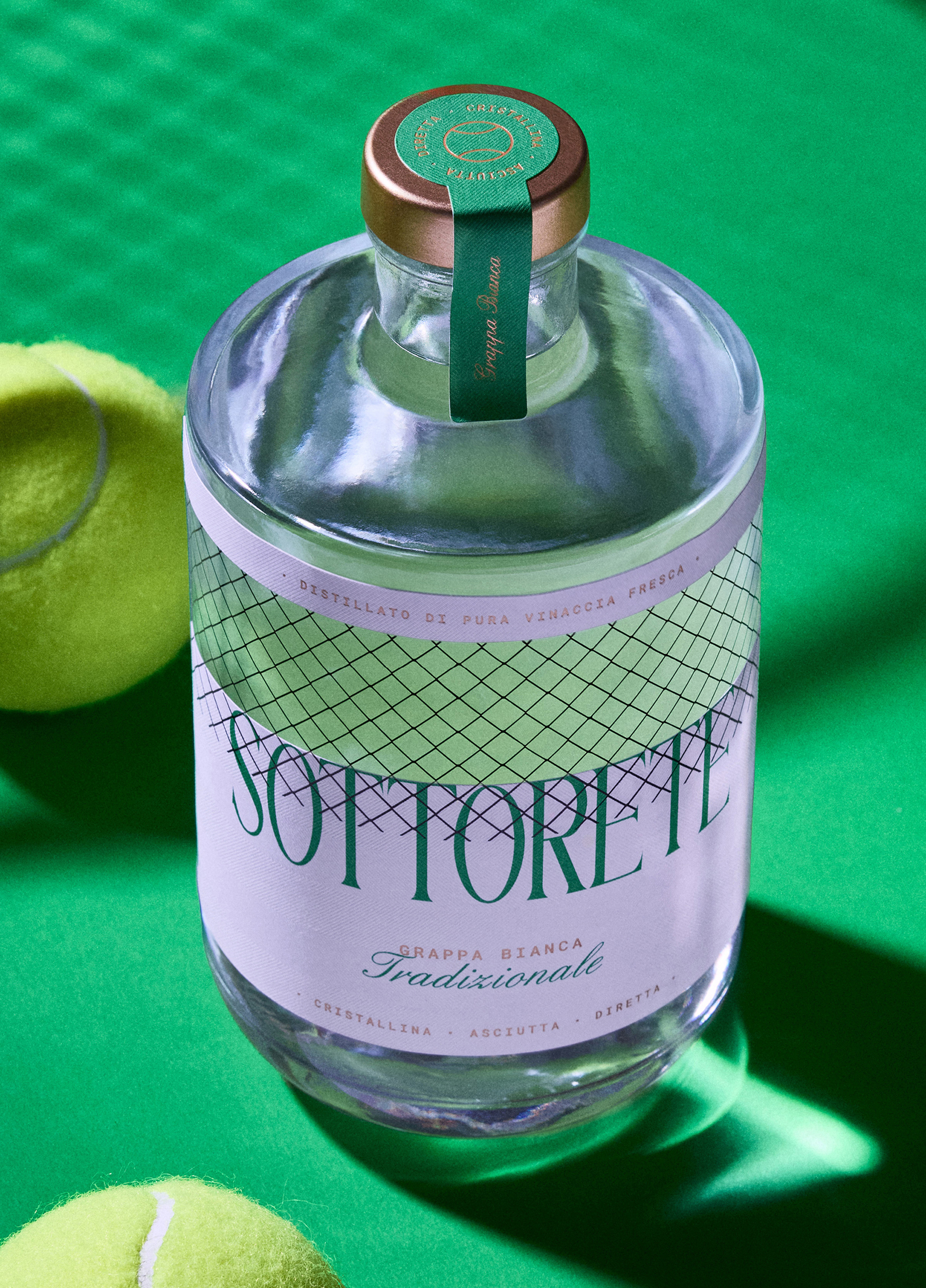
For the 2026 edition of Packaging Première, we created a packaging for a grappa that thrives on lines, rhythm, and tension. Its name is “Sottorete”. Not just a simple label, but an idea that dialogues with the glass, transforming the bottle into a miniature playing field to observe and experience.
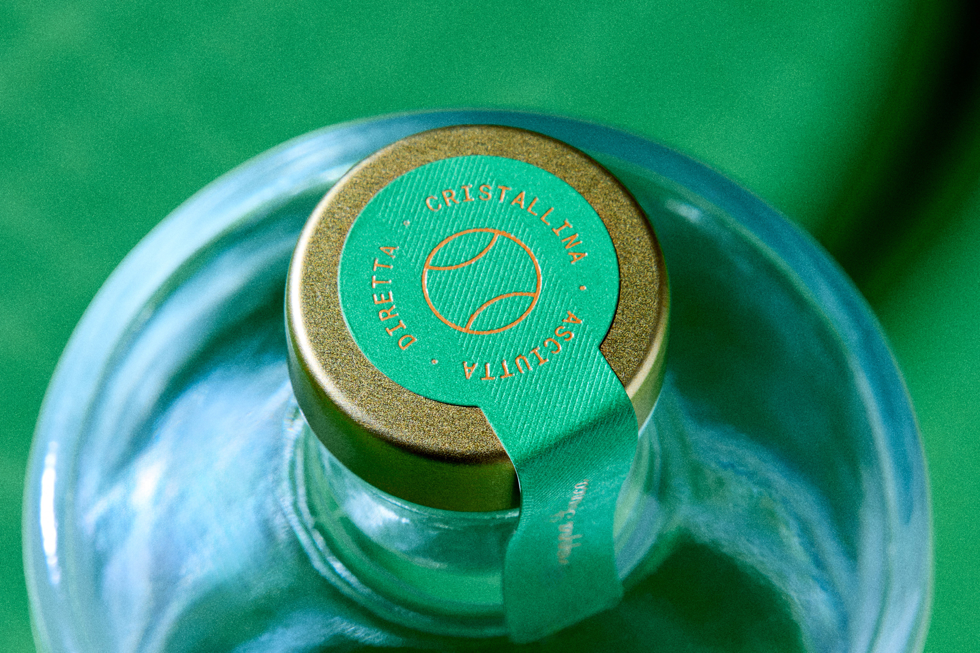
Print: Etic.a labels Glass bottle: Vetreria Etrusca Closure: Vetropiù Adhesive: Avery Dennison Fasson Foil: Luxoro by Kurz
Curator’s Insight
What lifts Sottorete above the category of “concept packaging” is how fully it commits to the metaphor as a structural design decision rather than a surface treatment. The net grid isn’t applied as decoration… it functions as a label that acknowledges the bottle’s three-dimensionality. Because the pattern is printed on a wrap that the clear glass reads through, the trellis shifts and refracts depending on viewing angle and light, giving the bottle a kinetic quality that most label design actively avoids.
The color pairing is doing precise tonal work: the soft pink of the label against the hard, saturated court green of the art direction creates a contrast that feels simultaneously vintage and contemporary. The choice of a high-contrast serif for the logotype that is spaced wide and stacked brings editorial weight that positions this closer to fashion or fragrance than to traditional grappa packaging. The gold capsule resolves the composition at the top without competing; it reads as a trophy rather than an afterthought. For a limited-edition competition brief, the execution is tight enough to function as a permanent identity.


 agarcia studio
 Wynand88
 Eva Chistyakova
 Maria Bukhtilova
 estudiomarciano
 monther al omari
 Thirst
 Maruf Nishat
 Gray Matter Studio
 Julia Jay
 Modern Theory
 Furt Goods
 Fluid
Fluid alchimistestudioParis
 Ancora
 Mostafa Abdelmawla
 MewKittyDraw
 Studio Shala
 43oz
43oz Lucid mk2
 Atiq Alam
 IDEOLOGO
 Open Strategy & Design