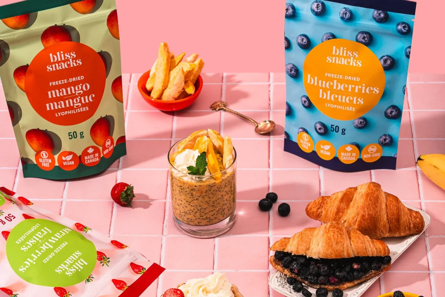

Bliss Snacks, a Canadian snack brand known for delivering indulgent-yet-accessible treats, expanded into the healthy snacking space with a new line of freeze-dried fruit products. The brief required packaging that felt like a natural, confident extension of the established Bliss brand, maintaining the visual language and colour identity consumers already recognized, while carving out clear shelf presence in the competitive better-for-you snack category.
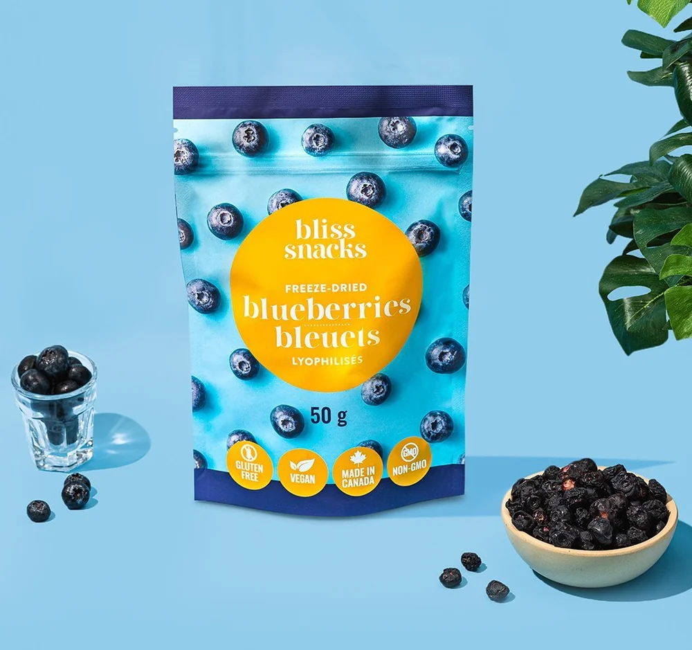
Eye Candy Design built the packaging system directly from Bliss’s existing brand assets: the signature colour palette, clean modern typography, and overall aesthetic were preserved and adapted for four fruit varieties (strawberry, blueberry, mango, and banana). Working within a tight production budget that precluded a dedicated photography shoot, the team curated and integrated vibrant, high-quality stock imagery that conveyed the natural freshness and texture of each fruit. Each SKU was given a distinct colour-forward treatment that communicates flavour at a glance while the system reads as a unified range on shelf.
The design balances clarity with appetite appeal, bold enough to stop the scroll, structured enough to communicate the health and convenience positioning that defines the freeze-dried snack segment. The pouches successfully launched across multiple formats, giving Bliss a credible entry point into the growing on-the-go healthy snack market without disrupting the core brand identity that drives loyalty across their existing product family.


 Natasha Spitsyna
 babyage
 GruppoSaida
 ahmedraoudgfx
 Hi estudio
 Nadezhda Gorelikova
 Studio Garces
 Brandsbylufo
 Rewot
Rewot alchimistestudioParis
 Asprey Creative
 kat bres
 Valérie Colace
 Atiq Alam
 Sara Communications
 David Hakobyan
 monther al omari
 Innovāt - Empowering Creative Innovation
 mmdesign
 Amjad Battal
 Hollóka Grafikai Műhely / Graphic Design Studio
 Palashcc
 ABC Design Communication
 ChrisSkarlatos
 Hedayat Hadavi
 Tia Nguyen