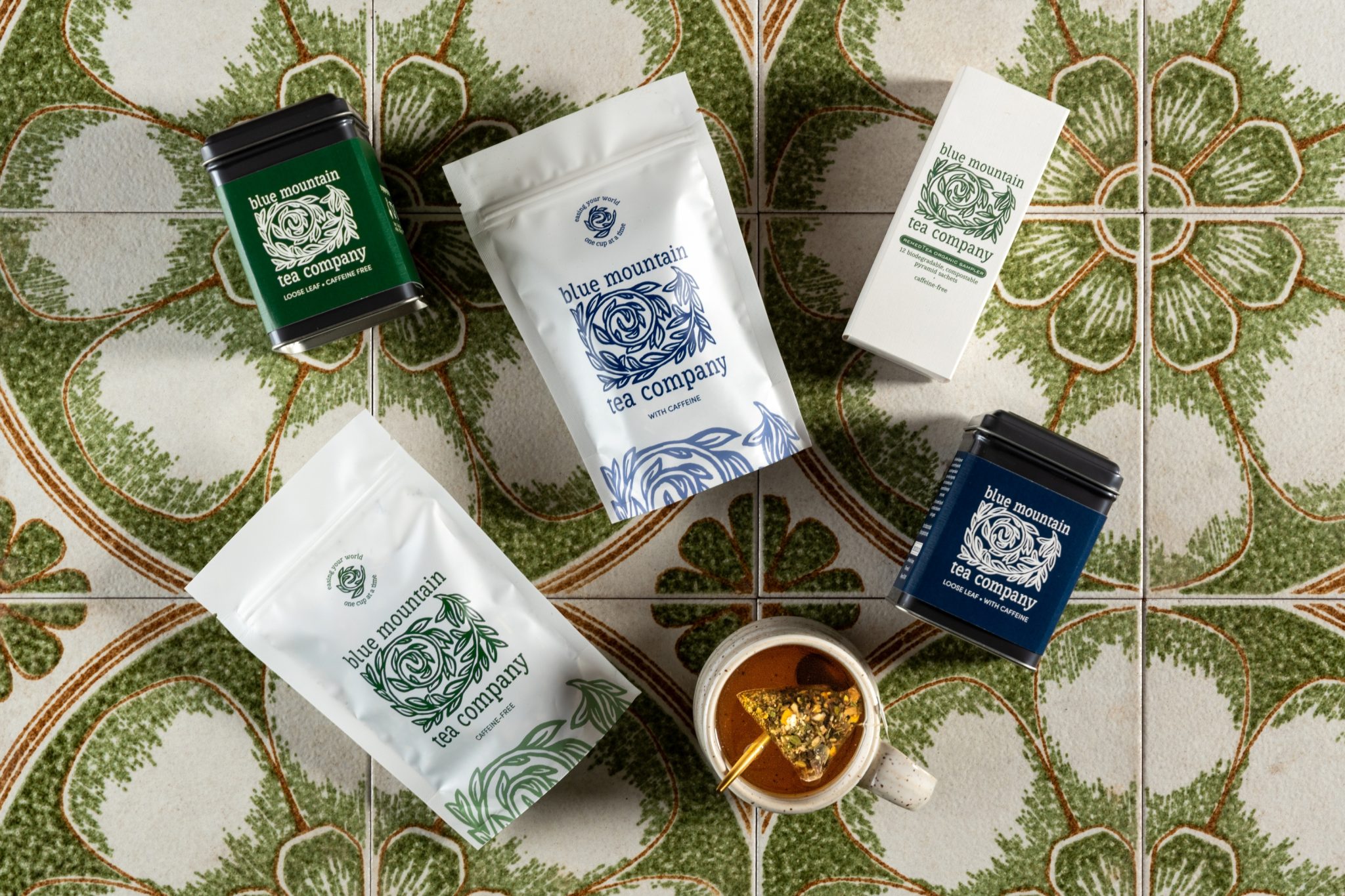

Blue Mountain Tea Company, based in Collingwood, Ontario, had built a loyal local following through its beloved in-store experience. Owner Katherine Maxwell was ready to grow, building e-commerce and entering select retail stores, but knew the brand’s existing visual identity needed to be elevated to compete in those new channels. The challenge was to evolve the brand without losing the warmth and familiarity her existing customers had come to associate with it, particularly the signature swirl element in the logo.
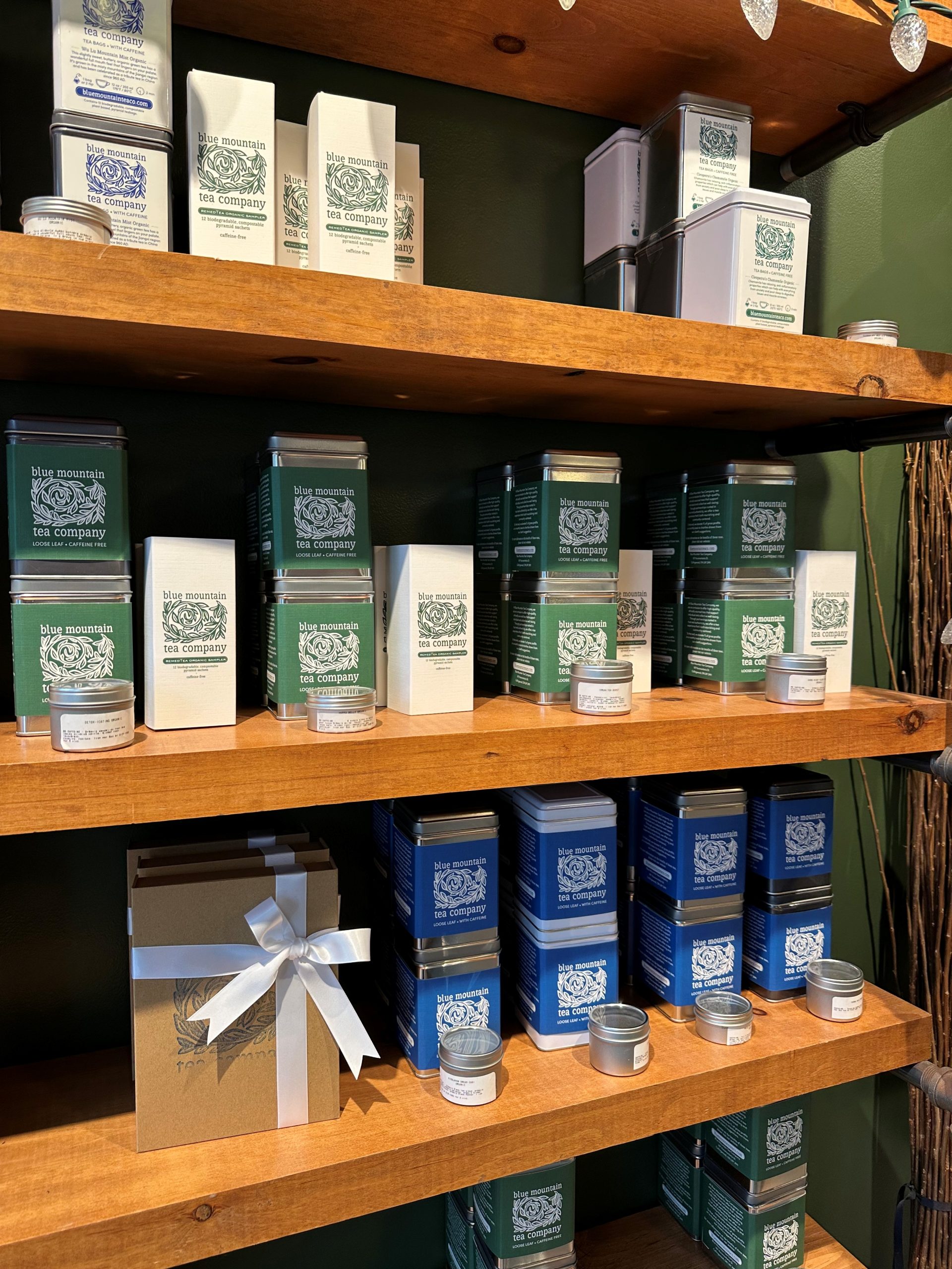
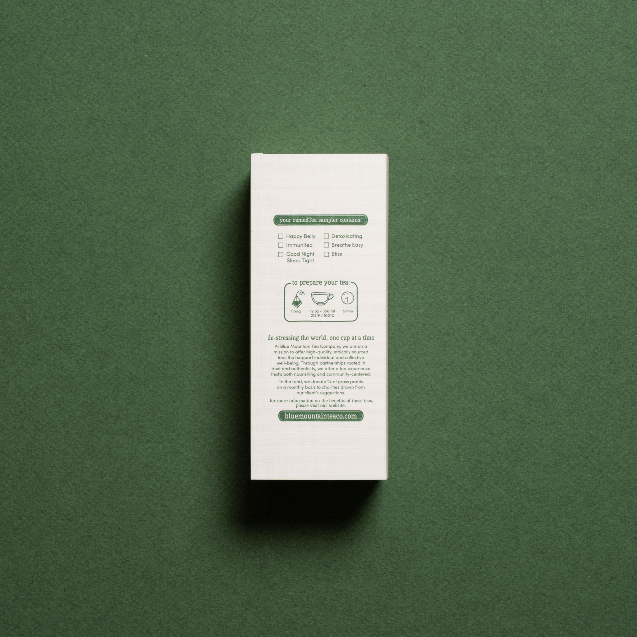
Eye Candy Design approached this as a careful refinement rather than a replacement. The swirl was stylized and strengthened, retaining its emotional resonance while gaining the polish required for retail environments. A dual primary colour system was introduced across the packaging range: blue for caffeinated teas, green for caffeine-free, enabling instant visual navigation both on shelf and online without requiring customers to read the fine print. The scope included a complete set of tea packaging, a distinctive sampler box concept executed by Pique Packaging, and marketing collateral to support the expanded distribution strategy.
The rebrand delivered measurable business results. The new sampler product recouped the entire design investment within three months of going on sale, according to the owner’s words. The sampler packaging was recognized with a 2025 Canadian Printing Award by PrintAction, further validating the design’s craft and commercial value. For a small-batch tea brand moving into omni-channel retail, the rebrand proved that great design is not a cost, it’s an accelerant.


 Natasha Spitsyna
 babyage
 GruppoSaida
 ahmedraoudgfx
 Hi estudio
 Nadezhda Gorelikova
 Studio Garces
 Brandsbylufo
 Rewot
Rewot alchimistestudioParis
 Asprey Creative
 kat bres
 Valérie Colace
 Atiq Alam
 Sara Communications
 David Hakobyan
 monther al omari
 Innovāt - Empowering Creative Innovation
 mmdesign
 Amjad Battal
 Hollóka Grafikai Műhely / Graphic Design Studio
 Palashcc
 ABC Design Communication
 ChrisSkarlatos
 Hedayat Hadavi
 Tia Nguyen