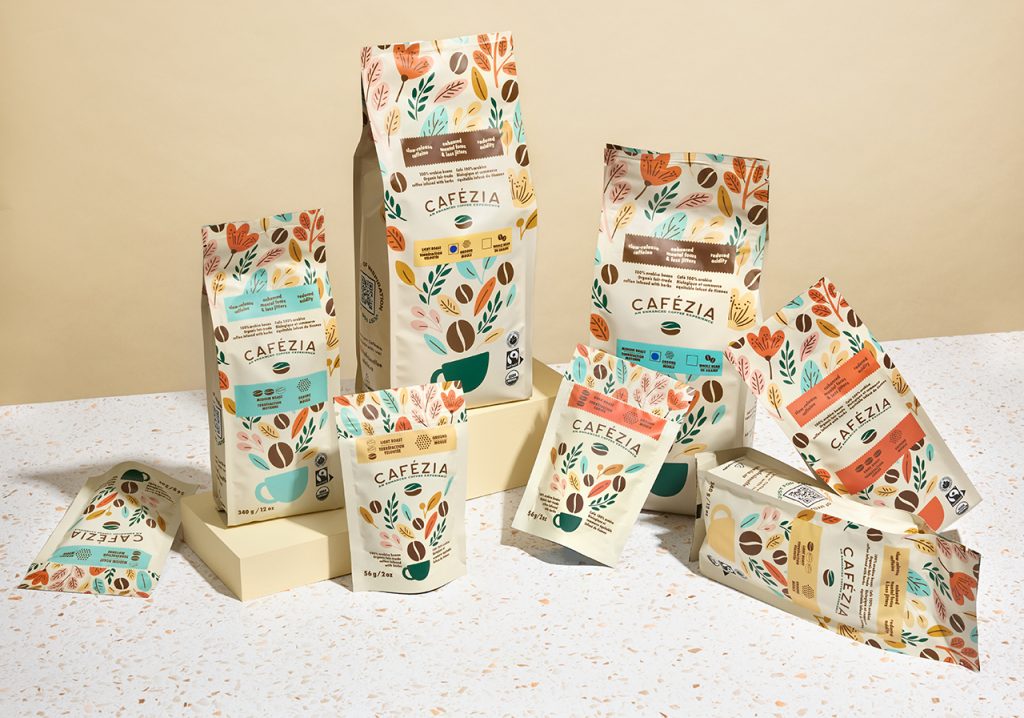

Cafezia offers something genuinely different in the coffee category: whole bean and ground coffee infused with tasteless herbs, formulated to reduce stomach upset and the jittery side effects associated with caffeine. The product’s unique position demands a degree of consumer education, and the existing branding failed to communicate this USP, leaving a compelling differentiator largely invisible on shelf and online.
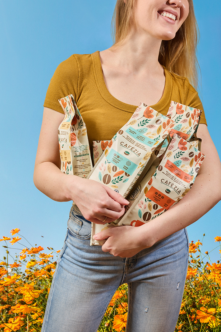
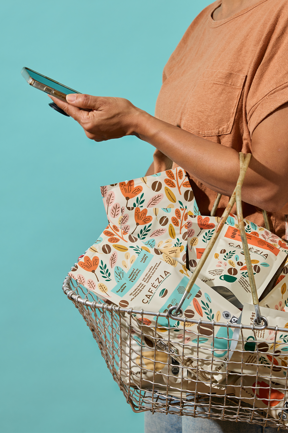
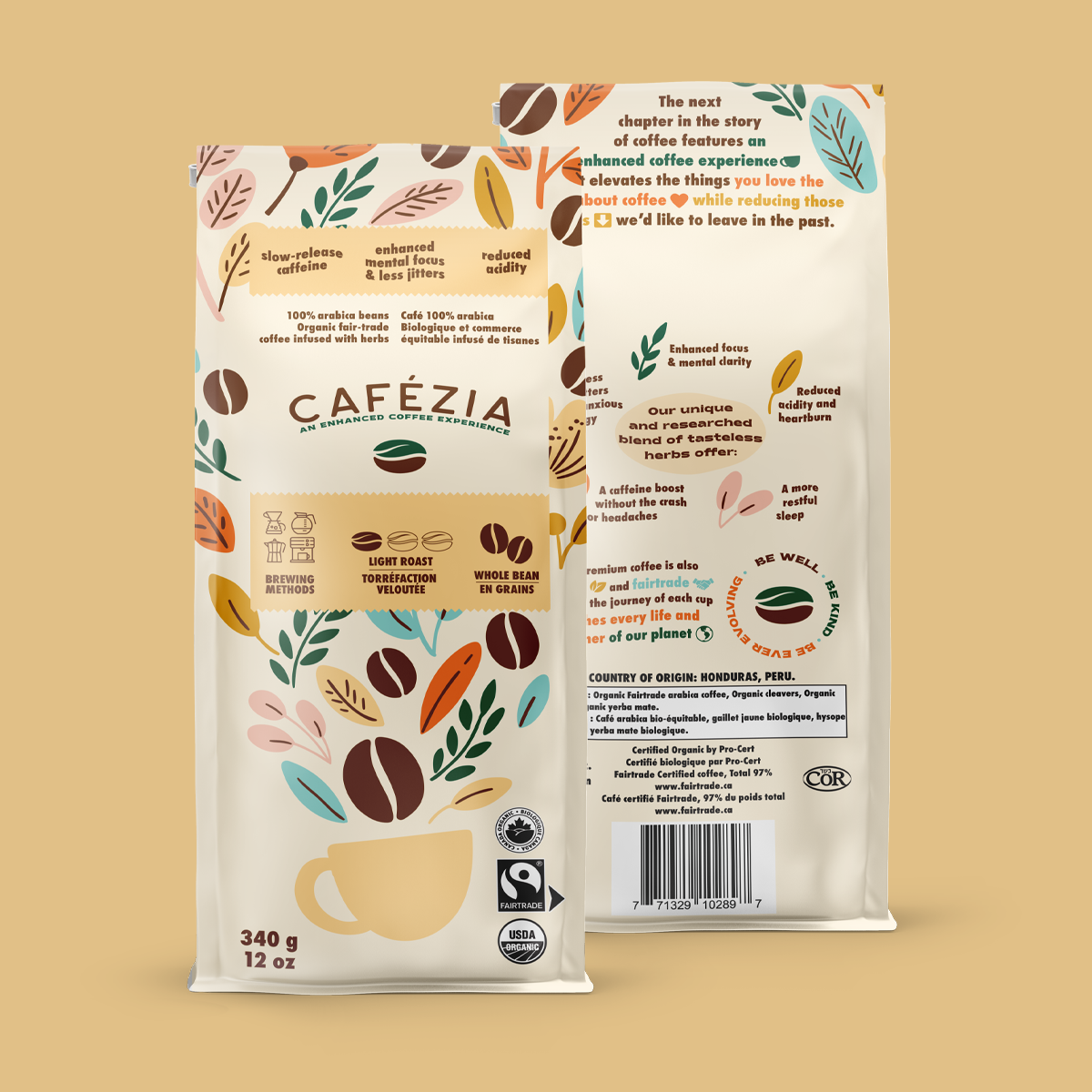
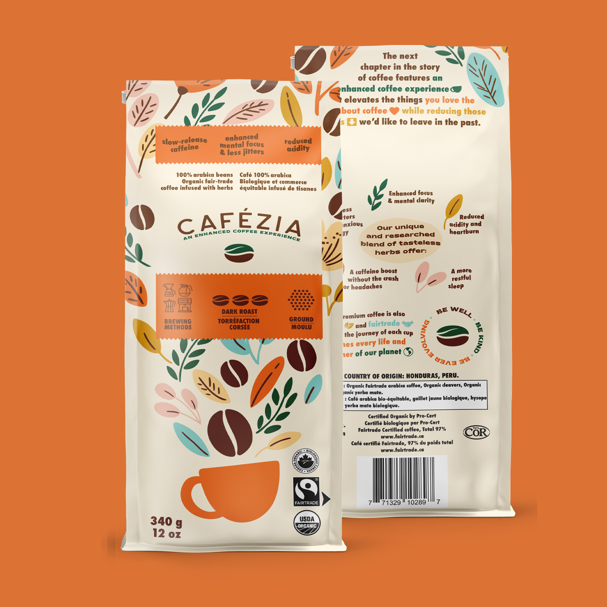
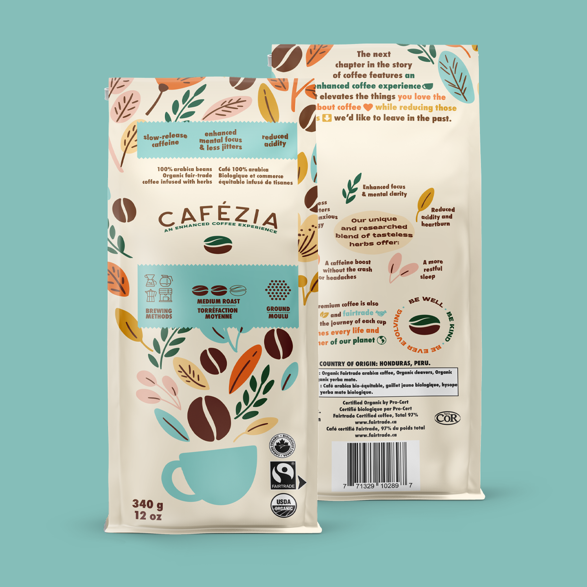
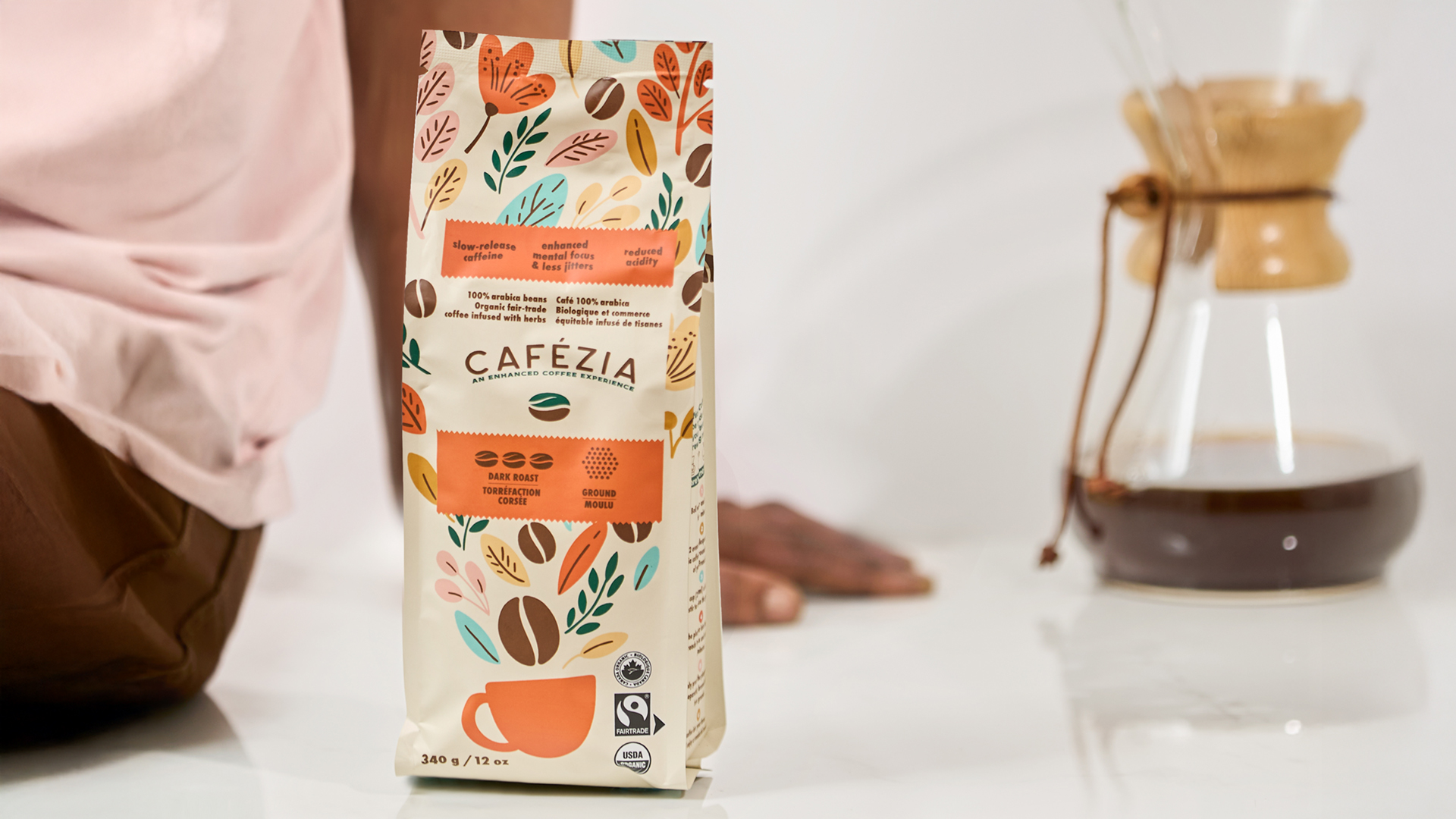
Eye Candy Design rebuilt the brand from the logo outward, embedding the value proposition directly into the visual identity. The new logo mark fuses a coffee bean with a leaf, making the herb-infusion story immediately readable as a symbol. Packaging artwork directly illustrates what consumers can expect inside each bag, a design approach that treats the label as a guide rather than just a carrier of brand aesthetics. Retail-ready display boxes, advertisements, and front-end website design were also developed as part of the full scope.
The impact was measurable and swift. Within the first six months of launching the new packaging, Cafezia’s product entered 25 additional cities across Ontario. Four new retailers stocked the product based on packaging and brand elements alone, without sampling the coffee first. Combined on- and offline sales grew 40% in the first year, demonstrating directly how strategic packaging design can unlock distribution and drive revenue for a differentiated CPG product.

 Natasha Spitsyna
 babyage
 GruppoSaida
 ahmedraoudgfx
 Hi estudio
 Nadezhda Gorelikova
 Studio Garces
 Brandsbylufo
 Rewot
Rewot alchimistestudioParis
 Asprey Creative
 kat bres
 Valérie Colace
 Atiq Alam
 Sara Communications
 David Hakobyan
 monther al omari
 Innovāt - Empowering Creative Innovation
 mmdesign
 Amjad Battal
 Hollóka Grafikai Műhely / Graphic Design Studio
 Palashcc
 ABC Design Communication
 ChrisSkarlatos
 Hedayat Hadavi
 Tia Nguyen