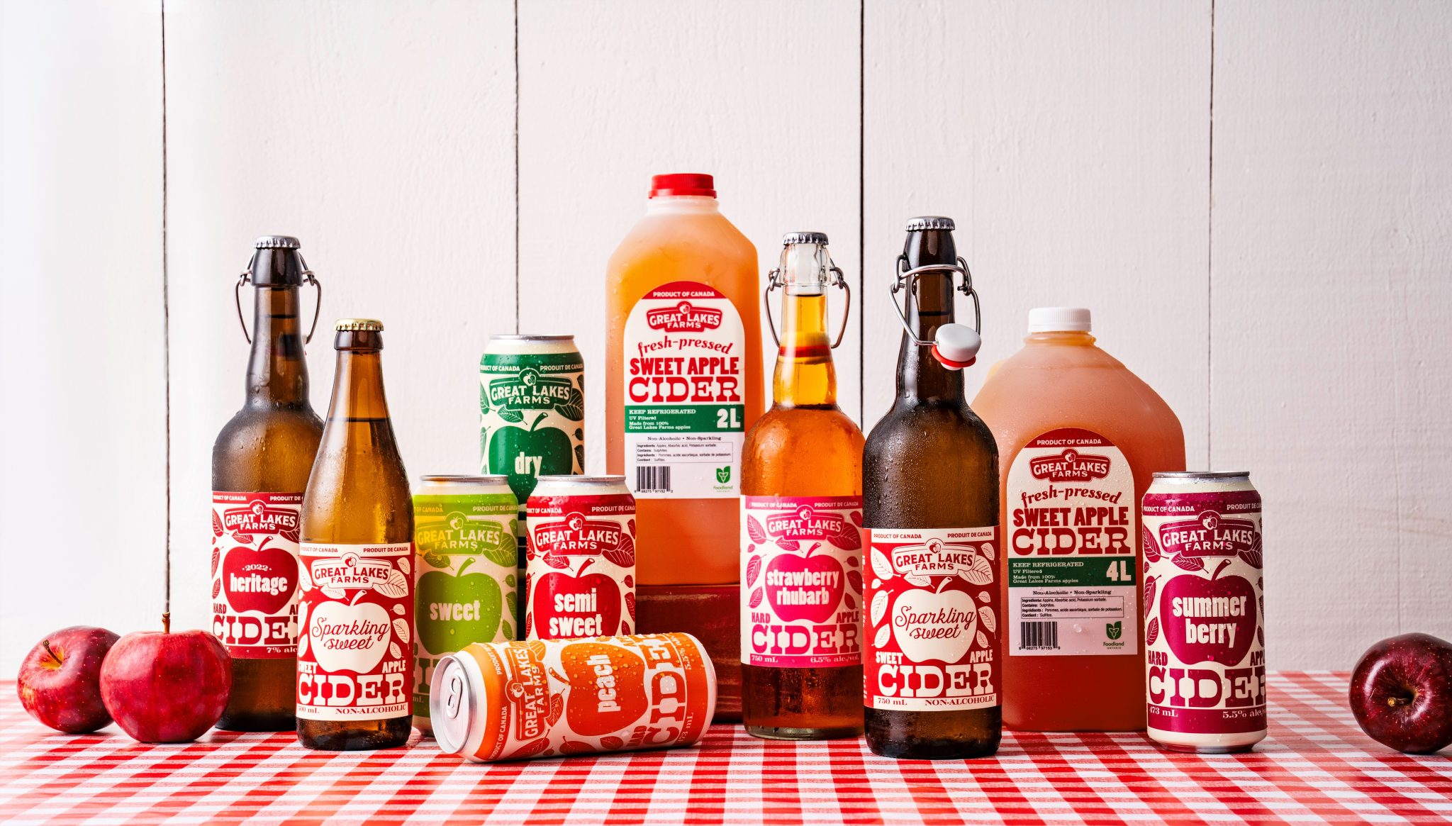

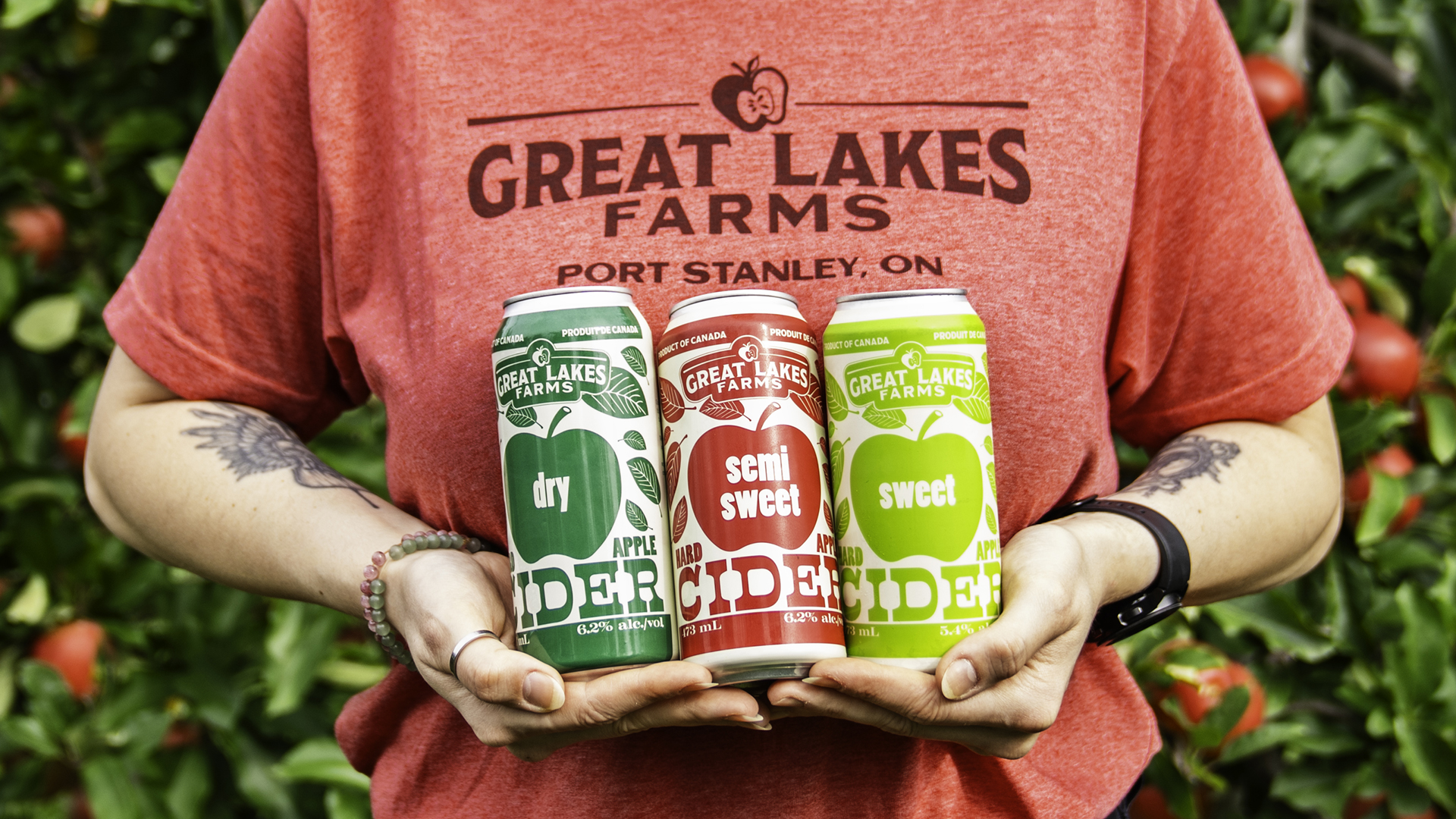
Great Lakes Farms, an Ontario apple farm, launched its first estate cider line, semi-sweet, dry, and a limited-edition seasonal variety, with 100% of the fruit coming from the property. The brief called for packaging that felt unmistakably artisanal and farm-fresh while standing out confidently on retail shelves and in the growing craft cider category. The project followed a full rebrand of the farm’s overall identity and needed to carry that refreshed visual language into bottles and eventually cans.
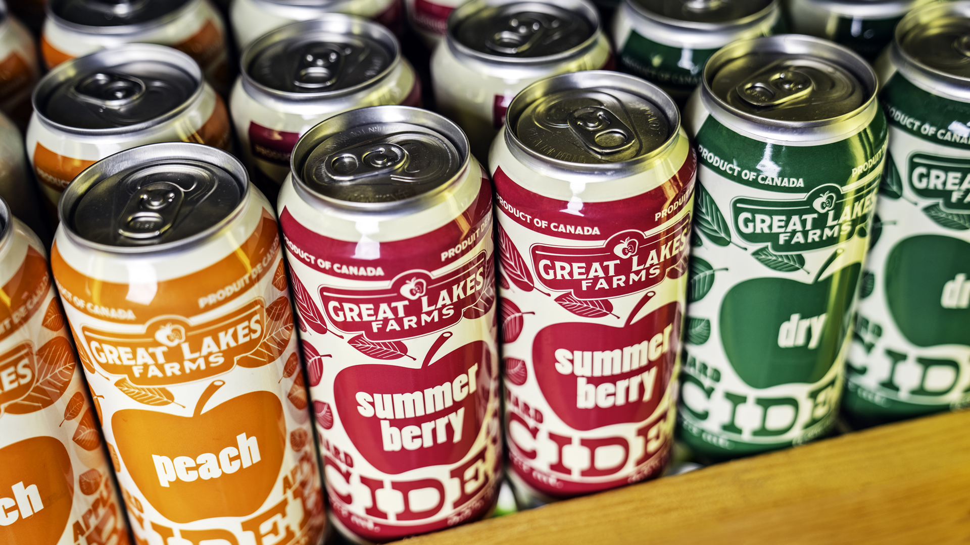
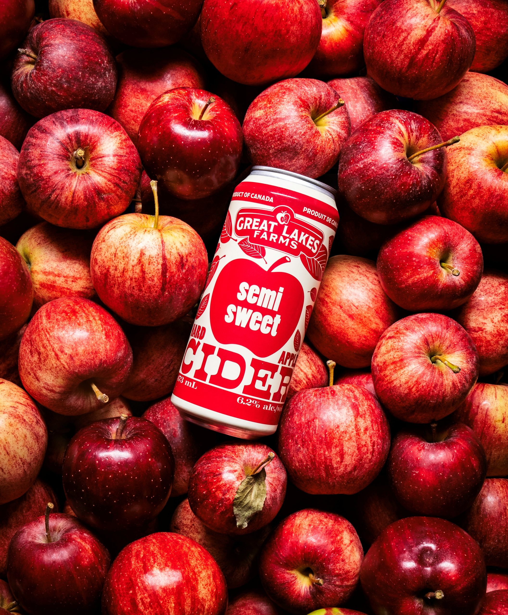
Eye Candy Design developed a bold, fruit-forward label system anchored by a statement apple graphic in a vibrant, high-contrast colour palette. Large expressive typography gives the packaging farmstand energy, confident and direct rather than fussy or rustic-cliché. Key product details, including the apple varieties used in each expression, are woven into the design to communicate provenance and craftsmanship without cluttering the label.
The design proved highly adaptable: it translated cleanly into a can format as the product line expanded, and the colour palette was extended in 2023 to accommodate additional flavour varieties. The project was recognized by The Dieline packaging blog for its bold typographic approach and farmstand vibrancy.





 monther al omari
 Ximena Ureta Design Studio.
 vitoramockup
 Up-Brands
 Sophiagdotcom
 Peter said
 ayeidadezigns
 Tancybox
 宏洛图品牌设计HONGLT
 Modern Theory
 Dozen Agency
 Atiq Alam
 Olio Studio
 Ruchi S. Joshi
 mmdesign
 awaiskhadim
 Octasoft
 United Creatives Studio
 Kingdom & Sparrow
 Anastasia Bakhmatskaya
 CreativeWise
 Great and Golden