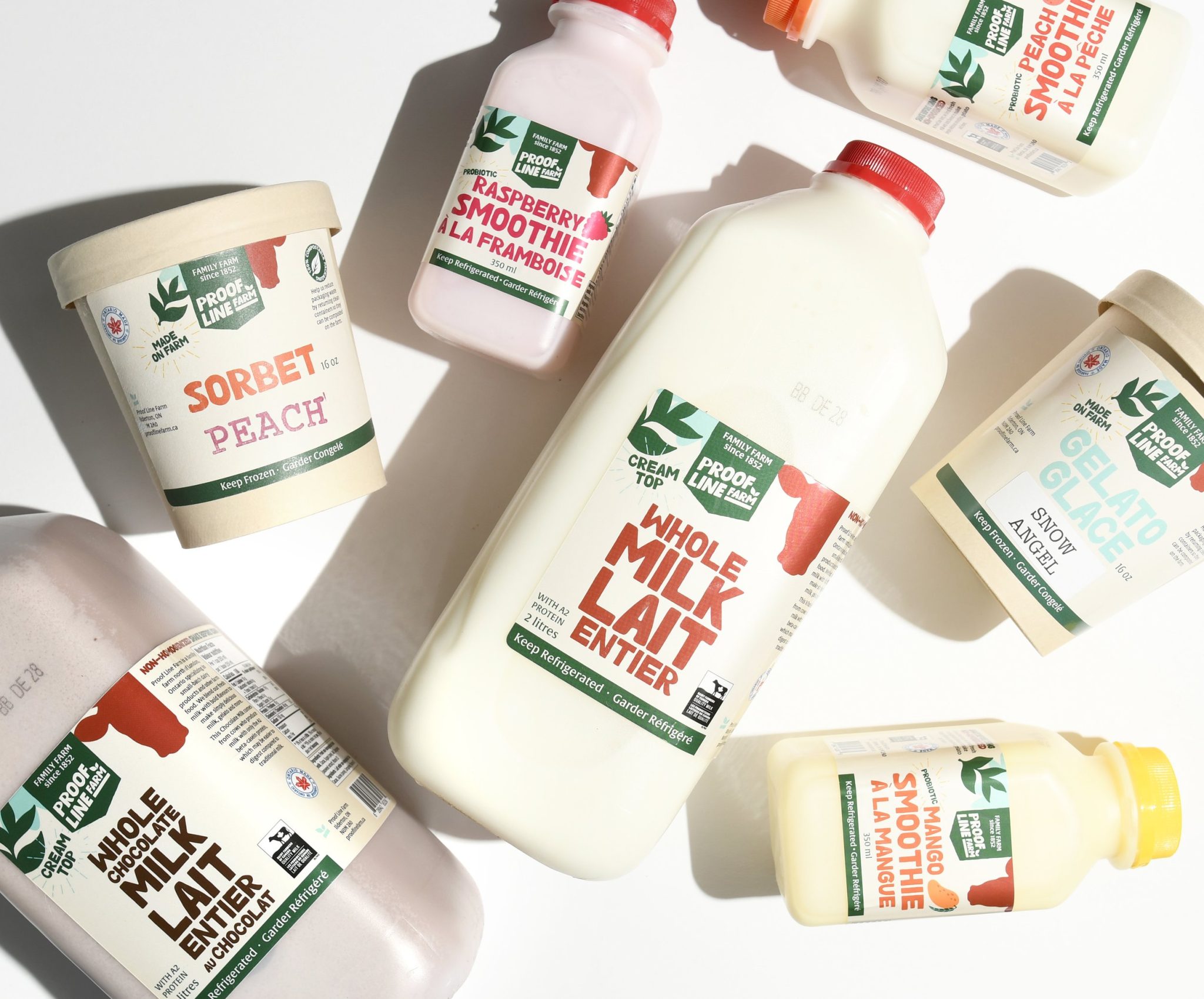

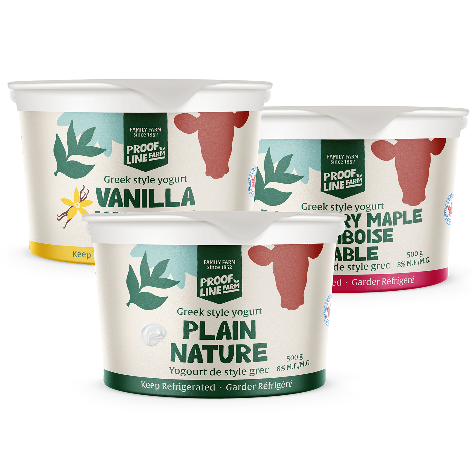
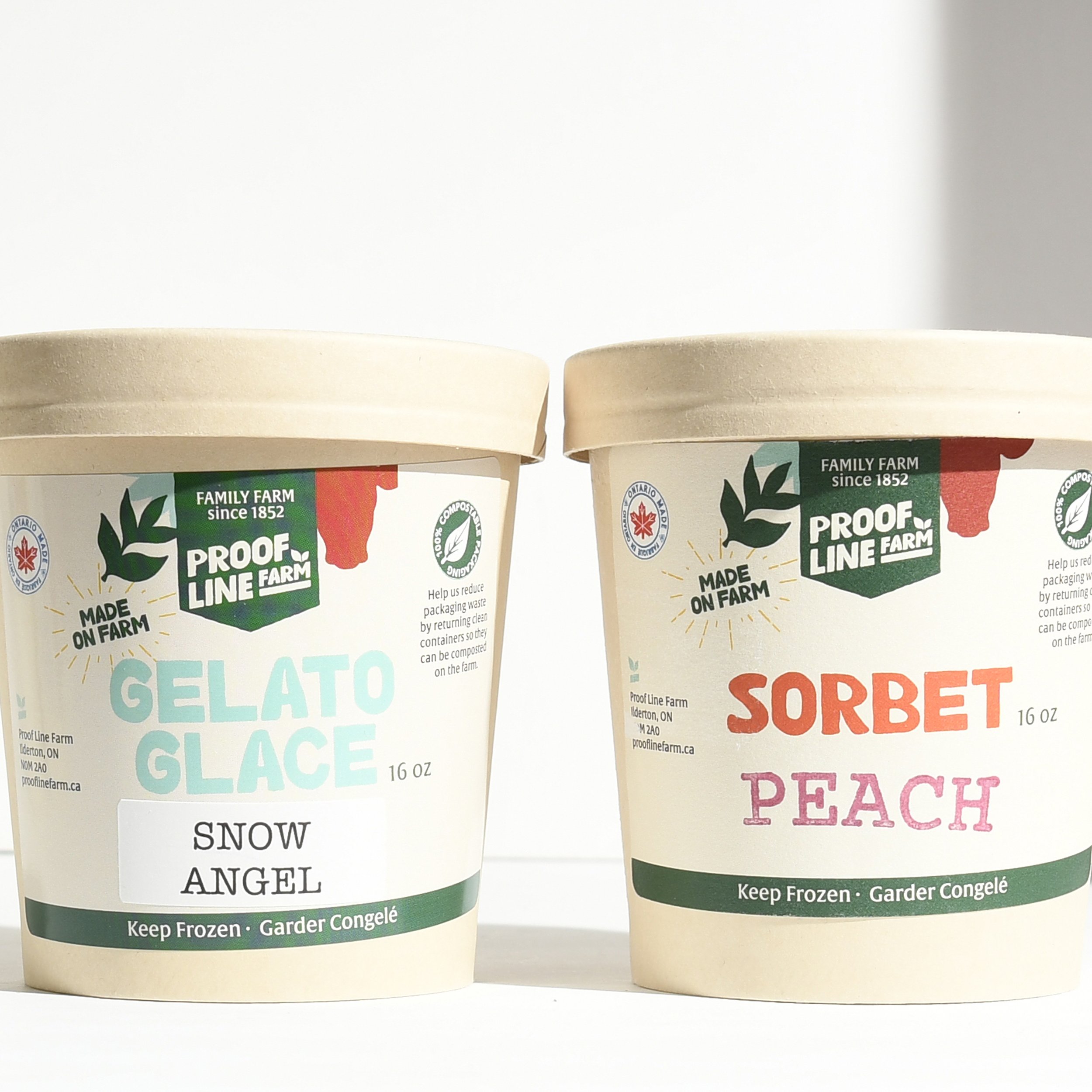
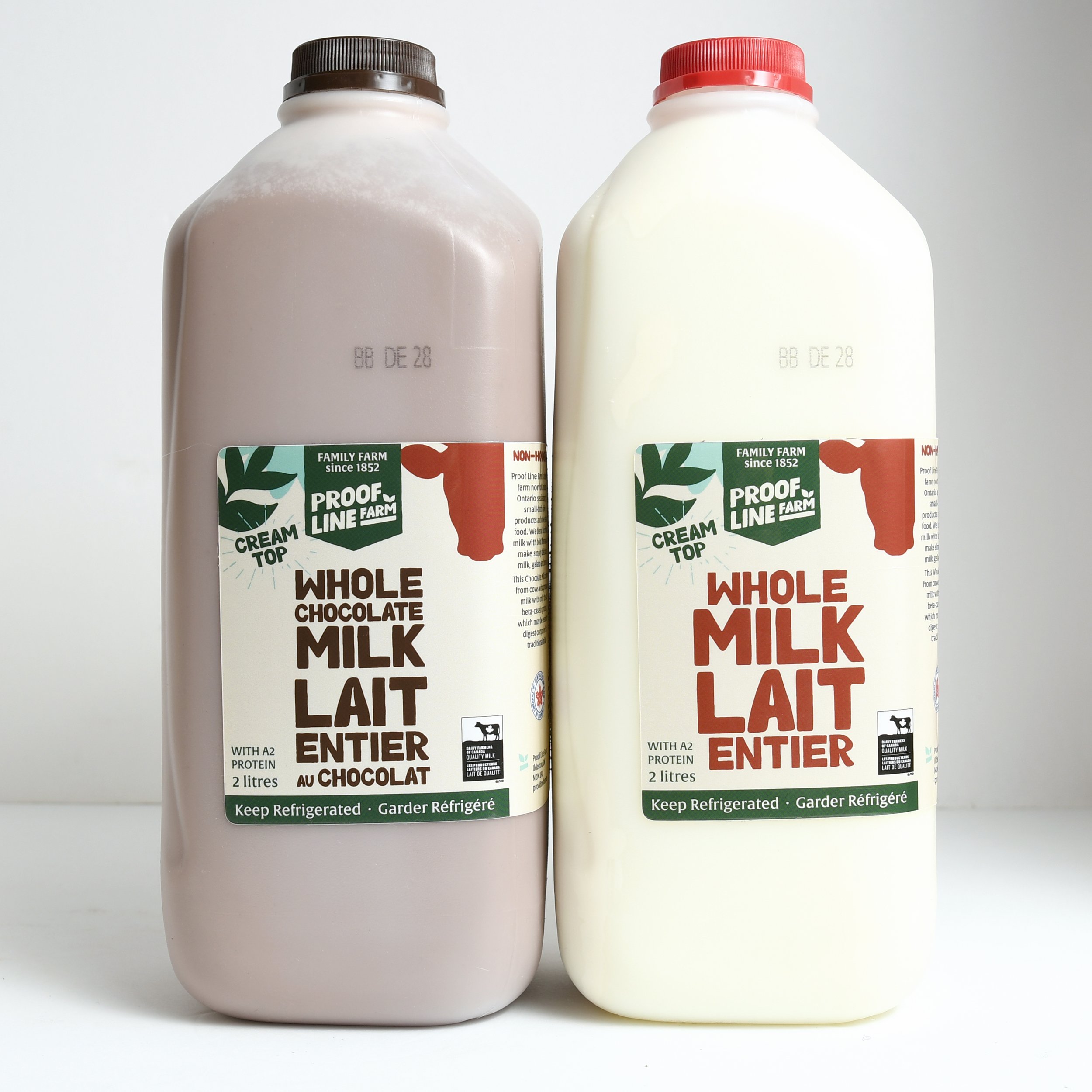
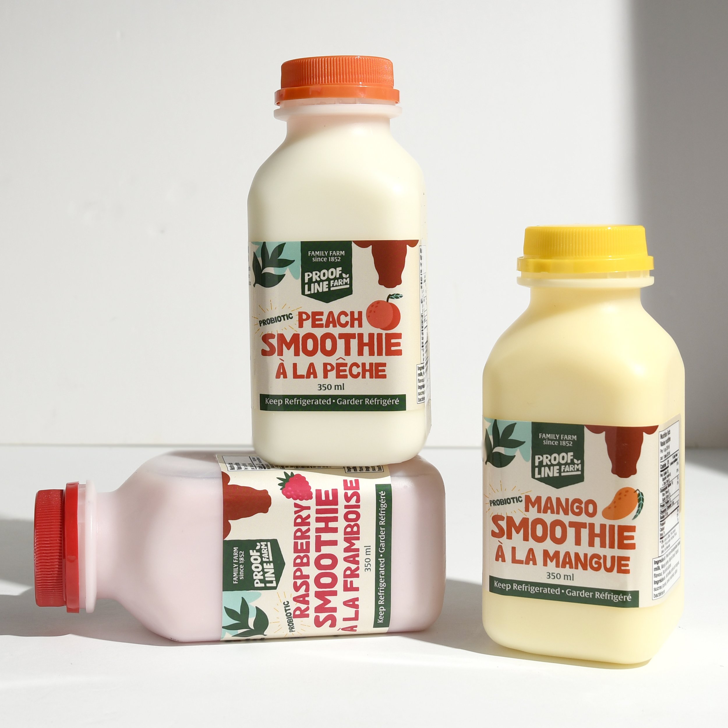
Proof Line Farm, an Ontario dairy operation with generations of farming heritage, was expanding beyond farm-gate sales into farmers markets, specialty food stores, and regional retail. With an existing brand identity in place, the challenge was not to redesign — but to build a rigorous packaging system that translated their visual identity faithfully across a diverse lineup: fresh milk, artisanal yogurt, premium gelato, and specialty dairy items, all with different container formats and retail requirements.
Eye Candy Design developed a comprehensive brand extension framework, expanding the existing colour palette and typography hierarchy into a flexible system that could accommodate each product category while maintaining cohesive recognition across the range. Colour coding plays a practical role in differentiating product lines at a glance. Every design decision — from label proportions to information hierarchy — was calibrated for the dual demands of farmers market immediacy and specialty store shelf credibility.
The result is a packaging family that communicates consistent farm provenance regardless of whether a shopper first encounters the milk, the yogurt, or the gelato. The system was designed to scale: seasonal editions, limited-run products, and new category expansions can be added without compromising overall brand coherence. For a traditional farm transitioning into direct-to-consumer markets, the packaging now does the storytelling that a label alone rarely accomplishes.
 habiba hatem
 Up-Brands
 sayadworks
 Kingdom & Sparrow
 furtgoods
 Si me preguntas
 Narrow House Packaging Branding & Design
 Clever Branding
 About House of Ta
 Hossam khalifa
 Valentyna Hradova
 Backbar Studios
 Holy Studio
 Prime
Prime Naeema Raashid
 Buddy Creative
 ezgidesignstudio
 Minim Brand Design
 Nenad Došen Studio
 Atyan
Atyan Massimo Lo Cascio
 Carreto Concepts Design Studio
 Charles Mason
 Pinot Agency