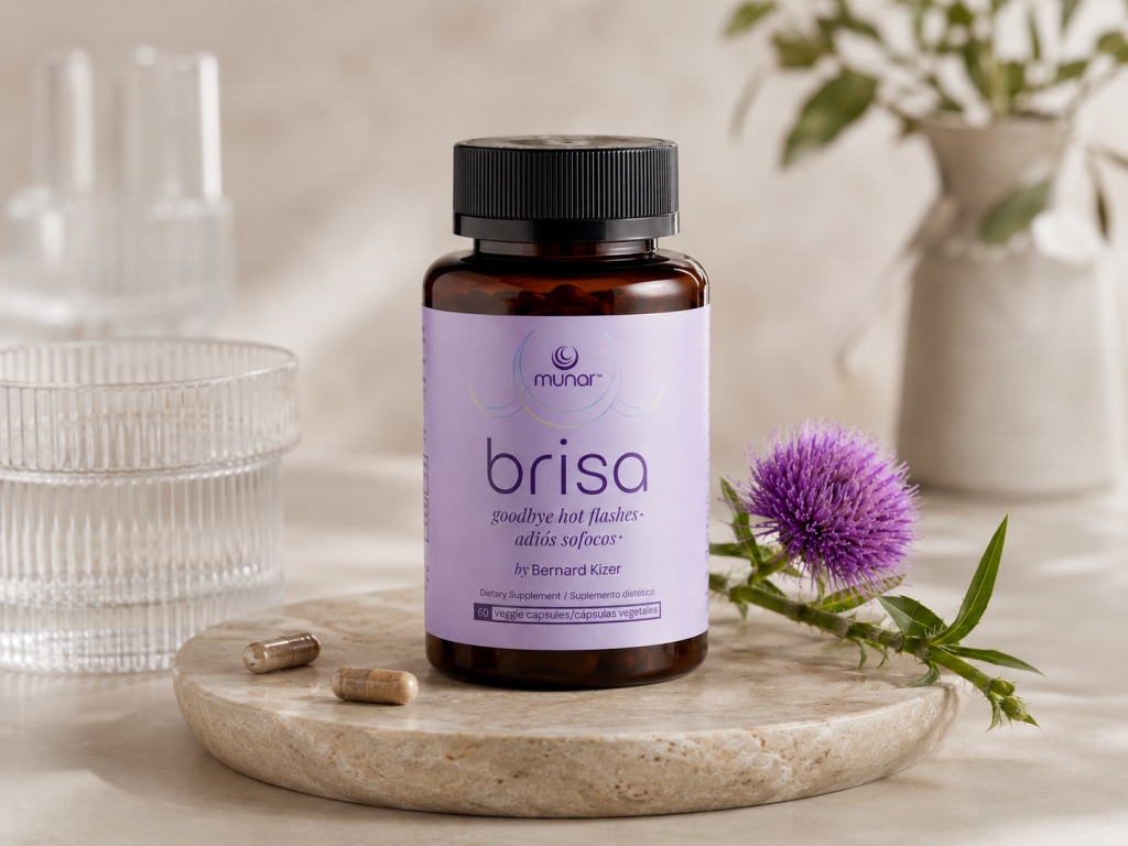

Brisa is a dietary supplement created to support women experiencing hot flashes during menopause. Developed as part of the Munar wellness collection for women over 40, the product was designed with the belief that menopause care should feel as thoughtful and refined as any other self-care ritual.
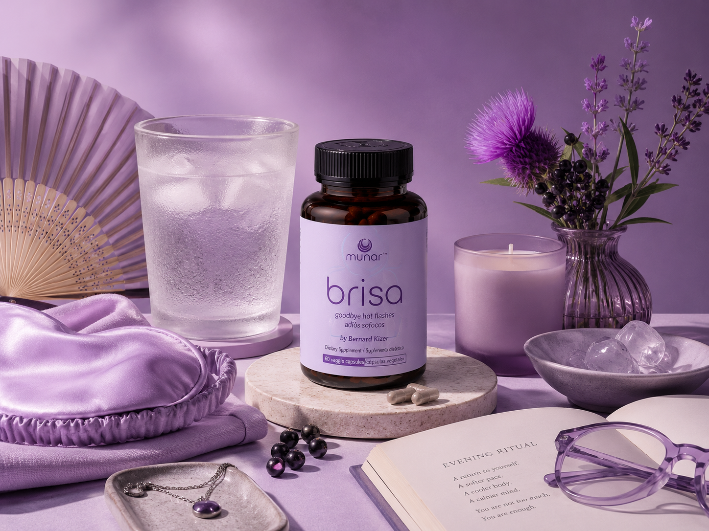
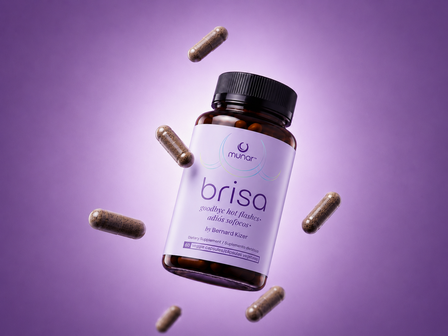
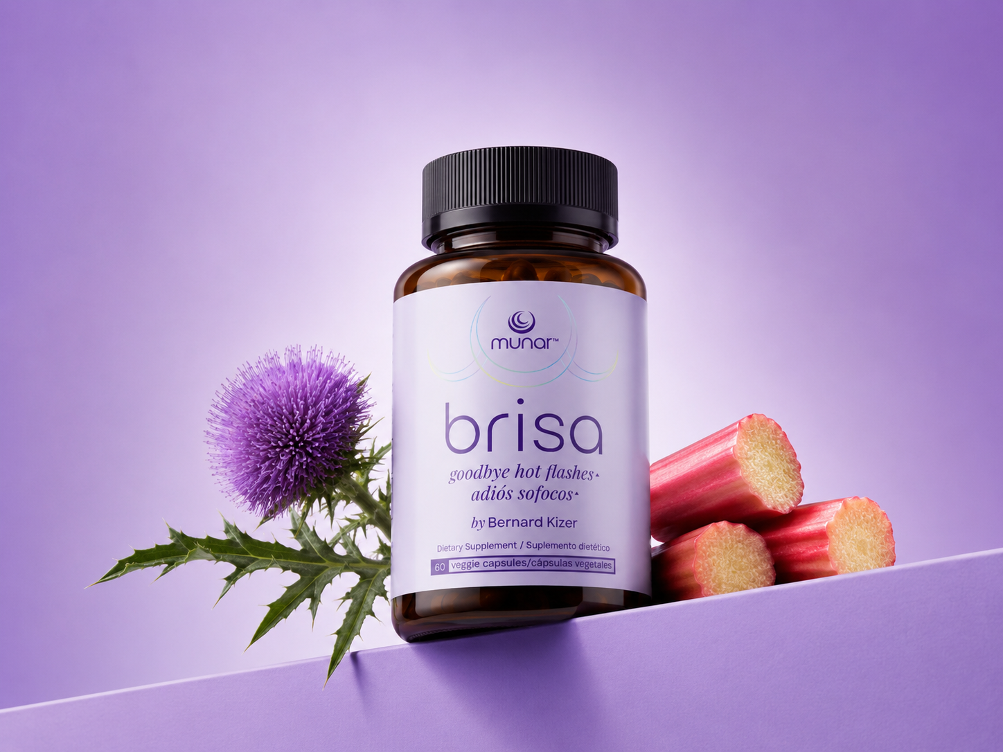
Inspired by the meaning of its name, Brisa (“breeze”), the packaging conveys a sense of calm, relief, and softness. A palette of gentle lavender tones paired with clean typography creates a visual language that is feminine without relying on clichés. Rather than following the conventional aesthetics of dietary supplements, the design takes cues from premium skincare, positioning the product as an elegant wellness companion that women can proudly display.
Brisa was conceived as part of a cohesive packaging system alongside its sister product, Serena, sharing a unified visual identity while maintaining a distinct personality through color and messaging. Together, the range reflects a modern approach to women’s wellness, balancing scientific credibility with warmth and approachability.
My role focused on the design and art direction of the product label within an existing brand identity. The Munar brand identity was developed collaboratively by Valentina Martínez, Mailén Escudero, and myself.
 butterflyhunters
 monther al omari
 Asprey Creative
 About House of Ta
 Up-Brands
 KJS CRAFT
 hello ocean
 PG Branding
 CF Napa Brand Design
 booouuuche
 Hyejung Choi
 Abbydraw Designs Unique Conceptual Branding & Packaging Designing Ideas
 Hollóka Grafikai Műhely / Graphic Design Studio
 Minim Brand Design
 saerom81
 YNL
YNL bilel tkouri
 vitoramockup
 Lampra
 Sanavala
 www.branding.uz
 alchimistestudioParis
 Estudio Argo
 Modern Theory