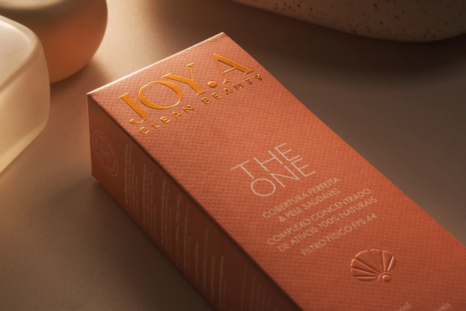

Premium Cosmetics Packaging Design – JOY.A Clean Beauty
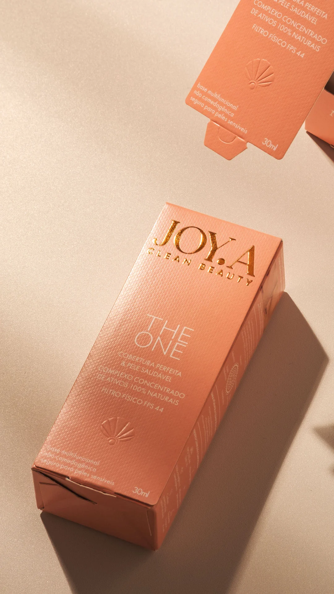
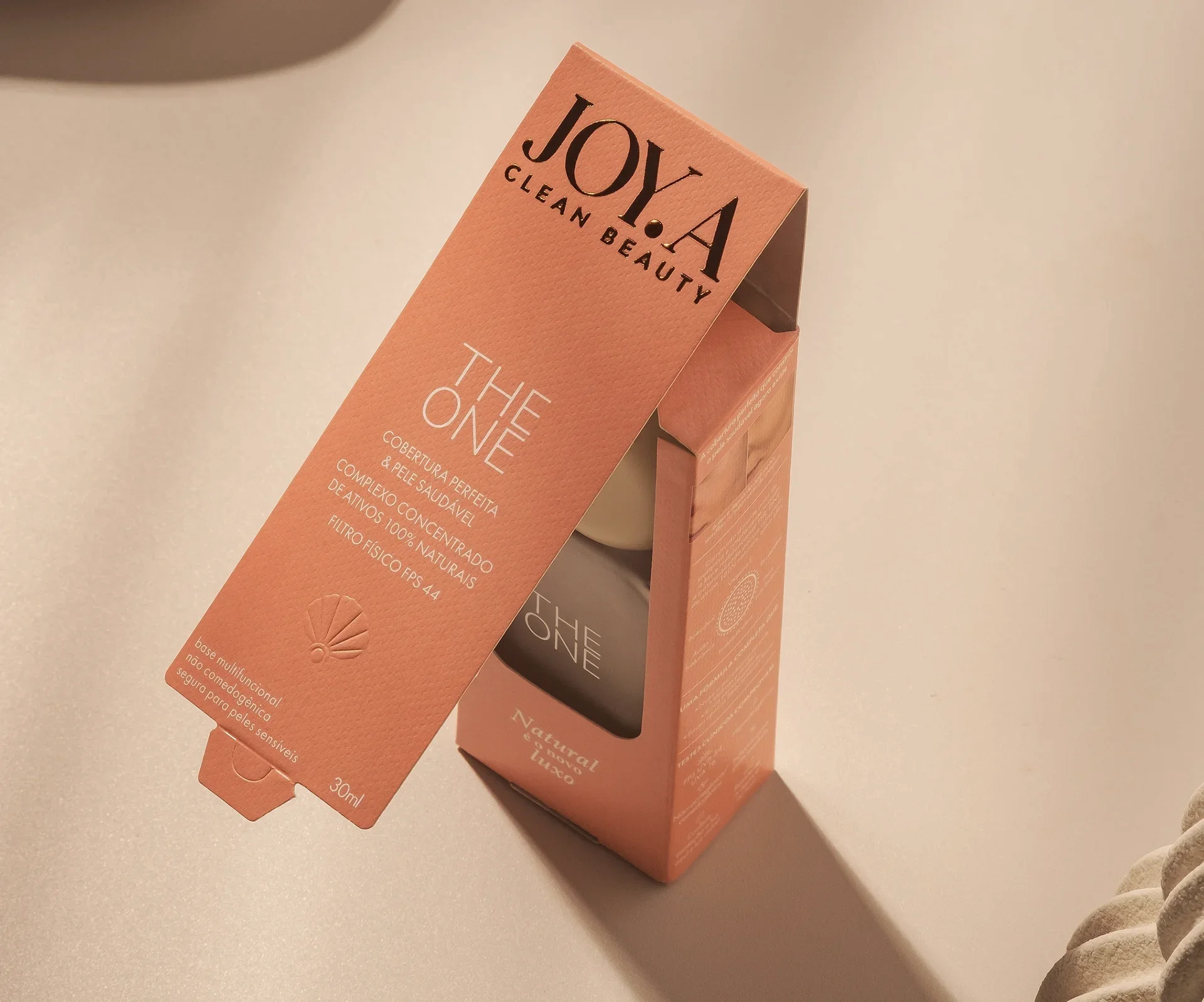
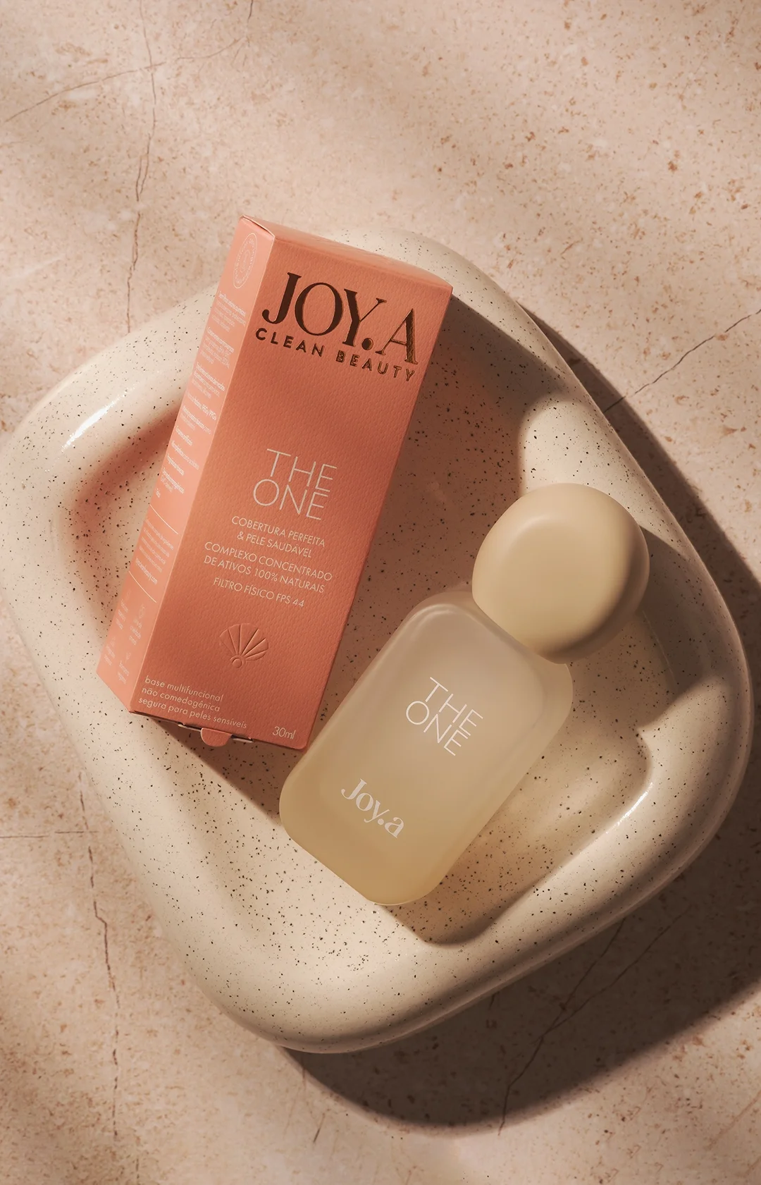
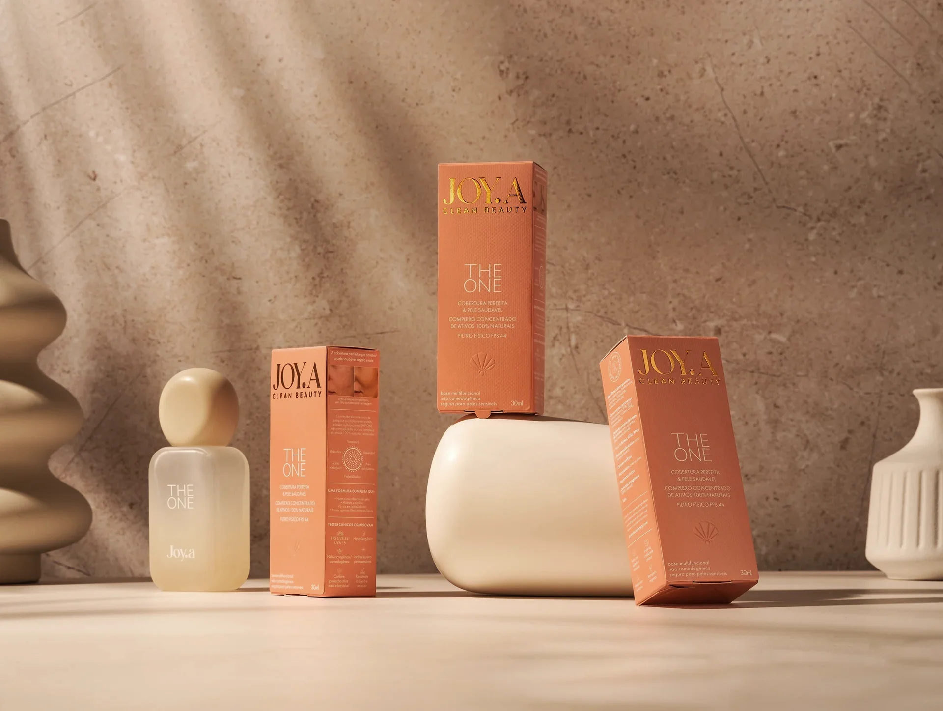
Competing in a market dominated by decades-old giants takes more than beautiful packaging; it demands a ritual. For JOY.A, we transformed the act of opening the product into a discovery experience. As the front face of the package opens, the bottle is gradually revealed, guided by the brand signature: “natural is the new luxury.”
The brand’s minimalism gains strength through tactile details:
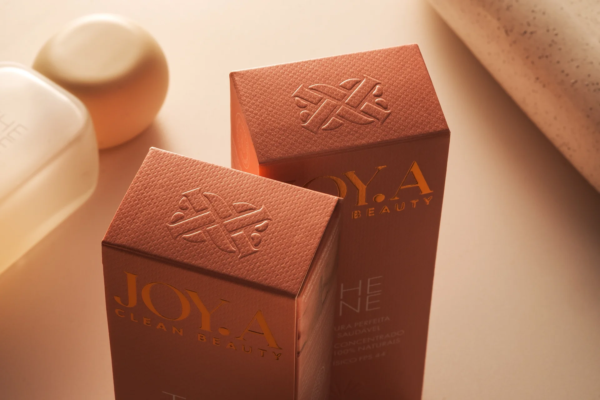
Identity Seal: On top, a dry emboss features a crest crafted from the initial “J,” forgoing the obvious logo in favor of sophistication.
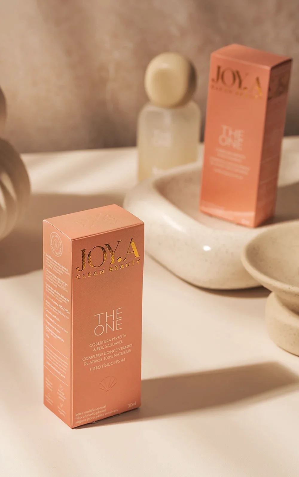
Texture: The embossed paper invites touch even before reading, establishing premium value through tactile sensation.
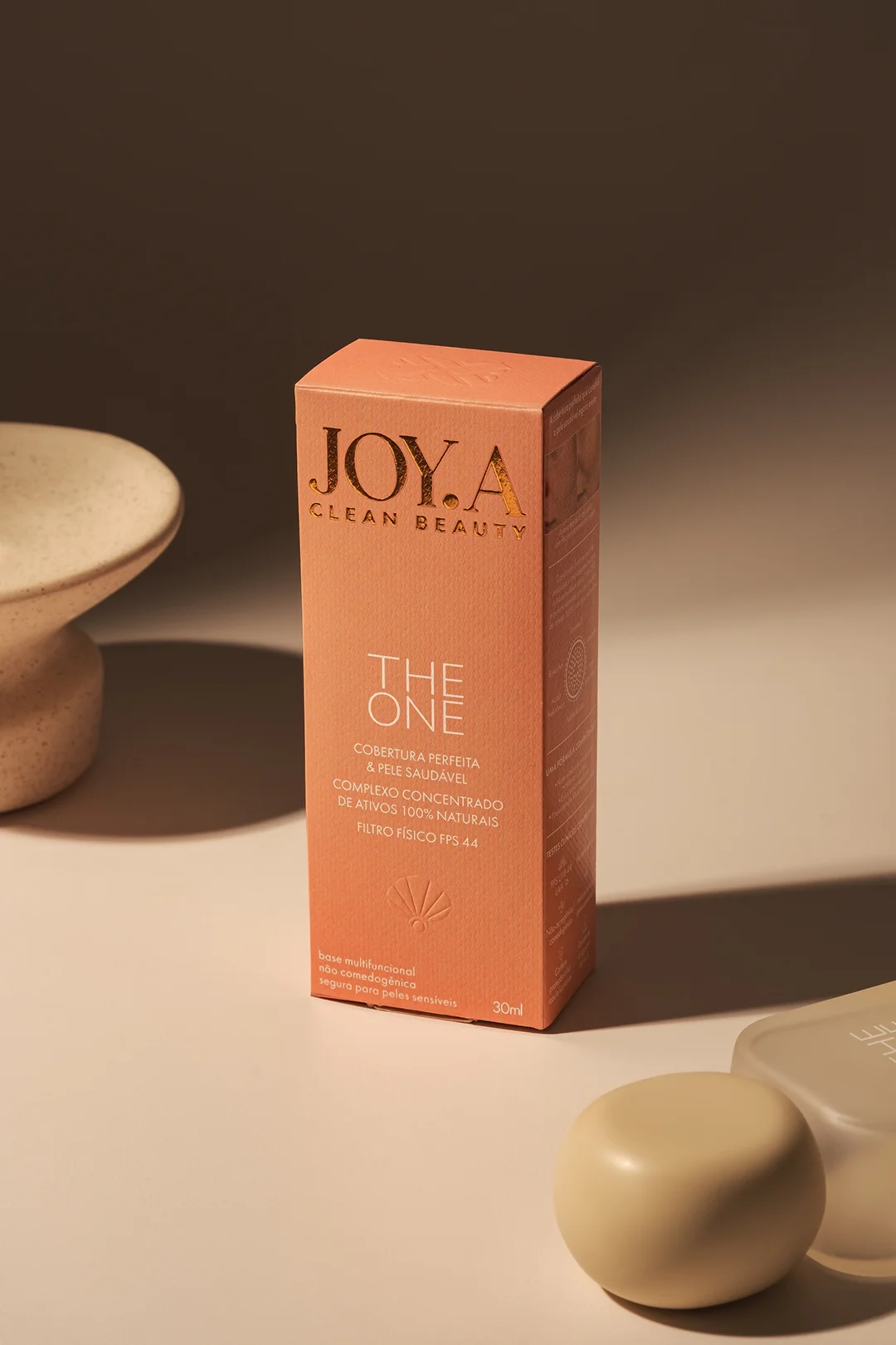
Colorway: We moved away from the generic, overly loud pinks common in the cosmetics market to select a distinctive feminine and contemporary hue, chosen from among several Pantone shades tested.
The details reinforce the concept. On the front face, a shell-shaped emboss serves as a content divider. More than an aesthetic touch, this element evokes the myth of Venus (goddess of love and beauty) and the organic formation of a pearl, a jewel created by nature itself, connecting the element back to the name JOY.A.

 monther al omari
 Alexander Skurihin
 Studio K95
 ARMBRAND
 Richa Rai
 houseoferas by Miti
 Agence des Coteaux
 Kushi Eaknath
 Ann Treasa
 Xiao Ning
 krrrrrllii
 babyage
 Deep
Deep Atiq Alam
 TUERCA Studio
 neo creative studio
 Pinot Agency
 Pixels Studio
 Anastasia Cherepanova | xtramez
 awaiskhadim
 Studio Be Design
 Belova Oksana