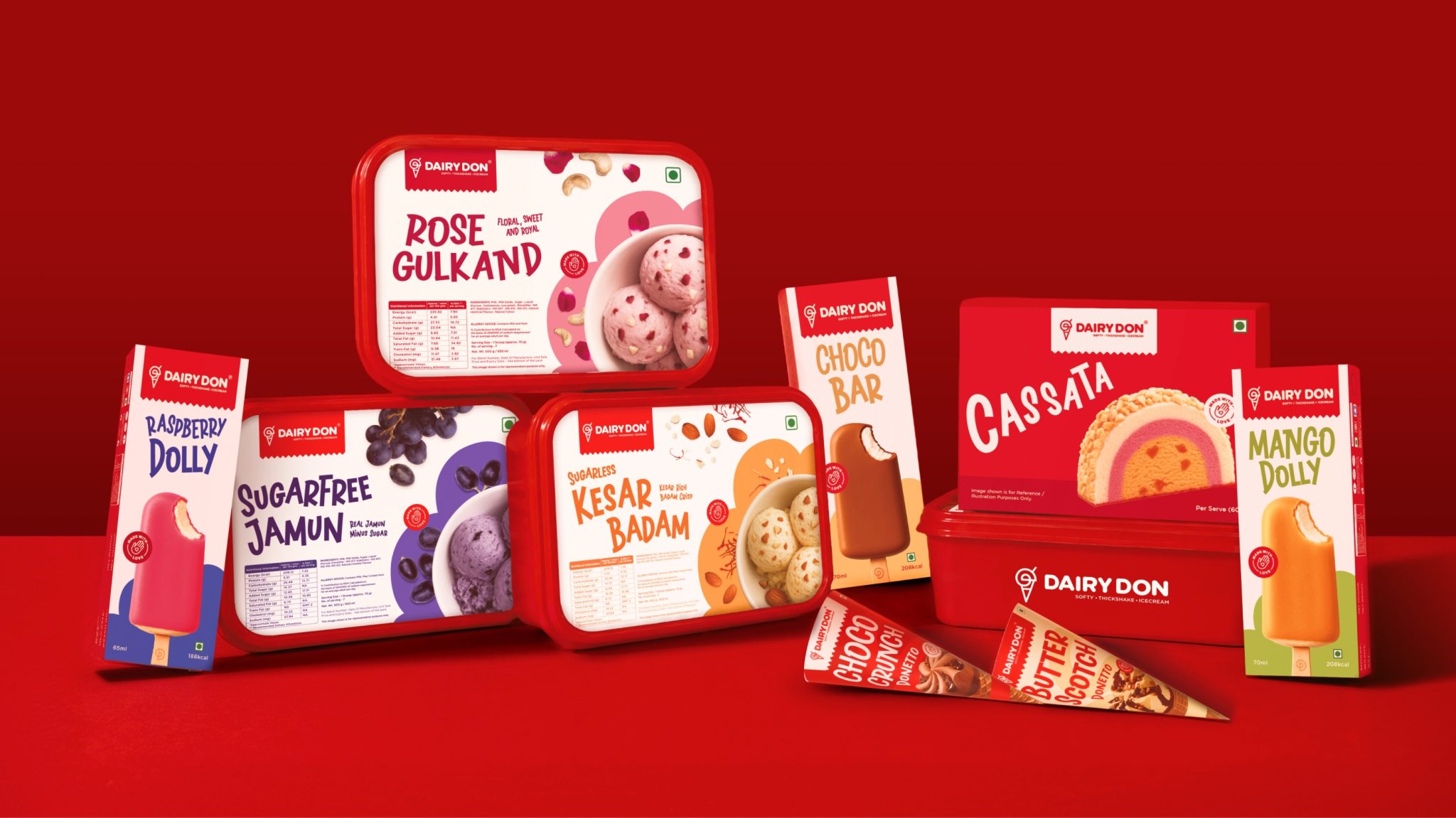

Dairy Don has been making ice cream in Nashik, Maharashtra since 1981, four decades of one family and a single promise of 100% pure milk. The loyalty and the product were always there; the brand had simply not kept pace. Confetti rebuilt the identity and packaging to carry forty years of family craft into a national future.
The whole system grows from the logo. The family wanted a mark that represented their entire range rather than a single product, so Confetti’s designers built a monogram from the two Ds of Dairy Don, drawn as one continuous line. It reads as an inverted scoop, becomes a cone when placed on one, a sundae in a cup, and a thick shake with a straw added. One mark, four product expressions.
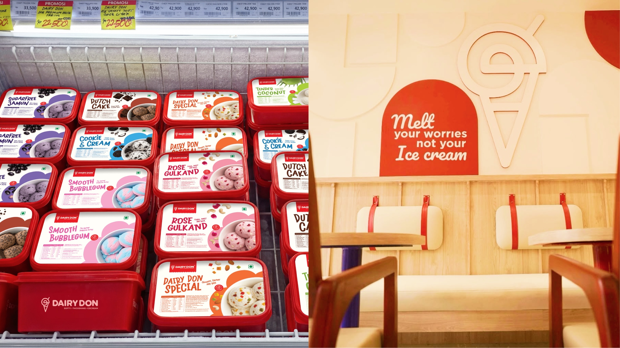
The identity runs on Vanilla Peach, Strawberry Burst Red and Frozen Blue, warm and confident where the category tends toward pastels and cartoon primaries, with a cloud-like motif and bold, rounded typography giving it a playful, dessert-first texture. On pack, the hardest problem was colour: more than thirty flavours, ten of them chocolate variants, and mango, butterscotch and vanilla all sharing the yellow family. Every flavour was given its own colour story so it stands alone on the shelf while the range still reads as one brand in the freezer.
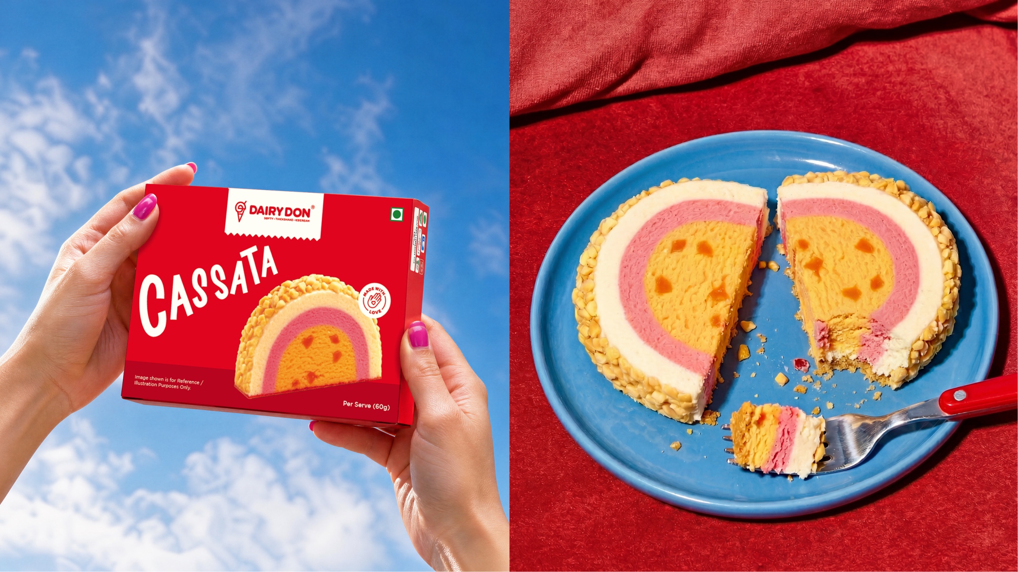
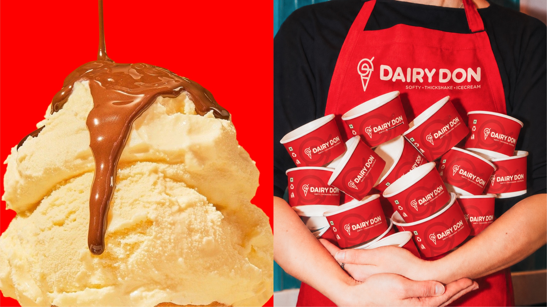
The packaging scope spans softy, family tubs, ice cream bars, cassata, cones, popsicles and sundae boxes, plus a full parlour suite of menu cards, paper cups, disposable glasses, spoons, aprons, caps and t-shirts, with the identity extending into the parlour interiors themselves. Dairy Don finally looks like what it is: a serious ice cream business with four decades behind it, and a brand built to grow.




 softmachine
 monther al omari
 alchimistestudioParis
 airobtq
 Buzz & Co.
 Ruby
Ruby themythographer
 IDNB Inc.
 viktorflr
 Zenpack
 Wessam Hussien
 samarabdelmonem
 StudioMordius
 Polaris Designs
 Atiq Alam
 duha mohamed
 HassanEtman22
 agarcia studio
 Wynand88
 Eva Chistyakova
 Maria Bukhtilova