
FRÜGO
FRÜGO is an Israeli frozen fruit brand created for people who value discipline, simplicity, and performance in their daily nutrition. Built around the idea of Nutritional Certainty, the brand delivers perfectly portioned frozen fruit for quick smoothies and shakes, making healthy choices effortless even on the busiest mornings.
The goal of the project was to develop the complete visual identity and creative direction for FRÜGO, translating the brand strategy into a cohesive system that communicates clarity, discipline, and consistency across every customer touchpoint.
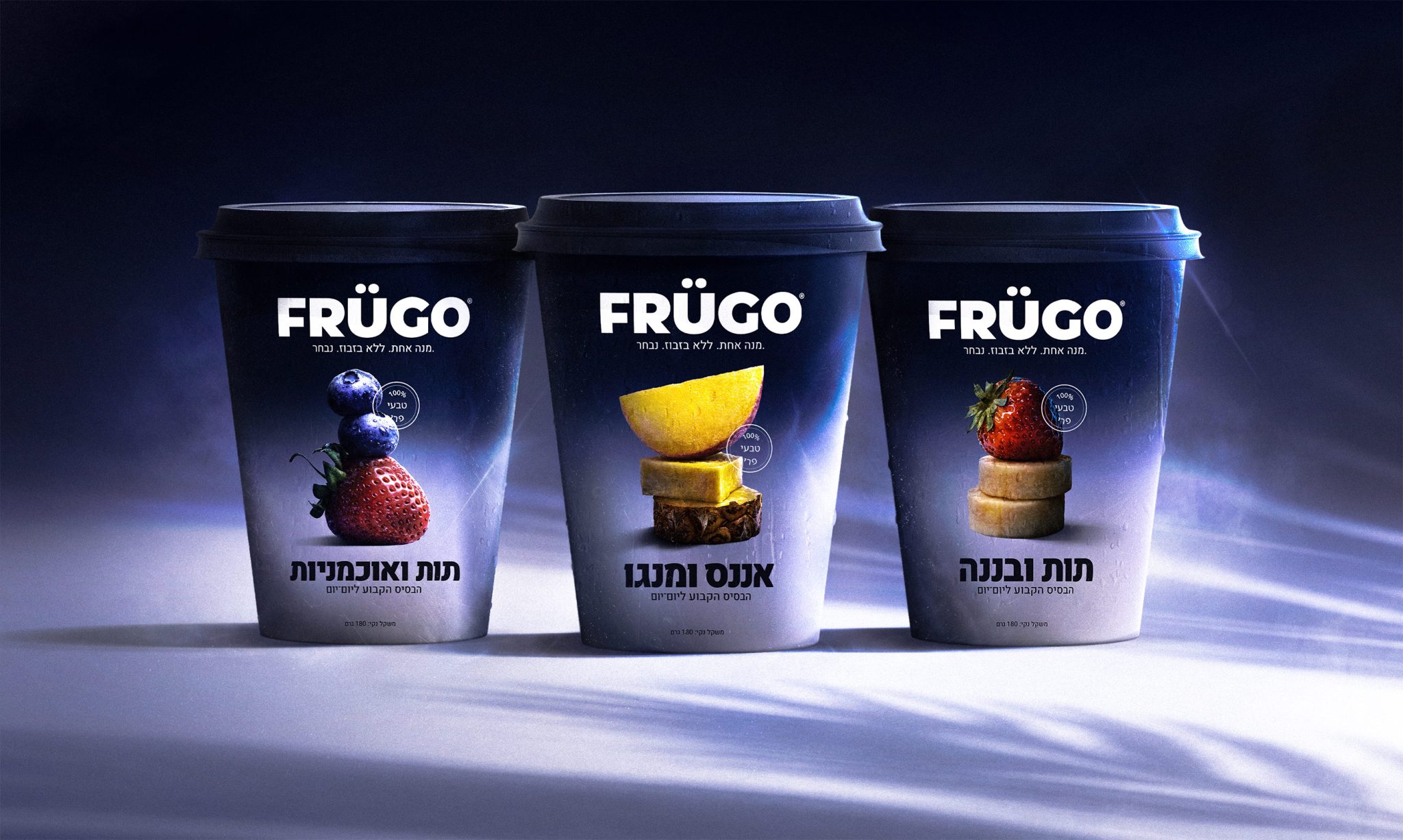
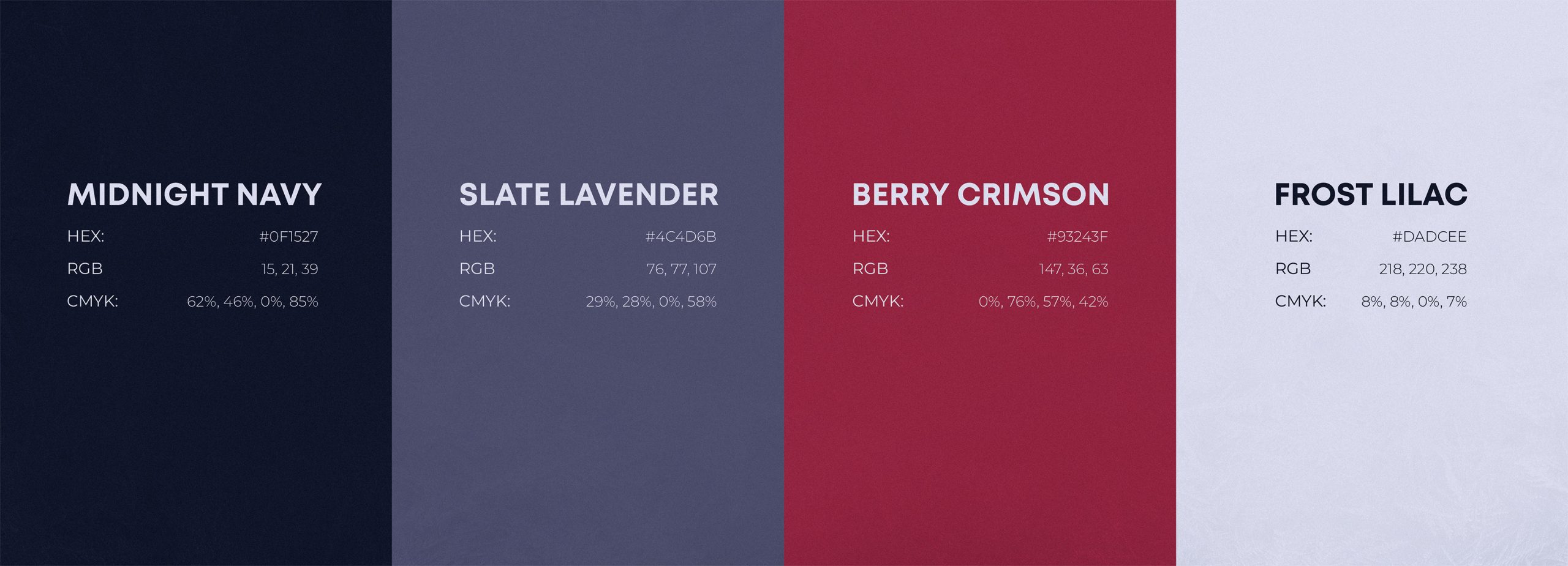
The visual direction was built around the contrast between the calm atmosphere of frozen freshness and the fast pace of modern mornings. Rather than relying on typical healthy-food aesthetics, the identity emphasizes confidence, simplicity, and premium restraint, reinforcing the feeling of making the easiest good decision of the day.
The project included the development of the brand identity, logo, typography, color palette, and supporting brand assets, establishing a flexible foundation for future growth.
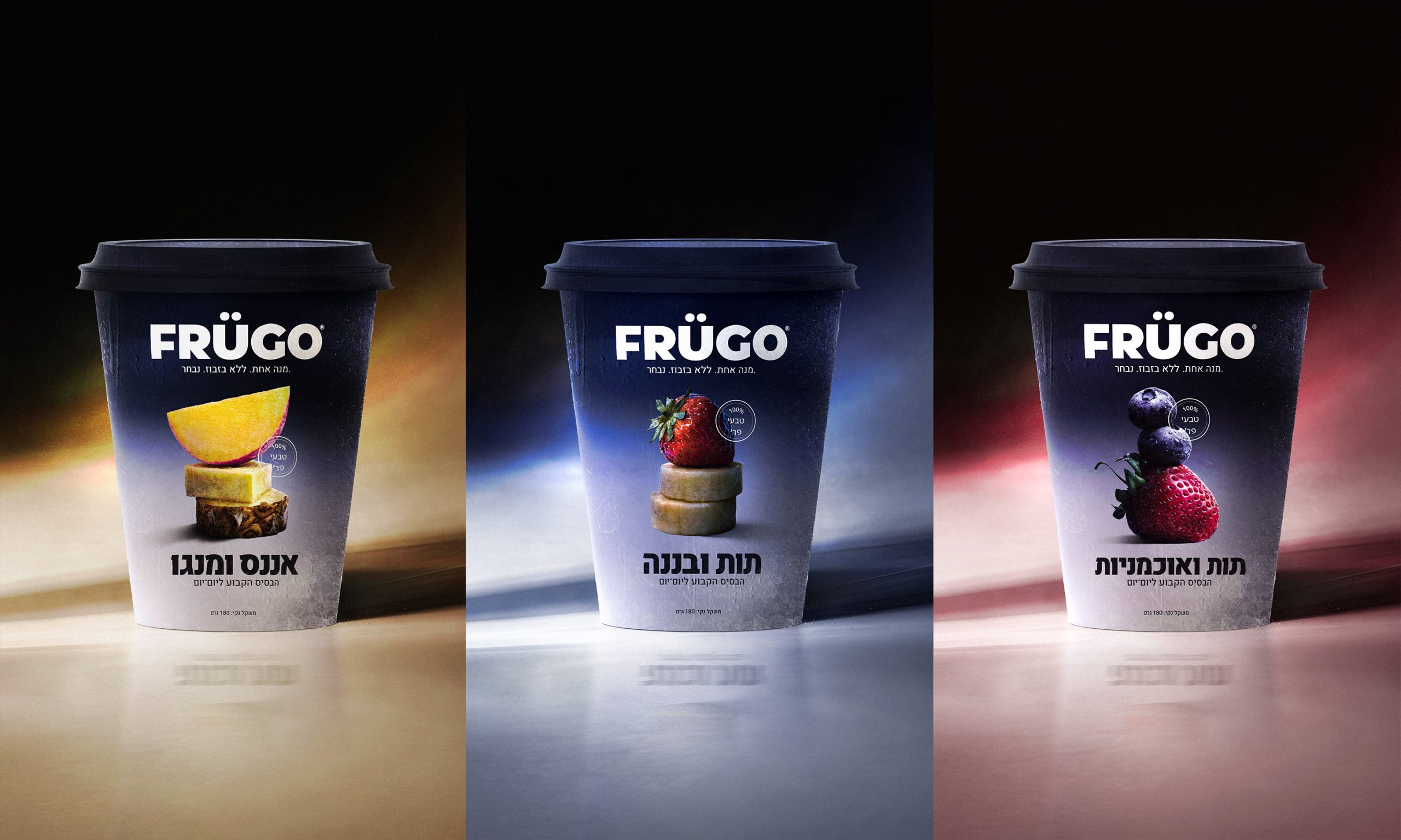
Building on this system, a complete packaging range was designed for the frozen fruit cups. Each flavor received its own carefully art-directed fruit composition while maintaining a consistent layout and visual hierarchy for strong shelf recognition across the product family.
To complete the launch, a series of premium campaign visuals and advertising assets extended the same visual language beyond the packaging, creating a cohesive brand experience that feels fresh, energetic, and unmistakably FRÜGO.
The result is a unified brand and packaging system that transforms a simple frozen fruit product into a distinctive premium brand built around convenience, consistency, and nutritional confidence.




 krrrrrllii
 babyage
 Deep
Deep monther al omari
 Atiq Alam
 TUERCA Studio
 neo creative studio
 Pinot Agency
 Pixels Studio
 Anastasia Cherepanova | xtramez
 awaiskhadim
 Studio Be Design
 Belova Oksana
 We Craft Studio
 ArtDesignByDIna
 Ananya Taran
 Nadezhda Gorelikova
 orhanirmaktasarim
 WillBe
 Hi estudio
 43oz
43oz Rosario Lo Iacono
 alchimistestudioParis