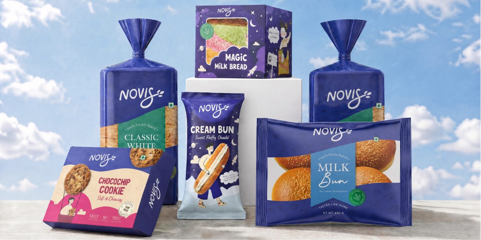

Confetti has partnered with Novis to build a complete bakery brand from the ground up. For years the region’s bakery shelves have told the same story: a handful of familiar names, dated packaging, no ingredient narrative, and enough distribution to make the absence of quality feel normal. Novis was set up to change that, built on the belief that people deserve bread genuinely worth buying. Confetti came on board at the very beginning, before a label had been designed or a name decided, with a scope running from strategy and naming through to identity and a full packaging system across three product categories.
The challenge was entering an established category without a legacy. The incumbents had familiarity and reach, but none had a real quality story, no ingredient transparency, no design investment, no reason for a thoughtful buyer to feel good about the choice. Research showed more than 90 per cent of consumers would switch to a better brand if one appeared. The white space was clearly there. The task was to move through it with strategy rather than noise, starting with the woman making the decision in most households: mid-thirties, shopping every couple of days, reading the label more closely than most brands assume, and honest about switching when a brand lets her down.
The name is rooted in the Latin word for new. It lands cleanly, easy to say and remember, the right name for a brand positioning itself as a fresh start. The wordmark is built in a custom script, warm and considered, with an elongated S carrying a wheat grain detail at its tip that connects the mark to what Novis makes without spelling it out. A standalone icon built around the same wheat motif works independently across favicons, stickers and embossed pack details.
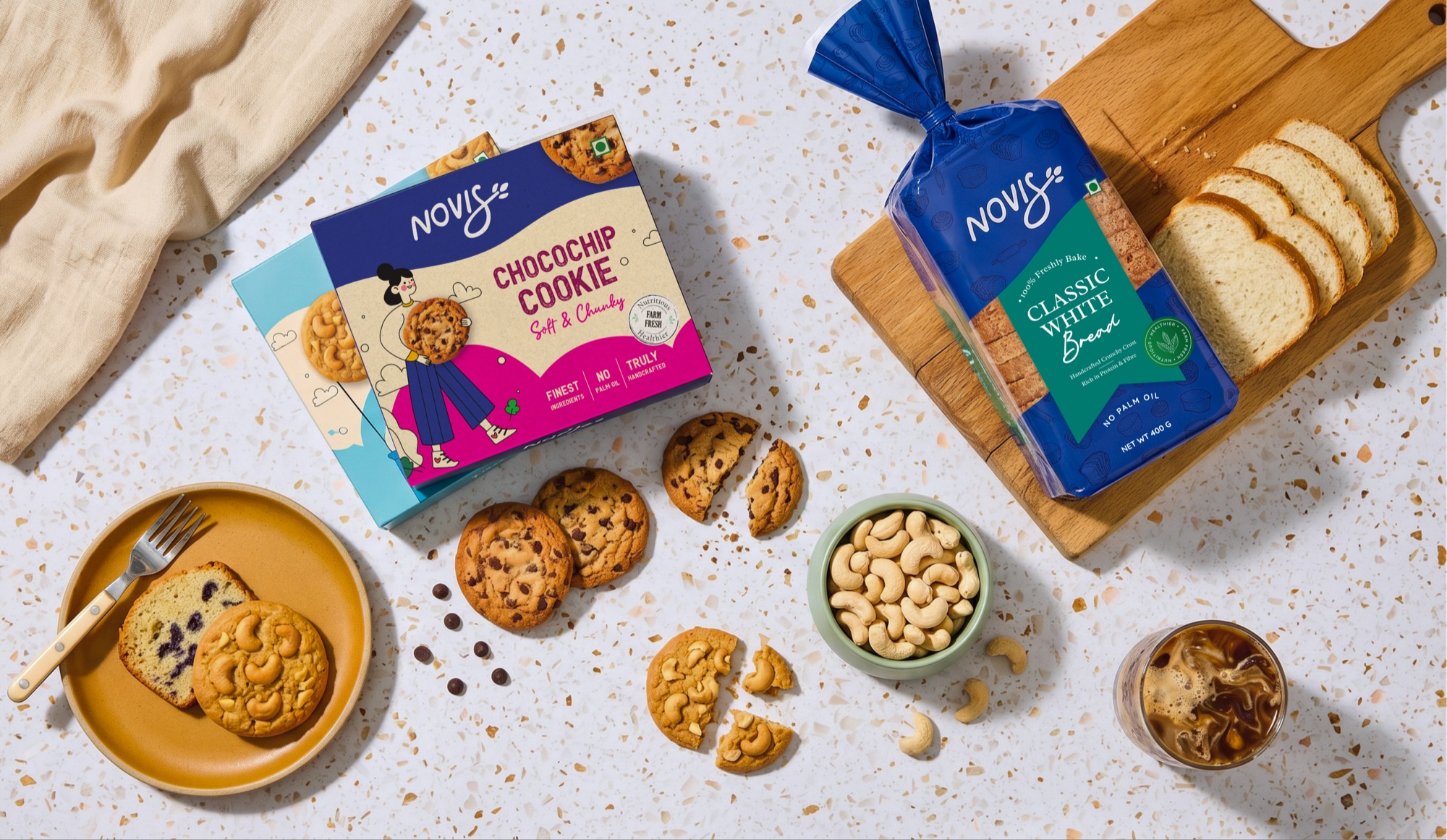
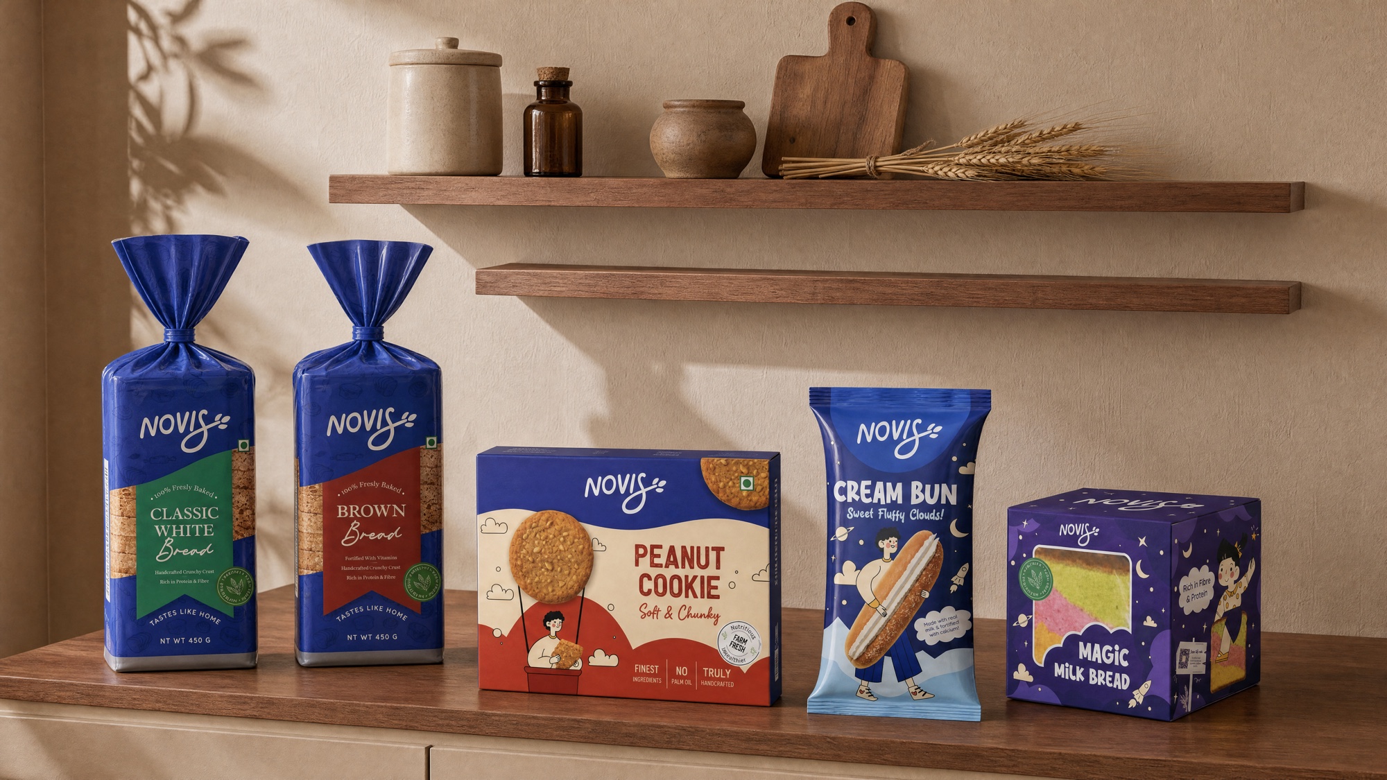
Colour does much of the heavy lifting. The primary shade is a deep, confident blue that Confetti named Blueberry, reading as fresh and trustworthy in an aisle that tends toward faded primaries and generic yellows, with Cream for warmth and Rose Frosting and Golden Crust giving the cookie and rusk ranges their own character. Radley, Quicksand and Claytonia carry the typography from headline to handwritten accent. Across all twelve SKUs the packaging holds one logic: wordmark top left, product name central, an illustrated character unique to each flavour, and a colour accent tied to its category. Those characters are what separate Novis from the aisle, each one warm enough to invite attention and specific enough to be remembered, where competitors rely on generic stock imagery or nothing at all.
Novis launched with a brand built to last. The identity holds across twelve SKUs and three product categories without losing coherence, the packaging system is structured to absorb new products and markets as the brand grows, and the guidelines give the team a foundation that does not need rebuilding each time. The gap in the market was always there. Confetti built the brand worth stepping into it.



 Derrick Lin
 Biaa
Biaa Petitmoulin Studio
 White Bear Studio
 Eva Chistyakova
 monther al omari
 Atipus
 alchimistestudioParis
 oneandother
 bloomburo
 helocrene
 Shapers Studio
 Denver Design
 Aidearte
 andrew.huerta
 softmachine
 airobtq
 Buzz & Co.
 Ruby
Ruby themythographer
 IDNB Inc.
 viktorflr
 Zenpack