

OWLENS — Opening a New Vision of Contact Lens Packaging
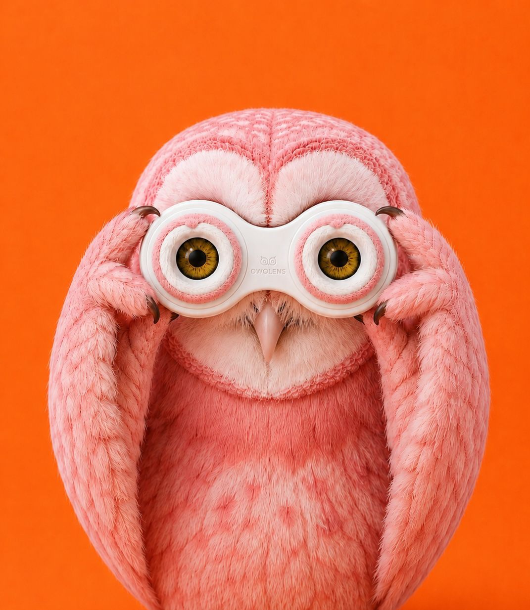
In a category dominated by sterile medical aesthetics, OWLENS reimagines the contact lens experience through emotion, symbolism, and premium design.
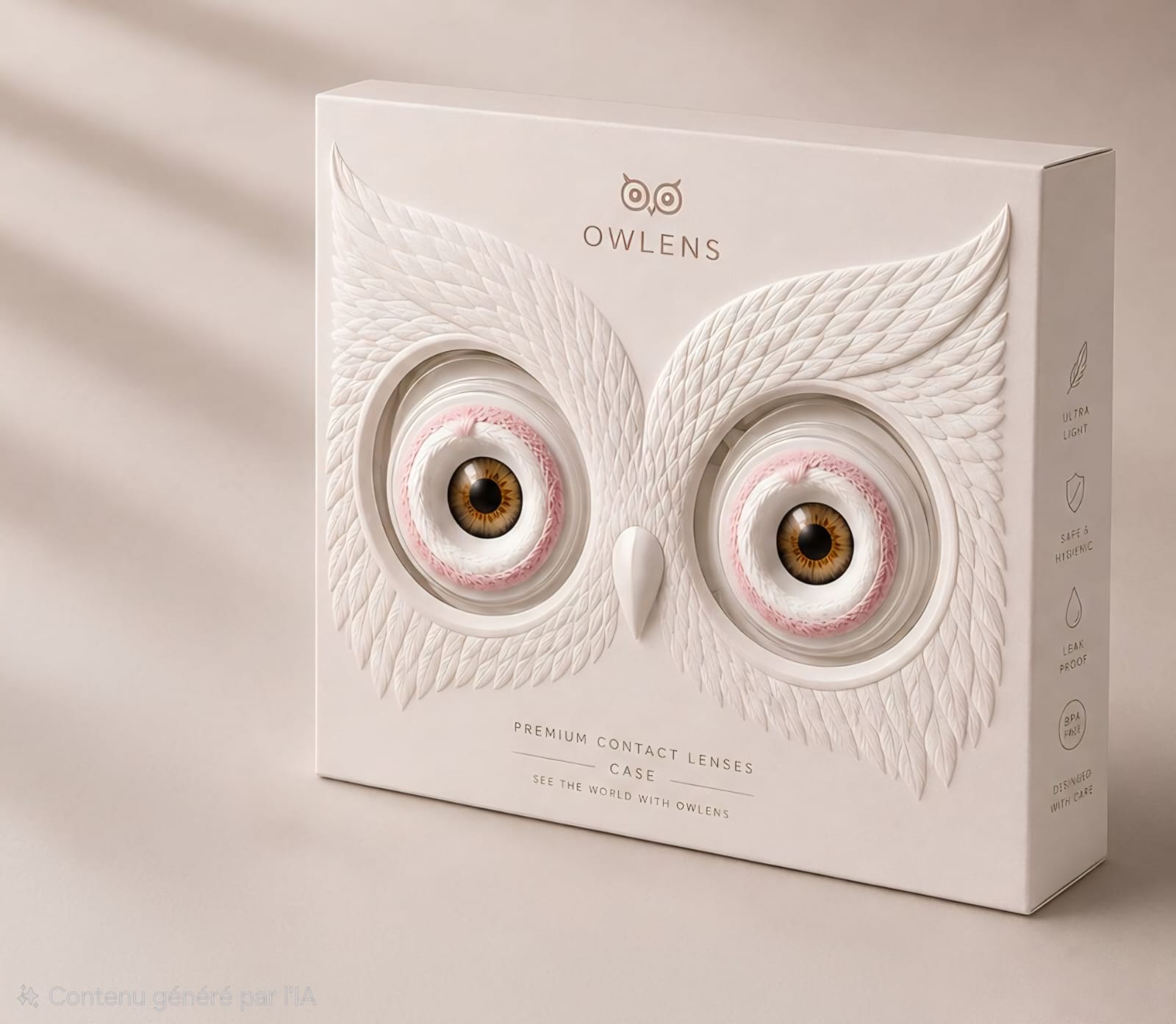
Inspired by the owl — a universal symbol of wisdom, precision, and exceptional vision — the identity transforms every interaction into a memorable ritual. Rather than hiding the product inside a conventional box, the packaging itself becomes the brand icon. Two sculpted feathered wings frame the contact lenses, naturally forming the owl’s expressive eyes, while a minimalist beak completes the character. The lenses are no longer just a product; they become the very soul of the visual identity.
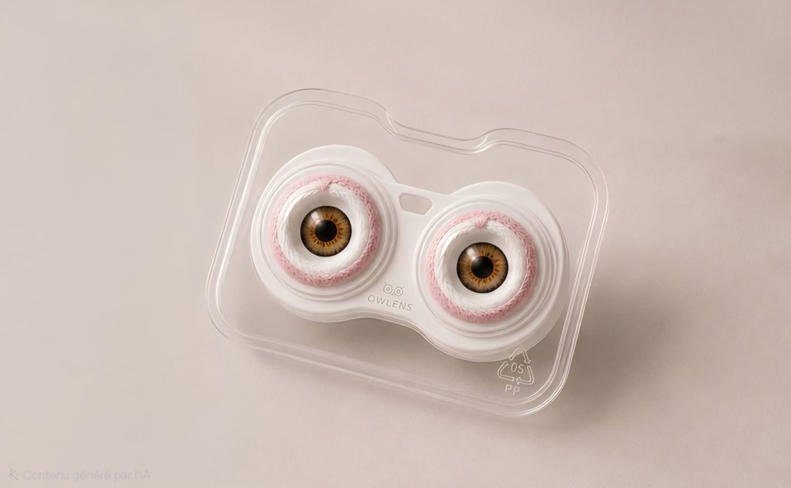
The experience continues beyond the outer box. Inside, each pair is presented in beautifully designed individual packs before being housed in a premium reusable contact lens case shaped like the owl’s eyes. The entire ecosystem has been designed as one coherent language where branding, functionality and storytelling become inseparable.
Every surface has been carefully crafted to reinforce the premium positioning: embossed feather textures create depth and tactility, a refined matte finish enhances elegance, and a restrained monochromatic palette allows the intricate details to speak for themselves.
The project balances emotional branding with industrial feasibility. Every structural element has been conceived to remain compatible with real packaging production while elevating an everyday healthcare product into a desirable lifestyle object.
With the tagline “Open Your Wiser Eyes”, OWLENS celebrates not only clearer vision, but a more thoughtful way of seeing design itself—where function, symbolism and beauty work together to create a packaging experience users will want to keep long after opening.

 IDEOLOGO
 Eva Chistyakova
 Open Strategy & Design
 cem kutlu
 monther al omari
 Bonsanco Creative Studio
 Confetti Design Studio
 古戈品牌
古戈品牌 Rare Ideas
 Studio Pistache
 Studio Tumpic/Prenc
 Atiq Alam
 bachir bachchar
 Akshita Agarwal
 Carreto Concepts Design Studio
 Hollóka Grafikai Műhely / Graphic Design Studio
 Arsen Avetisyan
 Derrick Lin
 Axiniya Knyazeva
 Hadi Samir
 Furt Goods