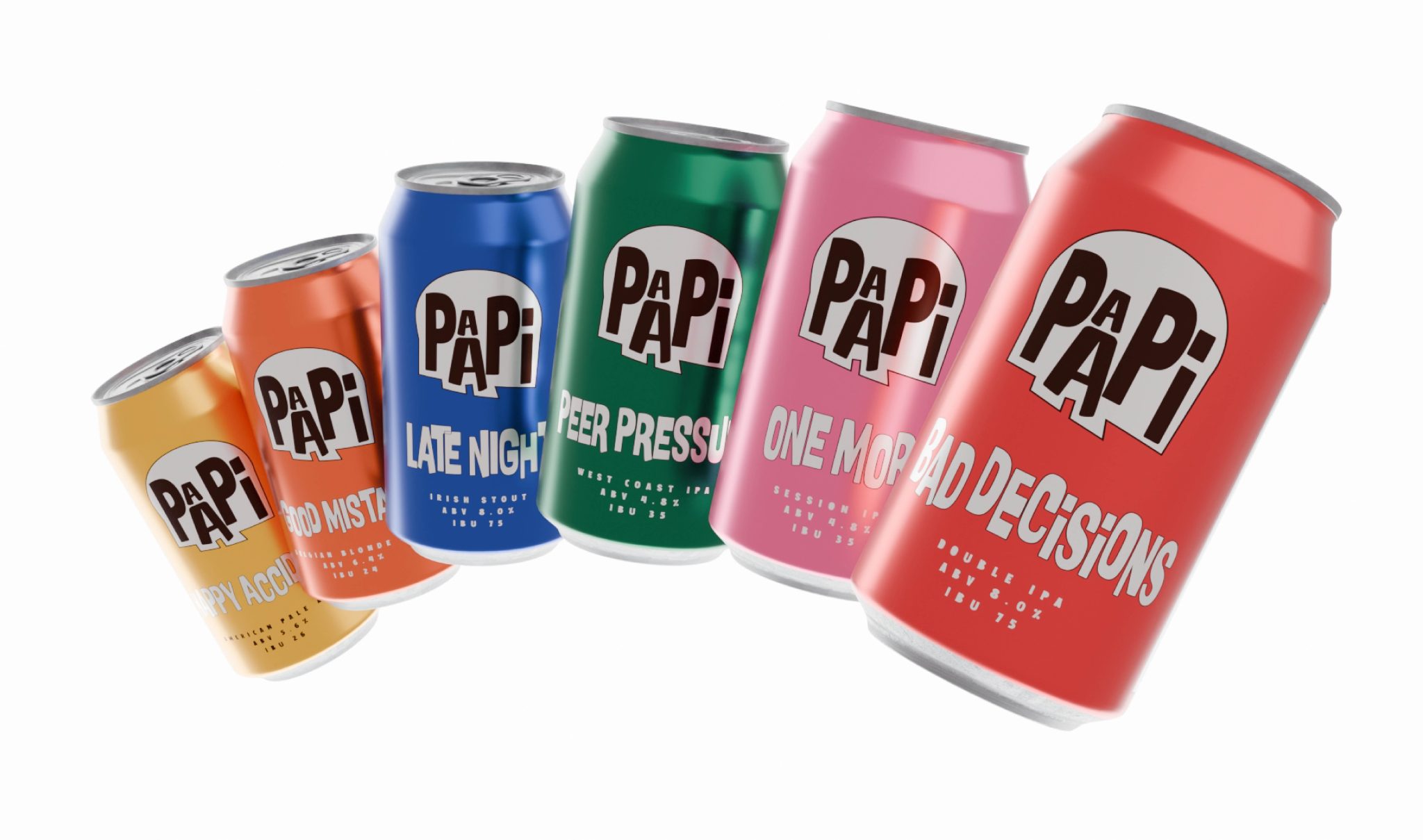

PAAPI
Beer was never the idea.
Friendship was.
The craft beer space is filled with conversations around hops, brewing techniques, tasting notes, and alcohol percentages. But the moments people remember rarely begin there. They begin with the people sitting around the table.
A beer is often just the excuse.
The real stories are late-night confessions, terrible dance moves, impulsive decisions, inside jokes, and the kind of laughter that somehow gets louder with every round.
That became the foundation for PAAPI.
Born from the phrase Pals & Pints, the name embraces the wonderfully imperfect side of friendship. It celebrates the friend who convinces everyone to stay for “just one more”, who turns ordinary evenings into unforgettable memories, and who somehow makes every bad idea sound like a good one.
Once the personality became clear, the identity followed naturally.
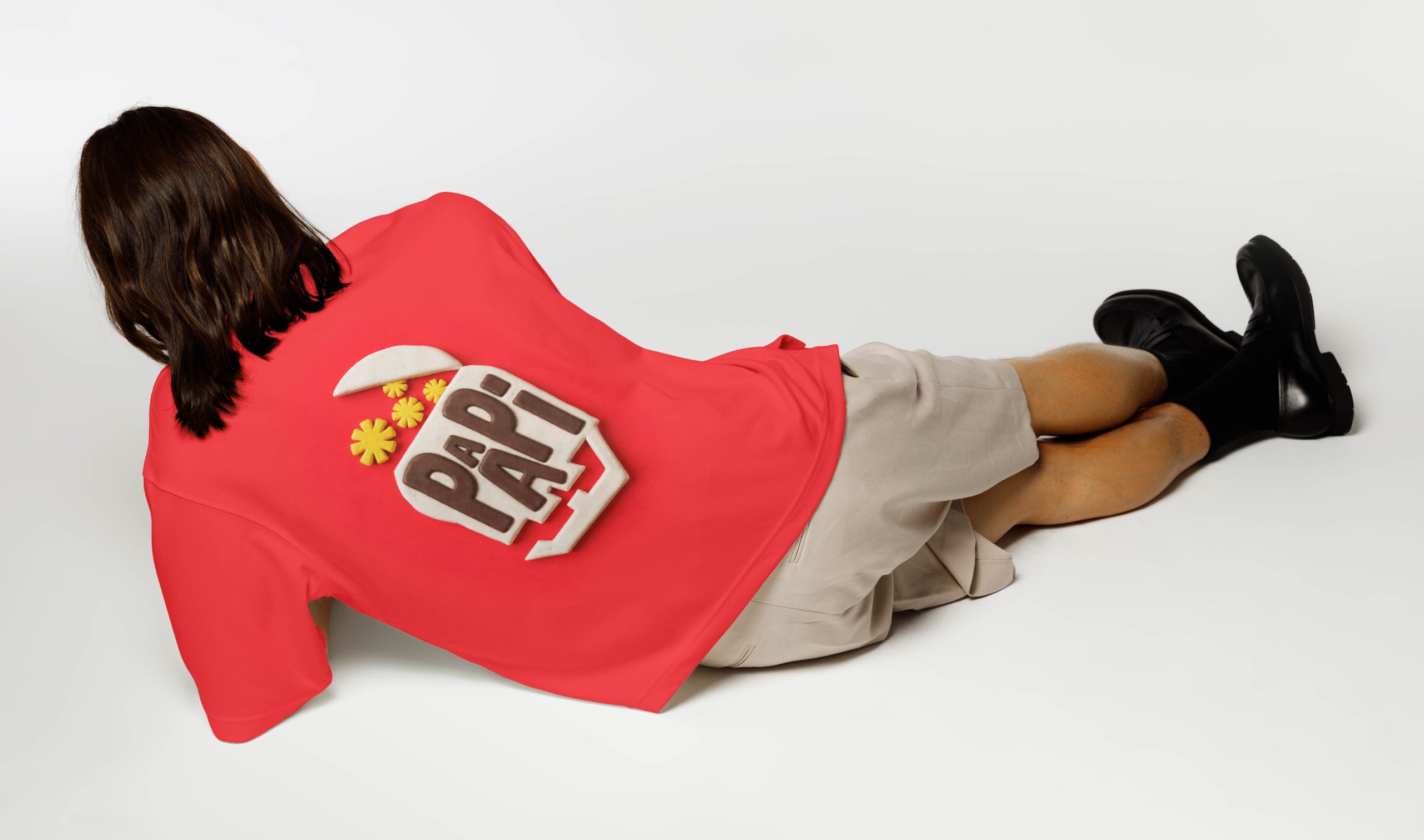
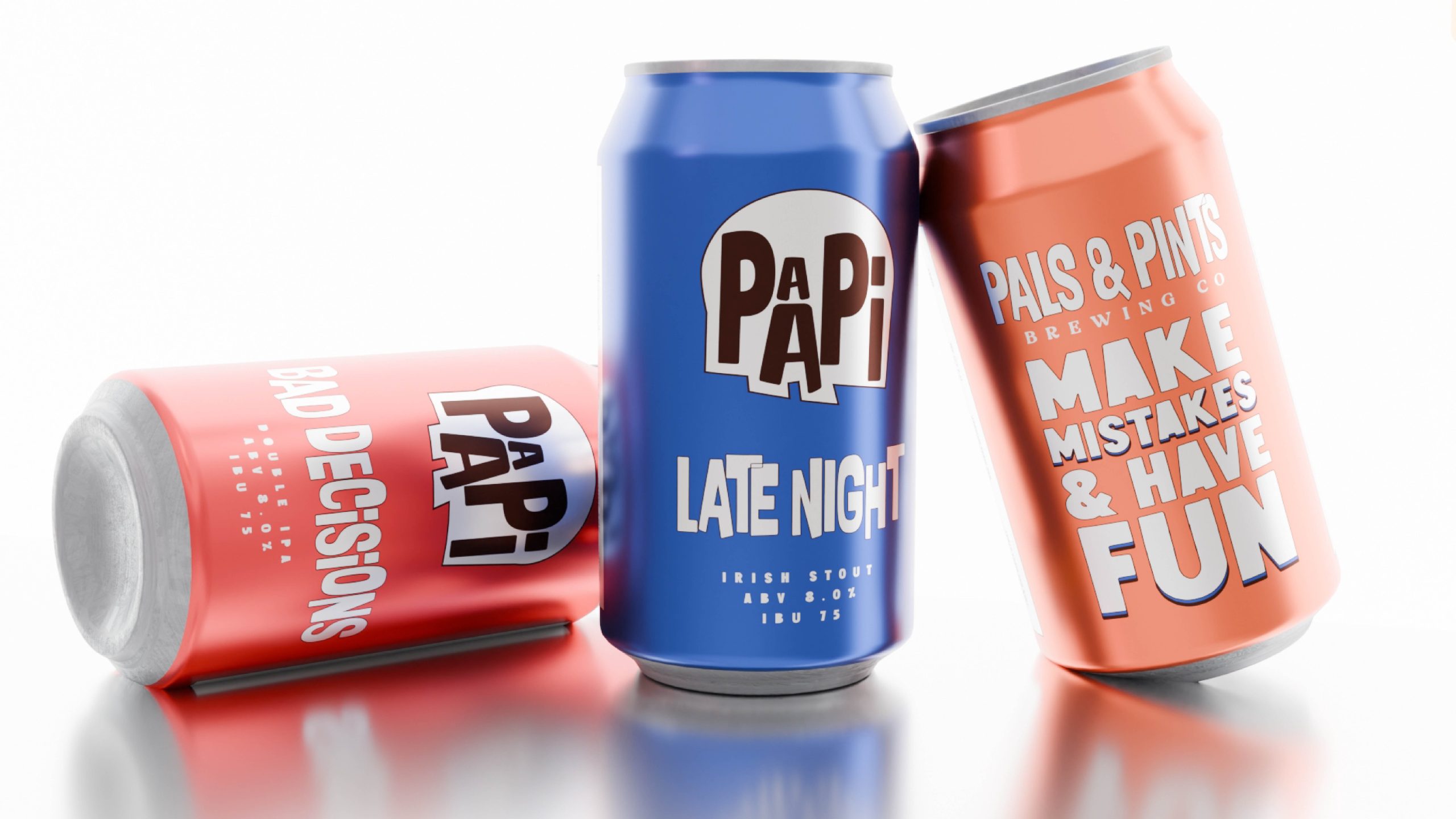
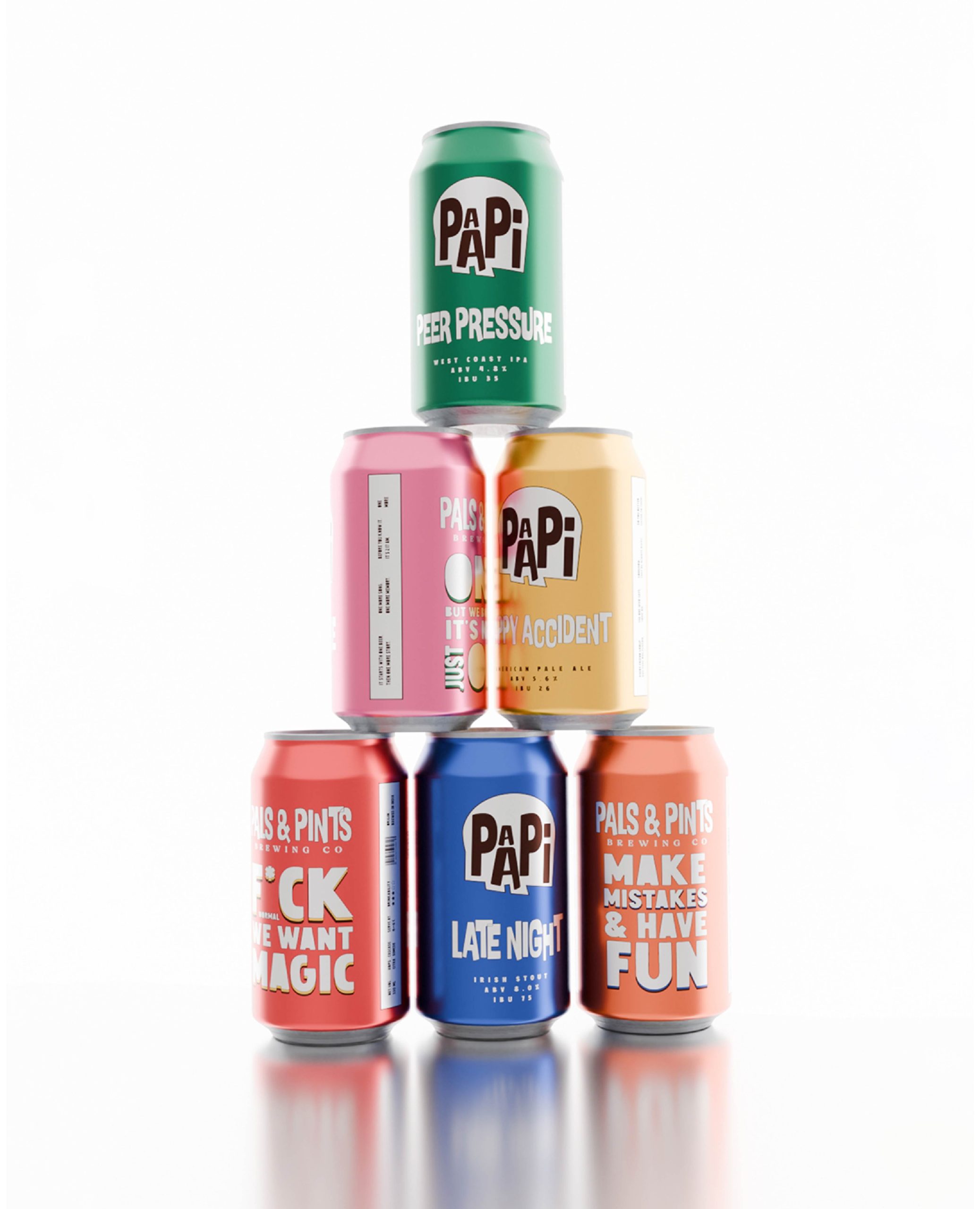
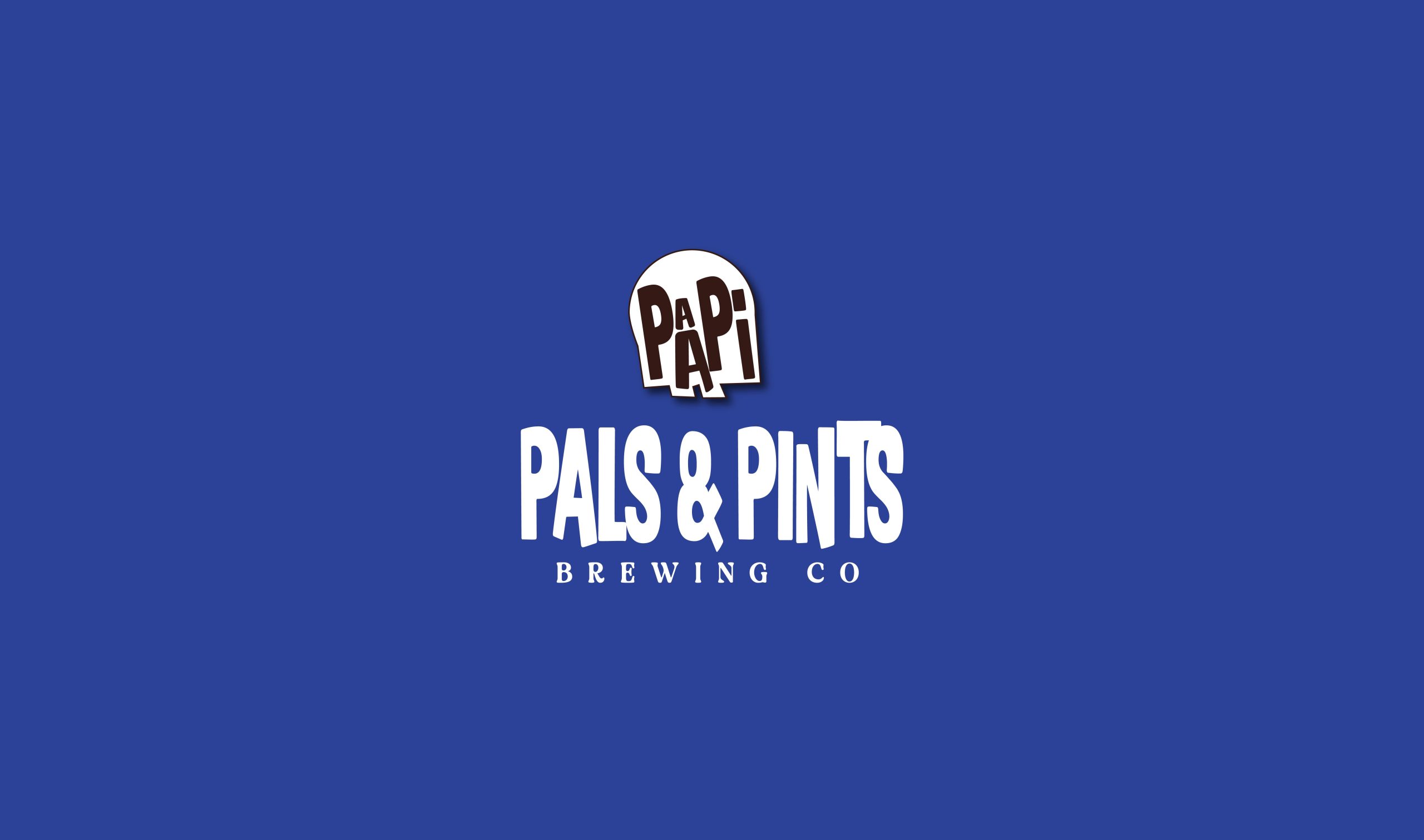
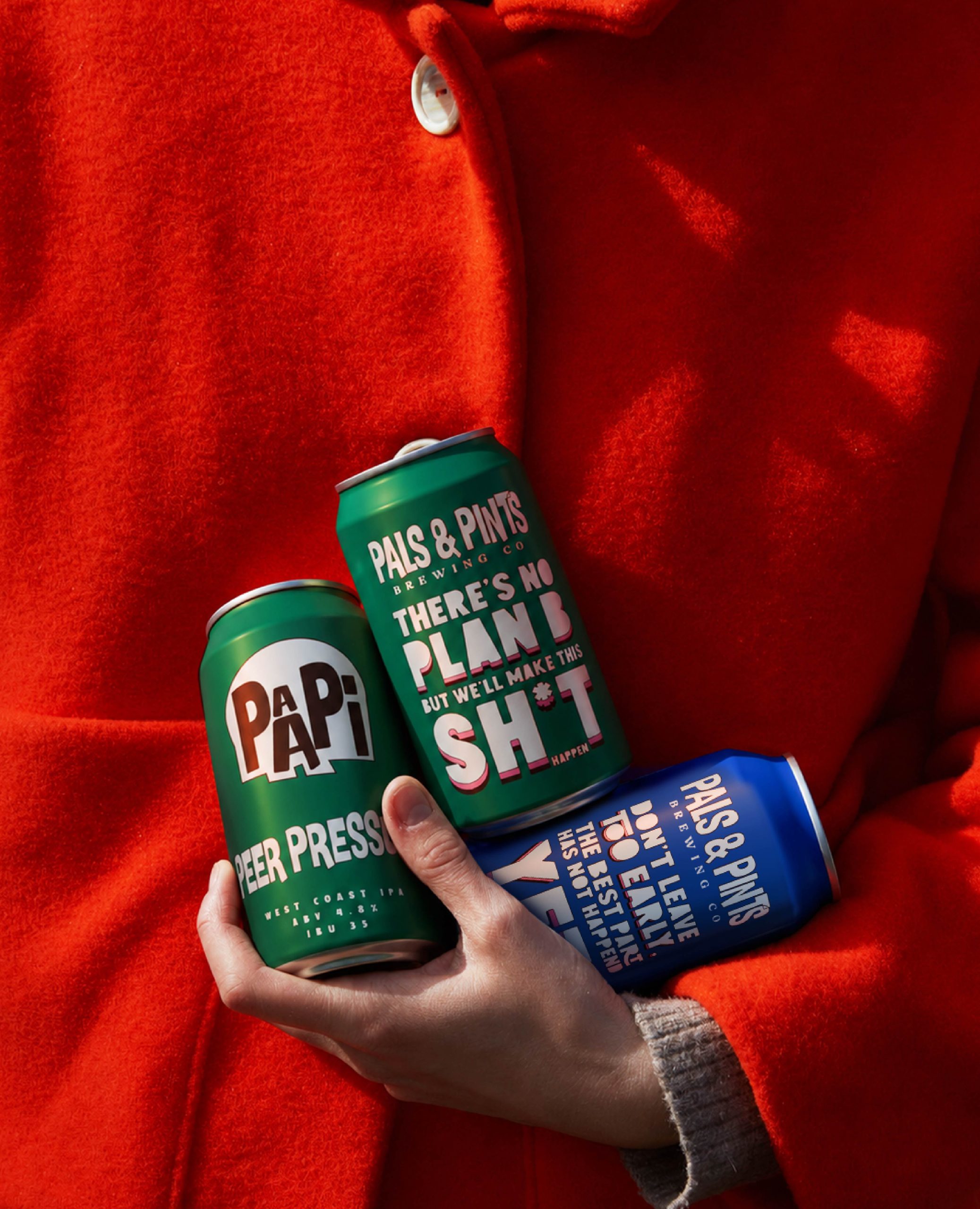
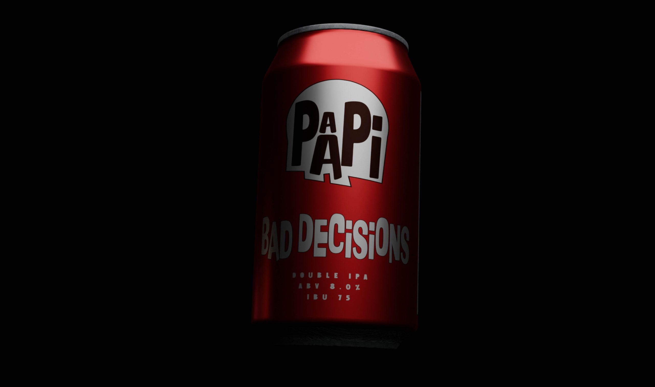
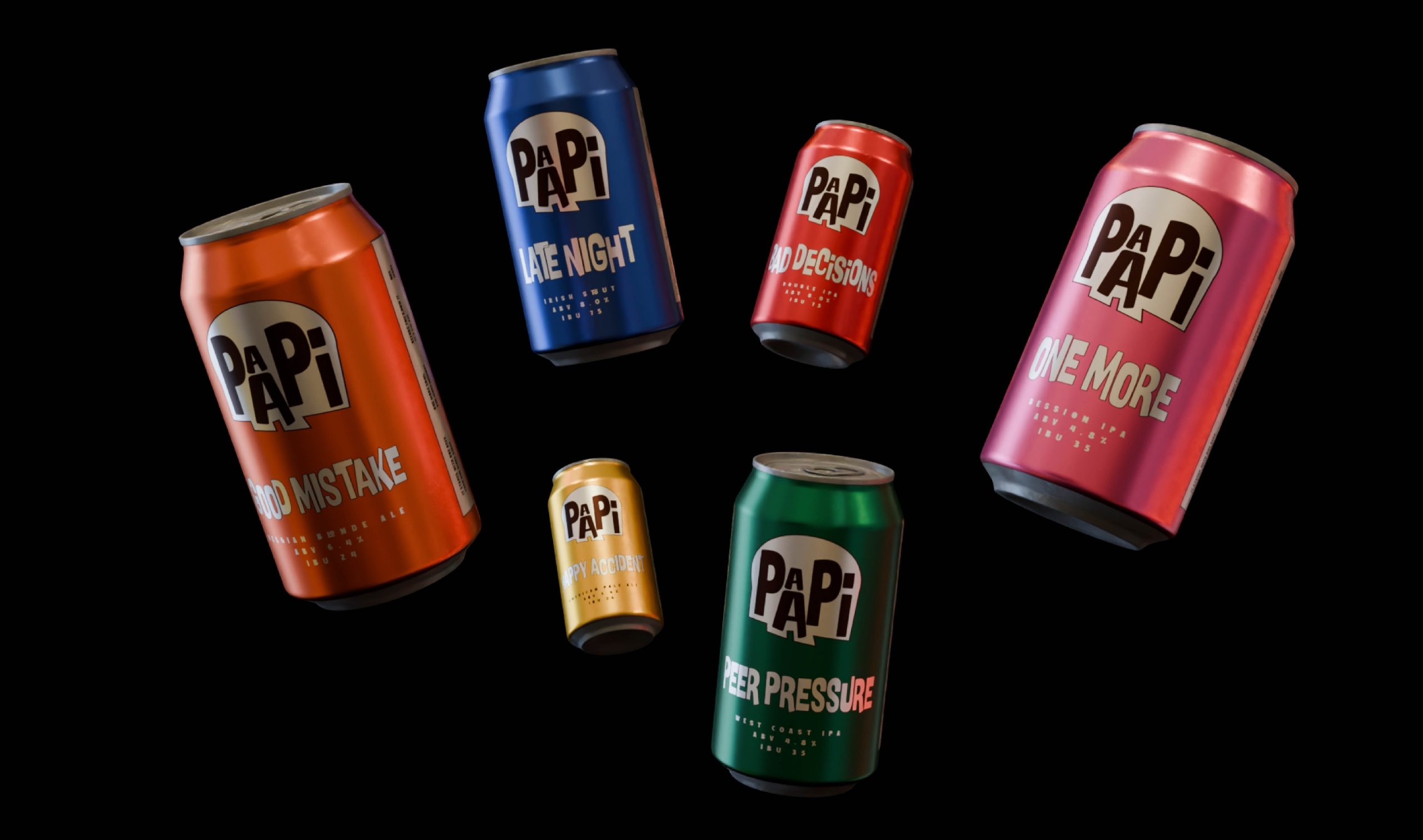
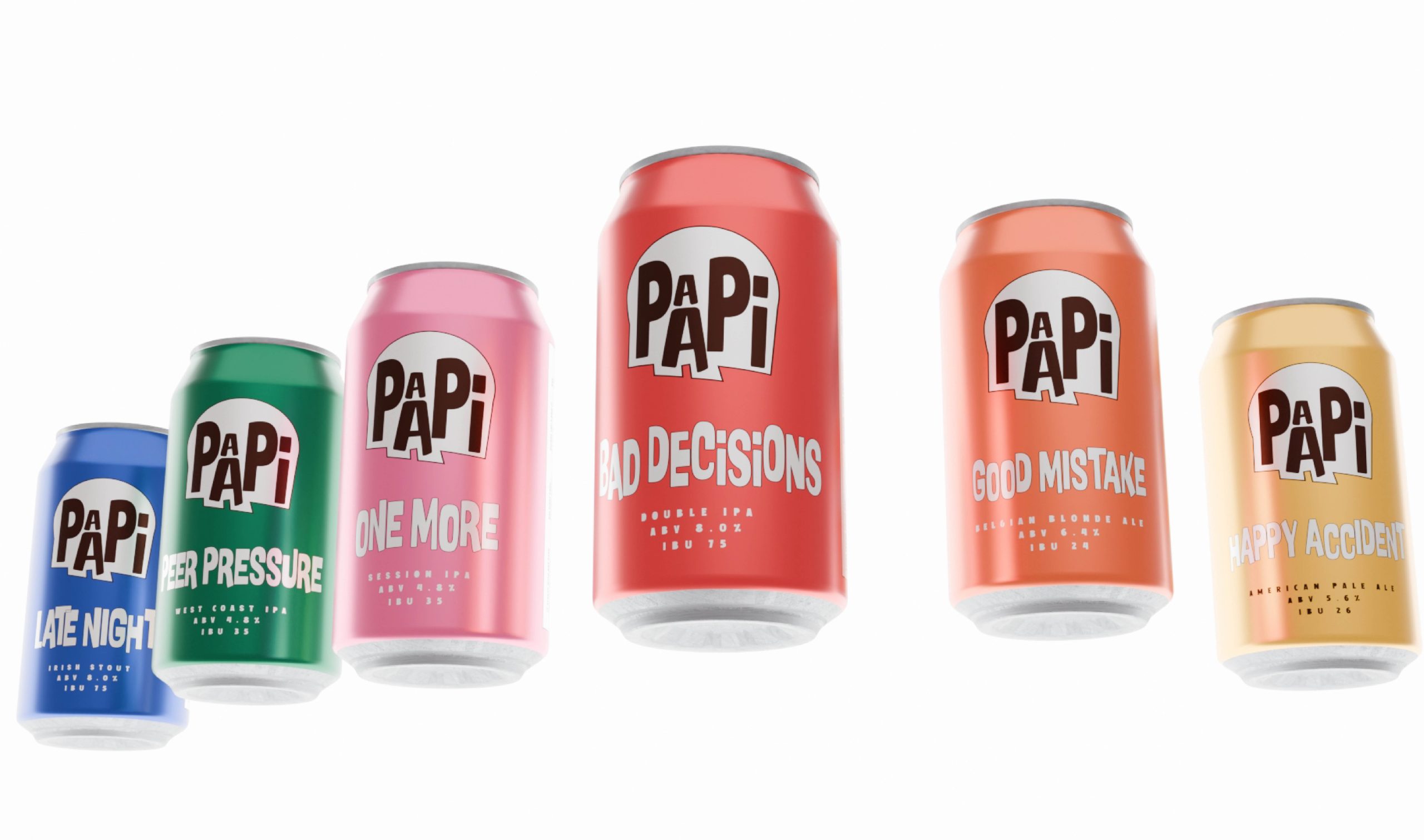
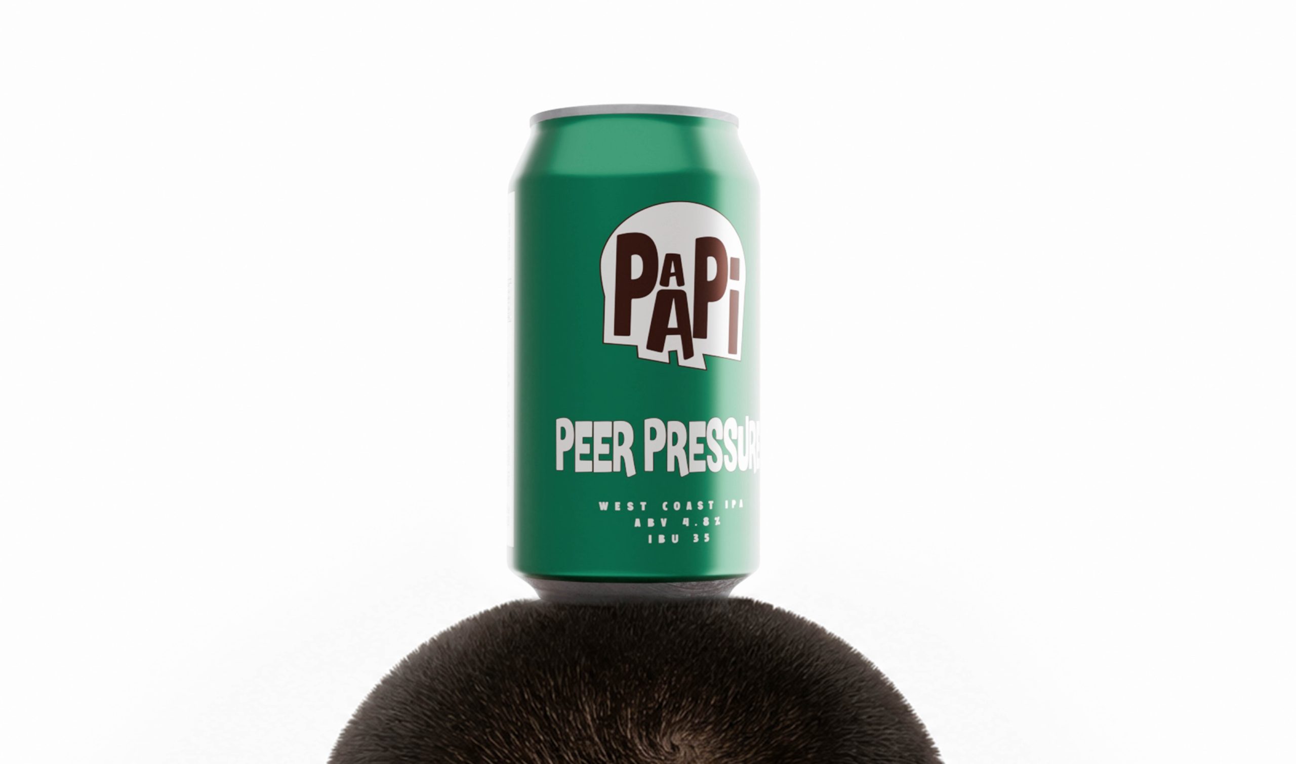
Rather than borrowing from familiar craft beer aesthetics, we built a bold typographic system that behaves as playfully as the people it represents. The wordmark seamlessly integrates into the skull, allowing it to shift expressions across applications. Sometimes it laughs, sometimes it winks, sometimes it rolls its eyes, transforming a static logo into a living character.
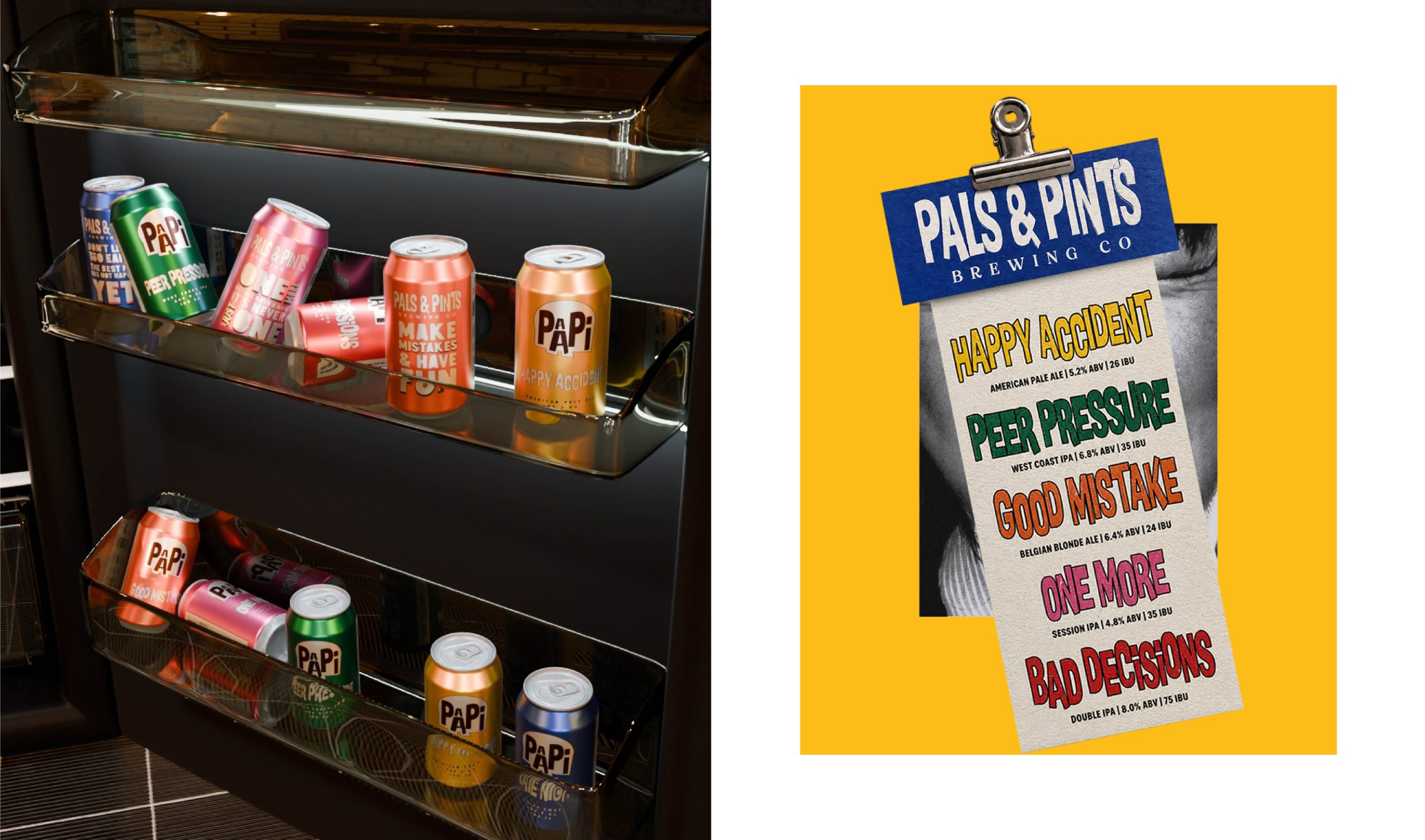
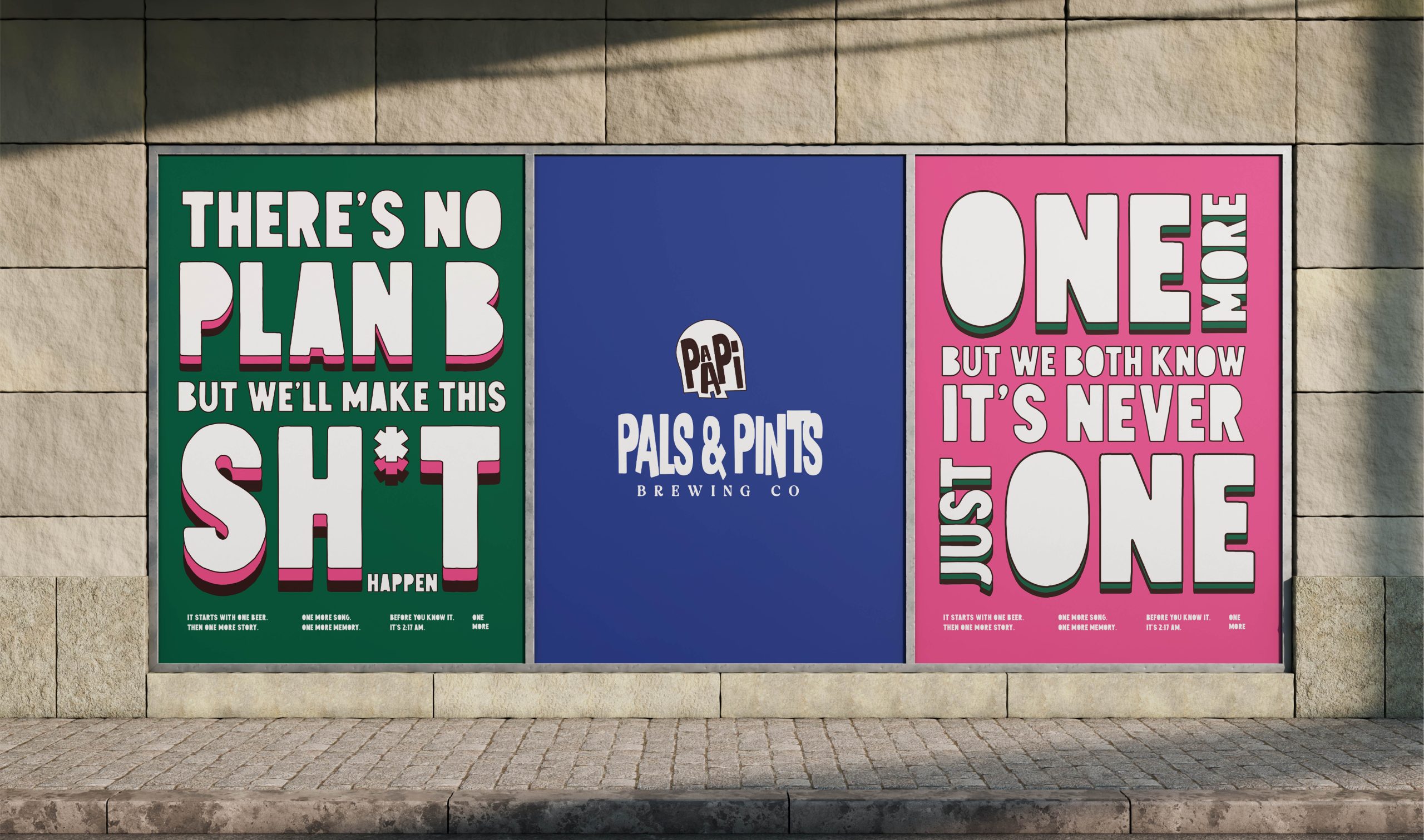
Bold colour blocking, oversized typography, mischievous illustrations, and unexpected compositions come together to create a visual language that feels loud, expressive, and unapologetically social.
PAAPI isn’t a brand that celebrates beer.
It celebrates everything that happens because people chose to share one.

 Natasha Spitsyna
 babyage
 GruppoSaida
 ahmedraoudgfx
 Hi estudio
 Nadezhda Gorelikova
 Studio Garces
 Brandsbylufo
 Rewot
Rewot alchimistestudioParis
 Asprey Creative
 kat bres
 Valérie Colace
 Atiq Alam
 Sara Communications
 David Hakobyan
 monther al omari
 Innovāt - Empowering Creative Innovation
 mmdesign
 Amjad Battal
 Hollóka Grafikai Műhely / Graphic Design Studio
 Palashcc
 ABC Design Communication
 ChrisSkarlatos
 Hedayat Hadavi
 Tia Nguyen