

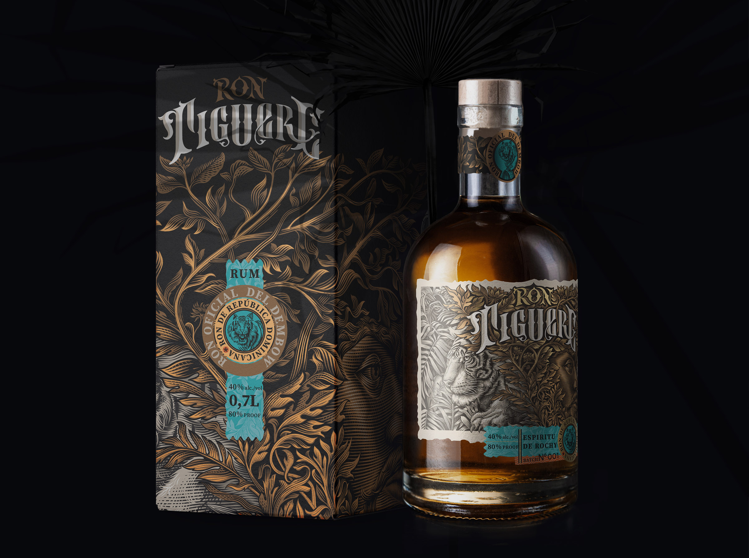
Ron Tiguere (Espiritu De Rochy) is a premium Dominican rum (Batch №001) designed to transform a bottle into a visual narrative about wildlife, rich traditions, and the mystical spirit of the Caribbean. The name and concept are inspired by the majesty of the tiger (Spanish: Tigre) and the deep roots of Dominican rum craftsmanship, where every barrel holds the true magic of aging.
The main challenge of the project was to create a multilayered, highly detailed visual identity that commands attention on the premium spirits shelf. The design masterfully balances the aesthetics of classic vintage engraving with a modern craft sensibility.
Design Concept & Visual Language
The visual heart of the label is an intricate, highly detailed illustration executed in a classic linocut or etching style. It seamlessly weaves together several symbolic layers:
- The Forest Spirit & Wilderness: Emerging from the center of the composition is the stern face of a mythical character, whose hair and beard organically transition into lush Caribbean foliage. To the left, a tiger silhouette is integrated into the thickets, symbolizing the strength, passion, and untamed nature of the spirit.
- The Heritage of Craftsmanship: On the right side, traditional oak barrels peek through the greenery—a nod to the authentic aging process of Dominican rum.
- Typography: The brand name is rendered in a custom gothic-inspired font with sharp, aggressive yet elegant serifs, emphasizing the premium and bold character of the product.
Color Palette & Premium Execution
The color scheme is built upon deep, earthy, and noble tones. A rich chocolate-brown background contrasts with the exquisite gold and silver foil stamping of the illustration.
A standout feature of the project is the vibrant turquoise (cyan) accent ribbon at the bottom of the label and around the neck. This color evokes the crystal-clear waters of the Caribbean Sea, serving as a powerful visual anchor that instantly draws the consumer’s eye. A circular stamp featuring the tiger emblem seals the look, guaranteeing the authenticity and quality of each bottle from this limited Batch №001.
What’s Unique?
“Ron Tiguere” rejects modern minimalism in favor of maximalist storytelling packaging. As consumers examine the label, they discover new elements every time—from the fine linework on the spirit’s face to the wood grain texture on the barrels. The combination of tactile, textured matte paper and metallic foil stamping creates a collectible, high-end feel that invites touch.
Technical Specifications & Materials
- Paper: Premium textured wine paper with a distinct felt-marked tactile finish.
- Finishing: Multi-level hot foil stamping (gold and silver), combined with precise embossing to add depth and volume to the intricate illustration and typography.
- Closure: A classic natural cork stopper, reinforcing the eco-conscious and traditional essence of the brand.
Curator’s Insight
Dense, illustrative labels like this one live or die on hierarchy, and this is where the design earns its keep. With so much line work packed into a small surface, it would be easy for the eye to have nowhere to land. The turquoise ribbon solves that problem directly: it’s the one flat, uncomplicated shape in a label full of texture, so it functions as a resting point before the eye moves back into the detail.
That contrast between busy and calm is really the whole strategy. Foil stamping tends to flatten under certain lighting, so pairing it with a saturated flat color gives the label a way to hold its shape on shelf even when the metallic surfaces catch light unevenly.
The choice to keep the illustration figurative, rather than abstract or pattern-based, also does something specific for a spirits category that often leans on heritage cues without much narrative behind them. Here, the tiger and the forest figure give the bottle a reason to be looked at twice, which matters more than usual on a crowded shelf where most labels are competing for a glance, not a study.



 agarcia studio
 Wynand88
 Eva Chistyakova
 Maria Bukhtilova
 estudiomarciano
 monther al omari
 Thirst
 Maruf Nishat
 Gray Matter Studio
 Julia Jay
 Modern Theory
 Furt Goods
 Fluid
Fluid alchimistestudioParis
 Ancora
 Mostafa Abdelmawla
 MewKittyDraw
 Studio Shala
 43oz
43oz Lucid mk2
 Atiq Alam
 IDEOLOGO
 Open Strategy & Design