The packaging design for tequila is not just a vessel; it’s an artistic expression that encapsulates the vibrant culture and traditions of Mexico. One such striking design is inspired by the festive elements of a Mexican fiesta, showcasing detailed linocut illustrations that bring to life the spirit of celebration. This article delves into the intricacies of this packaging, highlighting its artistic elements and cultural significance.
A Fiesta of Color and Artistry
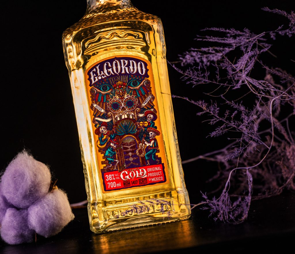
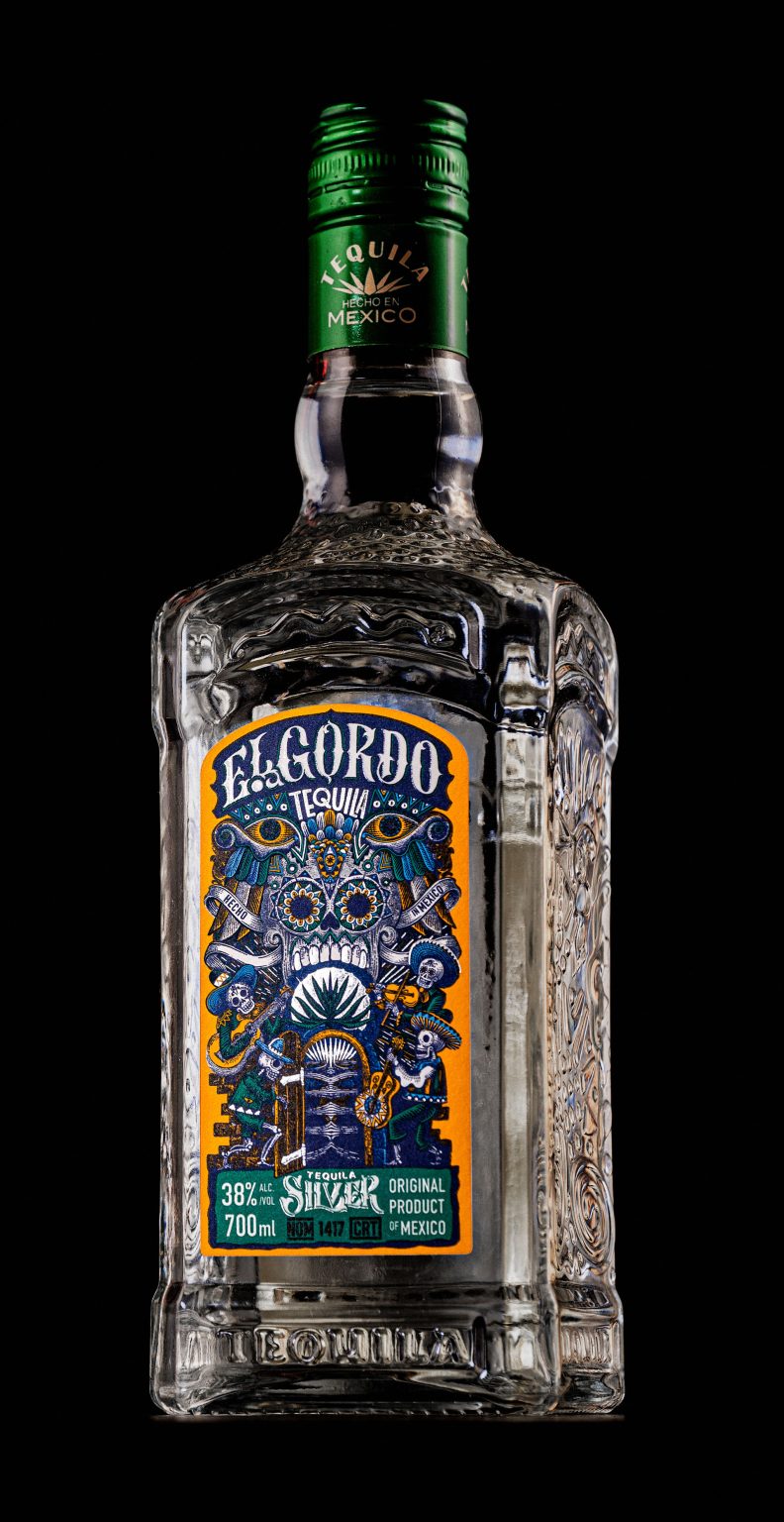
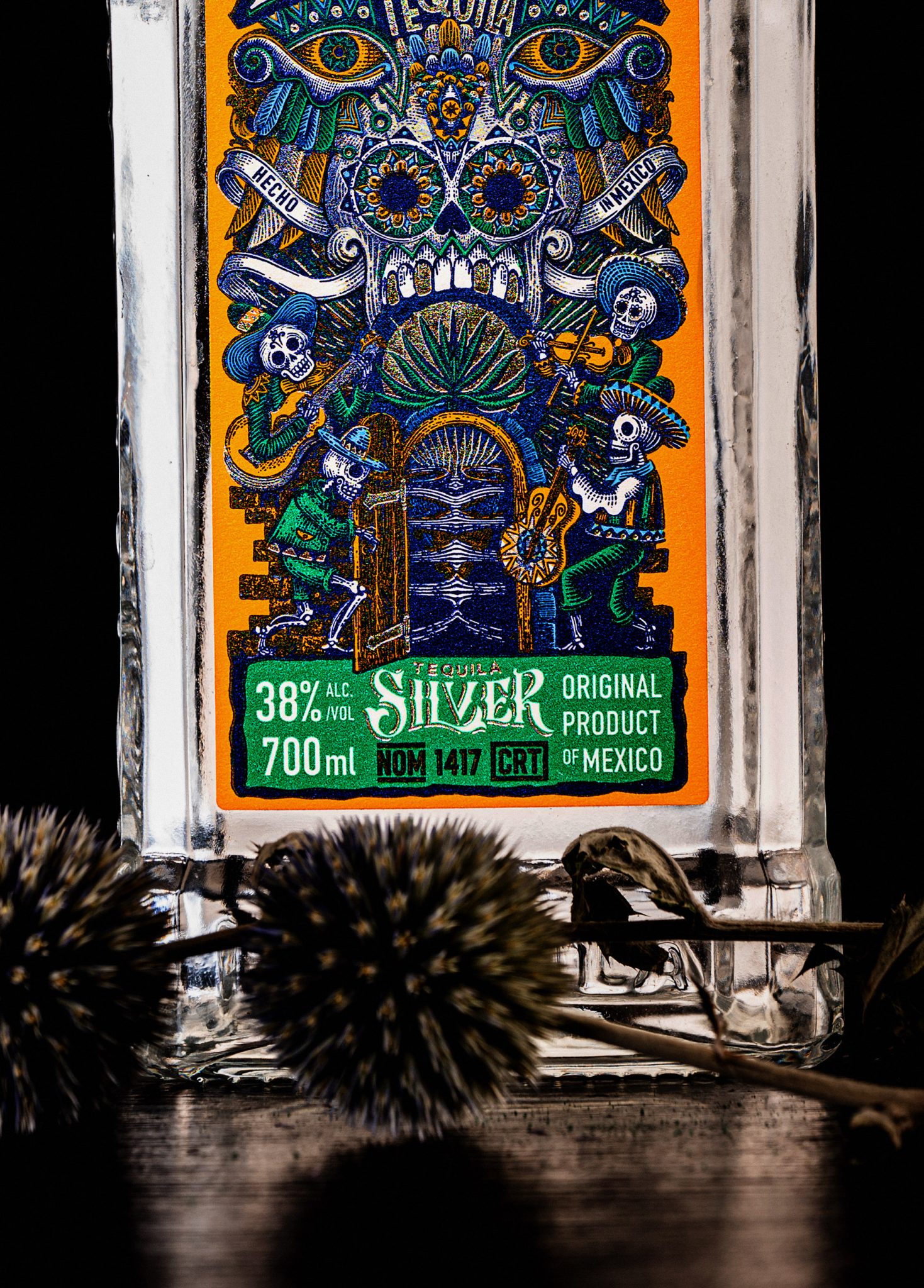
At the heart of this packaging is a detailed linocut design that features a lively mariachi band, set in captivating blue and green tones against an eye-catching orange background. This combination not only draws the eye but also evokes the joyous atmosphere of a traditional Mexican fiesta. The use of high-contrast colors and bold designs is reminiscent of psychedelic art, inviting the viewer to experience a visual feast that reflects the exuberance of Mexican culture.
Surrounding the mariachi band are surrealistic patterns that include sugar skulls, Aztec pyramids, and iconic symbols of the tequila lifestyle. These elements add depth and context, celebrating the Day of the Dead and other cultural motifs that resonate with the brand’s heritage. Each design choice is deliberate, aiming to create a narrative that speaks to both the history and the vibrant present of tequila production.
Typography and Symbolism
The brand name “El Gordo” takes center stage in bold, eye-catching letters. The typography is not merely functional; it serves as a canvas for intricate illustrations of Mexican music and dance symbols. Maracas and musical notes dance around the letters, reinforcing the connection between the drink and the celebratory music that often accompanies it. The vibrant palette—featuring shades of blue, yellow, green, and orange—contrasts beautifully with darker gray tones, creating a dynamic visual experience.
Central to the design is a large skull face, crafted from ornamental details that reflect the artistry of Mexican craftsmanship. This skull is more than a design element; it symbolizes the reverence for life and death that permeates Mexican culture. In one hand, the skull holds a bottle of turquoise-colored mezcal, a nod to the agave plant and the roots of this beloved spirit. The mezcal’s striking color stands out against the lively background, inviting curiosity and attention.
Textural Depth
To enhance the overall aesthetic, the packaging features an aged paper texture, adding depth and a tactile quality that beckons to be touched. This texture not only complements the vibrant colors but also evokes a sense of tradition, reminiscent of handcrafted products that tell stories of their origins. It invites consumers to connect with the heritage of tequila, making the experience of opening the bottle as rich as the spirit inside.
Conclusion
This tequila packaging design is a celebration of culture, artistry, and the joyous spirit of Mexico. Through its intricate illustrations, vibrant colors, and thoughtful symbolism, it captures the essence of a fiesta, inviting consumers to partake in a rich tradition. More than just a container, it’s an invitation to explore the lively world of tequila and the stories that accompany it—one sip at a time. As this design graces shelves, it serves as a reminder of the artistry and celebration that is at the heart of every bottle of tequila.


