
CHALLENGE
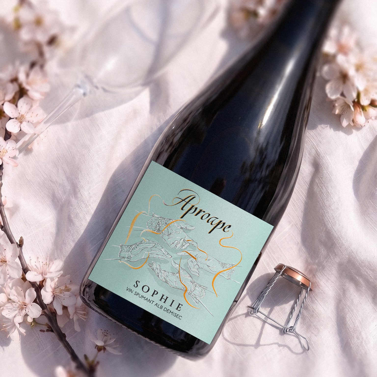
For Aproape’s sparkling wine collection, the challenge was to extend an already established visual identity into a new product category while preserving the distinctive character of the original brand.
The sparkling range needed to feel unmistakably Aproape, yet introduce a lighter, more delicate and sophisticated expression — one associated with summer, celebration and the social moments naturally surrounding sparkling wine.
SOLUTION
We evolved the existing Aproape visual universe rather than creating an entirely separate identity.
Inspired by the elegance of high-society balls, leisurely moments on the French Riviera and the romantic atmosphere of classic novels, we reinterpreted the brand’s signature graphic elements through a softer and more bohemian lens.
The result creates continuity with the original Aproape identity while giving the sparkling collection its own mood and personality.
CHARACTER & ILLUSTRATION
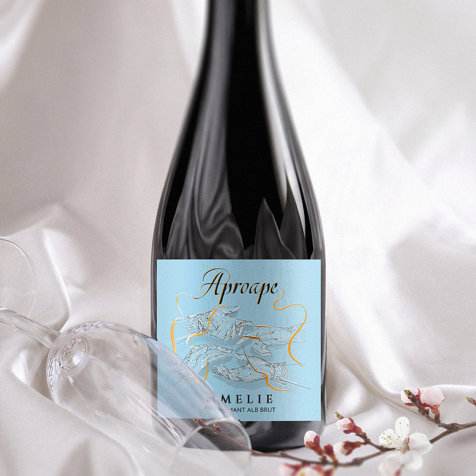
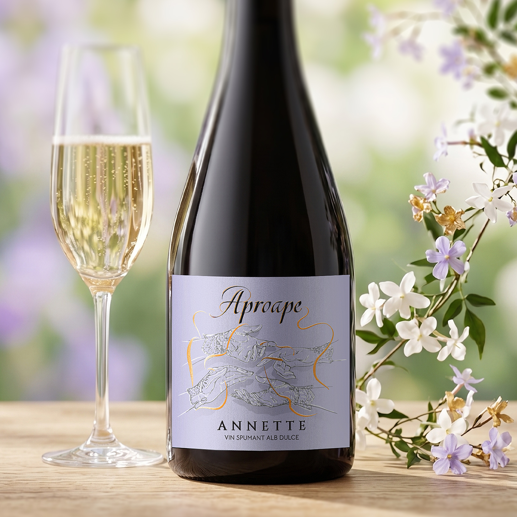
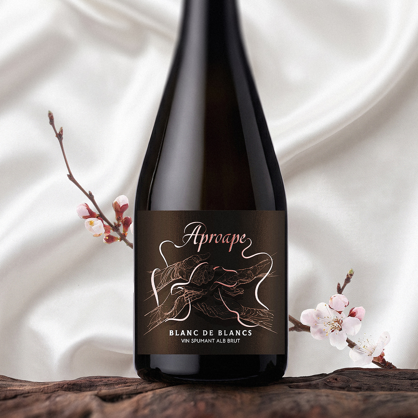
The hands — one of Aproape’s key visual elements — return as the central characters, but their gestures take on a new expression.
Delicate illustrated hands interact through graceful movements, evoking encounters, conversation, celebration and human connection. A flowing golden line moves between them, visually linking each gesture and preserving the idea of invisible connections established in the original brand.
For the sparkling collection, however, the composition becomes lighter and more playful, reflecting the effortless character of a summer gathering.
VISUAL LANGUAGE
The visual language combines fine line illustration, elegant script typography, soft pastel tones and delicate gold detailing.
Generous negative space gives the label an airy quality, while the contrast between the detailed hand illustrations and the fluid golden line introduces movement and refinement.
The overall aesthetic shifts the Aproape identity towards a more romantic and lifestyle-driven expression — sophisticated without becoming formal, and playful without losing elegance.
OUTCOME
The final design creates a natural extension of the Aproape visual identity into the sparkling wine category.
Recognizable brand elements maintain continuity with the original collection, while the softer palette, delicate illustration and refined composition establish a distinctive personality for the new range.
The result is a sparkling wine identity built around connection, celebration and the spirit of summer — a new chapter of Aproape, told through the same visual language in a lighter and more romantic way.
 NEV
NEV Stefano Bracci
 Alina
Alina monther al omari
 Lizakjx
 JOAOMARCOSDESIGN
 alchimistestudioParis
 Harriet Neild
 octavio rojo
 宏洛图品牌设计HONGLT
 DESIGN CONCEPTS
 Alexander Skurihin
 Studio K95
 ARMBRAND
 Richa Rai
 houseoferas by Miti
 Agence des Coteaux
 Kushi Eaknath
 Ann Treasa
 Xiao Ning
 krrrrrllii
 babyage
 Deep
Deep