

Barbados 1569: An Identity That Changes Perceptions
Competing on price may sustain volume, but it rarely builds brand preference. Barbados 1569 was facing precisely that turning point: an Ecuadorian company with a presence in 12 provinces and a portfolio of 19 products—including whiskey, rum, vodka, and tequila—that needed to strengthen its perceived value and prepare for expansion into new markets. The challenge was to preserve the down-to-earth character that had driven its growth while the brand adopted elements capable of projecting greater aspiration, recognition, and desire.
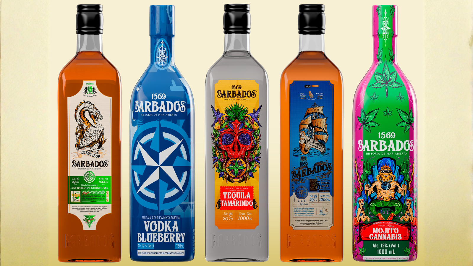
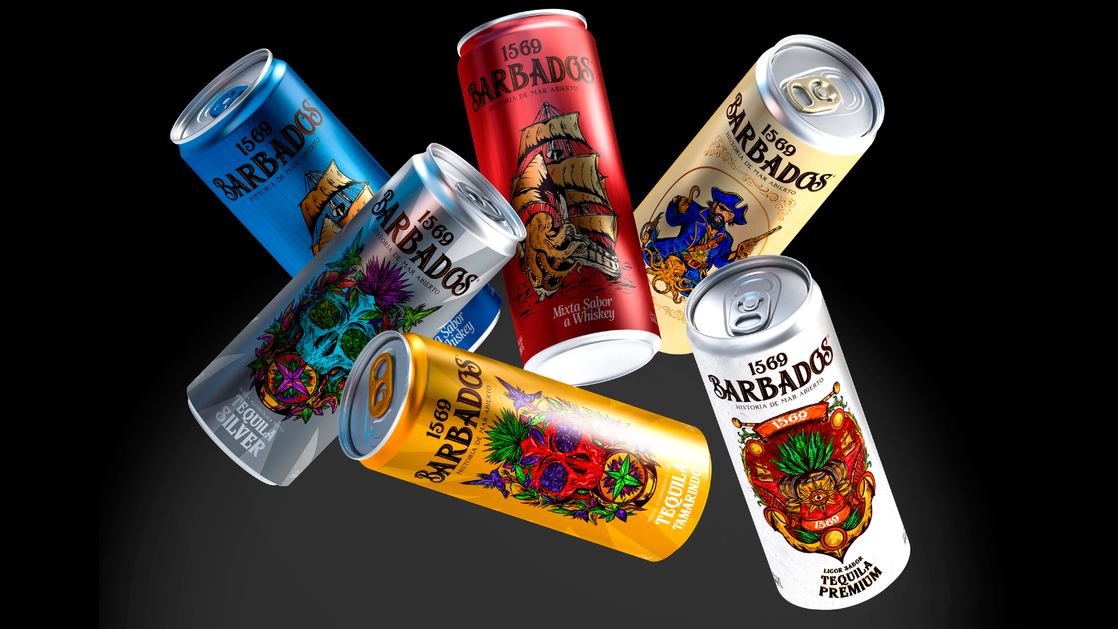
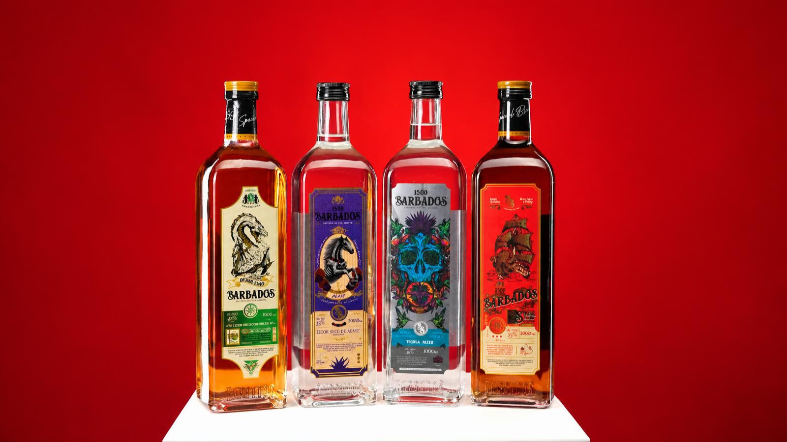
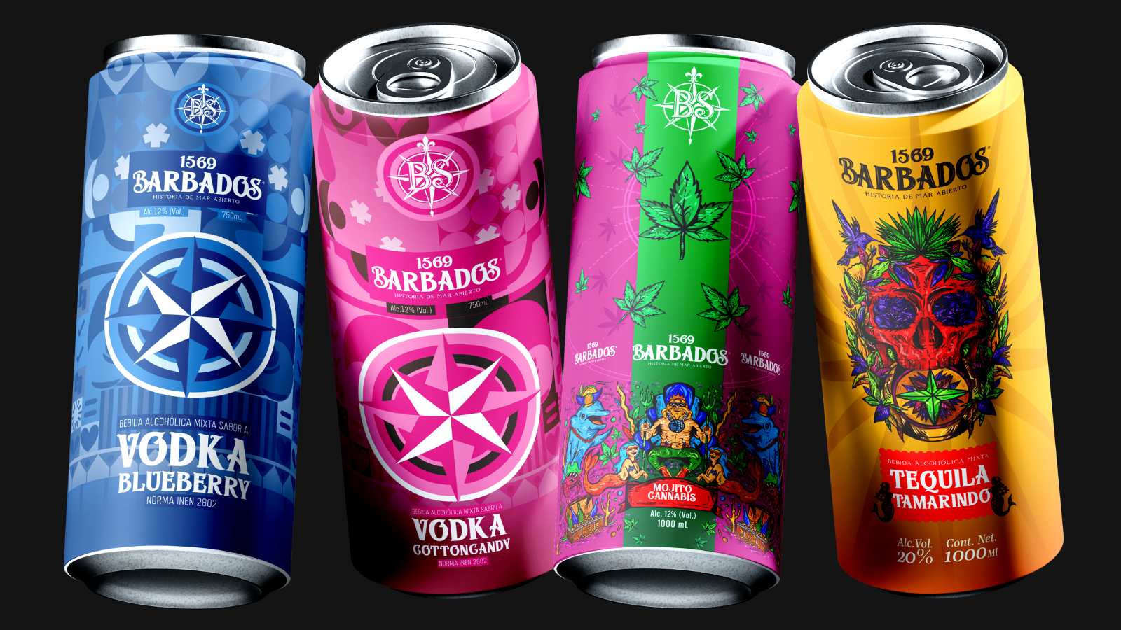
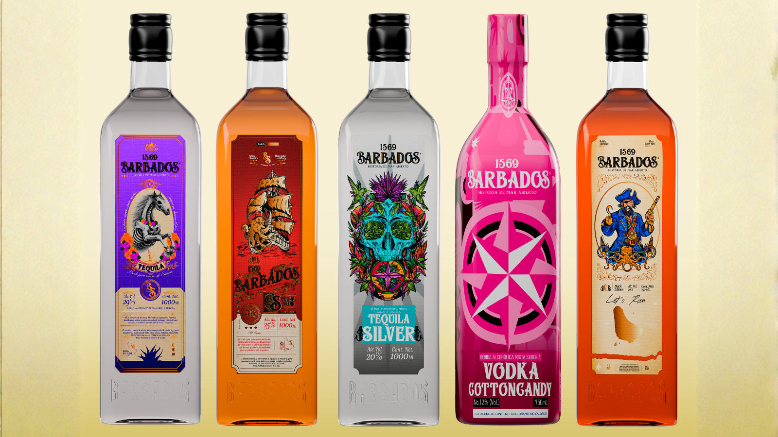
The solution began with the creation of a unique narrative framework. The Caribbean, seafaring, pirates, and the spirit of adventure provided a symbolic structure to convey freedom, celebration, and a sense of belonging. Rather than treating each product as a standalone item, the project transformed whiskey, rum, flavored vodkas, and tequila into chapters of a single story. Illustrations, narratives, and graphic elements create continuity across categories, allowing the portfolio to be recognized as a family even before delving into the details of each product.
This decision has a particularly significant impact on store shelves and in the digital realm, where many purchasing decisions are made in a matter of seconds. A bottle needs to convey its character before it is even opened. The Barbados 1569 visual system uses storytelling, illustration, branding, and packaging to give each product its own personality without fragmenting the brand, creating a presence capable of connecting with young consumers who value expressive, symbol-rich products. Consistency is no longer merely a matter of graphic design; it becomes a tool for brand recognition.
The project thus redefines how an affordable brand can compete. Price remains part of the proposition, but it no longer bears the sole responsibility for convincing consumers. Design, identity, and narrative introduce new reasons to choose and remember the product. Barbados 1569 gains a brand universe poised for growth, capable of differentiating categories and supporting its national and international expansion. When the bottle begins to represent a story and an attitude, the competitive landscape shifts: cost still matters, but desire begins to carry its own weight.
Curator’s Insight
The interesting problem here isn’t the storytelling, it’s the shelf math. A nineteen product portfolio spanning whiskey, rum, vodka, and tequila at an accessible price point usually fragments visually because each flavor variant wants to shout its own claim. Barbados 1569 solves this by treating illustration as the connective tissue rather than the differentiator.
Look at how the recurring elements work across formats. The compass rose and eight point star appear on nearly every SKU, sometimes as a dominant graphic, sometimes reduced to a small emblem beneath the wordmark. That consistency does the recognition work. Meanwhile the illustrated scenes, the trident god flanked by sirens, the jeweled skull framed in foliage, the tall ship rendered in engraving style, are where the variation lives. This split lets the brand tell one story while still giving each flavor its own visual hook at the point of sale.
The can and bottle formats reinforce this rather than compete with it. Rounder, simplified graphics on the tall cans versus denser, more ornamental linework on the glass bottles suggest a system that understands its own physical constraints instead of forcing one label design to survive two different substrates.

 alchimistestudioParis
 Estudio Argo
 Modern Theory
 monther al omari
 Ohmybrand
 Affogato Brand Design
 Tancybox
 waanrong
 nazystudio
 Daria Fox
 g.apolly
 sahildoesartt
 Stiandco
 BREAK DESIGN
 ShreyaDighe
 Sameh Elnahas
 Minim Brand Design
 Ebbi
Ebbi Shabouk Printing & Packaging (Shabouk Carton Boxes – شعبوق)
 Brandegree
 Abbydraw Designs Unique Conceptual Branding & Packaging Designing Ideas
 bilel tkouri
 NEV
NEV Stefano Bracci
 Alina
Alina