
CHALLENGE
For Crama Hermeziu, the challenge was to redesign the Moșanca wine range while preserving its connection to Romanian heritage and giving the brand a more distinctive and emotionally engaging visual identity.
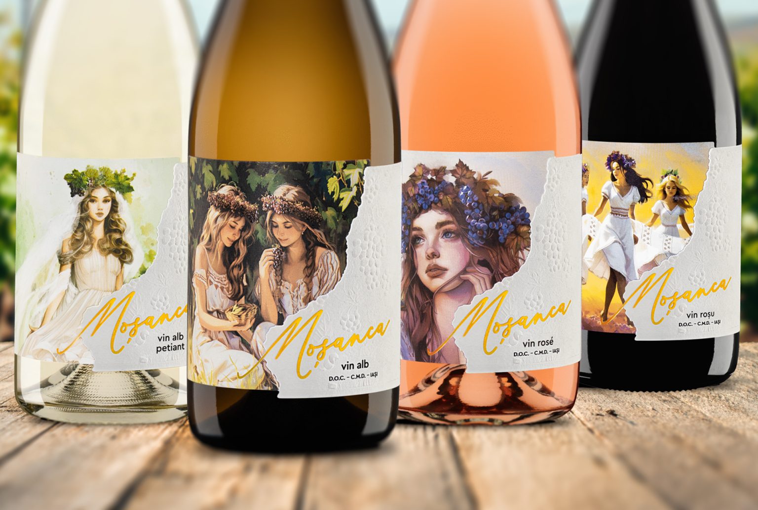
The new packaging needed to create a coherent family across the range while allowing each label to tell its own story — one rooted in femininity, tradition and local mythology.
SOLUTION
We built the redesign around the meaning and character of Moșanca, transforming Romanian feminine imagery into the central storytelling element of the range.
Inspired by the iele — mysterious female figures from Romanian mythology — we developed a sequence of illustrations that evolves from one label to another. Rather than repeating the same visual with colour variations, each wine reveals a different chapter of the story.
CHARACTER & ILLUSTRATION
The illustrations explore different expressions of feminine grace and create a visual progression throughout the collection.
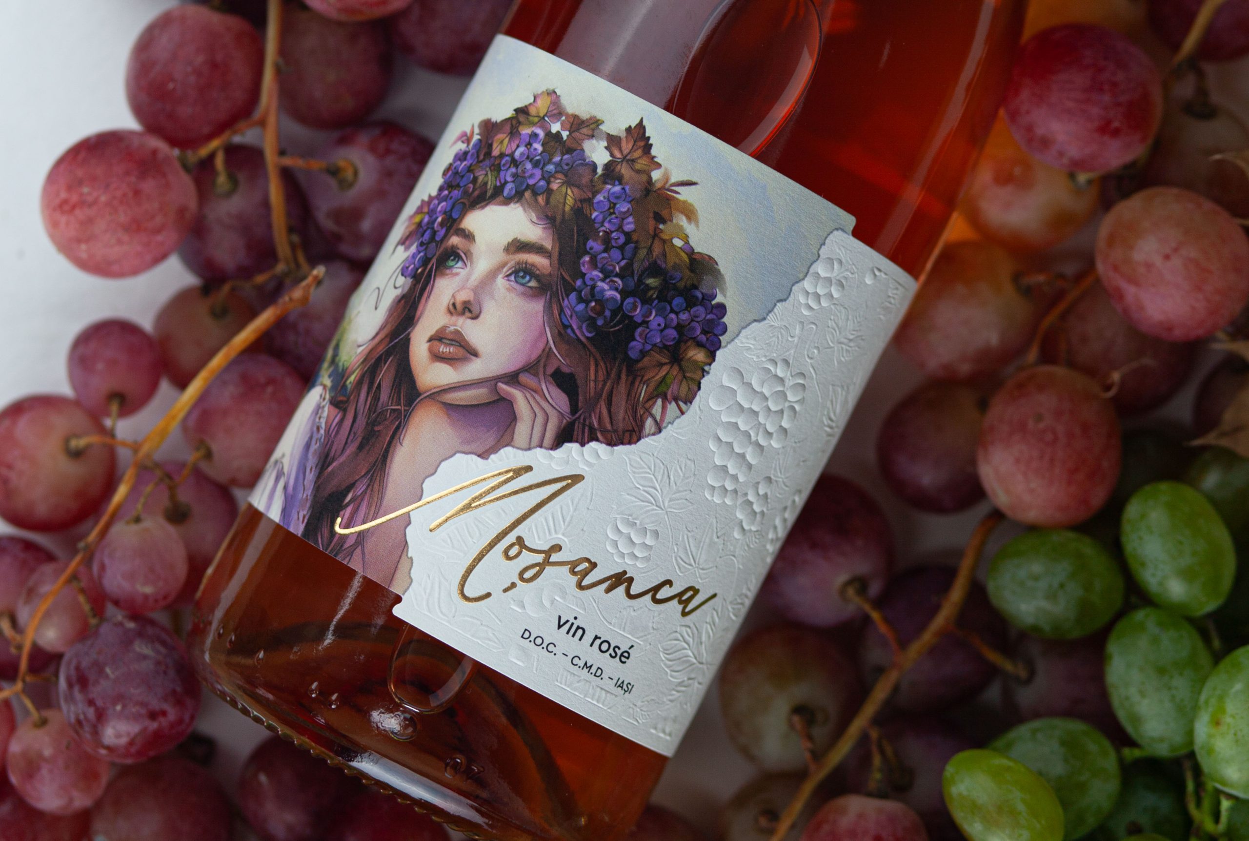
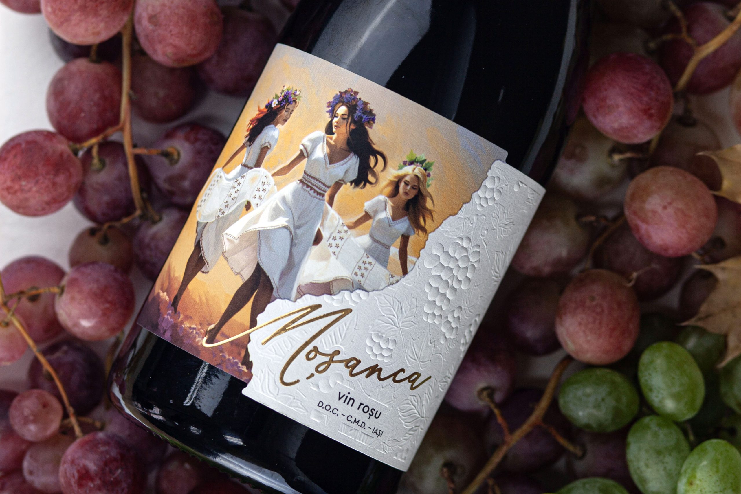
The story begins with the innocence of a young woman holding a grape, continues with the complicity of two women, develops into the seductive dance of the three iele, and culminates with the bride — a symbol of completeness, tradition and celebration.
Together, the characters transform the wine range into a sequence of interconnected scenes, giving each label an individual personality while building a larger narrative around the Moșanca brand.
VISUAL LANGUAGE
The expressive illustrations are balanced by a clean white background and a restrained graphic composition, allowing the characters to remain the main visual focus.
Subtle embossed grape motifs emerge from the background, creating a tactile connection to the vineyard and its fruit without competing with the illustration.
The contrast between delicate detailing, generous negative space and tactile finishing creates a contemporary interpretation of traditional Romanian references.
OUTCOME
The redesign gives Moșanca a coherent and recognizable identity built around storytelling rather than simple SKU differentiation.
Each bottle works individually, while together the labels reveal a visual journey through femininity, mythology and Romanian tradition.
The result is a wine packaging system that transforms cultural heritage into a contemporary brand experience — distinctive on the shelf, emotionally engaging and deeply connected to the story behind its name.
 monther al omari
 Shustova p
 mutta
mutta @Allenarts13
 Sirka Agency
 Atiq Alam
 Dozen Agency
 j.substance
 SCD
SCD Cristian Lepore | crilep Copia
 Chris Creative Works
 Aligned Design Co.
 CreativeWise
 Agence des Coteaux
 Ramyromeo2024
 Grain of Design ®
 Ebbi
Ebbi BFS Studio
 butterflyhunters
 Asprey Creative
 About House of Ta
 Up-Brands
 KJS CRAFT
 hello ocean
 PG Branding