
CHALLENGE
For Taraclia Winery, the challenge was to create a distinctive label concept for a wine range produced exclusively from grapes grown in the winery’s own vineyards.
The packaging needed to communicate this strong connection to origin and give the wines an identity rooted in a real place, while maintaining a contemporary and refined presence on the shelf.
SOLUTION
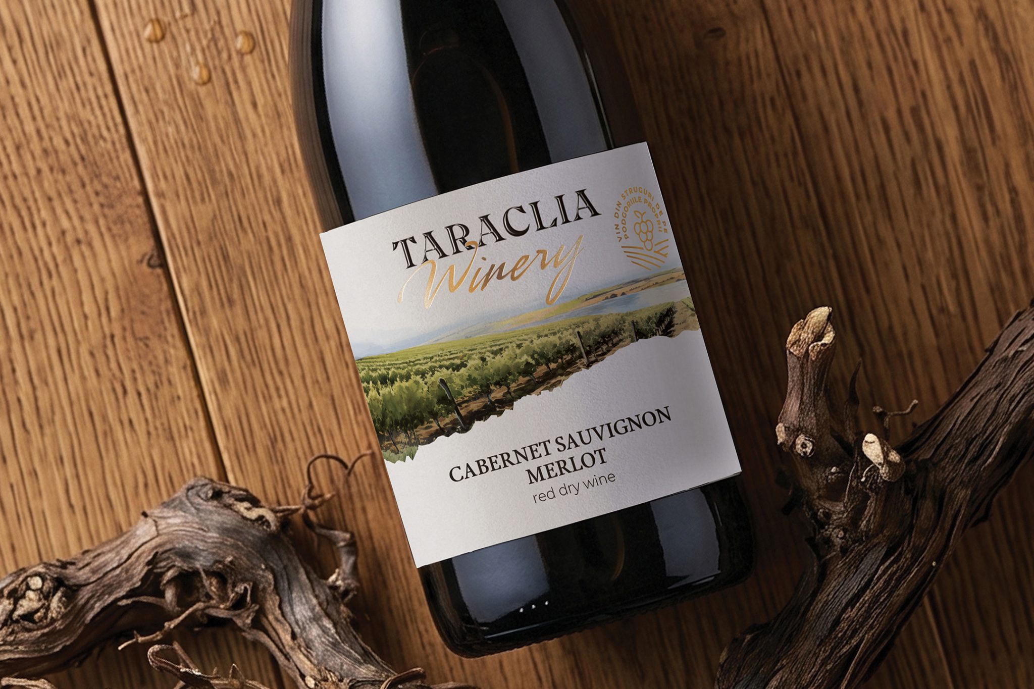
We developed the concept around the landscape of Taraclia Winery’s vineyards, turning the actual place where the grapes are grown into the central element of the visual identity.
Instead of using a generic vineyard representation, we translated the real landscape into a custom watercolor illustration, allowing the packaging to communicate provenance through an authentic and recognizable image of its origin.
The result creates a direct visual connection between vineyard, wine and place.
CHARACTER & ILLUSTRATION
The watercolor illustration captures the atmosphere and natural character of the Taraclia vineyards through a softer, artistic interpretation.
Its organic texture contrasts with the more structured typographic elements of the label, creating a balance between craftsmanship and contemporary wine packaging.
The landscape is not simply decorative — it becomes a visual expression of provenance, reinforcing the idea that the identity of the wine begins in the vineyard itself.
VISUAL LANGUAGE
The visual language combines watercolor illustration, elegant typography and tactile finishing techniques.
A custom typographic stamp reinforces the wine’s origin and is enhanced through raised varnish, while embossing and selective detailing introduce depth and a tactile dimension to the label.
The contrast between expressive illustration and precise typographic detailing creates a sophisticated composition that reveals additional elements as the consumer interacts with the bottle.
OUTCOME
The final design gives the range a distinctive identity built around provenance and estate-grown character.
By transforming the winery’s actual vineyard landscape into the central visual element, the packaging communicates where the wine comes from before the bottle is even opened.
The result is a contemporary wine label system where origin, landscape and craftsmanship become part of the product story, creating a recognizable presence both individually and across the complete range.


 krrrrrllii
 babyage
 Deep
Deep monther al omari
 Atiq Alam
 TUERCA Studio
 neo creative studio
 Pinot Agency
 Pixels Studio
 Anastasia Cherepanova | xtramez
 awaiskhadim
 Studio Be Design
 Belova Oksana
 We Craft Studio
 ArtDesignByDIna
 Ananya Taran
 Nadezhda Gorelikova
 orhanirmaktasarim
 WillBe
 Hi estudio
 43oz
43oz Rosario Lo Iacono
 alchimistestudioParis