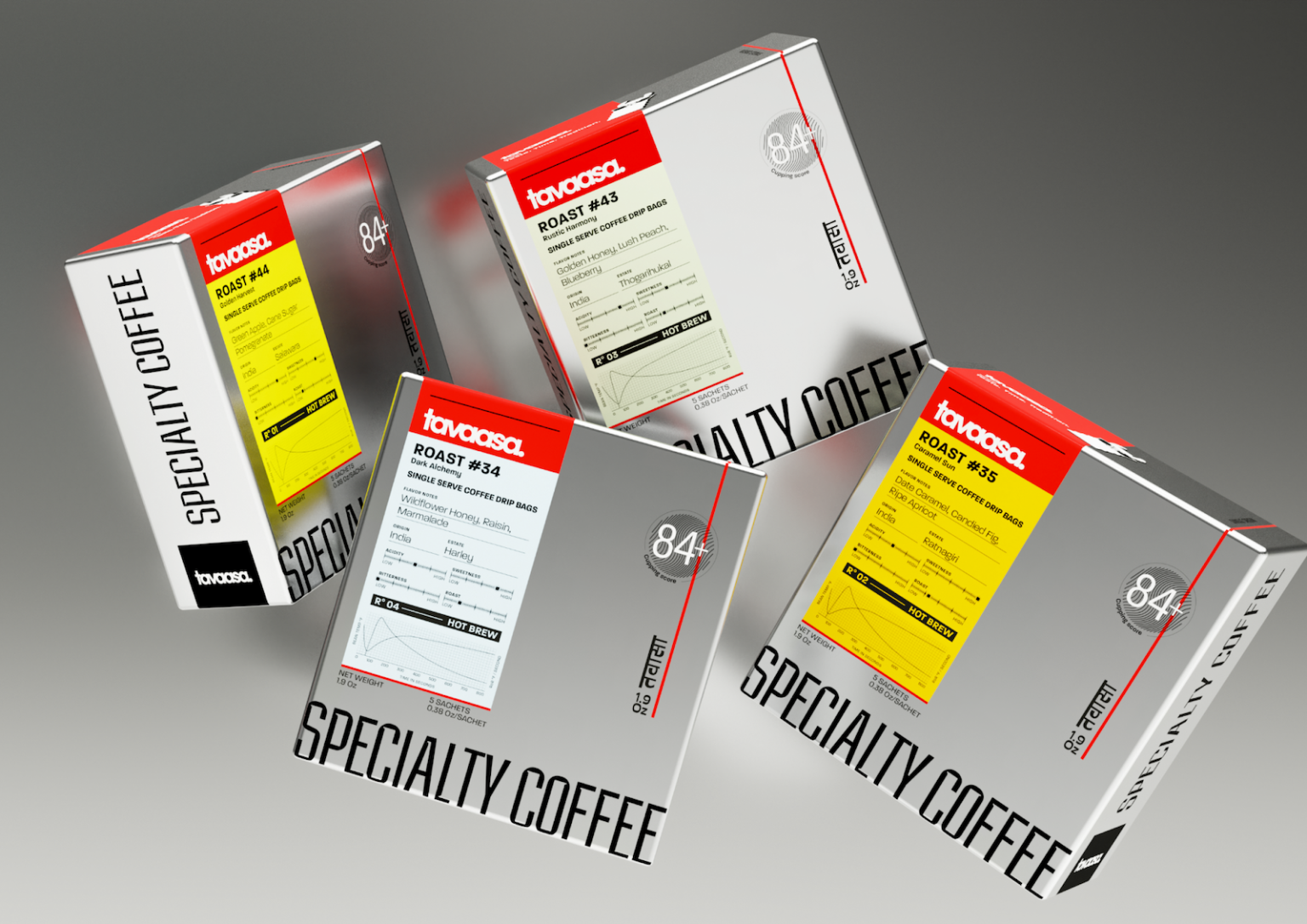

Tavaasa was created for a coffee brand founded by an ex-engineer, and that became the central design truth of the project. This was not a brand built around coffee as lifestyle alone, but coffee as a precise, researched, and deeply intentional craft.
The brand’s product philosophy comes from over 2,500 cupping sessions, multiple roast experiments, grind trials, bean sourcing studies, and constant refinement across the roasting curve. Every variable was tested, adjusted, and understood before the coffee reached its final form. Our challenge was to translate this obsessive engineering mindset into a brand and packaging system that felt premium, intelligent, and accessible.
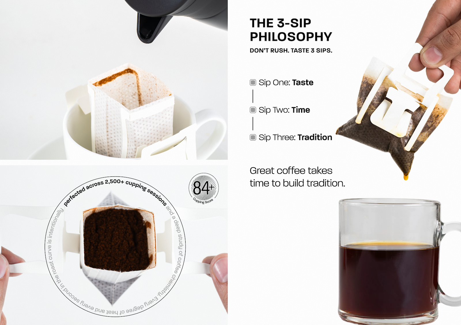
The choice of drip bags became a key part of the brand story. Tavaasa never wanted specialty coffee to feel out of reach or dependent on expensive machines, complex apparatus, or expert brewing knowledge. Good engineering is not only beautiful; it is functional, effortless, and made for people. The drip bag format allowed us to make a carefully engineered cup of coffee simple enough for anyone to brew, anywhere.
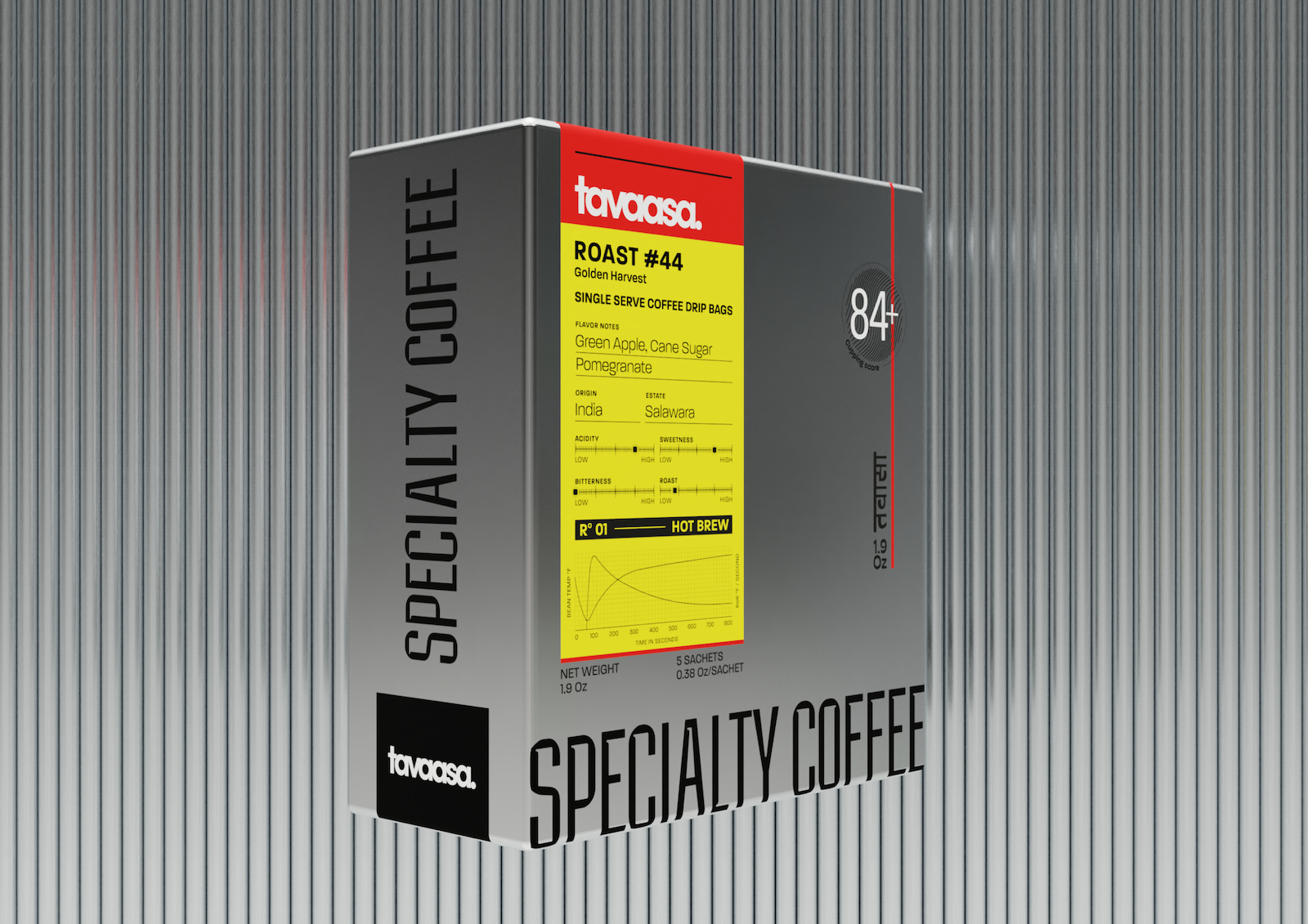
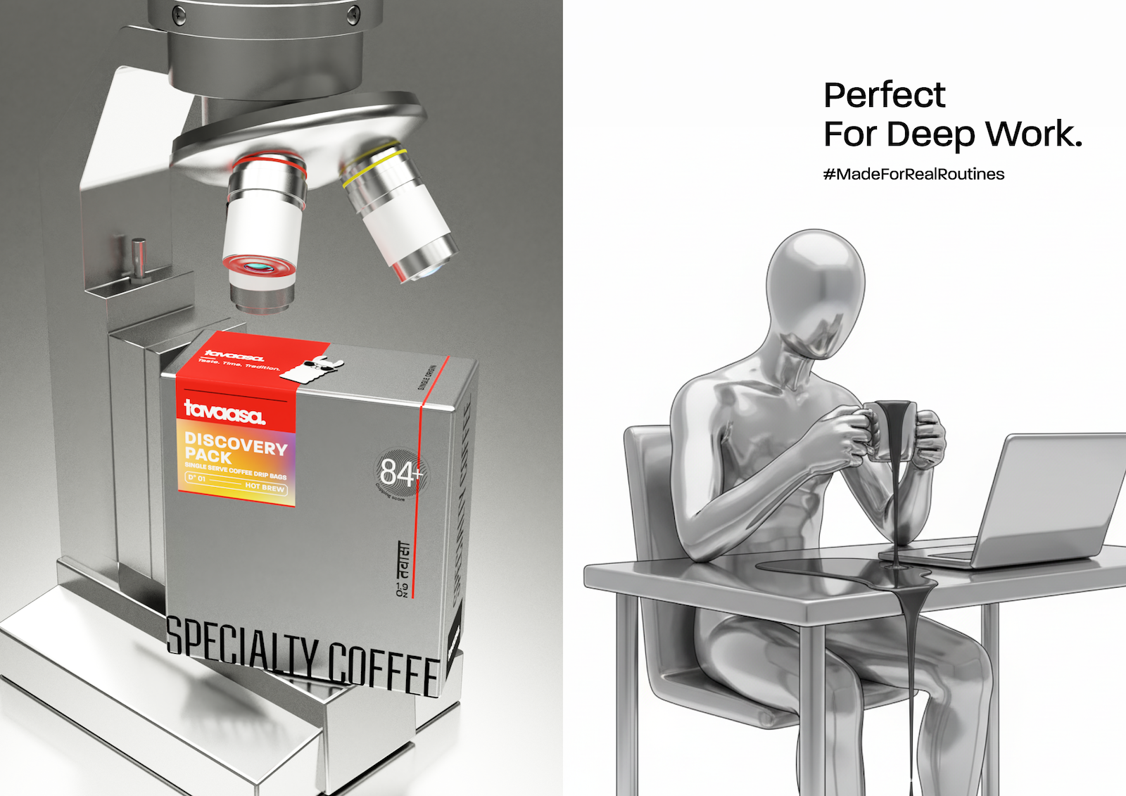
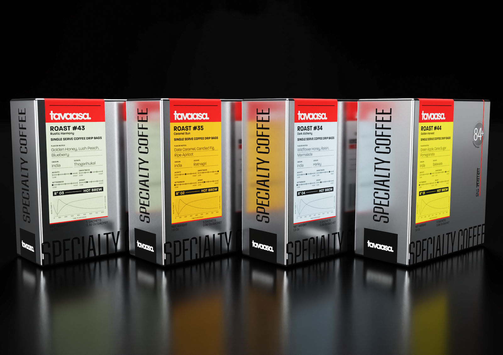
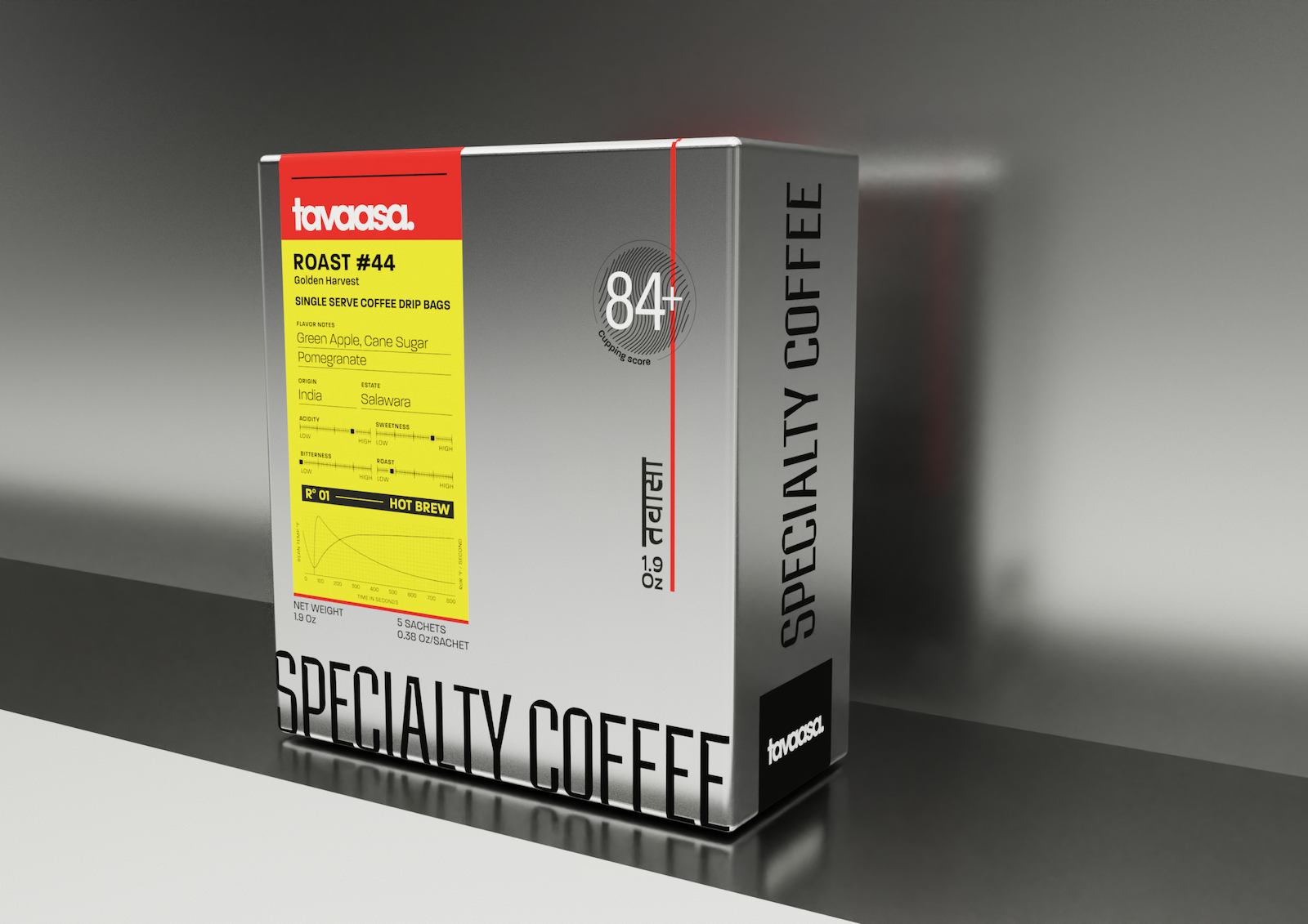
This idea of engineering became the driving force behind the visual identity. The brand world is modern, industrial, and precise, drawing inspiration from stainless steel, one of the most refined materials associated with engineering and manufacturing. The typography is sharp, geometric, and tightly composed, creating a visual language that feels calculated, confident, and controlled.
On the packaging, the actual roasting curve is displayed on the front of every pack. This creates transparency and turns the science behind the coffee into a visual signature. The product information is treated almost like a technical legend seen on architectural drawings, elevation sheets, or 3D engineering files. This helps the pack feel honest, structured, and grounded in process rather than decoration.
The roast numbers also play an important role in the naming system. Each coffee is identified primarily by its roast number, reflecting the many experiments, iterations, and variations that went into engineering the final cup. It makes the product feel like the result of research rather than guesswork.
While the design language is global and industrial, we also wanted Tavaasa to remain rooted in India. The brand name appears in Hindi on the pack, creating a quiet cultural anchor within an otherwise contemporary system. The brand mascot, LAMS, a cool llama wearing sunglasses, adds personality and memorability. It was inspired by the founder’s time in Arunachal Pradesh, where the idea for an engineered coffee first began to take shape. LAMS brings warmth and wit to an otherwise precise design system, balancing science with charm.
Tavaasa is ultimately a study in contrast: engineered yet emotional, technical yet accessible, industrial yet warm. The branding and packaging were designed to make coffee feel like an experience shaped by research, craft, and culture. A product that looks precise, feels premium, and remains easy enough for anyone to enjoy.
Taste. Time. Tradition.
Engineered into every cup.




 Vighnesh D
 lunapanda
 Tridimage
 Analoguecreative
 lettera7
 alchimistestudioParis
 Lana B
 Colossal
 Pivot Studio
 M&A CREATIVE AGENCY
 monther al omari
 Anastasia Cherepanova | xtramez
 Hollóka Grafikai Műhely / Graphic Design Studio
 BOLD branding
 Antonia Skaraki
 Pâmella Lorrany
 Z9BKAdsgn
 Francesco Paternoster
 b1studio.ro
 Chris Creative Works
 Boordon
 Dmitriy Kuzovlev
 Brand Society
 yasharpic