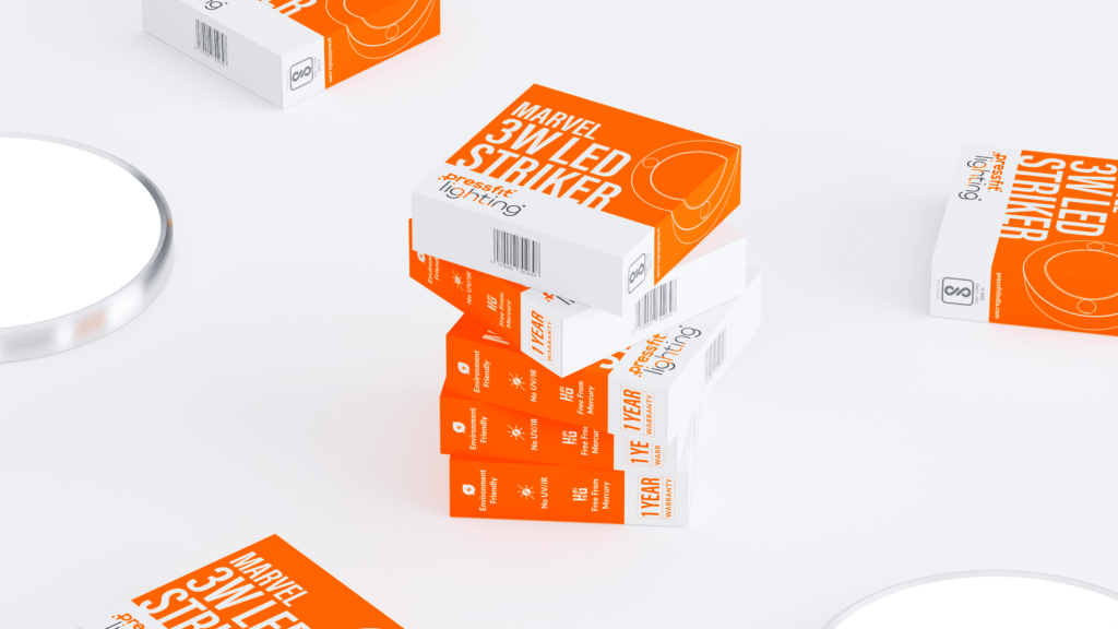
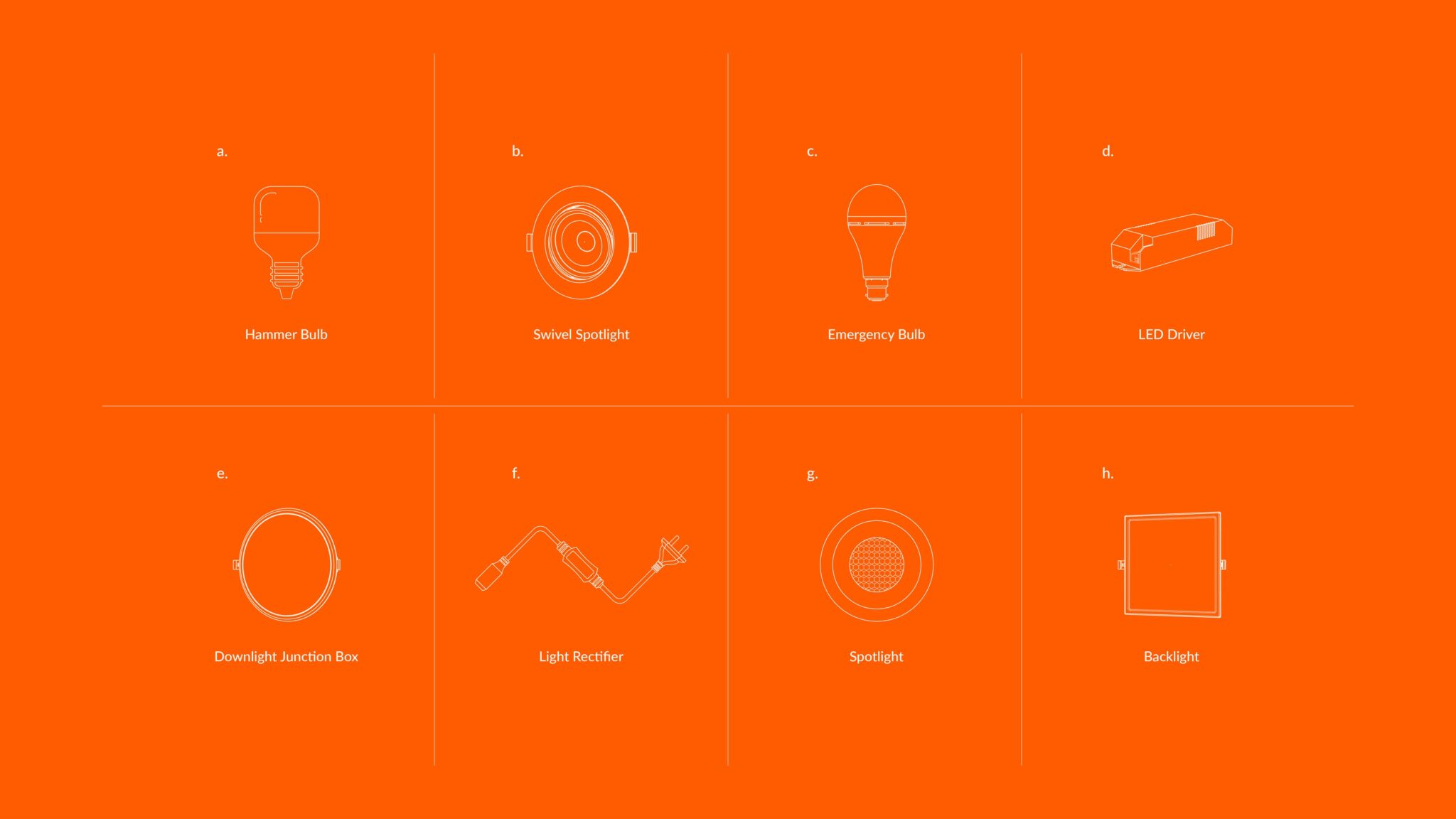
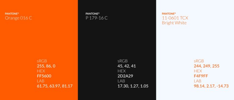
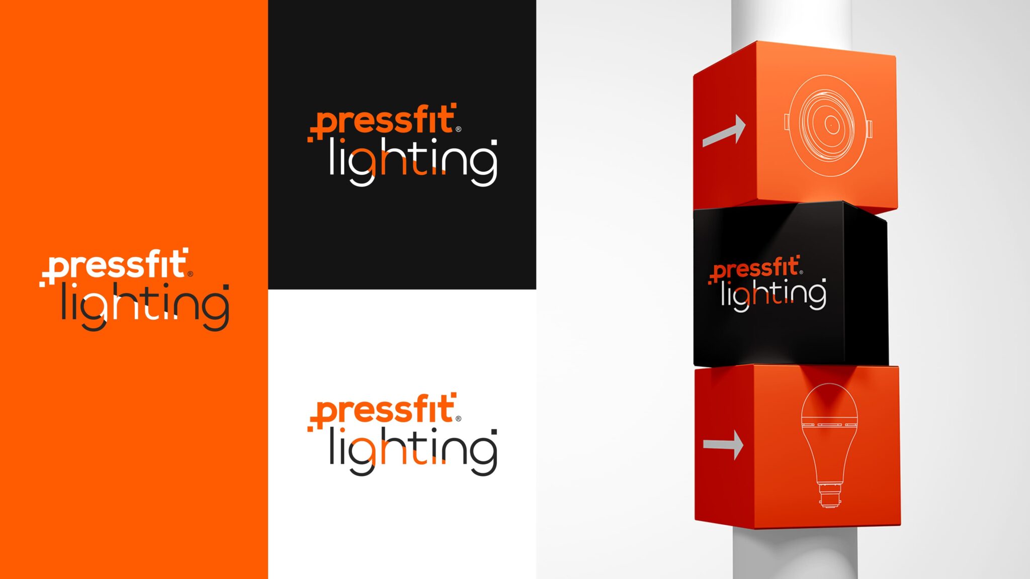
In spearheading the design of brand identity and packaging for Pressfit Lighting, a distinguished player in lighting, pipes, wires, and switches, the objective was to create a unified visual language for a diverse product range exceeding 150 SKUs. The central theme of the design revolves around the distinctive choice of electronic orange as Pressfit’s signature color—an innovative and bold statement that sets the brand apart in a rather crowded market.
The design philosophy reflects Pressfit’s dedication to modern solutions, utilizing a deliberate simplicity and modernity to convey efficiency and innovation. Striking a balance between boldness and minimalism, we ensured that each product maintains a unique identity while contributing to a cohesive brand image on the shelves.
A critical challenge was maintaining consistency across the extensive product line, prompting the creation of a minimalist and eye-catching design that not only stands out but also establishes a strong brand presence. This approach reflects Pressfit’s commitment to excellence and innovation in every facet of its product offerings.
Environmental considerations played a pivotal role in the design strategy. By minimizing ink usage and opting for non-laminated materials, we aimed to reduce the environmental impact of the packaging process, aligning with Pressfit’s commitment to sustainability.
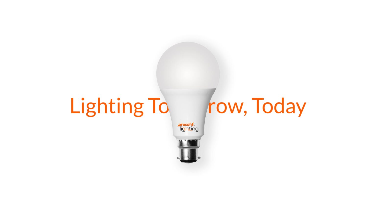
Furthermore, the technological prowess of Pressfit’s products, including LED bulbs, tubelights, and spotlights, showcases a dedication to energy efficiency and longevity. These products not only provide superior lighting solutions but also contribute to environmental sustainability by reducing waste through extended product lifecycles.
In essence, the design encapsulates Pressfit’s core values—innovation, sustainability, and quality—setting the brand apart in a competitive market while establishing a visual identity that resonates with modern consumers.


