
Tequilife: Designing a Category of Its Own Through Color
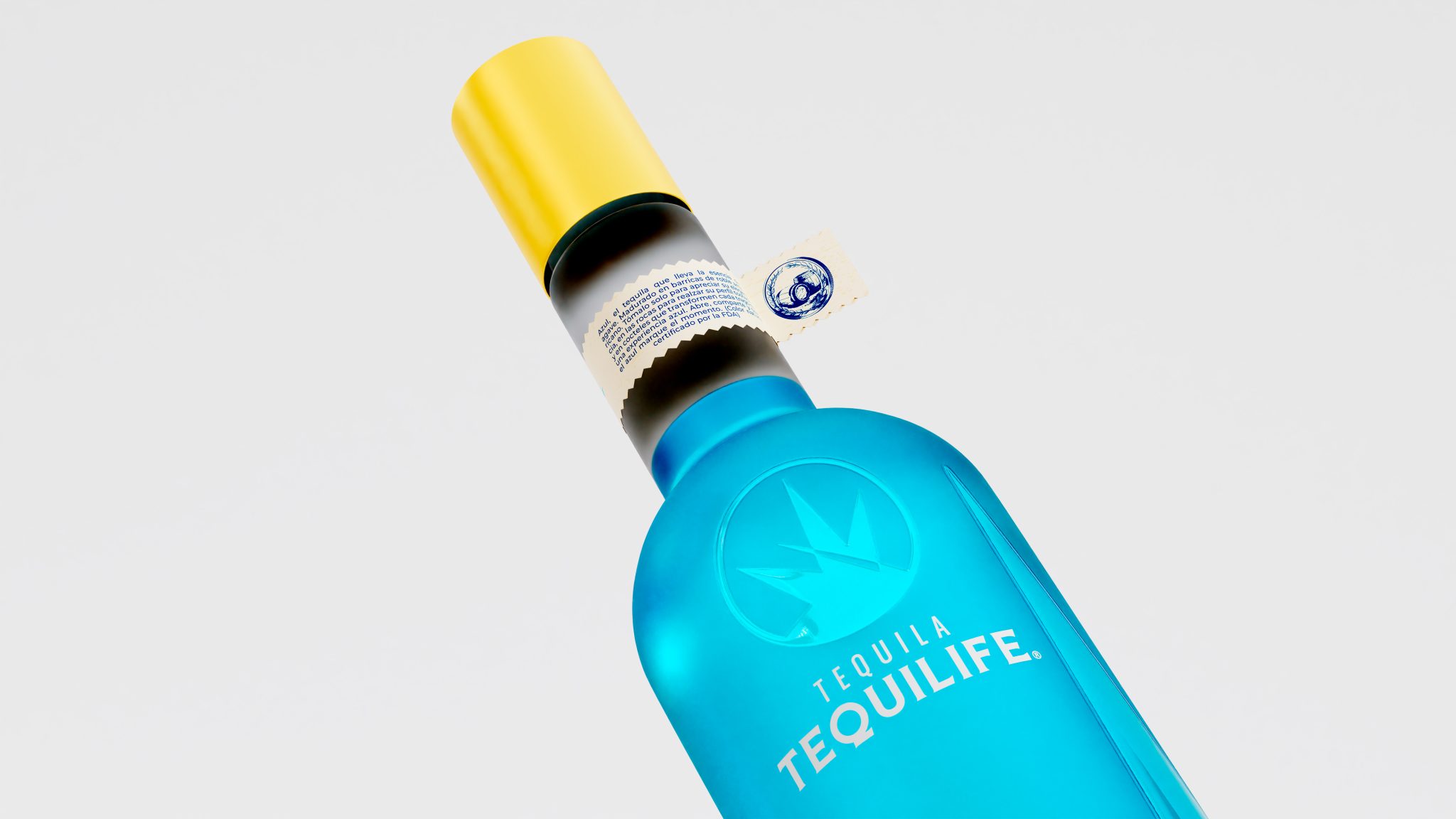
Tequilife began with a valuable paradox: it had a product that was difficult to ignore and a brand that was still easy to forget. Founded in Guadalajara in 2013, its portfolio already contained an exceptional visual asset—a pink blanco tequila and a blue cristalino reposado—yet brand awareness and distribution remained limited. That tension revealed the opportunity. Pink and blue could evolve from product characteristics into proprietary brand codes, capable of creating recognition before the consumer even read the name. Within a category shaped by traditional luxury, cultural experimentation and lifestyle-driven newcomers, Tequilife needed a territory it could genuinely own: color, Mexican origin and contemporary attitude expressed through one coherent narrative.
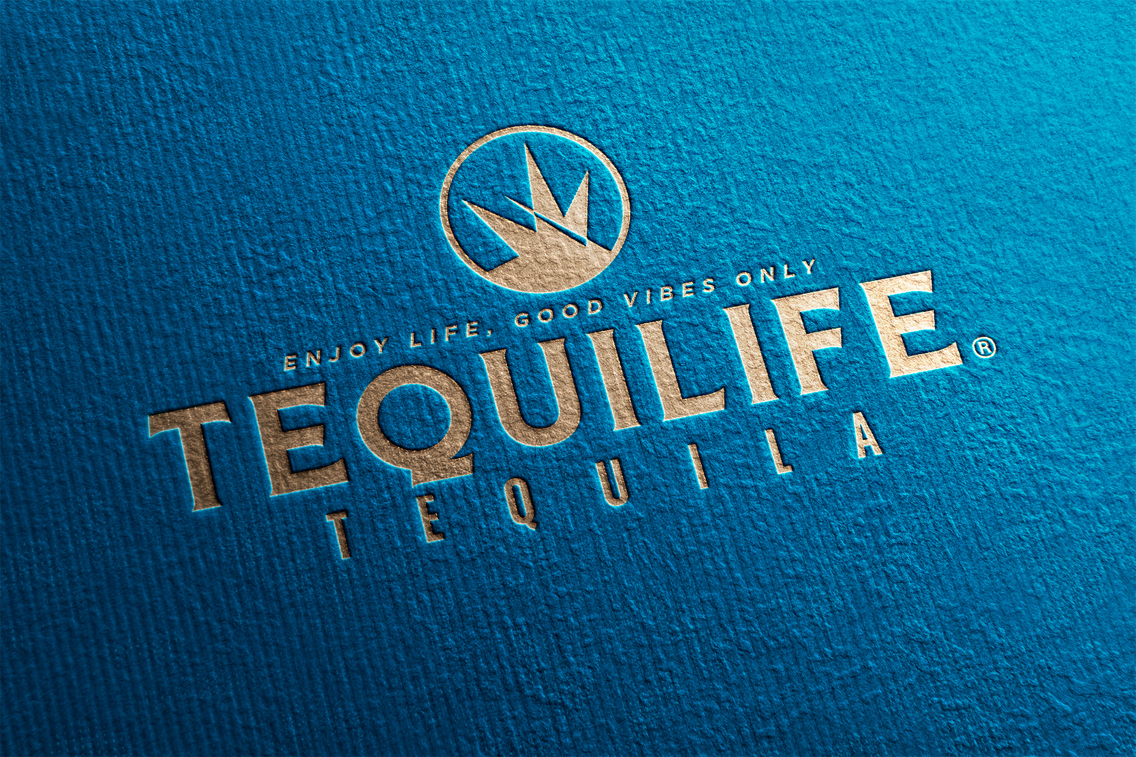
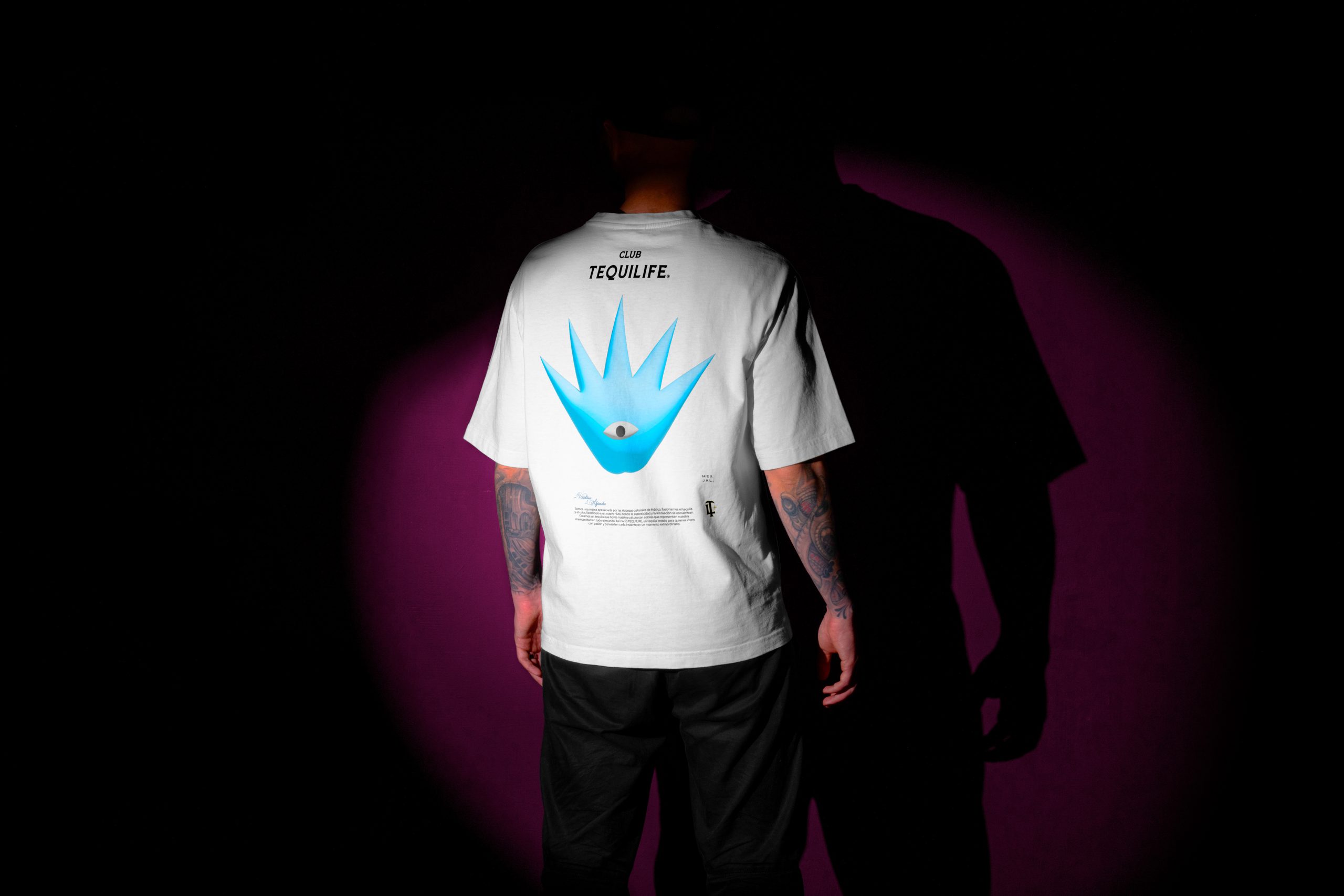
The visual strategy began by assigning meaning to the brand’s most distinctive asset. Mexican culture enters the system through references to agave, the Tapatía rose, wildflowers, embroidery and ornamental patterns, reinterpreted through a contemporary graphic language that avoids folkloric shorthand. At the center of this universe is “The Eye of the Agave,” a symbol merging the plant with a gaze: its leaves behave like lashes or rays converging toward the center, while the circular structure introduces ideas of vision, energy and ritual. An imperfect cut crosses the figure, carrying the trace of craftsmanship and referencing the physical act of cutting the agave. This gives the identity a recognizable visual logic that can move from bottle to digital platform without constantly relying on obvious representations of Mexico. That matters. Strong brands need their own memory.
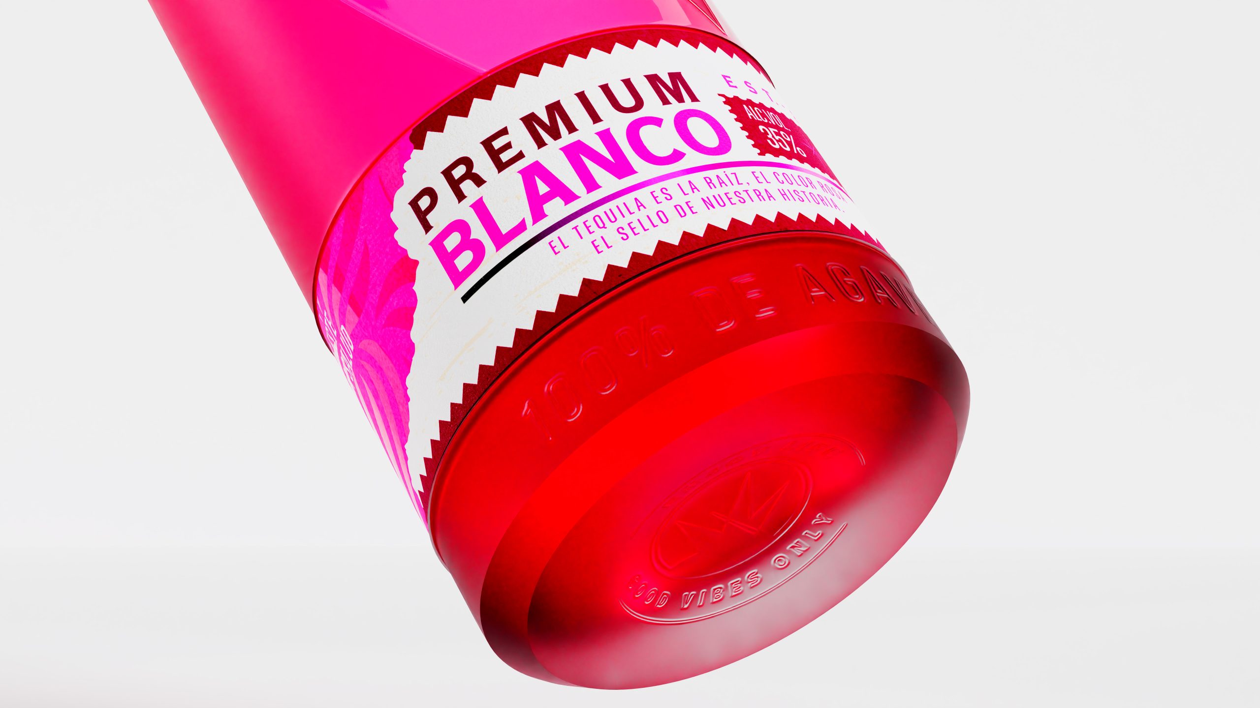
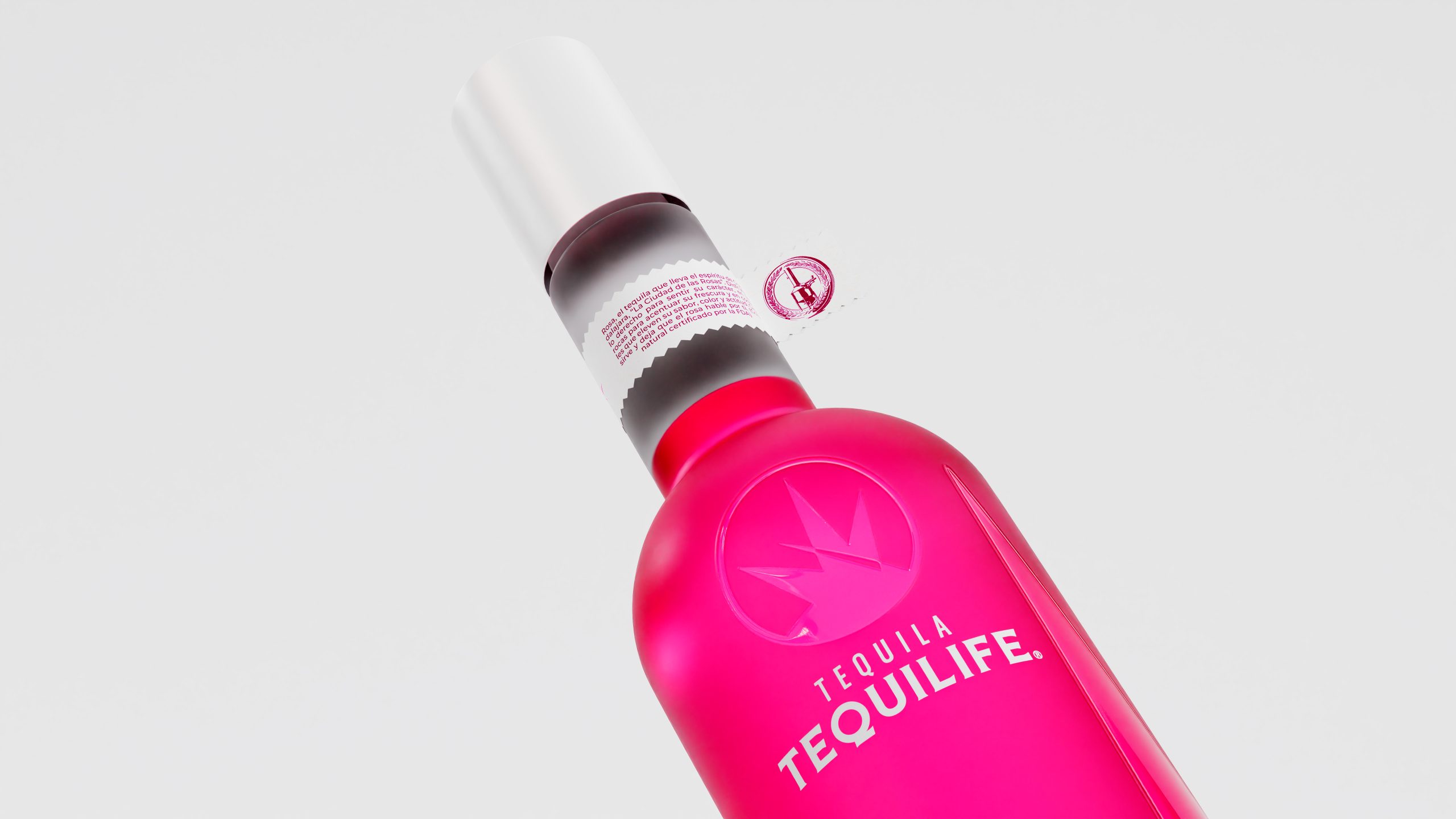
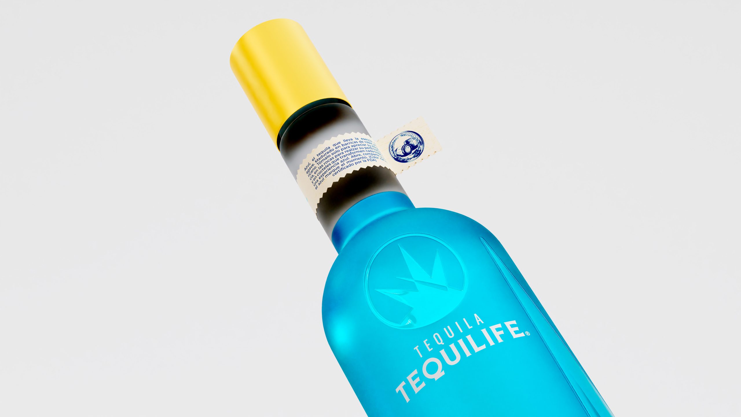
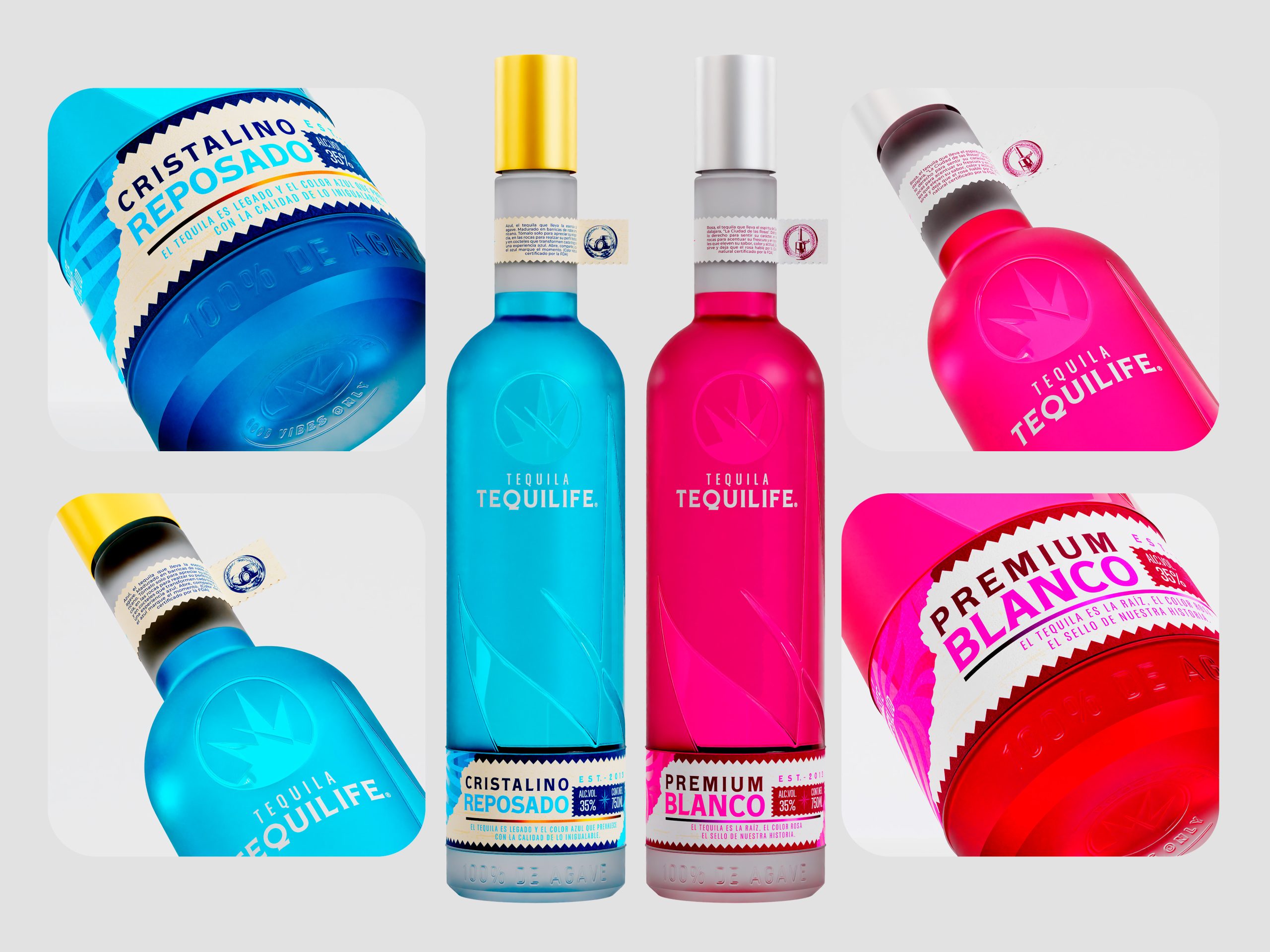
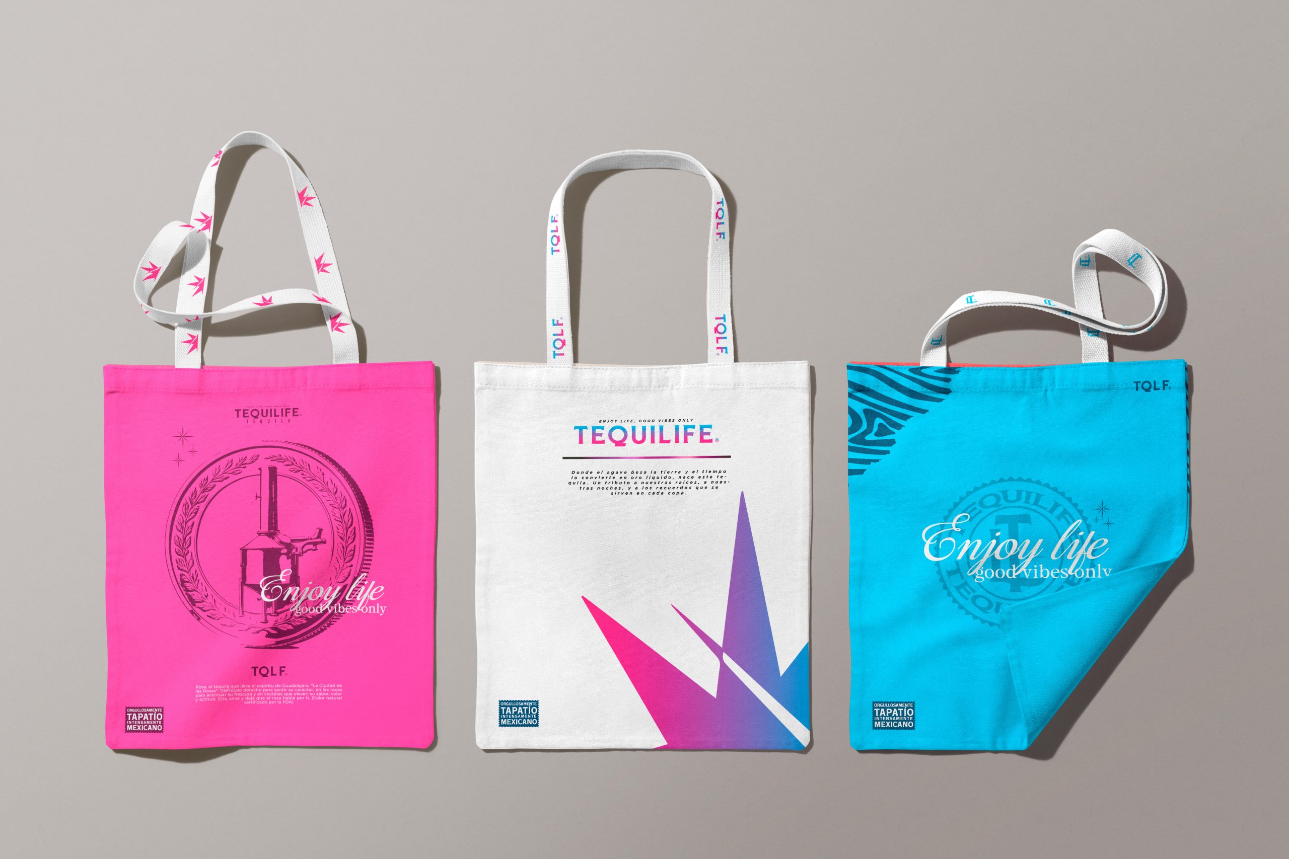
Packaging turns that logic into something physical. On the blue Cristalino Reposado, undulating textures reference barrel grain, time and handcraft; the surface is designed so the fingers encounter a story before the first sip. For the pink Premium Blanco, the narrative shifts toward Guadalajara as the “City of Roses,” where wind, petals and flowing forms create a bottle that appears almost in motion. The color system follows the same discipline. Pink-to-blue gradients translate different emotional states—day, night, calm, intensity—while Arena Ligera and Obsidiana Mate provide the structural foundation that allows the brighter tones to breathe and keeps the visual universe cohesive.
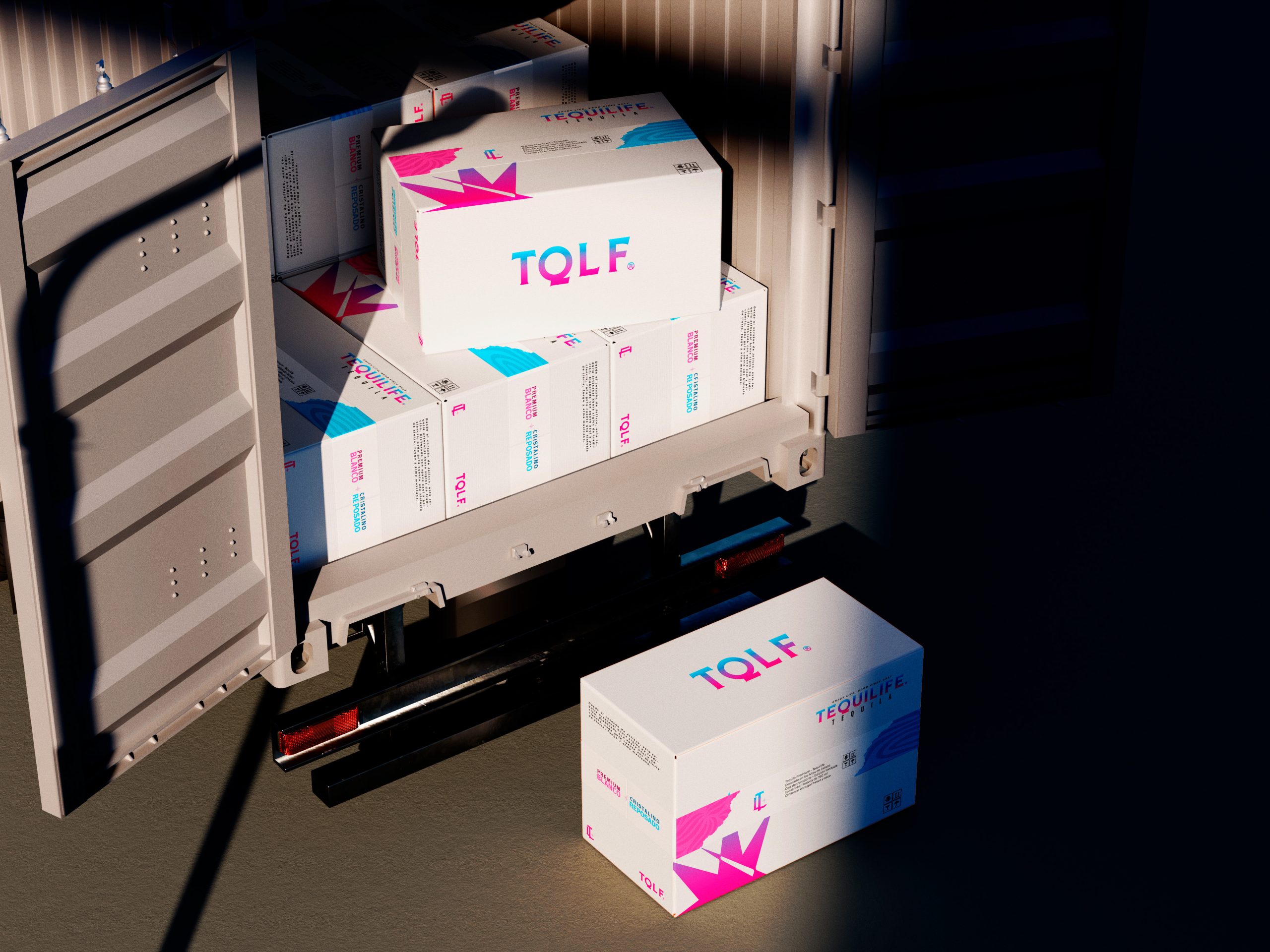
This is where the project becomes commercially significant. Tequilife gains a system capable of turning two chromatically distinctive products into a broader brand platform: an ownable symbol, repeatable visual codes, narrative-driven packaging, content territories and an aesthetic flexible enough to extend into experiences, digital channels and lifestyle applications. The strategic ambition is clearly defined: establish Tequilife as a reference for pink and blue tequila, increase recognition, deepen emotional connection and turn color, origin and floral inspiration into competitive assets. When every visual decision reinforces the same idea across different touchpoints, design creates one of the most valuable outcomes a business can achieve: it turns product difference into brand ownership.



 NEV
NEV Stefano Bracci
 Alina
Alina monther al omari
 Lizakjx
 JOAOMARCOSDESIGN
 alchimistestudioParis
 Harriet Neild
 octavio rojo
 宏洛图品牌设计HONGLT
 DESIGN CONCEPTS
 Alexander Skurihin
 Studio K95
 ARMBRAND
 Richa Rai
 houseoferas by Miti
 Agence des Coteaux
 Kushi Eaknath
 Ann Treasa
 Xiao Ning
 krrrrrllii
 babyage
 Deep
Deep