
THYSDRUS — Where Heritage Becomes Form
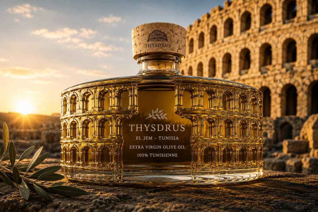
THYSDRUS is a premium extra virgin olive oil packaging concept rooted in the architectural heritage of El Jem, Tunisia. Rather than simply placing a historical reference on a label, the project transforms architecture itself into the physical identity of the bottle.
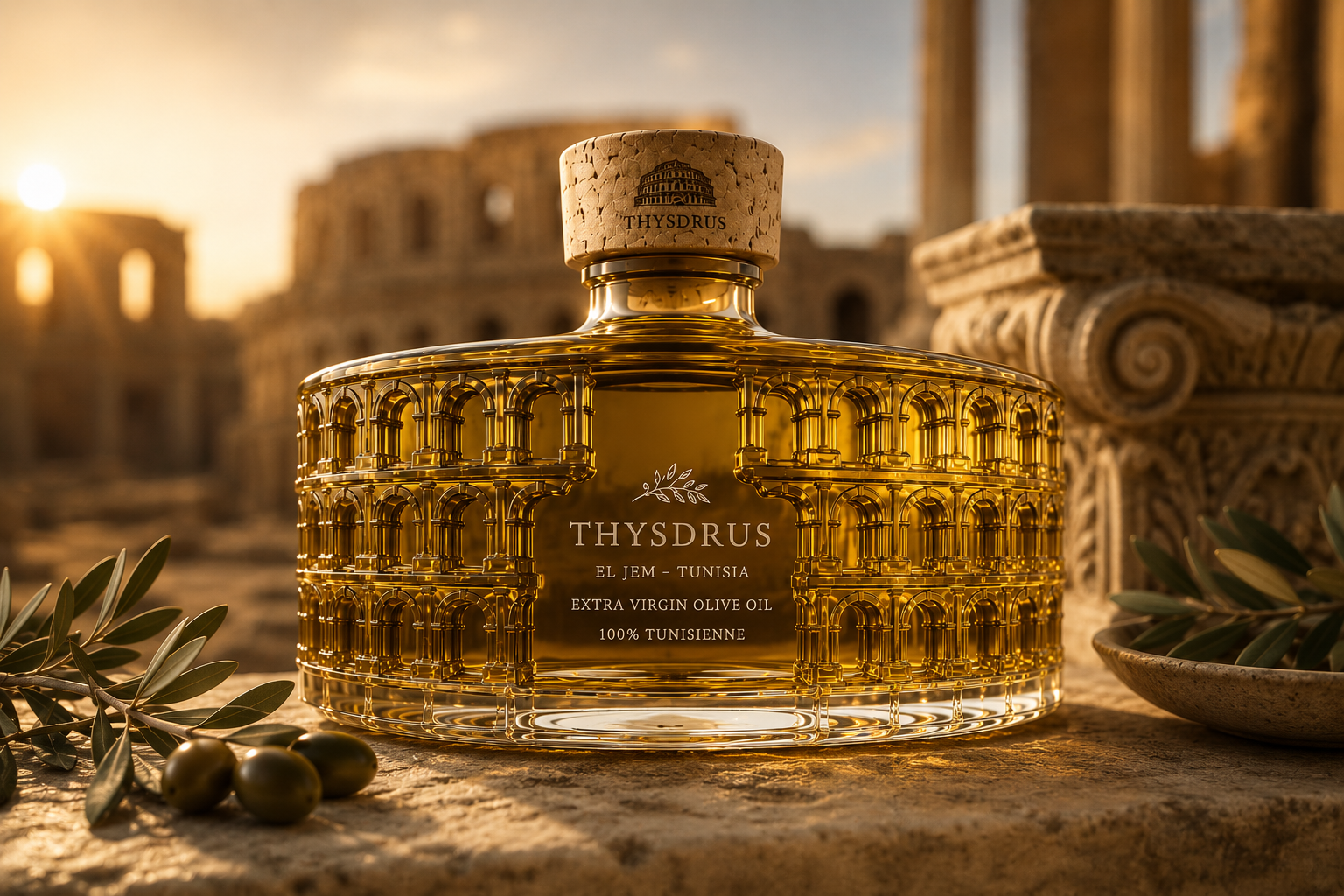
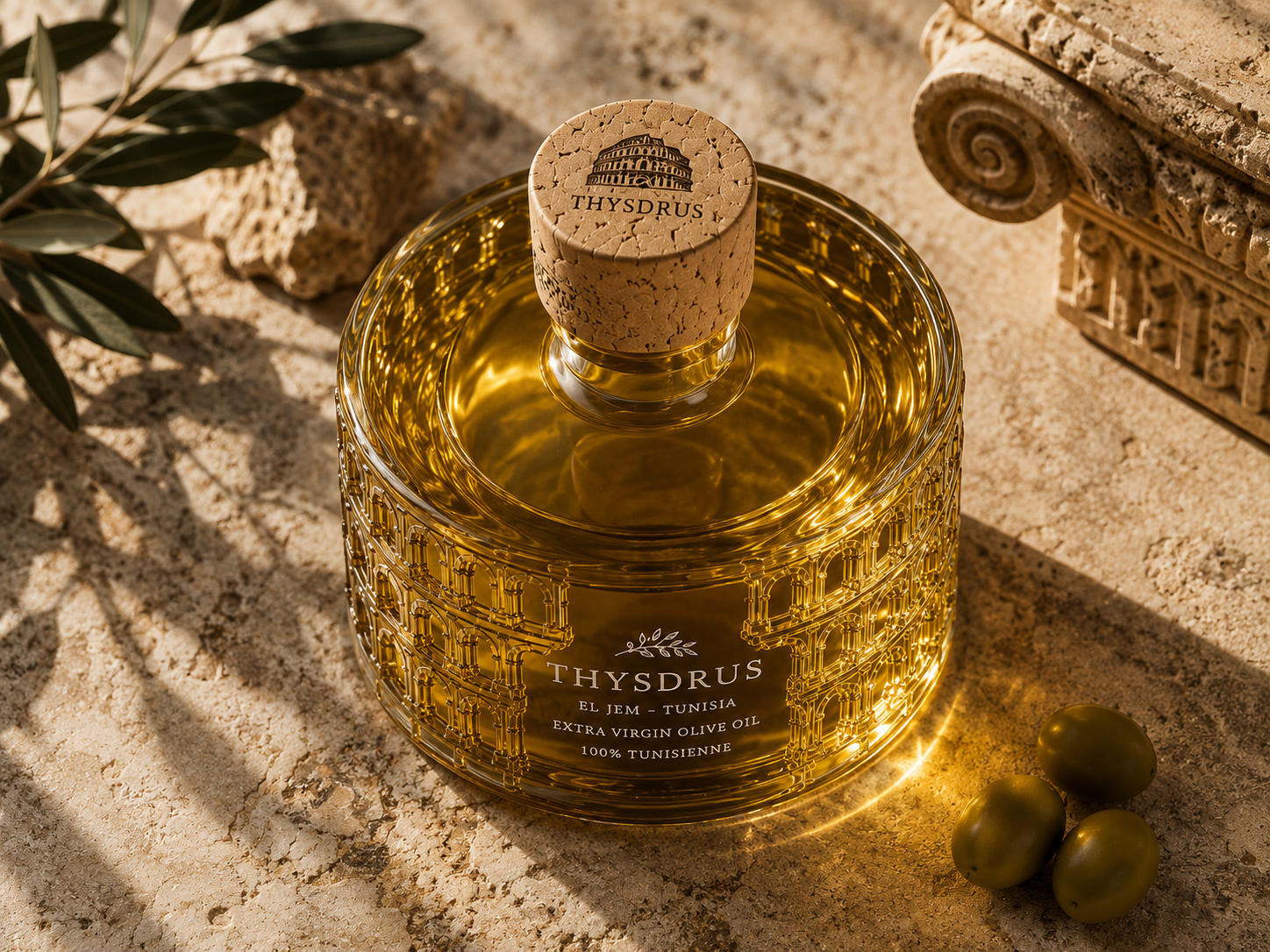
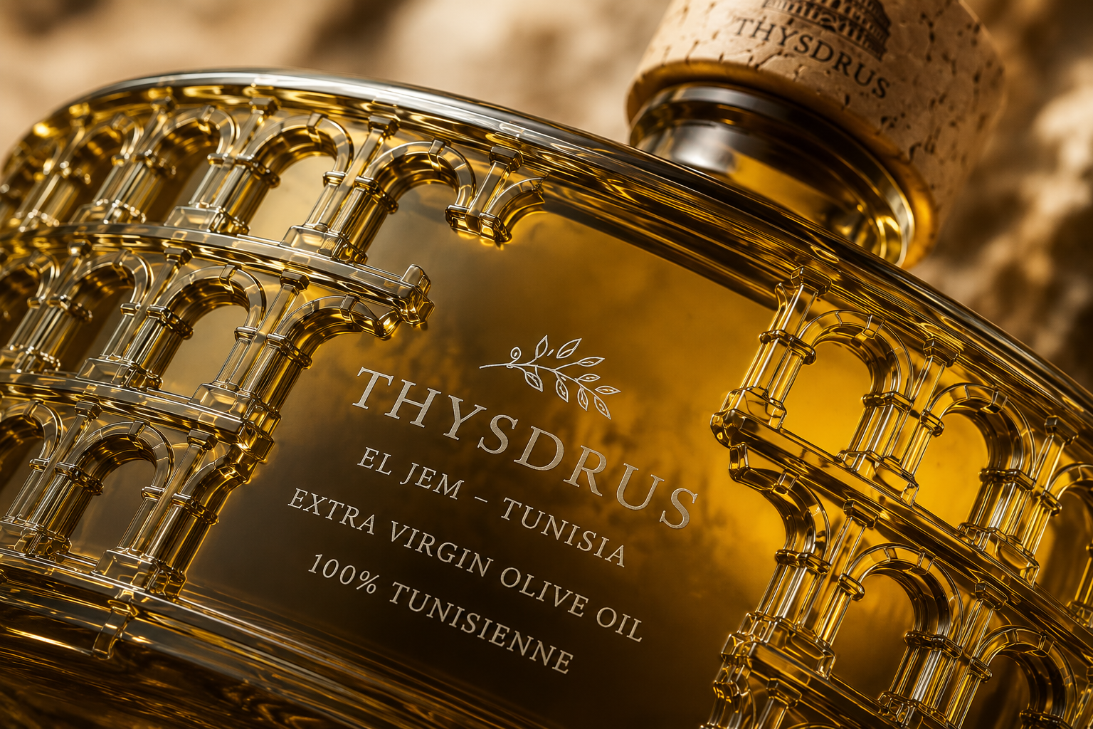
The glass structure draws inspiration from the monumental rhythm of the Amphitheatre of El Jem. Its succession of arches is sculpted directly into the bottle, creating depth, transparency and a distinctive interaction between glass, light and the natural golden tones of the olive oil. As the liquid fills the architectural relief, the façade appears illuminated from within, turning the product itself into part of the visual storytelling.
At the centre, a deliberately restrained graphic area creates contrast with the richness of the embossed structure. The THYSDRUS name, olive branch and origin are treated with simplicity, allowing the bottle’s form and materiality to become the primary expression of the brand.
The natural cork closure introduces warmth and tactility while reinforcing the Mediterranean character of the product. Its architectural mark creates a final connection between identity, origin and object.
THYSDRUS was conceived not merely as a container for olive oil, but as a contemporary interpretation of place. Architecture becomes packaging, olive oil becomes light, and heritage becomes a tangible brand experience.
Curator’s Insight
What’s interesting here is how the bottle solves a problem most heritage-referencing packaging never bothers to address: legibility versus decoration. Ornamental, arch-heavy motifs tend to compete with branding for attention, forcing designers to either flatten the pattern into a printed graphic or shrink it into a token detail. This design avoids both by moving the ornamentation into the glass structure itself and keeping the printed information to a tight, restrained block. The result is a hierarchy built on material contrast rather than scale or color: dense relief against a calm negative-space panel.
The choice to sculpt rather than print also makes the product an active participant in the design. Olive oil isn’t decorative in most packaging, it’s just contents. Here, the oil’s translucency and color become the mechanism that activates the arches, meaning the finished object looks different empty, half-full, or backlit. That’s a structural decision doing narrative work that a label alone couldn’t achieve.
 Estudio Argo
 Modern Theory
 monther al omari
 Ohmybrand
 Affogato Brand Design
 Tancybox
 waanrong
 nazystudio
 Daria Fox
 g.apolly
 sahildoesartt
 Stiandco
 BREAK DESIGN
 ShreyaDighe
 Sameh Elnahas
 Minim Brand Design
 Ebbi
Ebbi Shabouk Printing & Packaging (Shabouk Carton Boxes – شعبوق)
 Brandegree
 Abbydraw Designs Unique Conceptual Branding & Packaging Designing Ideas
 bilel tkouri
 NEV
NEV Stefano Bracci
 Alina
Alina