

Don Emilio: The New Fire of a Mexican Brand
Don Emilio started with a difficult-to-replicate advantage: a renowned product, a solid tradition, and an identity deeply linked to Mexican gastronomy. The problem lay in the packaging. The number of messages, graphic elements, seals, and two languages competing in a limited space weakened the hierarchy and caused a brand with so much to say to communicate too much at once. The strategy identified a clear opportunity: to refine the system so that the origin, variety, and product regained prominence.
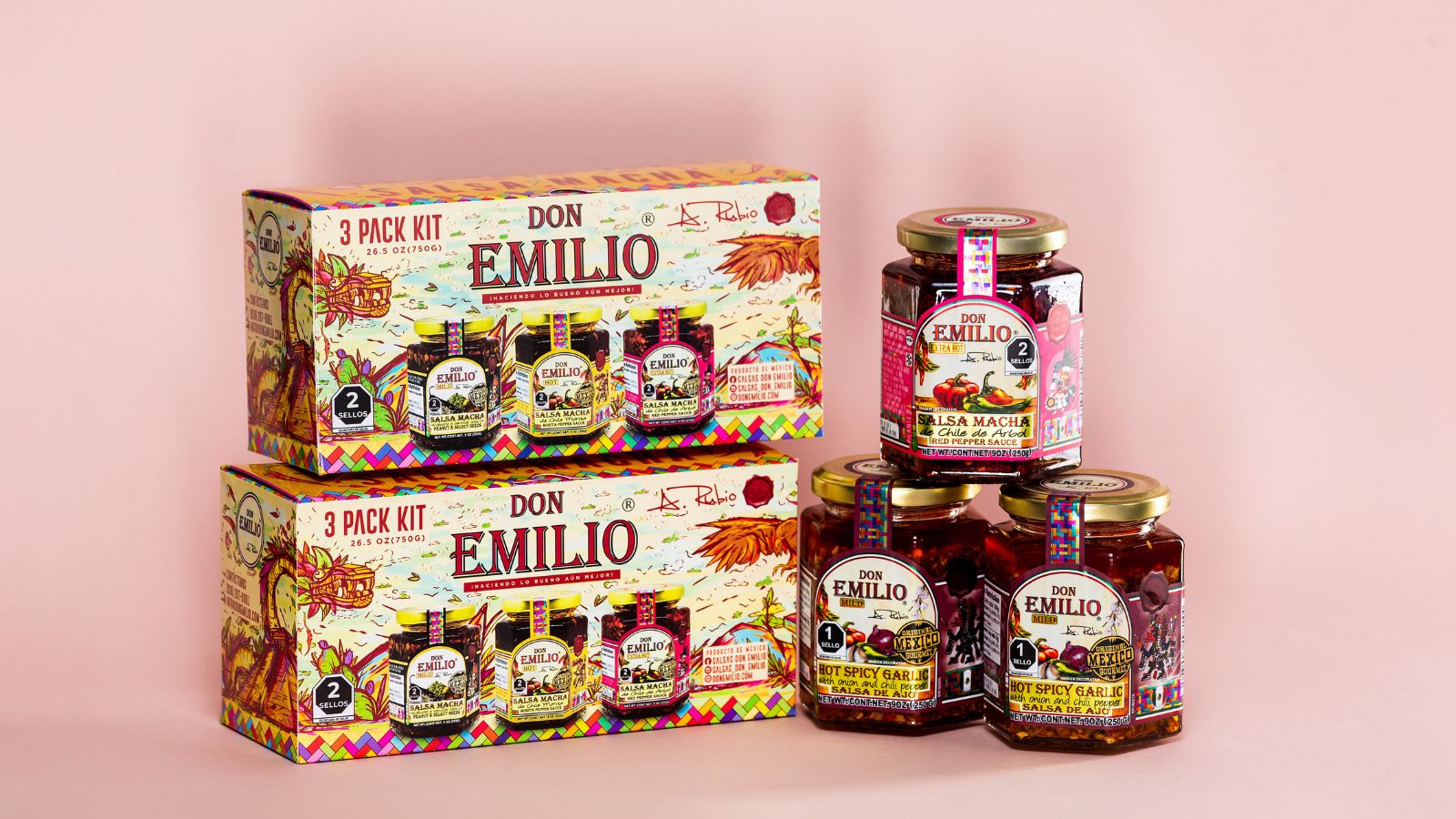
The solution reorganizes the packaging around a clearer structure and creates a more precise separation between the product brand and secondary information. The new logo gains greater presence thanks to a more direct typeface, accompanied by the phrase “Authentic Mexican Macha Salsa” as a declaration of origin. The system retains the expressive and popular character of Mexico, while introducing an architecture capable of organizing each product and assigning distinctive color codes to the different salsas. The hexagonal glass jar remains a recognizable element of the brand; Now the label integrates seamlessly with the product instead of competing for attention.
The creative concept takes this reorganization to a deeper narrative level. “La Gran Velada” envisions a celebration inspired by Mesoamerican deities, connecting each salsa with specific attributes, symbols, and ingredients. The morita chile, the garlic chile, the árbol chile, and the peanut salsa with selected seeds acquire their own characters, stories, and color palettes; the illustrations, patterns, and vibrant, pre-Hispanic-inspired colors transform each variety into a chapter within the same universe. The technical information remains—ingredients, spiciness level, nutritional information, and Mexican origin—but now occupies a clearly defined place within the composition.
The result strengthens Don Emilio’s ability to compete at the point of sale without sacrificing the energy that has always characterized its history. The packaging, identity, narrative, and communication extend to outdoor advertising, transportation, merchandising, and the digital realm with a coherent logic. The redesign transforms a visually saturated brand into a more legible and scalable system, where Mexican culture functions as a narrative structure and each bottle recovers its main function: to make the product recognizable before the consumer has to decipher it.




 lunapanda
 Tridimage
 Analoguecreative
 lettera7
 alchimistestudioParis
 Lana B
 Colossal
 Pivot Studio
 M&A CREATIVE AGENCY
 monther al omari
 Anastasia Cherepanova | xtramez
 Hollóka Grafikai Műhely / Graphic Design Studio
 BOLD branding
 Antonia Skaraki
 Pâmella Lorrany
 Z9BKAdsgn
 Francesco Paternoster
 b1studio.ro
 Chris Creative Works
 Boordon
 Dmitriy Kuzovlev
 Brand Society
 yasharpic