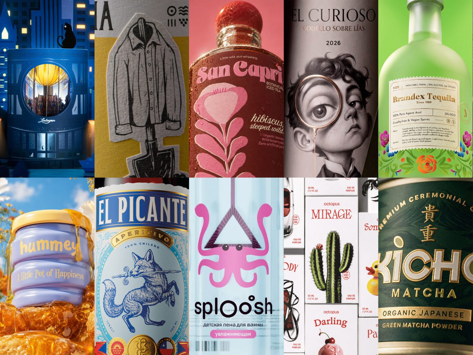

Issue #146 gathers ten packaging projects united by structural and material decisions rather than surface decoration alone. A die-cut mooncake tower with hidden paper depths, an engraved fox certifying a Chilean slang word, a matcha wordmark hiding a leaf and a disc of green, and a honey jar that trades gold for periwinkle ceramic all show how concept can be built into form itself. Selected by the Packaging of the World community, these projects reflect packaging that goes beyond presenting a product, shaping how it is perceived, understood, and remembered.
Follow us on Instagram, Facebook, and Pinterest to stay updated with the latest in packaging design and creative work. Got a project worth sharing? We welcome submissions from designers, studios, and brands worldwide.
Sign in or create an account to submit your work to our global community.

San Capri designed by Biaa
San Capri’s identity hinges on a flavour system built through illustration rather than colour-blocking, with each botanical rendered as its own linear composition in overlapping tones of a single hue family. That constraint keeps a varied product range visually unified rather than fragmented across the shelf. The bubble-lettered wordmark echoes the ball-shaped bottle closure, letting typography and structure speak the same visual language. A single, understated faux-typo tagline adds informality without becoming a repeated gimmick, while illustrated labels and sculptural glass extend the botanical world into a cohesive, playful summer identity.

Octopus designed by Opposite
Octopus treats twenty fragrances not as variations of one template but as twenty small brands under a single flag, each carrying its own name, typography, and image system. What holds this deliberately dissonant range together is one load-bearing constant: a single saturated red applied without exception across type, closures, and bottles. The custom cuboid bottle offers a clean structural canvas for each fragrance’s distinct mark, while an oversized closure adds heft. Rather than illustrating scent notes literally, the imagery gestures at mood, an approach that lets wildly different visuals still read as one cohesive, maximalist system.

El Picante – Vermut Rosso designed by TUERCA Studio
El Picante turns a loaded Chilean word for tacky into a badge of pride, pairing a hand-engraved fox, scarred and armed, with the heraldic grammar vermut has used for a century: seals, coins, and crests. The contradiction is deliberate, aristocratic craft applied to a street subject, so tradition in technique meets defiance in character. Red, white, and blue root the palette in national identity rather than a false spice cue, while multi-depth foil and intaglio detailing elevate the label to the pedigree the category expects. The result reclaims an insult as a coined, Chilean temperament.

Sploosh designed by Daria Levina
Sploosh solves child-facing SKU differentiation by pushing identity past the label and into the product’s structure. The bubble wand, a component every bubble solution needs regardless, is molded into the shape of each sea creature’s head or shell, so the necessary part becomes the identifying one. Seen through the transparent bottle, a child could tell the crab from the jellyfish by silhouette alone, no label required. Colour reinforces rather than repeats this logic, with each character owning a single hue carried consistently from cap to wand to accent band, letting recognition happen through shape and colour before any text comes into play.

Terraincamicia designed by pastello factory
Terraincamicia’s strongest decision isn’t its illustration but its die cut, letting the label follow the shirt and shovel’s contour rather than sit inside a rectangle, so the image appears to hang off the bottle’s shoulder rather than lie flat on its surface. A toothy, laminated stock reads closer to worn cotton than glossy label paper, letting the material itself carry narrative weight before any copy is read. Spare, woodcut-like linework keeps the symbolism restrained rather than tipping into costume, a reminder that when a concept is this personal, craft choices around cut, stock, and line weight often say more than the illustration’s subject alone.

Kicho Matcha designed by Hashem Gerashi
KICHO Matcha earns its premium price through restraint rather than obvious signalling, a harder route most packaging avoids. The wordmark carries meaning quietly: the dot above the “i” is actually a leaf, and the “O” holds a disc of matcha green, subtle details a shopper registers before consciously noticing. A near-black forest green, unusual in a category dominated by bright appetite greens, lets gold foil do the signalling instead, catching light rather than competing for attention outright. A tone-on-tone illustrated landscape sits nearly invisible behind the type, resolving only on closer inspection, a system built to reward the customer already inclined to linger.

Hummey designed by Biaa
Hummey breaks from honey’s expected visual shorthand, warm ambers, kraft textures, drip motifs, by swapping the anticipated gold jar for periwinkle ceramic, a move that departs from category convention while the lid and product still carry the warmth shoppers expect. The jar’s ribbed, stacked form reads as a drip caught mid-fall while giving the object a huggable, kitchenware quality that shifts it from condiment to countertop keepsake. Even the wordmark builds the world quietly: a small antennae detail on the “h” illustrates the brand’s bee without needing a separate mascot, proving character can live in a single considered detail rather than explicit imagery.

Los Observadores designed by Andrea Marín
Los Observadores builds its identity around a single reversal: instead of the drinker studying the wine, the wine studies back. Three archetypal characters, each embodying a different mode of observation, share nothing in illustration style, palette, or likeness except one recurring device, a monocle with a slightly oversized eye. That shared motif alone signals the family connection, doing the work an entire matching visual system would normally handle. Fine linework and a single warm metallic accent keep the illustration deliberately quiet, ensuring the magnified gaze remains the loudest element on the label and the concept stays legible at a glance.

Some Stories Are Better Bottled designed by monther al omari
Brandex Tequila builds its concept on material contrast rather than heritage decoration alone. Frosted glass softens the bottle’s silhouette into something closer to memory than object, hazy and indistinct until color surfaces at the base, where hand-painted florals with deliberate looseness signal warmth over polish. The label then shifts register entirely: small serif type, aged stock, and a scalloped ticket-stub edge invite close reading rather than a glance. That rhythm between an expressive body and a quiet label keeps the bottle from tipping into costume, giving Brandex Tequila a considered, layered identity built for moments that become stories.

Timeless Gate Arc II 2026 designed by Bracom Agency
Timeless Gate Arc II confronts the one-time problem of seasonal gifting by treating its box as an architectural object first, a container second. Rather than printing its illustrated city across the surface, the studio withholds it behind cut openings, forcing an active viewer to tilt and move closer to catch fragments at a time. Layered die-cut planes set at varying depths create genuine parallax rather than illusory depth, so the scene shifts with viewing angle, reading as architecture rather than illustration wrapped around a cylinder. Built to hold its own in daylight and glow differently after dark, the design performs across two lighting conditions without losing intent.
 monther al omari
 Ximena Ureta Design Studio.
 vitoramockup
 Up-Brands
 Sophiagdotcom
 Peter said
 ayeidadezigns
 Tancybox
 宏洛图品牌设计HONGLT
 Modern Theory
 Dozen Agency
 Atiq Alam
 Olio Studio
 Ruchi S. Joshi
 mmdesign
 awaiskhadim
 Octasoft
 United Creatives Studio
 Kingdom & Sparrow
 Anastasia Bakhmatskaya
 CreativeWise
 Great and Golden