
We started from the story of the person behind the wine. A story of change, courage, and a return to the land.
The name itself comes from the combination of two worlds: terra = land, camicia = shirt.
On one side, the vineyard; on the other, the life that David (the owner) chose to leave behind to dedicate himself entirely to the countryside.
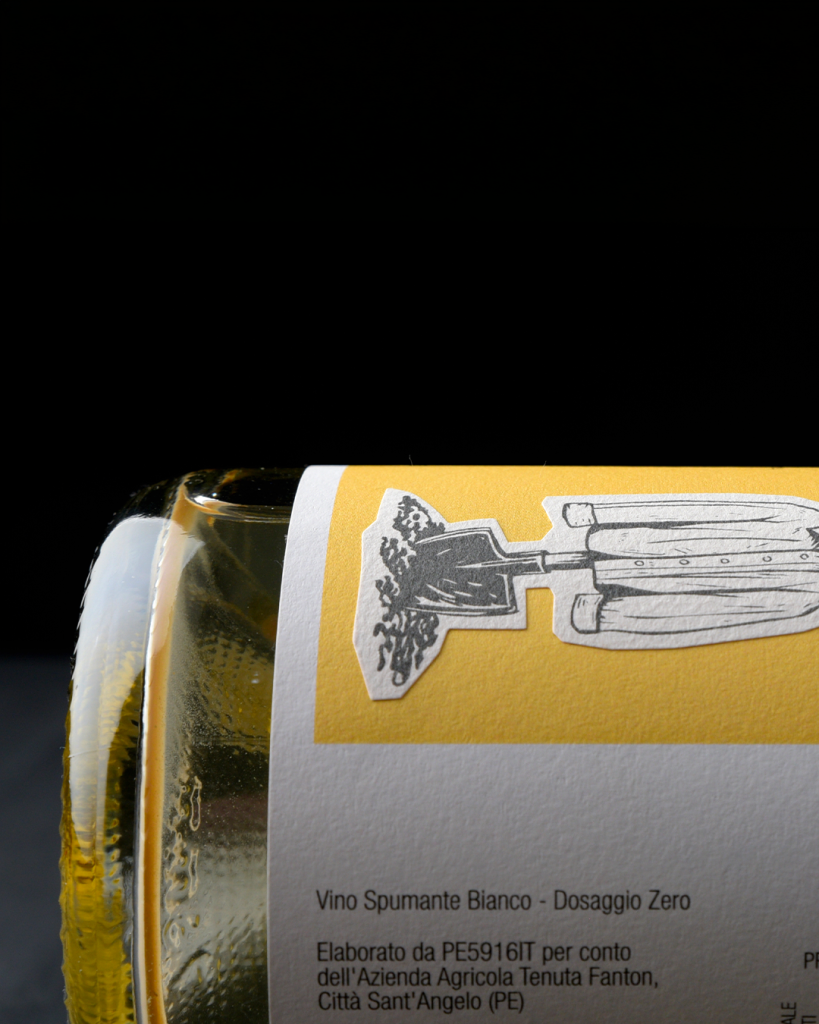
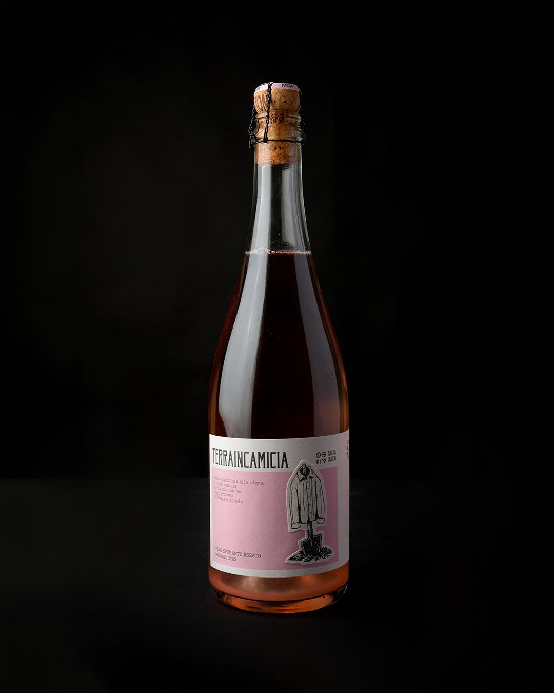
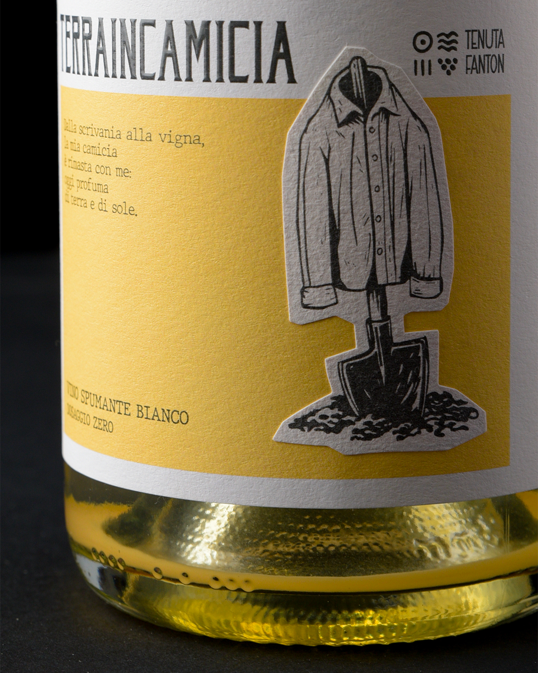
From this story, the concept took shape. A neat, buttoned-up shirt resting on a shovel driven into the ground: a simple image, but full of meaning. It doesn’t represent abandonment, but transformation. That shirt hasn’t been left behind; it is still there, among the rows of vines, witnessing an identity that has evolved without denying its origins.
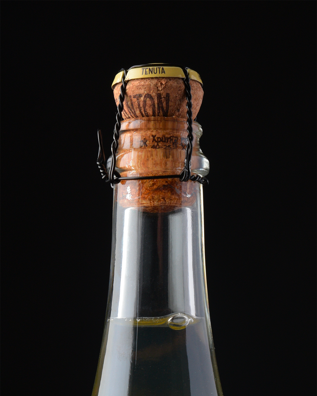
To make the story even more authentic, we chose a laminated paper stock that brings the shirt to the forefront, making it the absolute protagonist of the design. A custom foil capsule, matching the color of the label, completes the bottle and reinforces its distinctive character.
Terraincamicia is not simply about bottle-fermented wine. It is about the exact moment when someone decides to change direction and finds, in the land, their place in the world.
Curator’s Insight
The strongest decision here isn’t the illustration itself, it’s the die cut. By letting the label follow the contour of the shirt and shovel rather than sitting inside a standard rectangle, the design turns a printed image into an object. The shirt appears to hang off the bottle’s shoulder rather than sit flat on its surface, which does real work for a brand built around the idea of a garment left in a field.
Paper choice reinforces that same logic. A laminated, toothy stock reads closer to canvas or worn cotton than to glossy label stock, so the material itself is doing some of the storytelling before anyone reads a word of copy. It’s a quiet trick: the substrate becomes part of the subject.
What’s worth noting is the restraint in the illustration style. A looser, more painterly rendering of the shirt would have tipped into costume, literal and a little precious. Keeping it as spare linework, closer to a woodcut or technical sketch, lets the image stay symbolic rather than decorative. It’s a useful reminder that when a concept is this personal, the craft choices around it (cut, stock, line weight) often carry more narrative weight than the illustration’s subject matter alone.


 alchimistestudioParis
 Estudio Argo
 Modern Theory
 monther al omari
 Ohmybrand
 Affogato Brand Design
 Tancybox
 waanrong
 nazystudio
 Daria Fox
 g.apolly
 sahildoesartt
 Stiandco
 BREAK DESIGN
 ShreyaDighe
 Sameh Elnahas
 Minim Brand Design
 Ebbi
Ebbi Shabouk Printing & Packaging (Shabouk Carton Boxes – شعبوق)
 Brandegree
 Abbydraw Designs Unique Conceptual Branding & Packaging Designing Ideas
 bilel tkouri
 NEV
NEV Stefano Bracci
 Alina
Alina