

CONCEPT
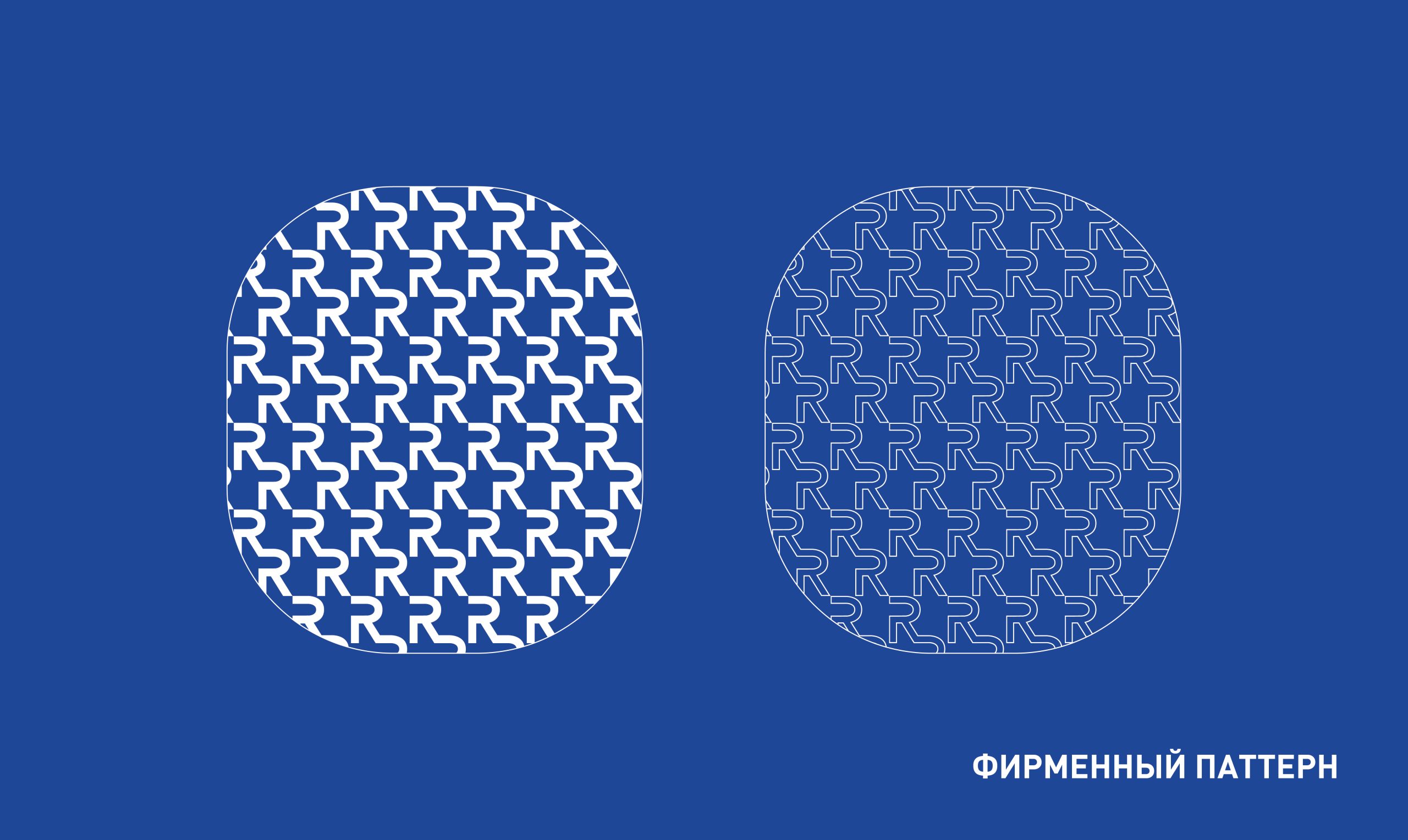
REDOX is derived from “reduction–oxidation,” referring to redox reactions—a key biological process involved in antioxidant defence and the fight against skin ageing. Our goal was to translate this scientific concept into a visual language that feels clear, approachable and appealing to consumers.
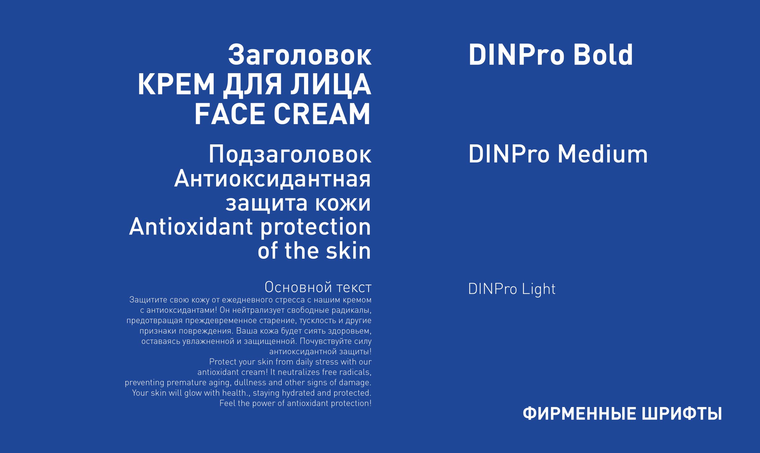
TYPOGRAPHY
Modern, clean and highly legible typefaces create a sense of professionalism while reinforcing the brand’s contemporary character.
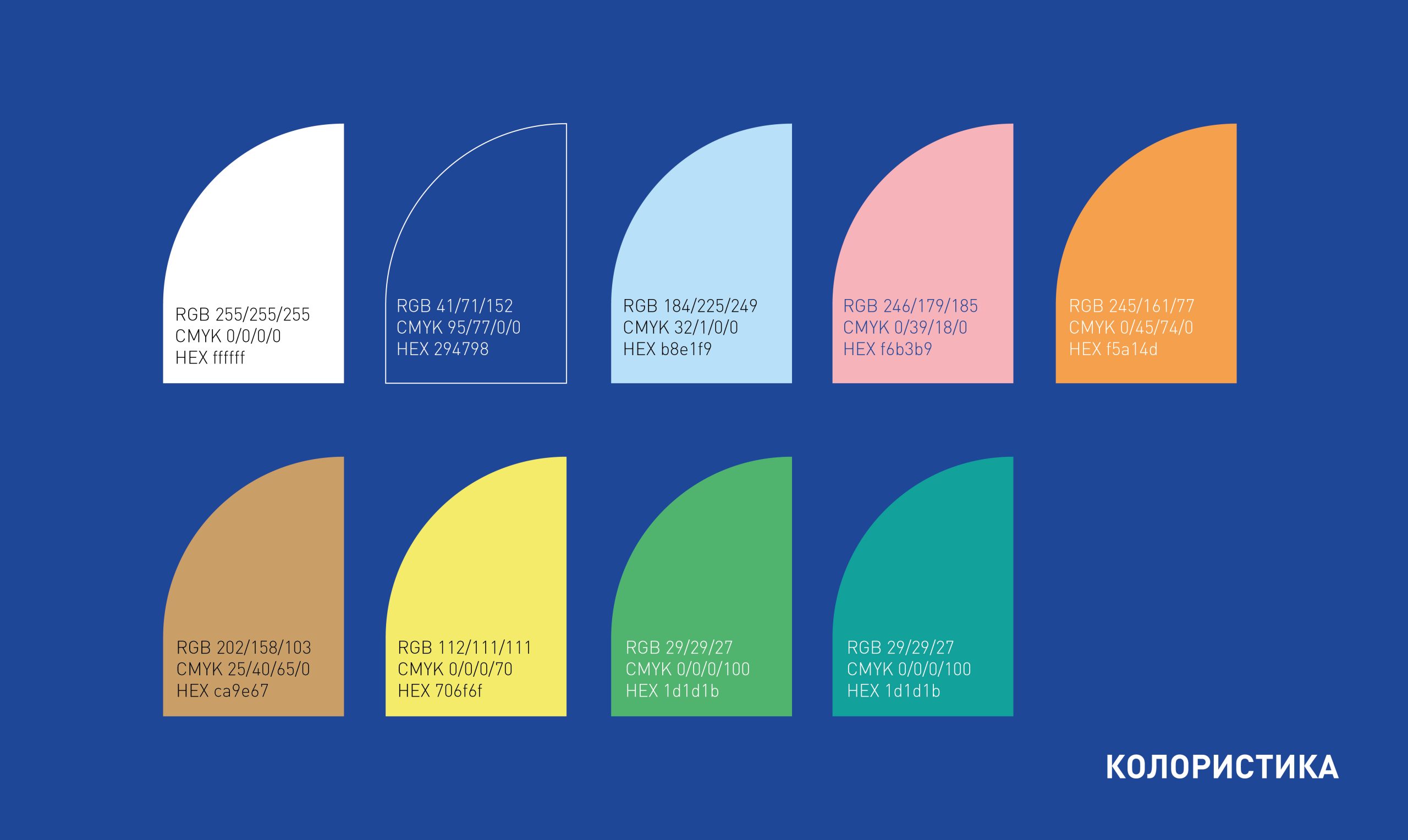
COLOUR PALETTE
An approachable colour palette helps communicate complex scientific ideas in a consumer-friendly way. The colours are more than a visual device—they are an integral part of the brand philosophy. They convey trust, accessibility and modernity while emphasising the effectiveness of the products.
THE RESULT
REDOX is a brand that speaks the language of both science and beauty. It stands apart through its distinctive combination of scientific expertise, elegant design and environmental responsibility. The packaging feels contemporary and visually engaging, inspiring trust and encouraging consumers to experience the products.
REDOX is more than skincare—it is an investment in the health and youthfulness of the skin.
This REDOX design case study demonstrates how a complex scientific concept can be transformed into a visually compelling and persuasive brand. We created more than packaging; we built an entire world where science meets beauty, allowing consumers to feel confident that they are choosing the very best for their skin.




 Eclectic M
 Katya Slobodskaia
 Евгения Береснева
 CreativeWise
 宏洛图品牌设计HONGLT
 erandy
 Abbas Sayyed
 Ollie
Ollie Moço Wine Branding
 khadijaaljifri
 Abdulrahman Taha
 Juana Sarabia
 Modern Theory
 Mohammed Nasr Sharfi
 Minim Brand Design
 Asmaa Mohamed
 Aidearte
 Navy Creative
 GIRAFA STUDIO
 Tia Nguyen
 Logoclub99
 monther al omari
 Dina Gamal eldin
 Stefano Bracci
 Backbar Studios
 Leyma Design
 AUN BRANDS