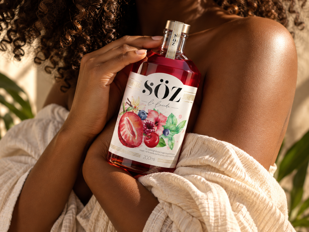

SÖZ Turns Botanical Flavours Into Emotional Rituals
SÖZ is a contemporary beverage brand designed around a simple idea: flavour is not only tasted — it is felt.
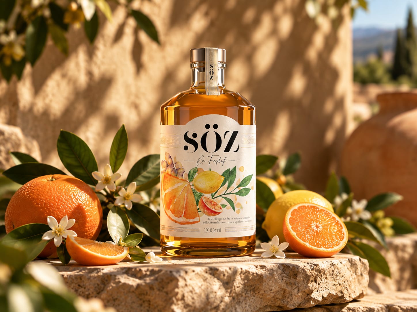
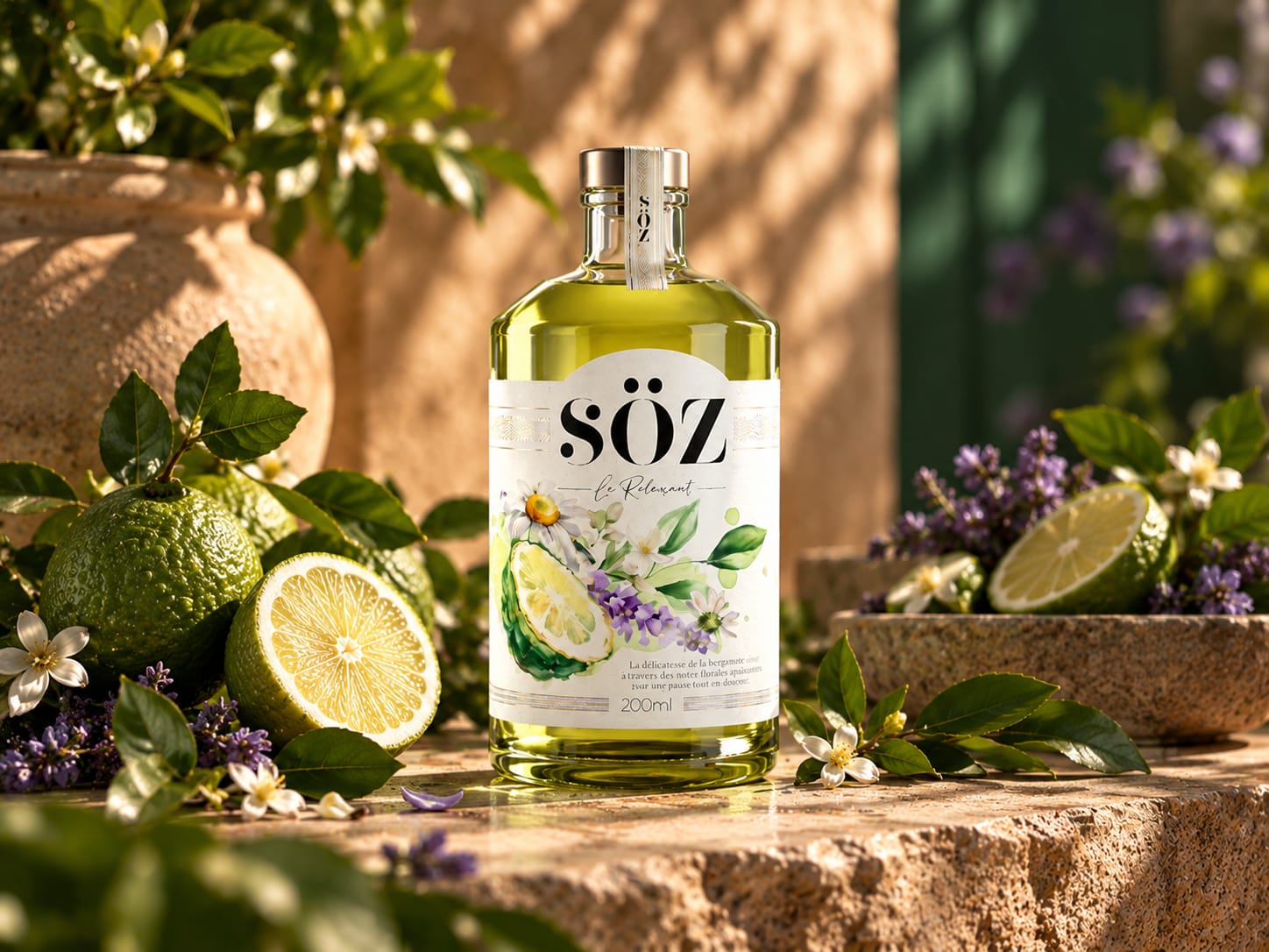
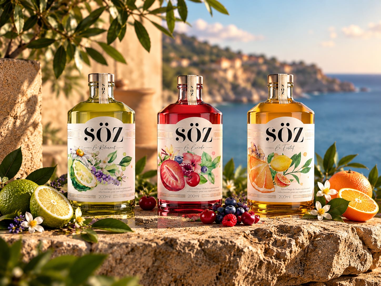
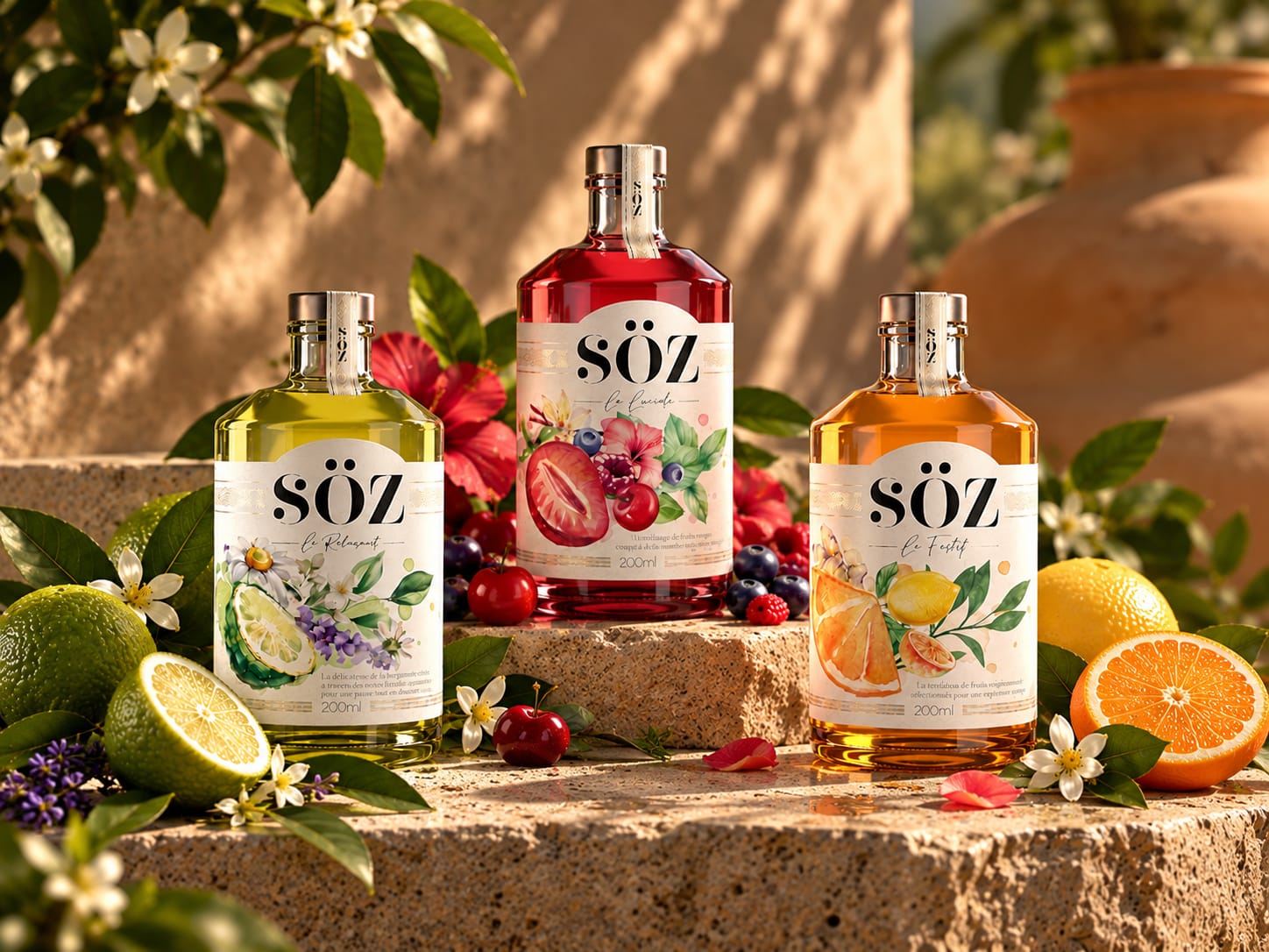
The identity transforms each recipe into a distinct emotional personality. Le Relaxant, Le Lucide and Le Festif form a coherent collection, while botanical illustrations give every variant its own sensory universe. Fruits, flowers and leaves are composed with an expressive, almost hand-painted character, creating a deliberate contrast with the bold, sophisticated SÖZ logotype.
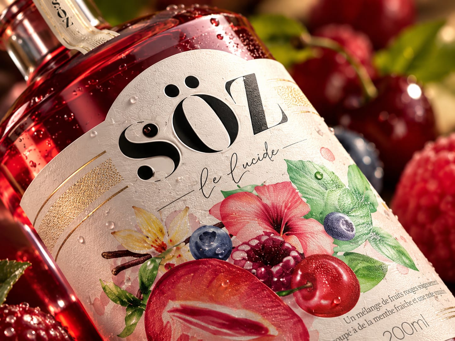
The packaging balances naturalness and premium expression. A warm off-white canvas, delicate metallic details and richly illustrated ingredients bring an artisanal quality, while the strong typographic architecture ensures immediate shelf recognition across the range.
Rather than treating each flavour as an isolated SKU, the system was conceived as a family. Colour comes directly from the liquid and ingredients, allowing the bottles to become part of the visual identity themselves: fresh green, vibrant red and luminous amber.
The photographic direction extends this philosophy beyond the label. Natural materials, Mediterranean light, fruits, flowers and human gestures place SÖZ in moments of warmth and pleasure. Close-up imagery reveals the tactile character of the packaging, while lifestyle compositions shift the product from an object to an experience.
The result is a packaging system built around emotion, nature and ritual — creating a distinctive world where every flavour carries its own mood while unmistakably belonging to SÖZ.
 Derrick Lin
 VincoStudio
 lisakaplina
 CreativeWise
 Adriana Adamo
 tauqueer
 MAISON D'IDÉE Prague
 Pixels Studio
 Atchayaa
 DESIGN CONCEPTS
 hello ocean
 monther al omari
 the Labelmaker
 alamgirbrands
 kat bres
 Vantablack Studio
 GruppoSaida
 studiorevv
 grafisercreative
 Kate Reichel
 UPRISE
 Modern Theory
 By siddika
 Kinshuk Bainss