

Tam’z Brings Chocolate Dates Into a Colourful Everyday
Tam’z brings a fresh visual expression to chocolate-covered dates, pairing the warmth of a familiar ingredient with the pleasure of contemporary confectionery. Its identity makes this combination immediately tangible: expressive typography, soft pink tones and rich plum accents introduce a brand that feels both refined and approachable.
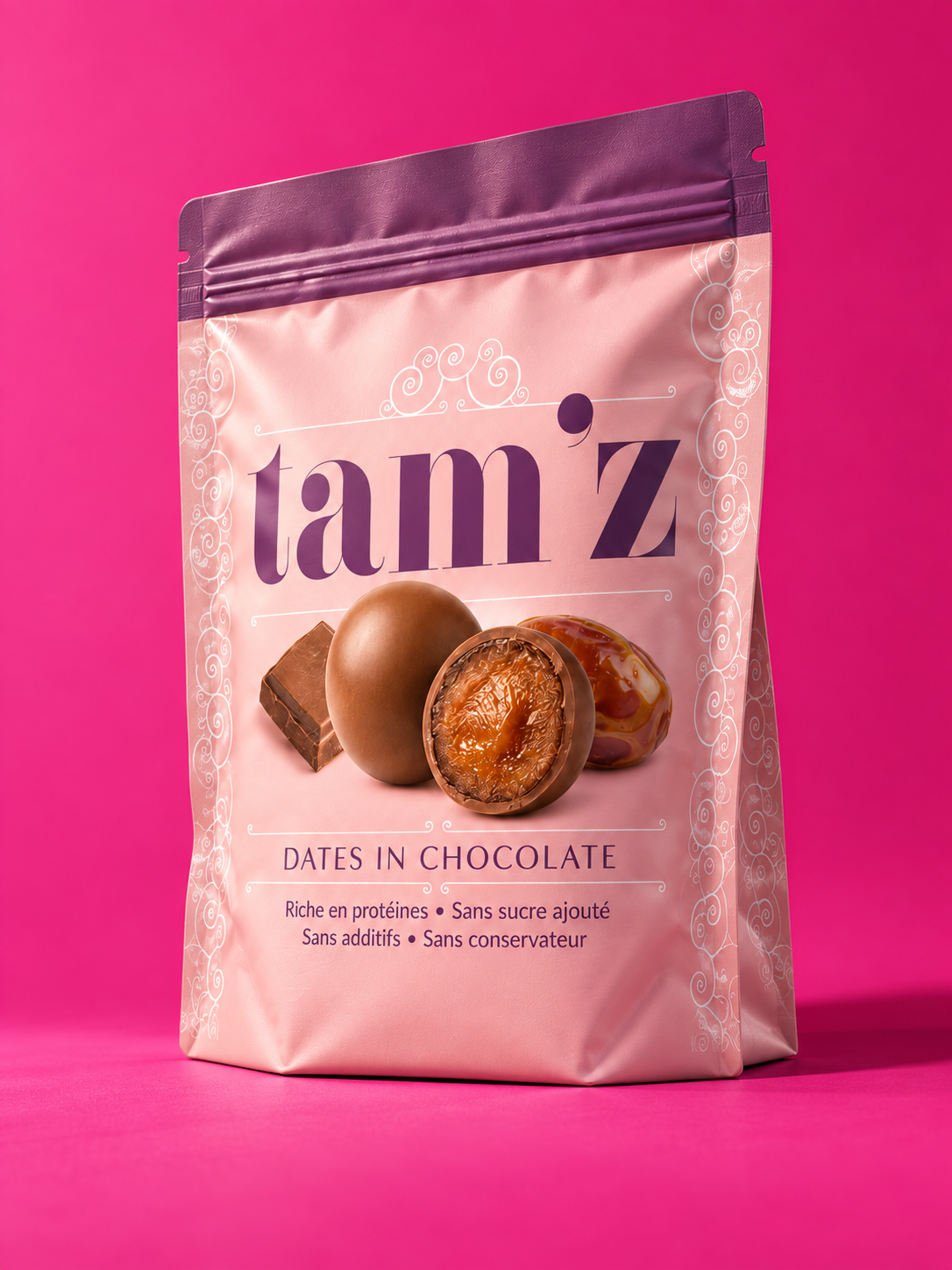
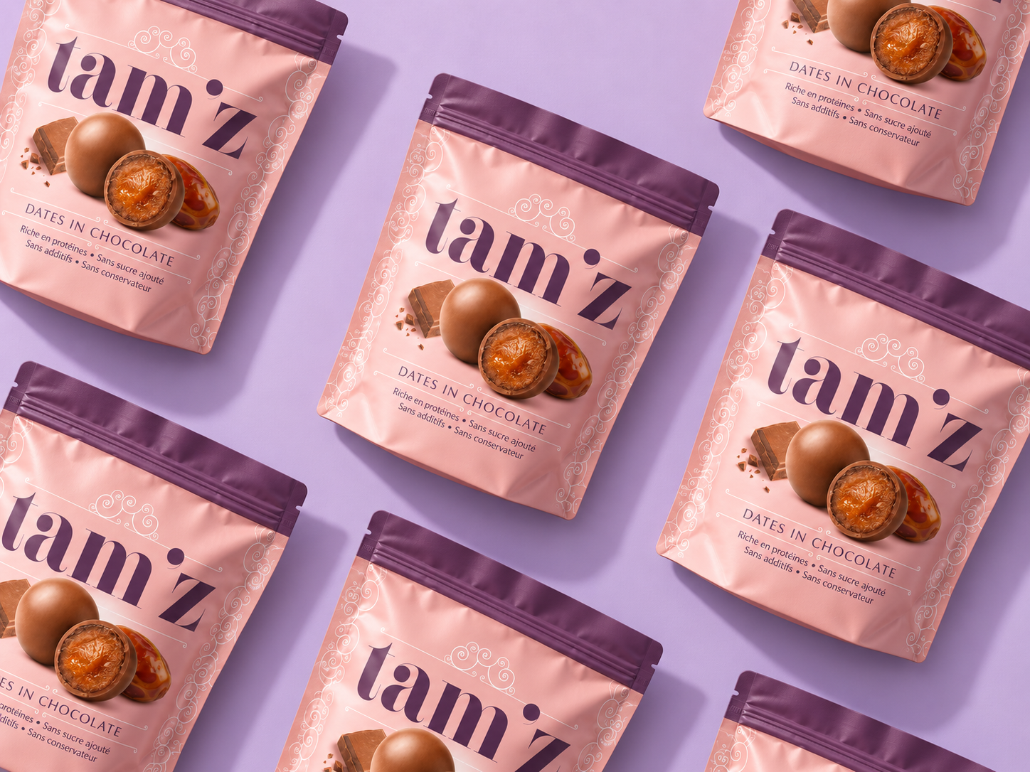
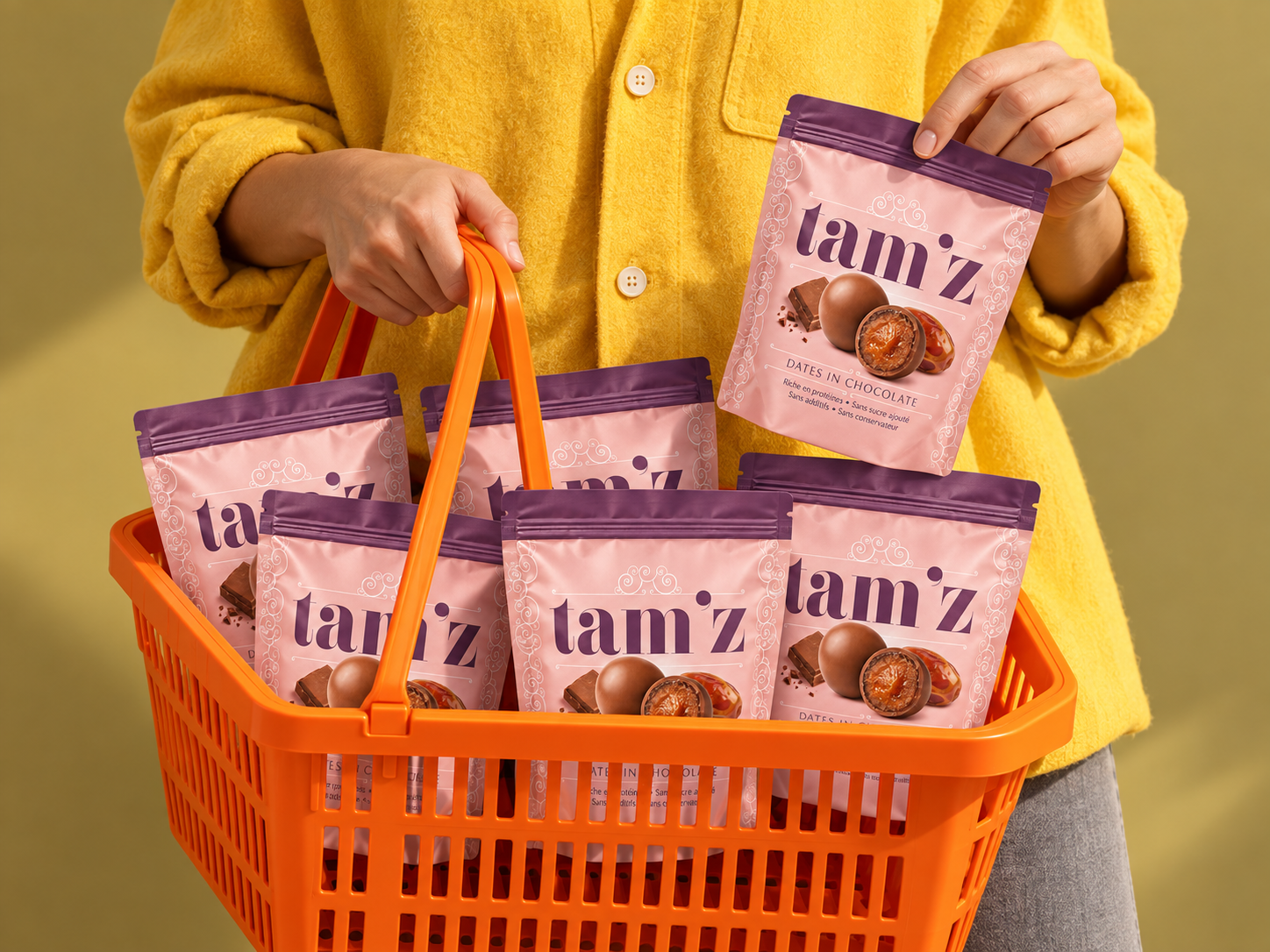
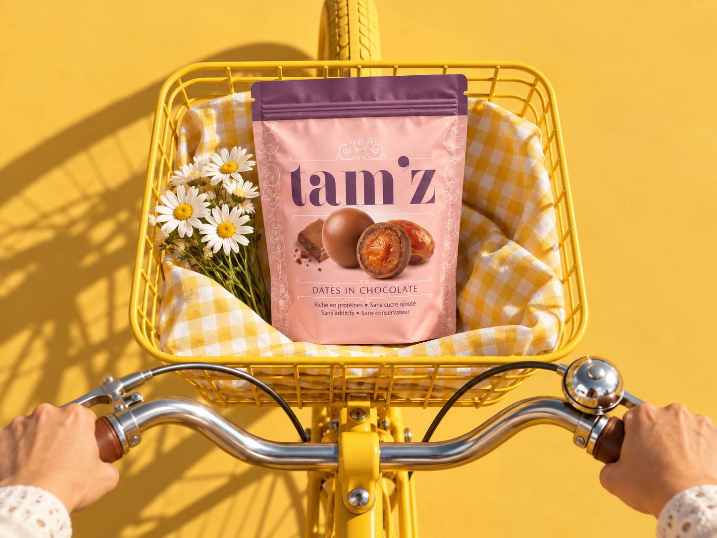
The packaging centres on an oversized serif wordmark. Its contrasting strokes and generous proportions give tam’z a confident presence, while the lowercase lettering keeps the personality warm and informal. Set against a blush pink background, the deep plum logotype establishes a distinctive colour relationship, echoed by the band across the top of the resealable pouch.
Fine white ornamentation frames the composition, adding a delicate decorative layer around the bold typography. These flowing details bring a sense of care and confectionery tradition to the design. Their lightness preserves space around the central elements, allowing the brand name and product imagery to lead.
At the heart of the pack, an image of a chocolate-covered date reveals the fruit beneath its coating. The contrast between the smooth chocolate shell and the textured centre communicates the product’s appeal through a clear, appetising visual. Below, the product descriptor and supporting information complete a straightforward hierarchy, guiding the eye from brand recognition to product understanding.
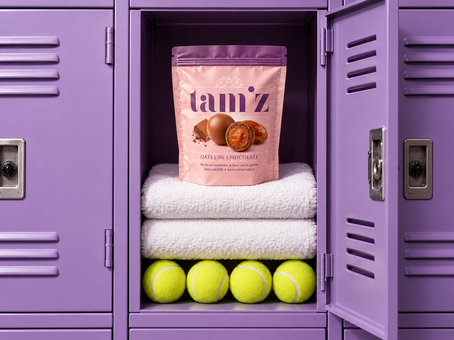
The wider art direction extends this identity into an energetic world of colour and everyday moments. Fuchsia, lilac, sunshine yellow and bright blue create expressive settings for the soft pink packaging. Shopping baskets, a bicycle and a tennis locker place tam’z within familiar routines, presenting indulgence as something that belongs naturally in daily life.
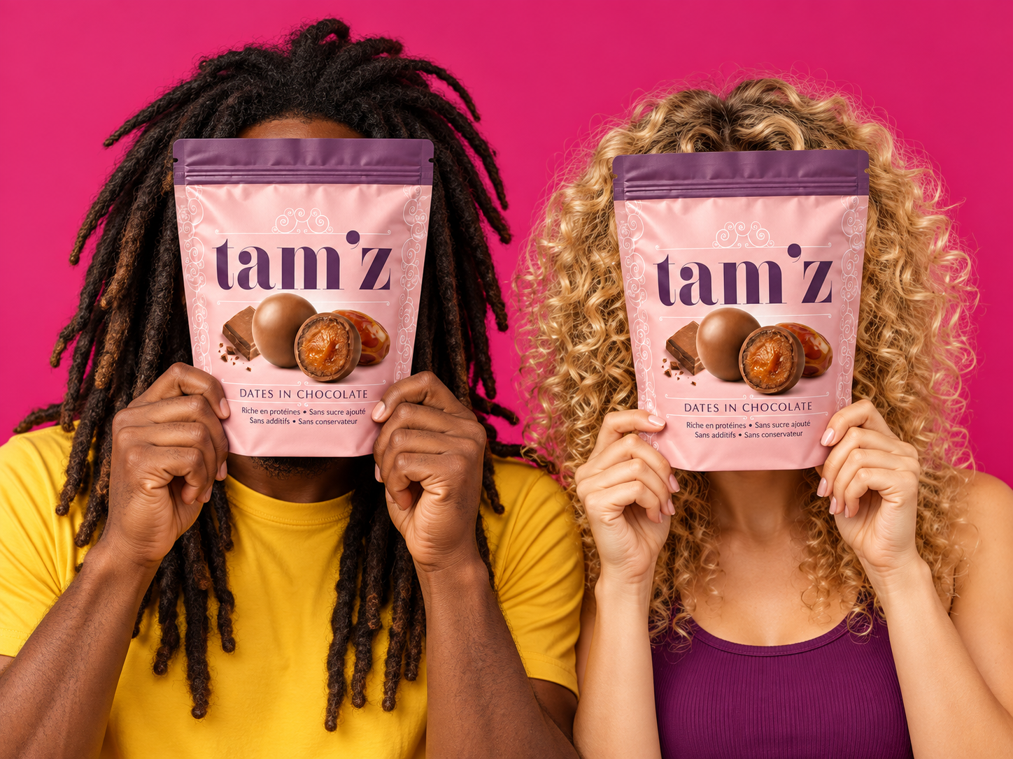
Human interaction adds another dimension to this visual language. Playful portraits, faces hidden behind pouches and an older man’s open smile give the brand a sociable character across generations. Throughout these compositions, the packaging remains the focal point, carrying both the identity and the product story.
Tam’z brings together decorative finesse, bold recognition and an accessible sense of joy. From the pouch to its wider visual world, the design presents chocolate-covered dates as a small pleasure with a confident, colourful personality.

 Derrick Lin
 VincoStudio
 lisakaplina
 CreativeWise
 Adriana Adamo
 tauqueer
 MAISON D'IDÉE Prague
 Pixels Studio
 Atchayaa
 DESIGN CONCEPTS
 hello ocean
 monther al omari
 the Labelmaker
 alamgirbrands
 kat bres
 Vantablack Studio
 GruppoSaida
 studiorevv
 grafisercreative
 Kate Reichel
 UPRISE
 Modern Theory
 By siddika
 Kinshuk Bainss