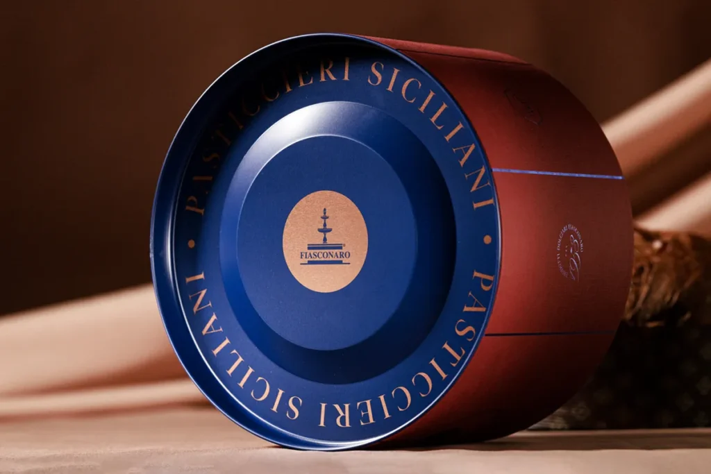

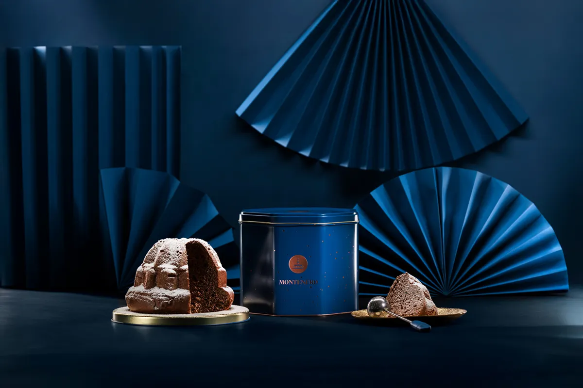
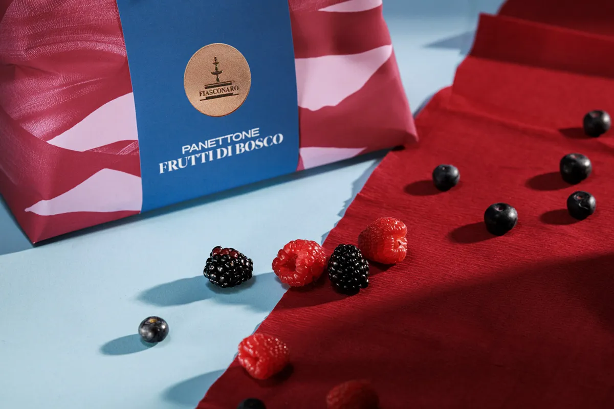
Art direction and design for Fiasconaro gives the Sicilian pastry makers from Castelbuono a visual language that honors their heritage while feeling confident and contemporary. The identity is anchored by the brand’s fountain emblem, which appears as a warm copper or gold seal across every format and acts as a quiet signature. The 1953 Collection leans into richness and ceremony.
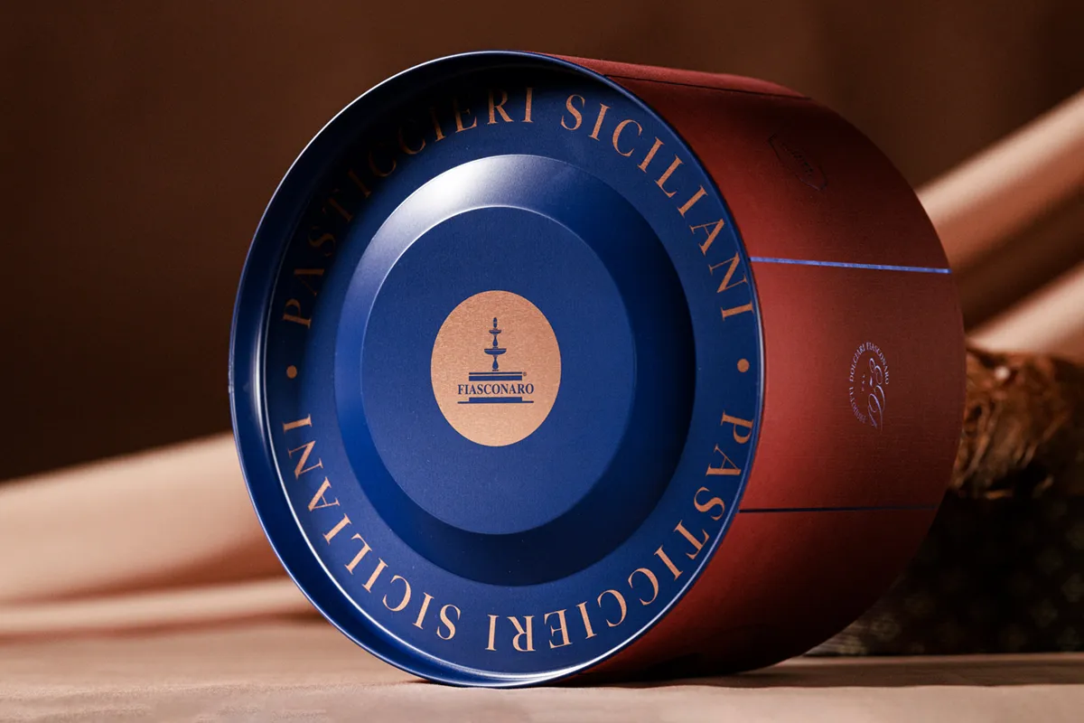
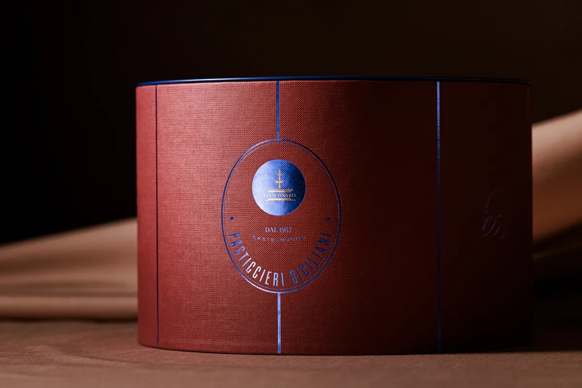
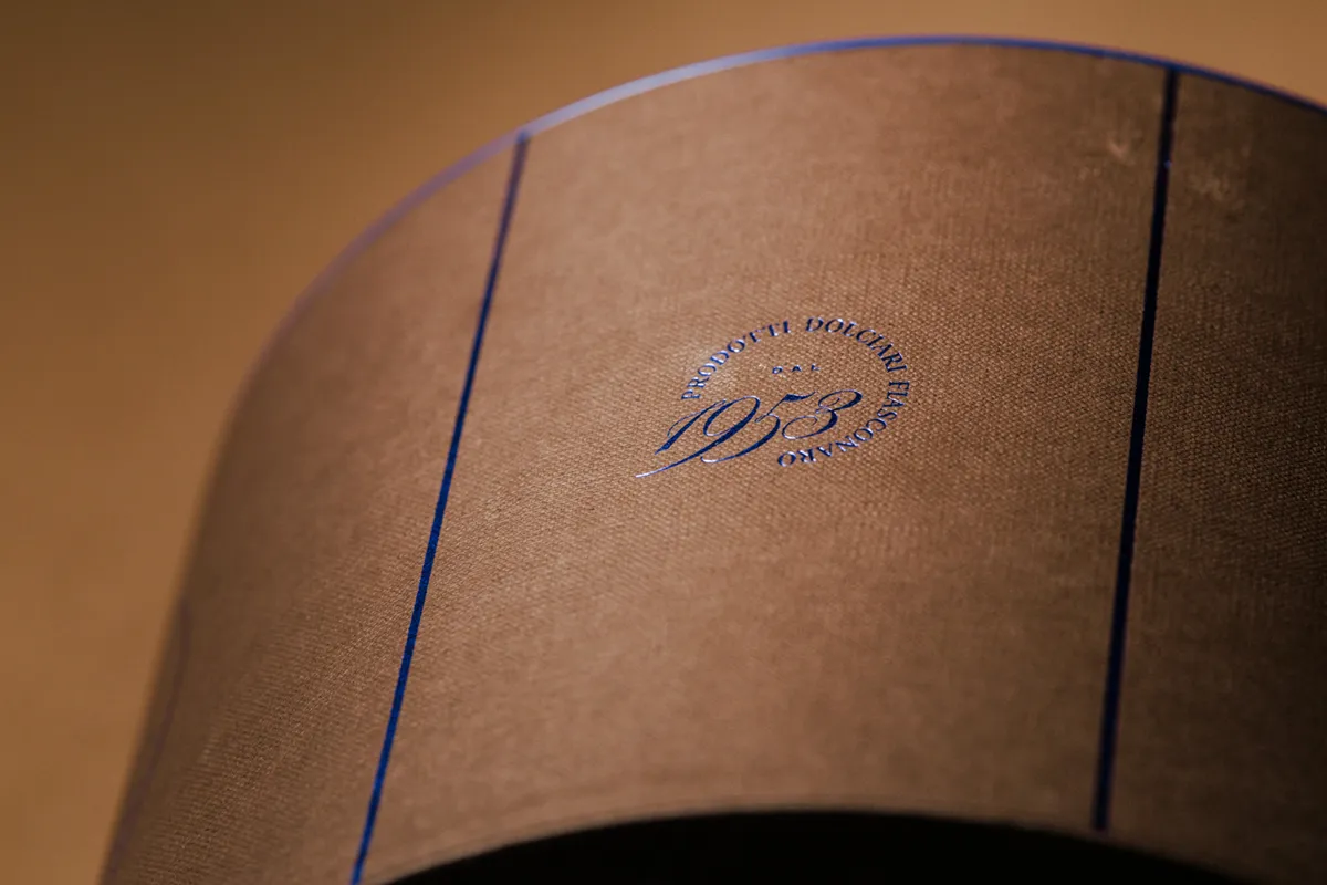
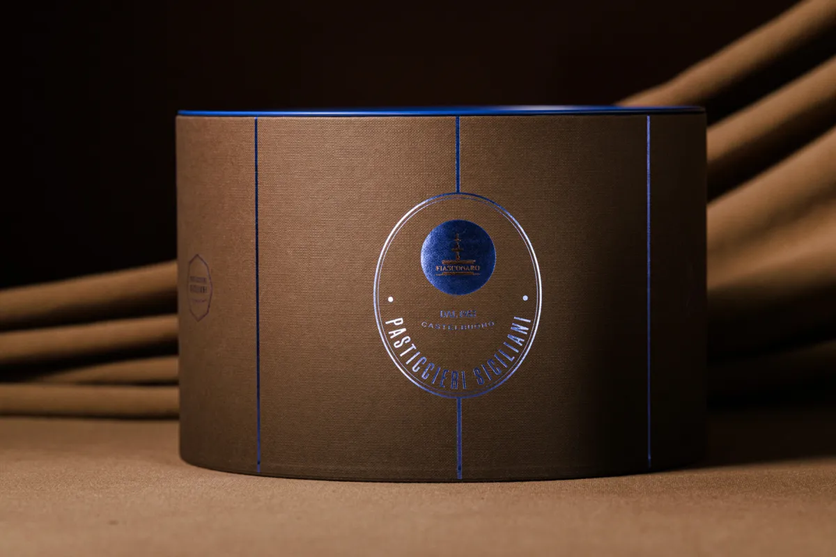
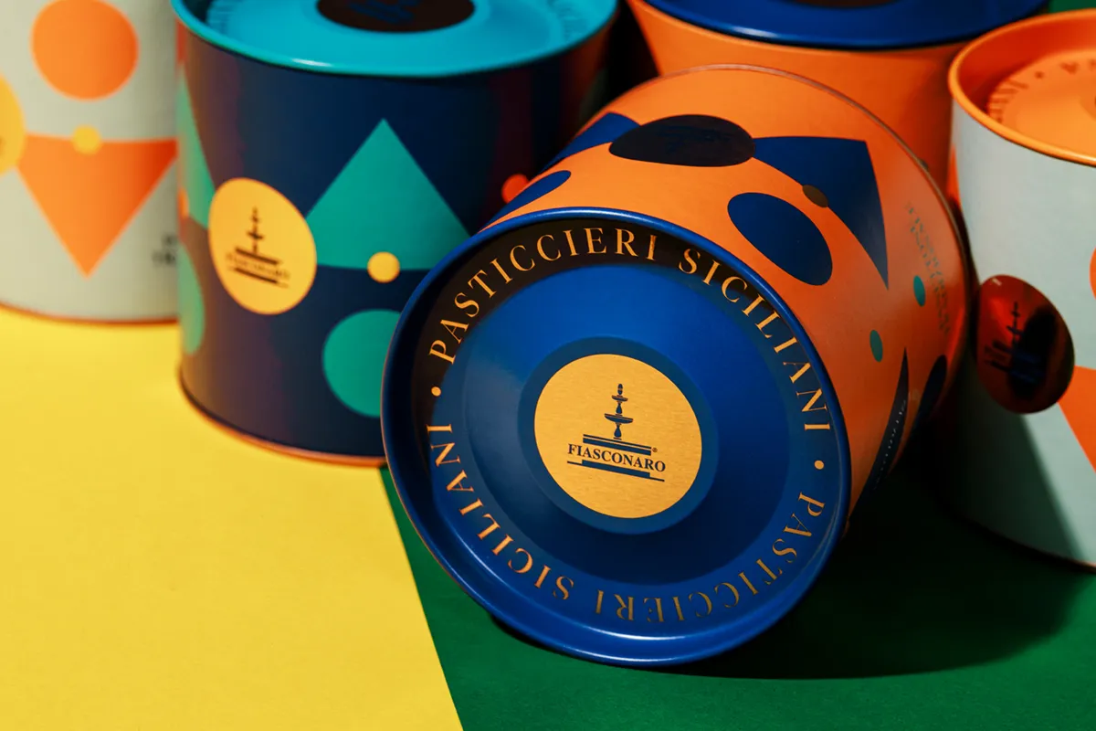
A terracotta red wrap with a fine linen texture is divided by thin blue foil lines, while an oval crest carries the founding year and the words Pasticcieri Siciliani. The deep blue metal tin beneath it, with copper lettering circling the lid, makes opening the box feel like a small ritual. The mood is classic and almost jewel-like, the kind of gift that suggests tradition without looking dusty. The 100g line takes the opposite route and lets color do the talking. Circles, triangles and playful geometric shapes in orange, teal, navy and pale sage tumble across compact tins, each topped with a bold lid that makes the range read as one joyful family on the shelf. It feels modern, bright and unmistakably Mediterranean, and it gives the brand a younger, more spontaneous voice.
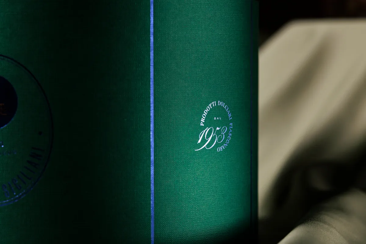
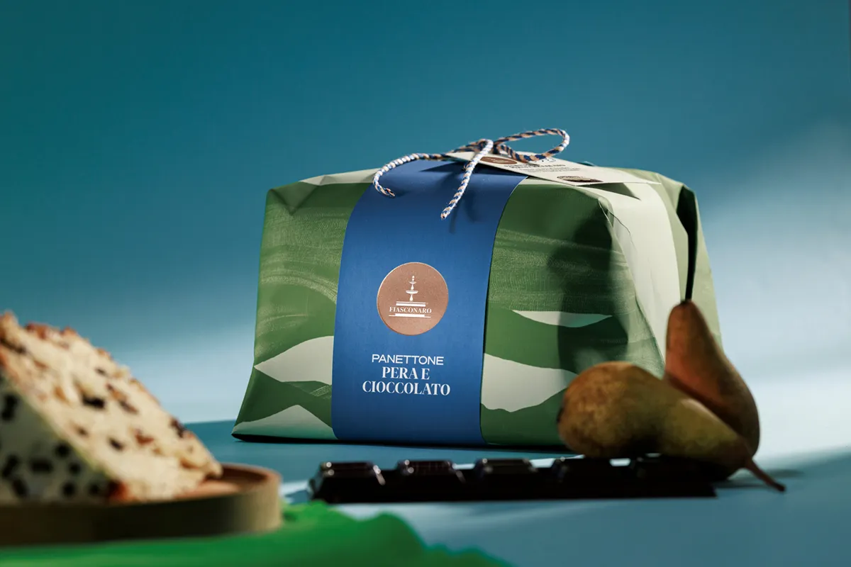
The Pera e Cioccolato panettone shows the same thinking applied to a softer format. Its green wrapping paper, painted with loose brush-like waves, suggests orchard and landscape, while a clean blue band, a copper seal and a twist of blue and orange twine keep it neat and giftable. Across all three directions, the consistent typography, the shared seal and a disciplined palette hold the system together.






 Derrick Lin
 ADStudio
 WeAreDepot
 Manuvila
 Yellow Umbrella Creative
 Toka
Toka Studio Zak
 Atiq Alam
 monther al omari
 Modern Theory
 Sirka Agency
 DESIGN CONCEPTS
 Eva Chistyakova
 Puigdemont Roca
 marianaaworks
 bloomburo
 andreamarinnn
 Alina
Alina Saadmost
 Bruhken
 Maruf Nishat
 Richest Branding Pvt. Ltd.
 Sophiagdotcom
 saifullahmaslool
 Up-Brands
 daniitenaa