
LOOMIABOUT
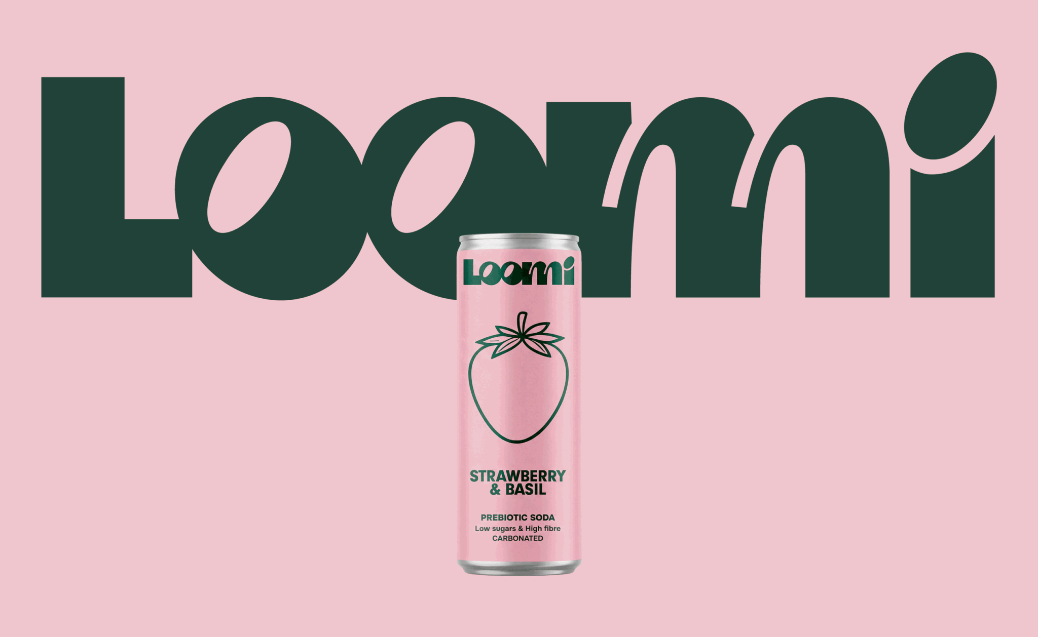
LOOMI is Lithuania’s first prebiotic drink, created as a fresh alternative to conventional soft drinks. The challenge was to develop both the logo and packaging identity, positioning the product as modern, clean and distinctive within a crowded drinks category.
As a prebiotic drink, LOOMI is built around a clean and straightforward proposition. We wanted the visual identity to reflect the same clarity while still communicating freshness, flavour and energy.
CONCEPT
The concept was built around the idea of clean simplicity with a juicy twist.
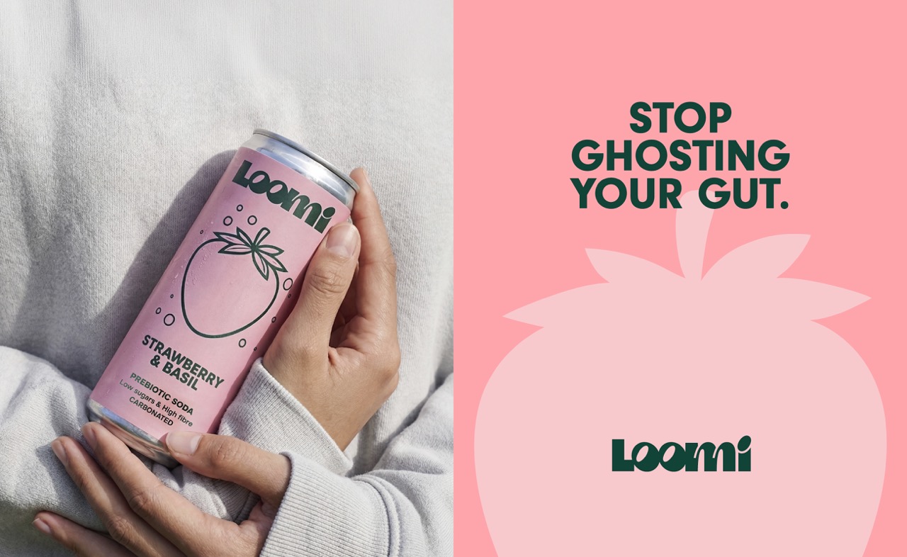
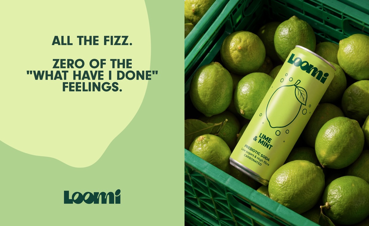
Instead of relying on complex illustrations or multiple visual elements, we reduced the packaging to a few strong ingredients: a clean base, bold typography, vibrant colours and one oversized graphic representing each flavour.
The result is a visual language that feels fresh and contemporary while allowing each flavour to have its own recognisable identity.
SOLUTION
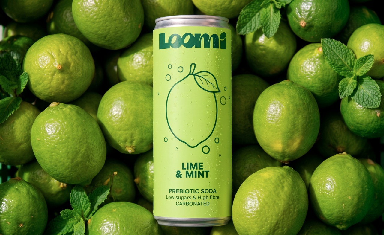
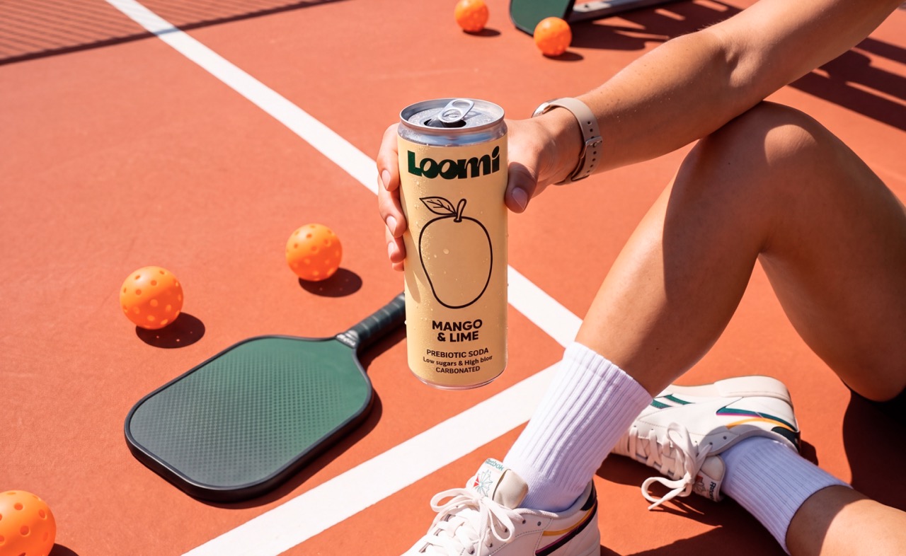
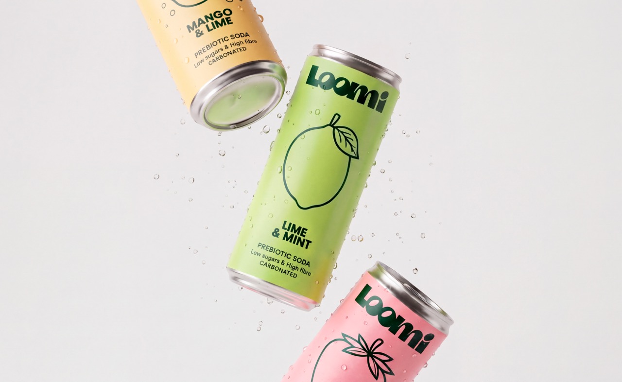
The packaging is built around a single bold graphic positioned at the centre of each pack, creating an immediate visual focal point.
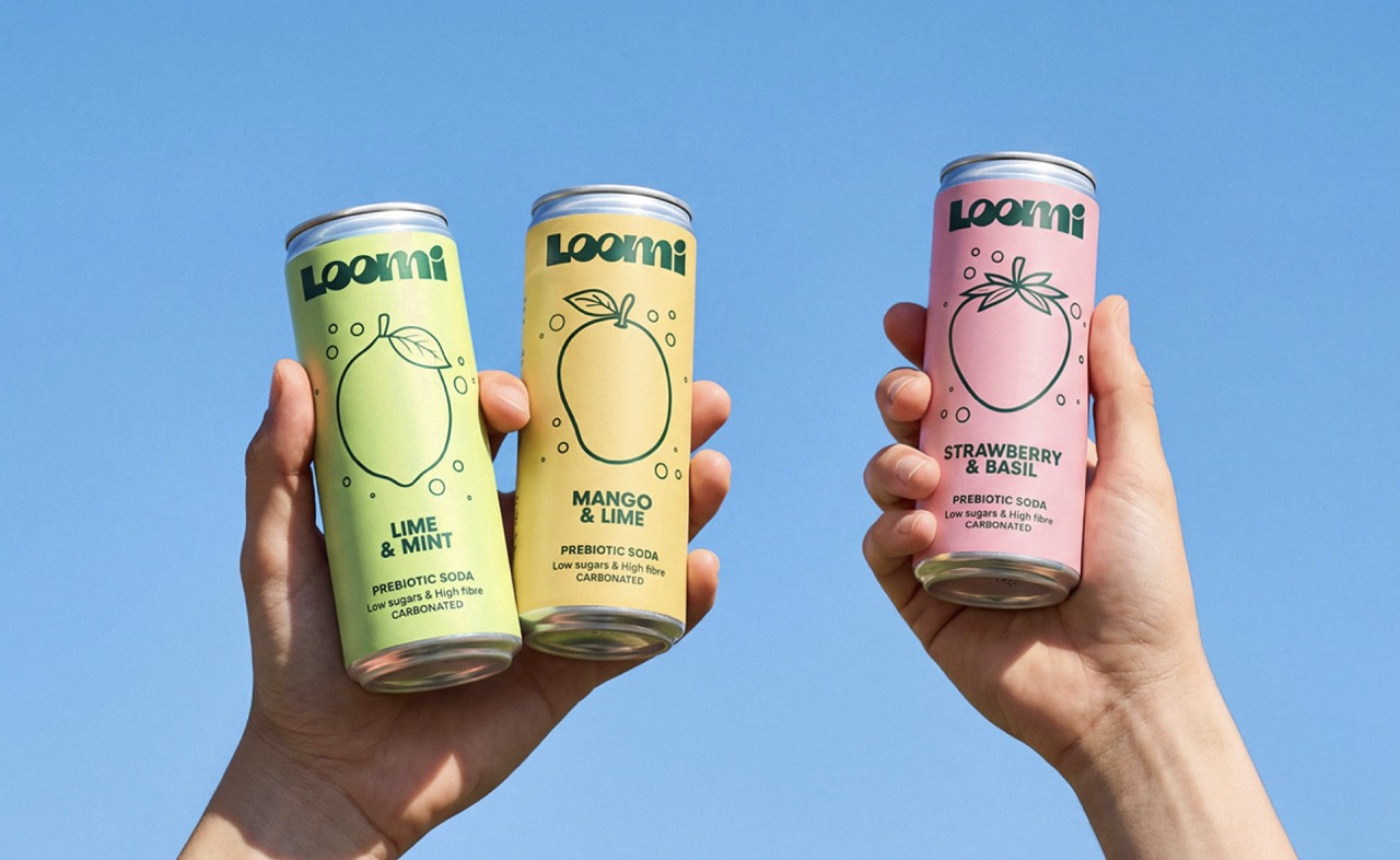
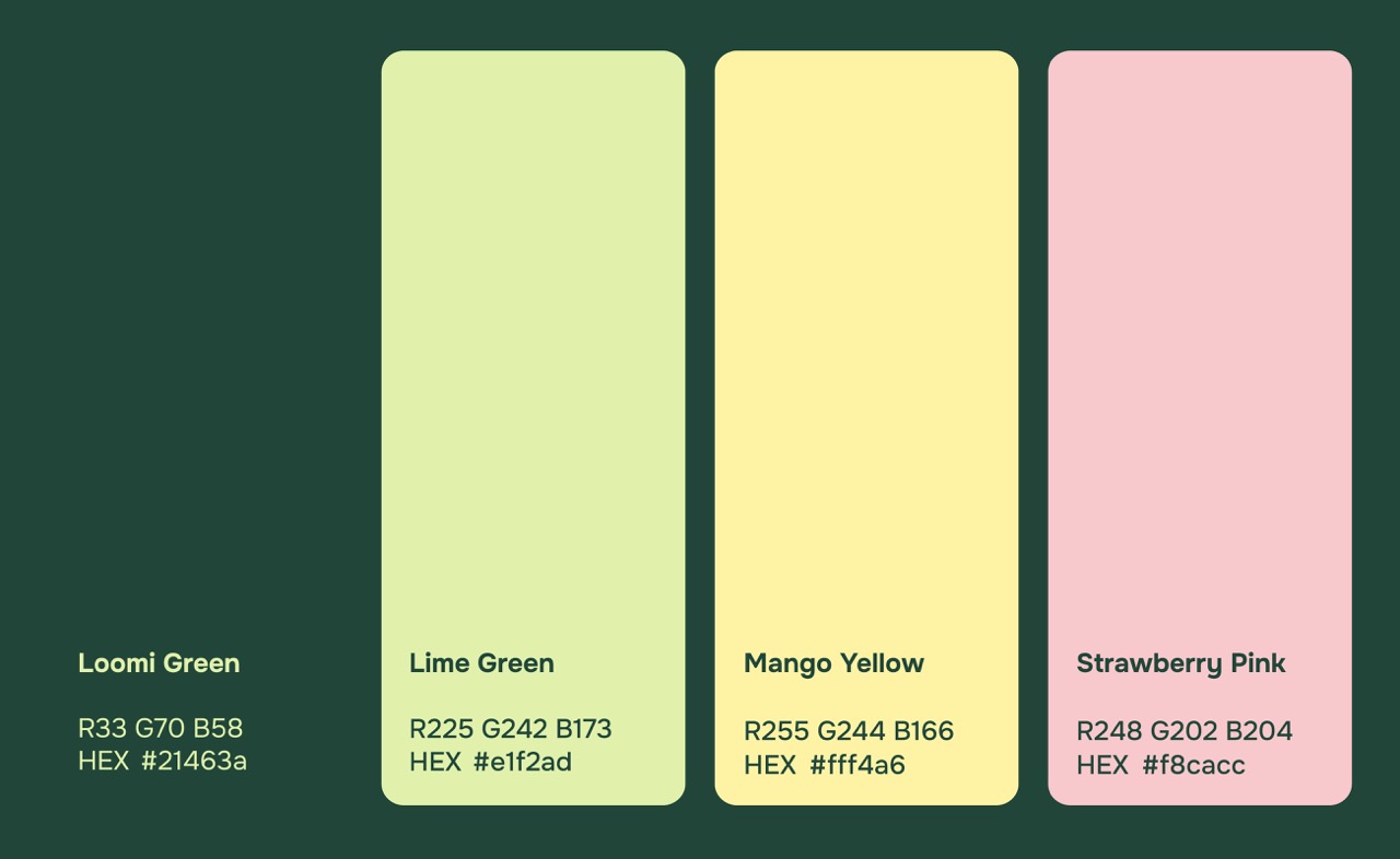
Each flavour is represented through a different vibrant colour and graphic, making the range easy to navigate while creating a strong collective identity.
The minimal layout gives the product plenty of visual space, while the oversized flavour graphics add character, energy and a sense of freshness.
Logotype · Illustration · Packaging Design · Packaging System
TECHNIQUE
The design combines bold typography, simplified illustration and a vibrant colour system.
The central flavour graphics were intentionally enlarged and simplified, allowing them to work as both functional flavour cues and distinctive visual assets. The consistent layout creates a coherent packaging system, while colour and illustration differentiate each SKU.
WHAT MAKES IT UNIQUE?
LOOMI takes a minimalist approach to a category that is often visually crowded.
Rather than adding more elements to communicate freshness, we focused on making fewer elements work harder. The oversized graphics give the otherwise clean packaging a playful and energetic character, creating what we call “juicy minimalism.”
RESULT
The result is a clean, confident and highly recognisable packaging system that gives LOOMI a distinctive presence within the soft drink category.
By combining a minimal visual structure with bold flavour cues, the identity manages to feel both simple and expressive – reflecting the product itself: clean ingredients with plenty of flavour.
 lunapanda
 Tridimage
 Analoguecreative
 lettera7
 alchimistestudioParis
 Lana B
 Colossal
 Pivot Studio
 M&A CREATIVE AGENCY
 monther al omari
 Anastasia Cherepanova | xtramez
 Hollóka Grafikai Műhely / Graphic Design Studio
 BOLD branding
 Antonia Skaraki
 Pâmella Lorrany
 Z9BKAdsgn
 Francesco Paternoster
 b1studio.ro
 Chris Creative Works
 Boordon
 Dmitriy Kuzovlev
 Brand Society
 yasharpic