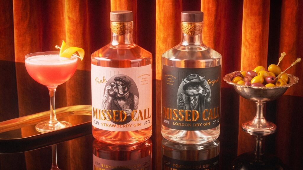

MISSED CALL is a new gin brand created for Vilniaus degtinė, one of the oldest and largest spirits producers in Lithuania and the Baltic States.
The challenge was to create a distinctive label that would establish a strong identity for the new gin, reflect its British character and stand out in the increasingly saturated craft gin category.
Rather than relying on traditional gin imagery, we looked for a more playful way to communicate the drink’s British connection and turn the brand name itself into part of the visual story.
CONCEPT
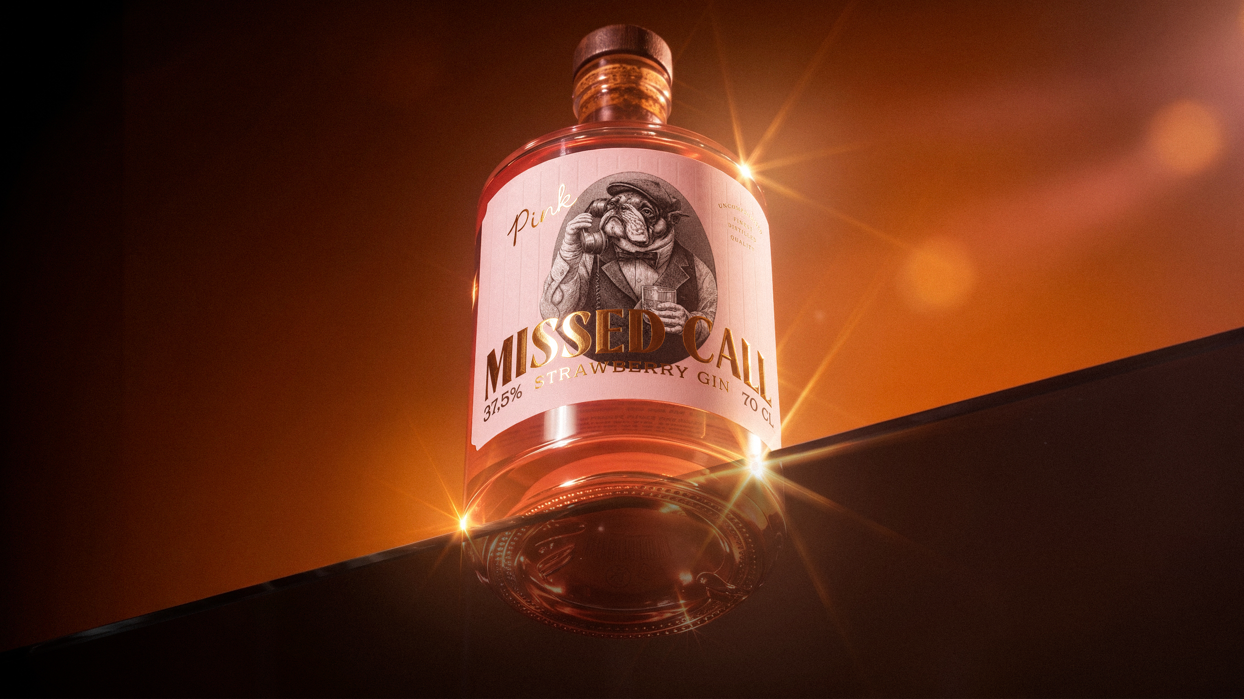
Gin has strong historical ties to Great Britain, which led us to two instantly recognisable British characters: the fox and the bulldog.
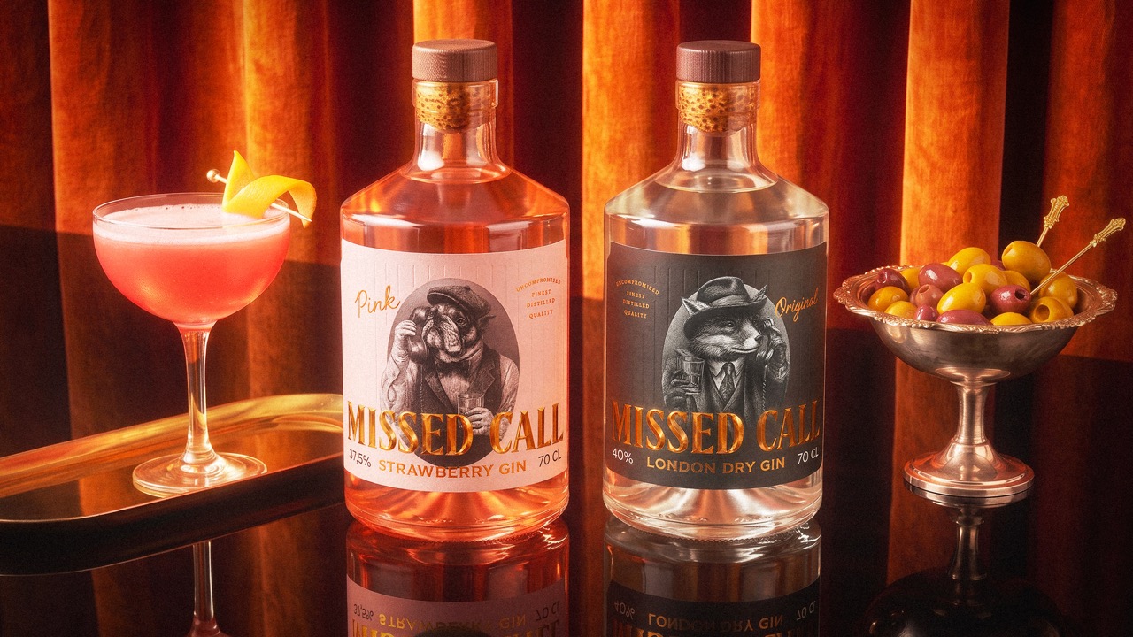
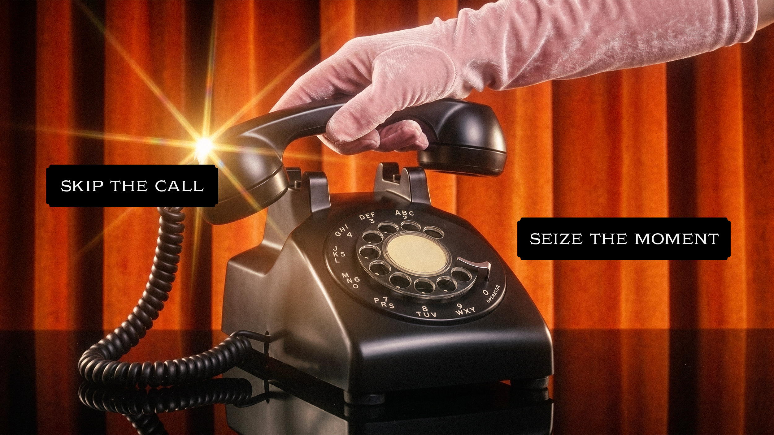
The idea behind MISSED CALL was to imagine these characters trying to reach each other by phone. This simple interaction became the central concept of the packaging – turning the bottle into a scene rather than simply a container.
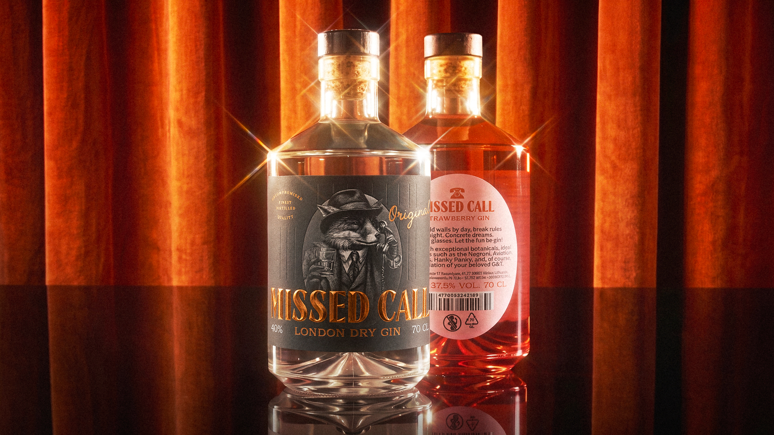
When placed next to each other on the shelf, the bottles create a visual conversation between the two characters, making the name MISSED CALL part of the experience.
SOLUTION
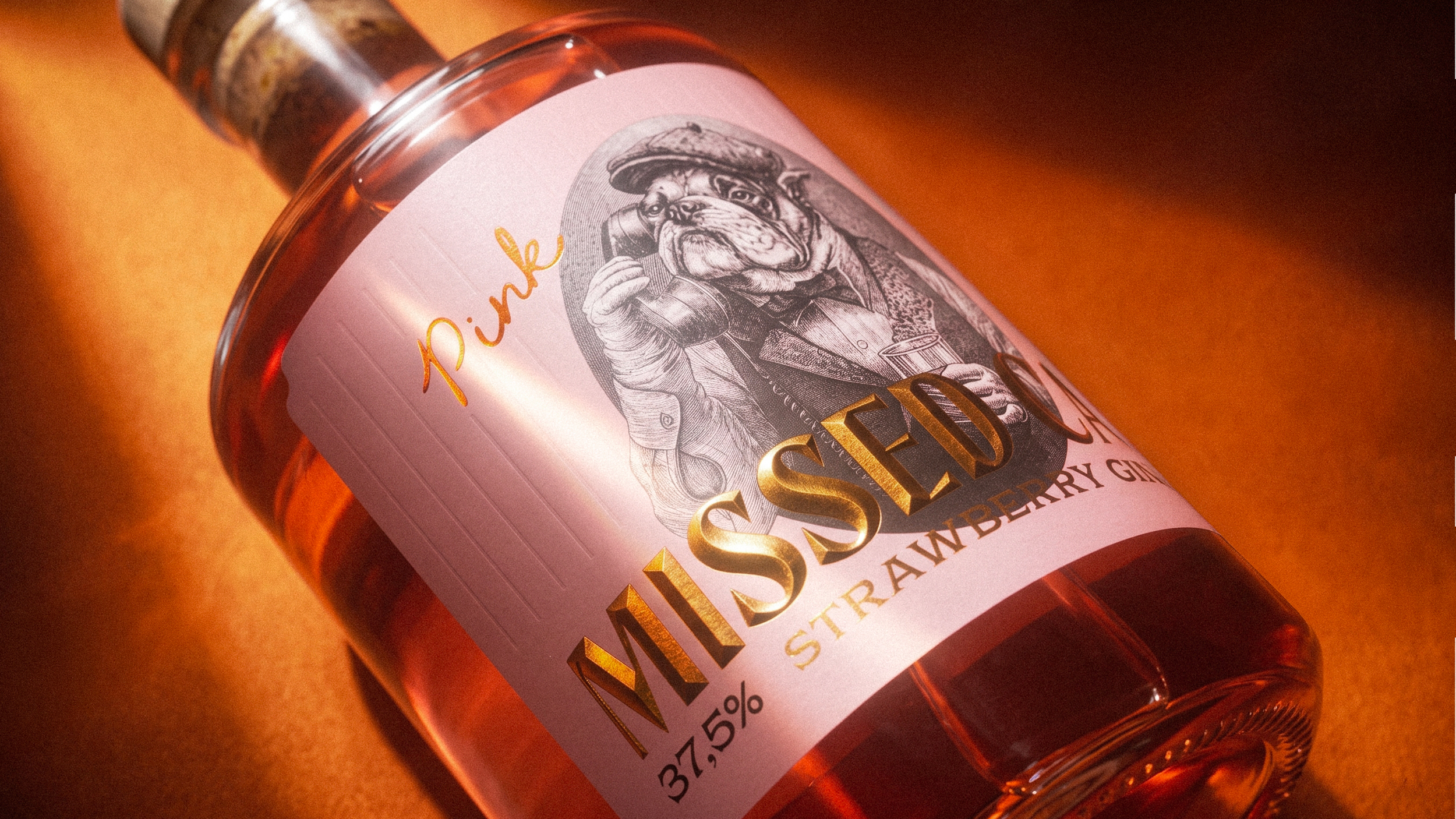
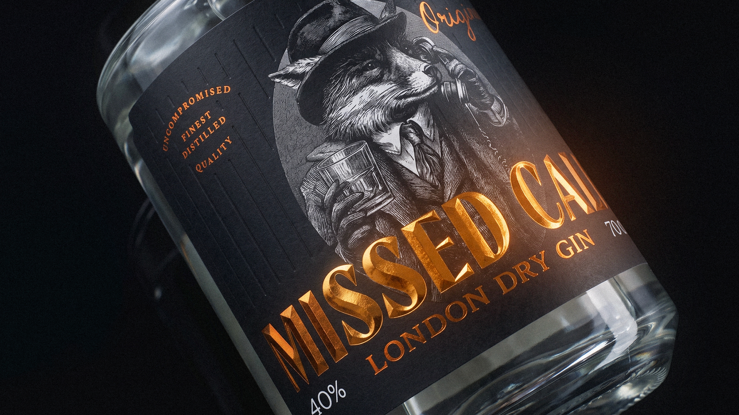
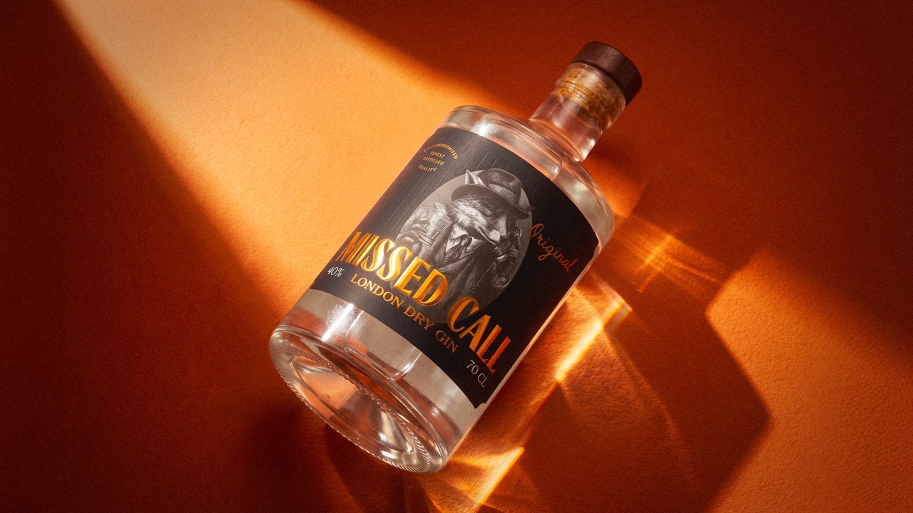
The fox and bulldog are placed inside an oval frame, creating a strong focal point on the label. Their illustrations deliberately extend beyond the frame, adding depth and making the characters feel more present.
Each character holds a phone, creating an interactive element that only fully reveals itself when the bottles are placed together. Their positioning allows the characters to appear as if they are calling or trying to reach one another.
This turns the shelf into part of the storytelling and gives the packaging an element of discovery.
The concept was also developed as a flexible packaging system. Future flavour variations can introduce new British characters while maintaining the same visual language and interaction between the bottles.
TECHNIQUE
The packaging combines illustration, composition and premium finishing techniques to balance playfulness with the quality expected from a gin brand.
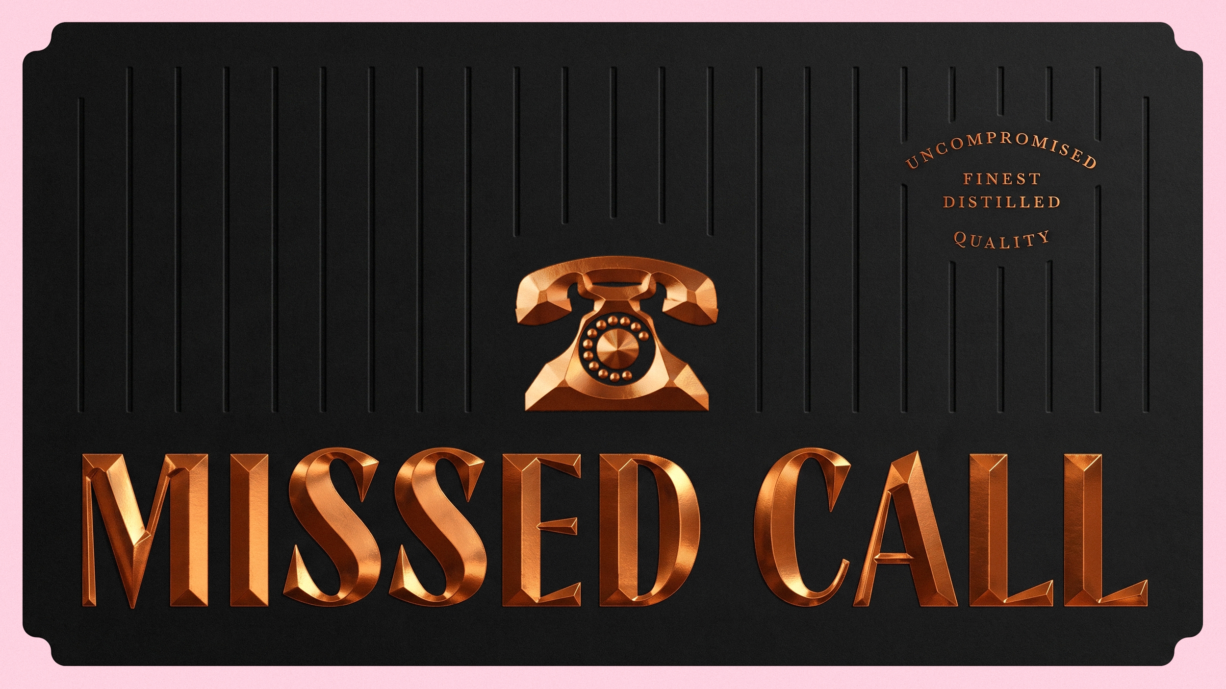
The character illustrations create the main visual impact, while copper foil and 3D embossing on the brand name add a tactile and premium detail without competing with the storytelling.
The positioning of the characters and labels was carefully designed so that individual bottles work independently, but become more engaging when viewed together.
WHAT MAKES IT UNIQUE?
MISSED CALL turns a simple brand name into a physical interaction.
Instead of treating each bottle as an isolated object, the packaging uses the relationship between bottles to create a larger visual narrative. The fox and bulldog, their phones and the way they interact across the shelf make the identity immediately recognisable and encourage a second look.
The modular character system also allows the brand to expand into new flavours while keeping the same playful logic.
RESULT
The result is a bold and memorable gin identity that combines British references, storytelling and interaction in a single packaging system.
By making the bottles interact with one another, MISSED CALL transforms the shelf into part of the brand experience – giving the product a distinctive personality while creating a flexible foundation for future range expansion.
Art Direction · Label Design · Illustration · Packaging Design · Packaging System
 lunapanda
 Tridimage
 Analoguecreative
 lettera7
 alchimistestudioParis
 Lana B
 Colossal
 Pivot Studio
 M&A CREATIVE AGENCY
 monther al omari
 Anastasia Cherepanova | xtramez
 Hollóka Grafikai Műhely / Graphic Design Studio
 BOLD branding
 Antonia Skaraki
 Pâmella Lorrany
 Z9BKAdsgn
 Francesco Paternoster
 b1studio.ro
 Chris Creative Works
 Boordon
 Dmitriy Kuzovlev
 Brand Society
 yasharpic