
HiGenie!ABOUT
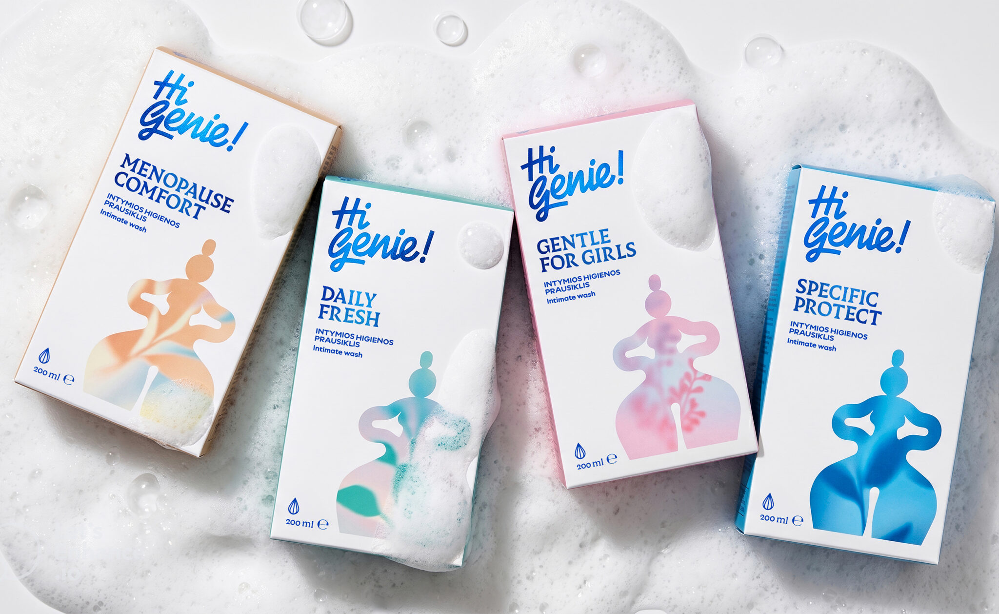
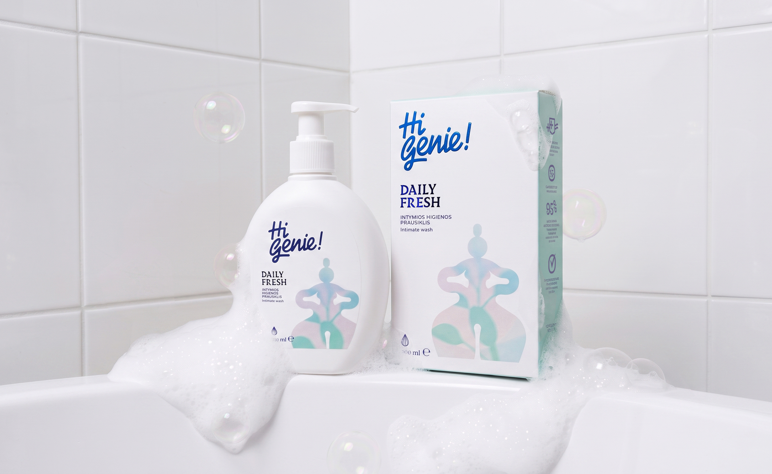
HiGenie! is a new private-label brand created for Gintarinė Vaistinė, one of Lithuania’s pharmacy chains. The range includes feminine hygiene and intimate care products, developed specifically for the pharmacy to sell under its own brand.
The challenge was to create a brand that could stand out in a category heavily dominated by familiar feminine codes — pink tones, floral motifs, soft illustrations and delicate aesthetics. At the same time, the visual language of feminine hygiene often moves towards cold, clinical packaging.
We wanted to create something different: a brand that feels confident, expressive and contemporary, while giving an everyday functional product a stronger sense of personality.
CONCEPT
The idea behind HiGenie! is rooted in the thought that every woman is a “miracle worker” in her own way. She manages countless roles, challenges and everyday demands — almost as if she had a little magic of her own.
This idea led to the name HiGenie! and became the foundation for the visual identity.
At the centre of the brand is a distinctive genie figure, created as a monolithic silhouette inspired by the sculptural form of Venus. Its shape also echoes the elegant contour of a genie bottle, connecting the character directly with the brand name.
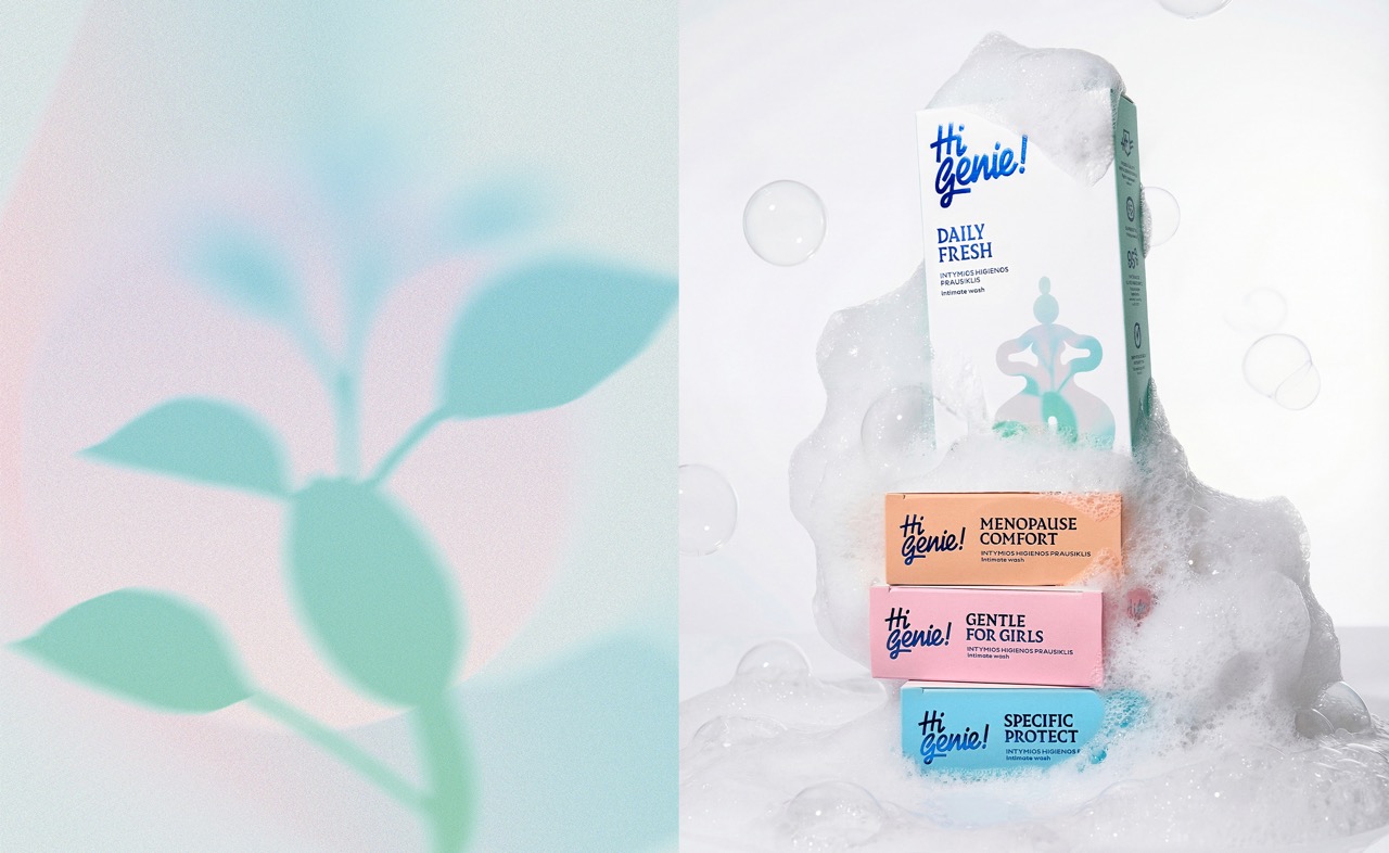
The figure is surrounded by nature-inspired elements representing earth, creative power and rebirth — adding a deeper symbolic layer to the identity.
SOLUTION
Instead of using the conventional visual language of feminine hygiene, we created a bold and recognisable world around the genie character.
The packaging uses a deep blue colour palette combined with vibrant blue foil, creating a sense of mystery and magic while giving the products a strong presence on the pharmacy shelf.
The sculptural figure acts as the main visual anchor across the range, while the surrounding botanical elements create a flexible system that can be adapted across different products and formats.
The result is a packaging identity that feels playful and expressive without becoming overly sweet, and feminine without relying on stereotypical feminine codes.
TECHNIQUE
The visual identity combines sculptural illustration, symbolic botanical elements and metallic foil finishing.
The genie silhouette was developed as a strong, simplified graphic form, allowing it to remain recognisable across the entire product range. The use of deep-blue foil adds dimensionality and a tactile, almost magical quality to the otherwise clean packaging system.
The combination of the sculptural form, nature-inspired graphics and foil treatment creates contrast between the functional nature of the products and the more emotional world of the brand.
WHAT MAKES IT UNIQUE?
HiGenie! transforms an everyday functional product into a brand with its own character and attitude.
Rather than adapting to the existing visual codes of the category, the identity creates a distinctive world of its own. The Venus-inspired genie silhouette, symbolic nature elements and deep-blue foil work together to create a packaging system that is both recognisable and highly ownable.
The identity is designed not only to differentiate individual products, but to build a strong and coherent private-label brand that can grow across the entire feminine hygiene and intimate care range.
RESULT
The result is a confident, contemporary and memorable private-label brand that challenges the conventional aesthetics of feminine hygiene.
The distinctive genie character gives the range an immediate visual signature, while the foil treatment creates a premium and eye-catching presence on shelf.
Naming · Logotype · Branding · Art Direction · Packaging · Packaging System



 monther al omari
 Ximena Ureta Design Studio.
 vitoramockup
 Up-Brands
 Sophiagdotcom
 Peter said
 ayeidadezigns
 Tancybox
 宏洛图品牌设计HONGLT
 Modern Theory
 Dozen Agency
 Atiq Alam
 Olio Studio
 Ruchi S. Joshi
 mmdesign
 awaiskhadim
 Octasoft
 United Creatives Studio
 Kingdom & Sparrow
 Anastasia Bakhmatskaya
 CreativeWise