
The brand’s identity stems from the vibrancy of the laughter shared among loved ones over their favourite dishes and the colours conveyed how a meal by yourself can bring peace, when needed.
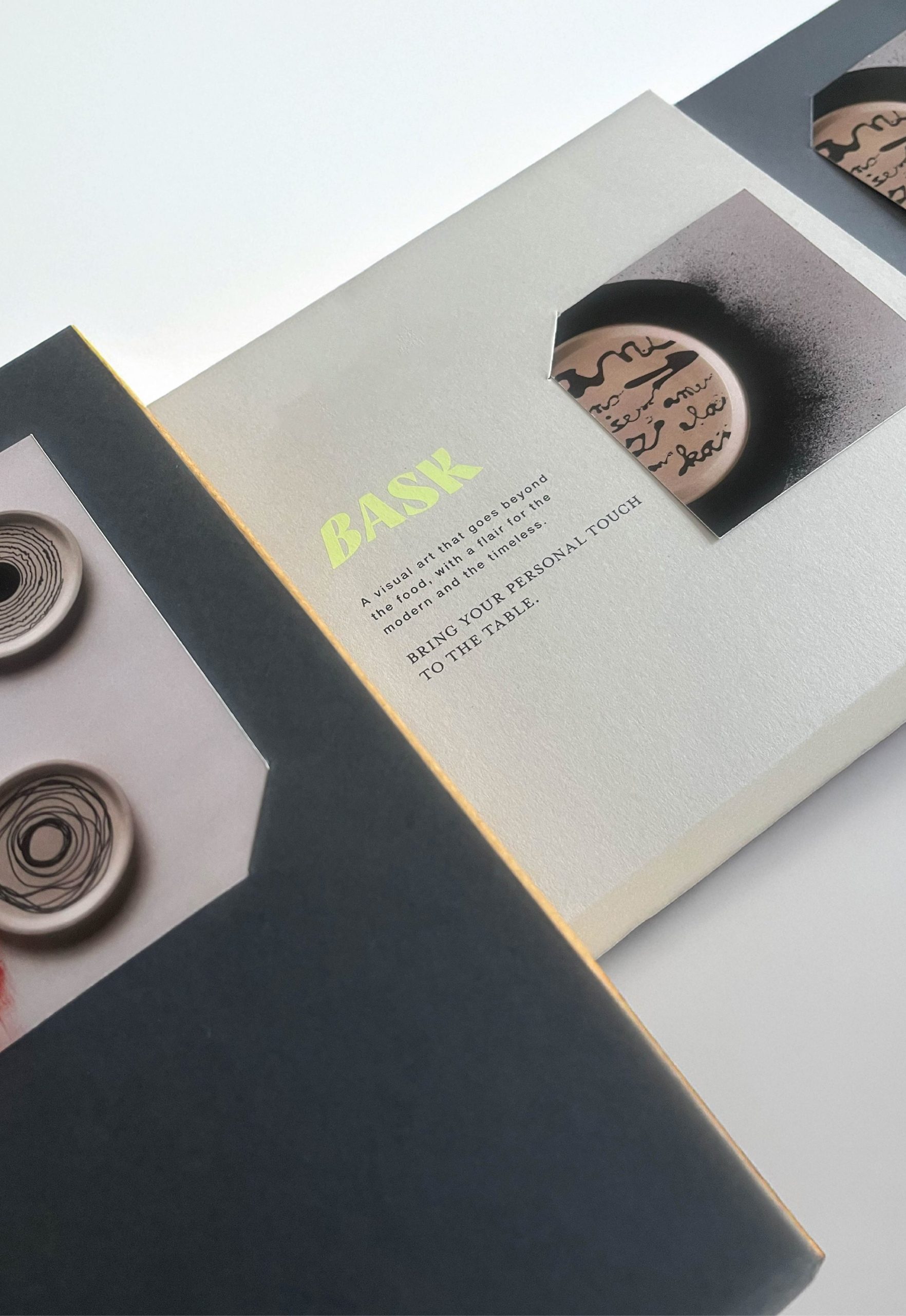
The main challenge while designing the packaging for Bask lay in creating something that was neutral in its look as the products are so versatile and varied. The products vary not only in shape and size, but also in design, colour and the overall mood.
Beige & grey shades were chosen to ensure the focus remains on what is inside. Every box sleeve comes with a small cut out where the image of the collection inside is to be inserted. No matter how different each collection is from the other, this feature ensures that the packaging would always blend with the product while standing out on its own.


 VERONIKA KISELEVA
 al margen
 Jasgul
 Abhijith Madhu
 mariee
 Modern Theory
 Tancybox
 WINK®DESIGN
 impprintz
 Chainhouse
 rufydesign
 White Candy Design
 Just Design
 alchimistestudioParis
 bmd group
 Laurie Offer
 medok4r
 Nouna design
 CreativeWise
 ANNA ONISHCHENKO
 Denomination
 VANESA GARCÍA ESTUDIO
 Julia Persuk