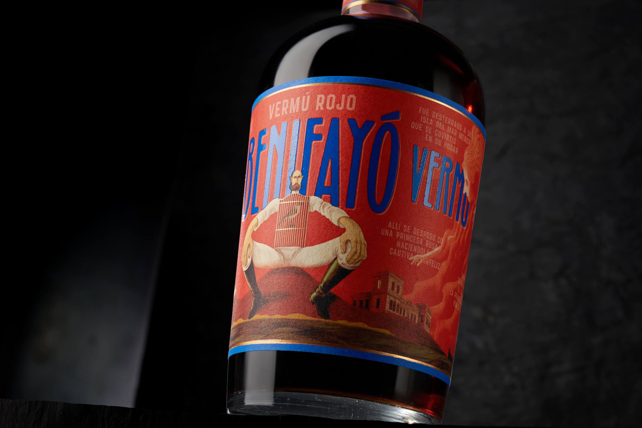

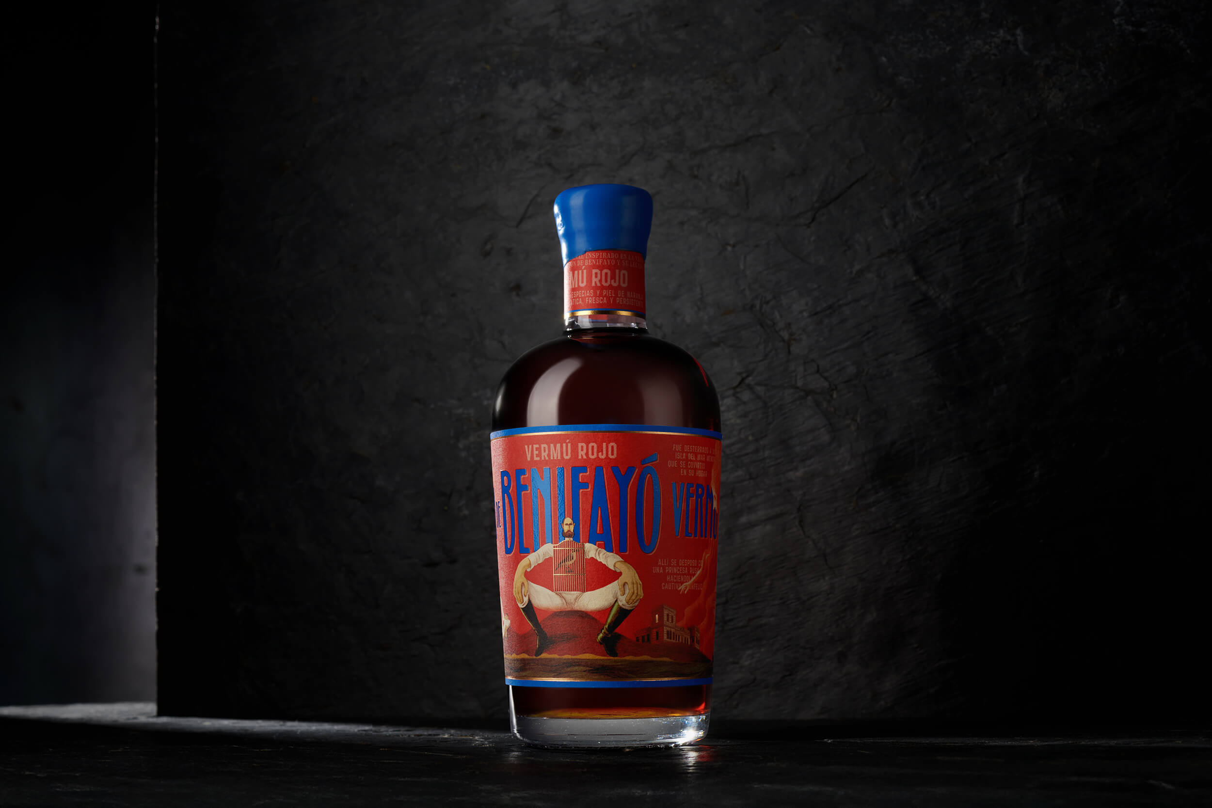
Benifayó is rooted in a narrative where history and fiction merge into a rich, symbolic universe. The challenge was to translate this legacy into a visual identity capable of expressing its depth and distinctive character.
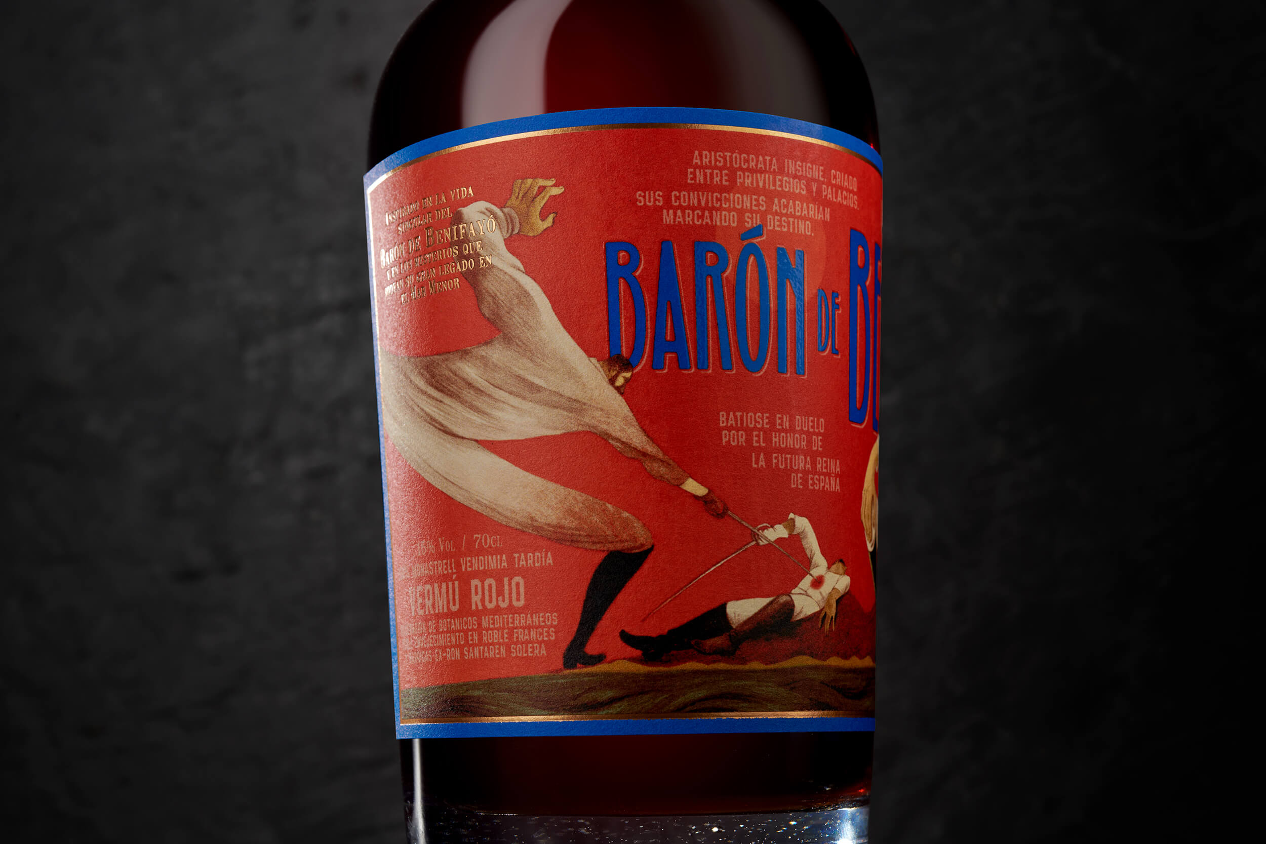
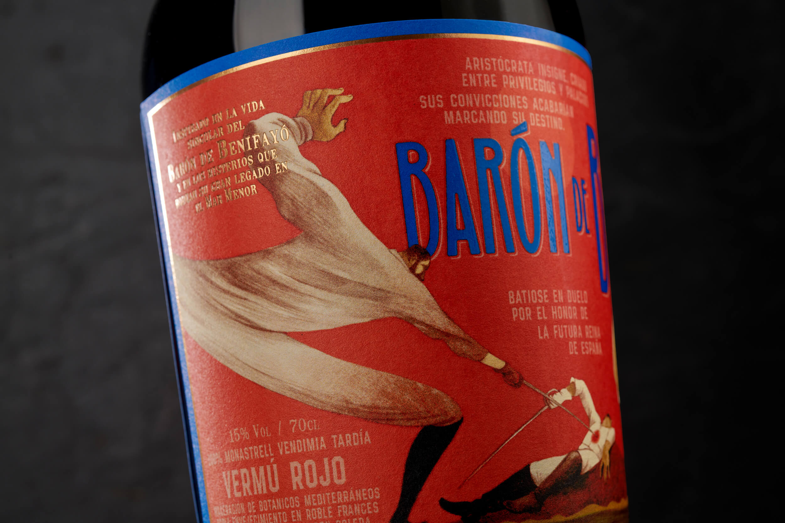
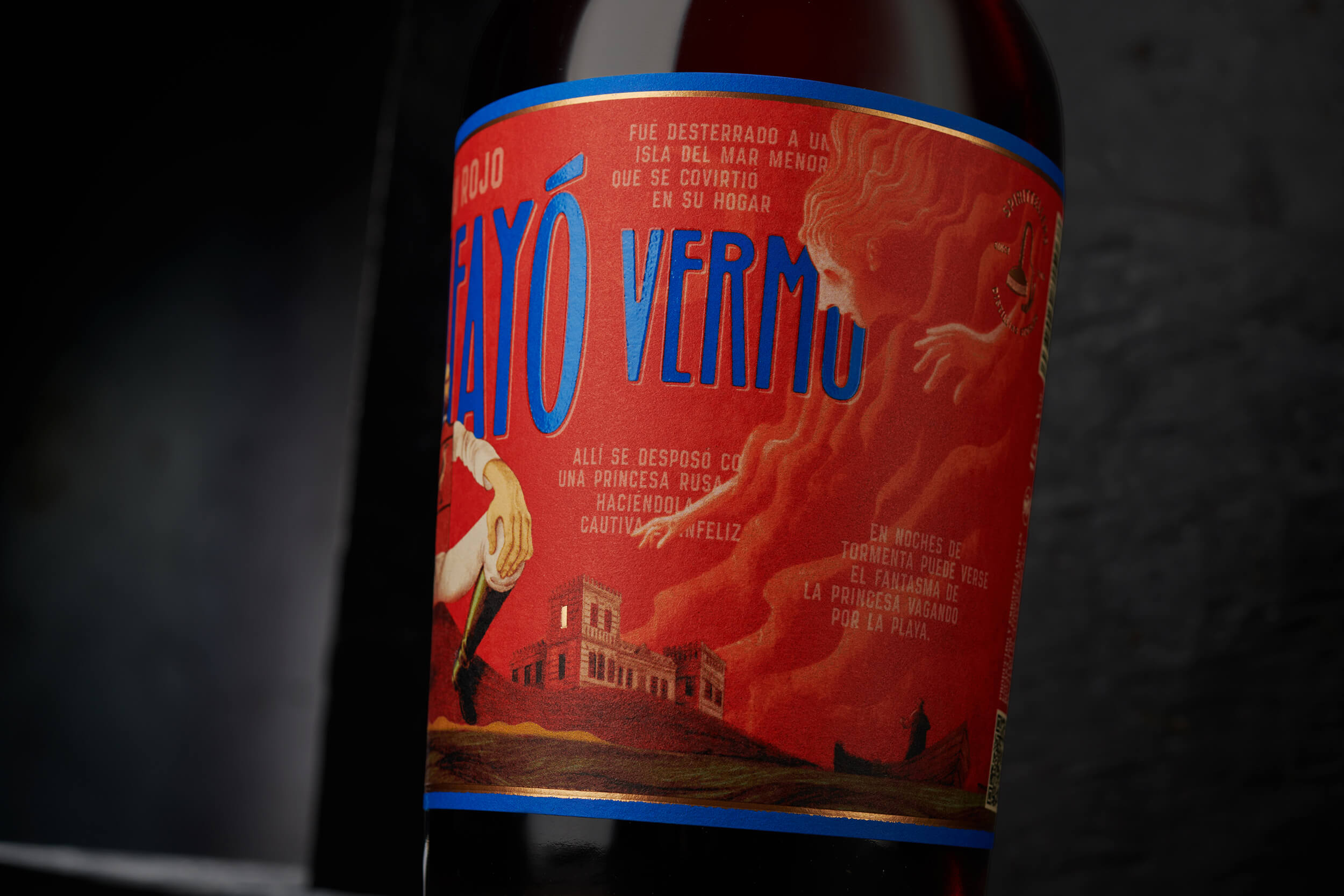
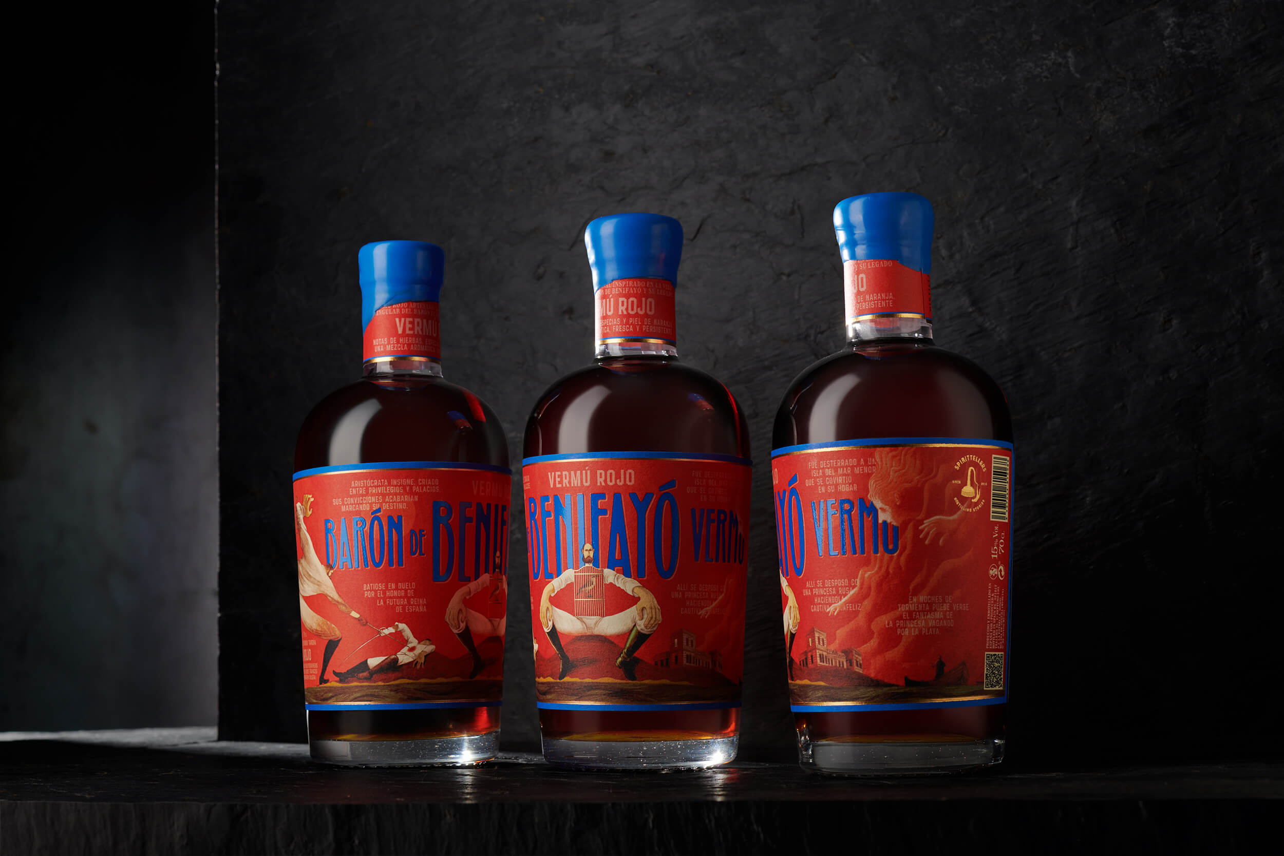
Illustration becomes the core of the project. With a bold, almost theatrical style, each label unfolds as a scene—reinterpreting historical imagery through a contemporary lens and turning every bottle into a fragment of a larger story.
Color plays a key role. Deep reds contrasted with electric blues heighten the dramatic tone and ensure strong shelf impact.
Typography is fully integrated into the artwork, behaving more like part of a poster than a conventional label.
The result is a striking and memorable identity where illustration, color, and storytelling come together to shape a vermouth with a unique voice.



 Anna Kachaeva
 vrai studio
 Studio Pistache
 Slice Design
 David Byerlee
 宏洛图品牌设计HONGLT
 The Creative Method
 Fond
 DS1 branding agency
 Ashwini D
 Dozen Agency
 We Craft Studio
 Likit
 Asprey Creative
 Firstrein
 Nouna design
 JavierGarduno
 Daria Kolesnikova
 HerCreativeSide
 lbeck